
Visualizations and infographics are both visual representations of data that are often confused. In fact, there is not a clear line of demarcation between the two. Both are informative. Both can be static or animated. Both require a knowledgeable person to create them.
Visualizations Explore
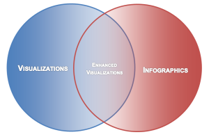
Data visualizations are created to make sense of data visually and to explore data interactively. Visualization is mostly automatic, generated through the use of data analysis software, to create graphs, plots, and charts. The visualizations can use the default settings of the software or involve Data Artistry and labeling (i.e., these Enhanced Visualizations fall in the intersection of the two circles in the figure). The processes used to create visualizations can be applied efficiently to almost any dataset. Visualizations tend to be more objective than infographics and better for allowing audiences to draw their own conclusions, although the audience needs to have some skills in data analysis. Data visualizations do not contain infographics.
Infographics Explain
Infographics are artistic displays intended to make a point using information. They are specific, elaborate, explanatory, and self-contained. Every infographic is unique and must be designed from scratch for visual appeal and overall reader comprehension. There is no software for automatically producing infographics the way there is for visualizations. Infographics are combinations of illustrations, images, text, and even visualizations designed for general audiences. Infographics are better than visualizations for guiding the conclusions of an audience but can be more subjective than visualizations.
| Visualization | Infographic | |
| Objective | Analyze | Communicate |
| Audience | Some data analysis skills | General audience |
| Components | Points, lines, bars, and other data representations | Graphic design elements, text, visualizations |
| Source of Information | Raw data | Analyzed data and findings |
| Creation Tool | Data analysis software | Desktop publishing software |
| Replication | Easily reproducible with new data | Unique |
| Interactive or Static | Either | Static |
| Aesthetic Treatment | Not necessary | Essential |
| Interpretation | Left to the audience | Provided to the audience |
REFERENCES
http://killerinfographics.com/blog/data-visualization-versus-infographics.html
http://killerinfographics.com/infographic-design-start-finish.html
http://www.thefunctionalart.com/2014/03/infographics-to-reveal-visualizations.html
https://eagereyes.org/blog/2010/the-difference-between-infographics-and-visualization
https://visage.co/throwdown-data-visualization-vs-infographics/

Read more about using statistics at the Stats with Cats blog. Join other fans at the Stats with Cats Facebook group and the Stats with Cats Facebook page. Order Stats with Cats: The Domesticated Guide to Statistics, Models, Graphs, and Other Breeds of Data analysis at amazon.com, barnesandnoble.com, or other online booksellers.


Pingback: Visualizations versus Infographics | A bunch of data
Pingback: Why You Wouldn’t Want Me To Curate Your Medium Article | Random TerraBytes