What to Look for in Data – Part 1 discusses how to explore data snapshots, population characteristics, and changes. Part 2 looks at how to explore patterns, trends, and anomalies. There are many different types of patterns, trends, and anomalies, but graphs are always the best first place to look.
Patterns and Trends
There are at least ten types of data relationships – direct, feedback, common, mediated, stimulated, suppressed, inverse, threshold, and complex – and of course spurious relationships. They can all produce different patterns and trends, or no recognizable arrangement at all.
 There are four patterns to look for:
- Shocks,
- Steps
- Shifts
- Cycles.
Shocks are seemingly random excursions far from the main body of data. They are outliers but they often reoccur, sometimes in a similar way suggesting a common, though sporadic cause. Some shocks may be attributed to an intermittent malfunction in the measurement instrument. Sometimes they occur in pairs, one in the positive direction and another of similar size in the negative direction. This is often because of missed reporting dates for business data.
Steps are periodic increases or decreases in the body of the data. Steps progress in the same direction because they reflect a progressive change in conditions. If the steps are small enough, they can appear to be, and be analyzed as, a linear trend.
Shifts are increases and/or decreases in the body of the data like steps, but shifts tend to be longer than steps and don’t necessarily progress in the same direction. Shifts reflect occasional changes in conditions. The changes may remain or revert to the previous conditions, making them more difficult to analyze with linear models.
Cycles are increases and decreases in the body of the data that usually appear as a waveform having fairly consistent amplitudes and frequencies. Cycles reflect periodic changes in conditions, often associated with time, such as daily or seasonal cycles. Cycles cannot be analyzed effectively with linear models. Sometimes different cycles add together making them more difficult to recognize and analyze.
 Simple trends can be easier to identify because they are more familiar to most data analysts. Again, graphs are the best place to look for trends.
 Linear trends are easy to see; the data form a line. Curvilinear trends can be more difficult to recognize because they don’t follow a set path. With some experience and intuition, however, they can be identified. Nonlinear trends look similar to curvilinear trends but they require more complicated nonlinear models to analyze. Curvilinear trends can be analyzed with linear models with the use of transformations.
There are also more complex trends involving different dimensions, including:
 Temporal
- Spatial
- Categorical
- Hidden
- Multivariate
Temporal Trends can be more difficult to identify because Time-series data can be combinations of shocks, steps, shifts, cycles, and linear and curvilinear trends. The effects may be seasonal, superimposed on each other within a given time period, or spread over many different time periods. Confounded effects are often impossible to separate, especially if the data record is short or the sampled intervals are irregular or too large.

 Spatial Trends present a different twist. Time is one-dimensional; at least as we now know it. Distance can be one-, two-, or three-dimensional. Distance can be in a straight line (“as the crow flies”) or along a path (such as driving distance). Defining the location of a unique point on a two-dimensional surface (i.e., a plane) requires at least two variables. The variables can represent coordinates (northing/easting, latitude/longitude) or distance and direction from a fixed starting point. At least three variables are needed to define a unique point location in a three-dimensional volume, so a variable for depth (or height) must be added to the location coordinates.
Looking for spatial patterns involves interpolation of geographic data using one of several available algorithms, like moving averages, inverse distances, or geostatistics.
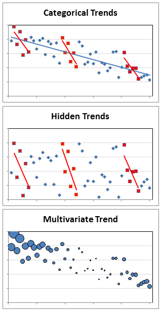 Categorical Trends are no more difficult to identify than any trend except you have to break out categories to do it, which can be a lot of work. One thing you might see when analyzing categories is Simpson’s paradox. The paradox occurs when trends appear in categories that are different from the overall group. Hidden Trends are trends that appear only in categories and not the overall group. You may be able to detect linear trends in categories without graphs if you have enough data in the categories to calculate correlation coefficients within each.
Multivariate Trends add a layer of complexity to most trends, which are bivariate. Still, you look for the same things, patterns and trends, only you have to examine at least one additional dimension. The extra dimension may be an additional axis or some other way of representing data, like icon type, size, or color.

 Anomalies
Sometimes the most interesting revelations you can garner from a dataset are the ways that it doesn’t fit expectations. Three things to look for are:
- Censoring
- Heteroskedasticity
- Outliers
Censoring is when a measurement is recorded as <value or >value, indicating that the measurement instrument was unable to quantify the real value. For example, the real value may be outside the range of a meter, counts can’t be approximated because there are too many or too few, or a time can only be estimated as before or after. Censoring is easy to detect in a dataset because they should be qualified with < or >.
 Heteroskedasticity is when the variability in a variable is not uniform across its range. This is important because homoscedasticity (the opposite of heteroskedasicity) is assumed by probability statements in parametric statistics. Look for differing thicknesses in plotted data.

Influential observations and outliers are the data points that don’t fit the overall trends and patterns. Finding anomalies isn’t that difficult; deciding why they are anomalous and what to do with them are the really tough parts. Here are some examples of the types of outliers to look for.
How and Where to Look
That’s a lot of information to take in and remember, so here’s a summary you can refer to in the future if you ever need it.

And when you’re done, be sure to document your results so others can follow what you did.

Read more about using statistics at the Stats with Cats blog. Join other fans at the Stats with Cats Facebook group and the Stats with Cats Facebook page. Order Stats with Cats: The Domesticated Guide to Statistics, Models, Graphs, and Other Breeds of Data Analysis at amazon.com, barnesandnoble.com, or other online booksellers.