Some activities are instinctive. A baby doesn’t need to be taught how to suckle. Most people can use an escalator, operate an elevator, and open a door instinctively. The same isn’t true of playing a guitar, driving a car, or analyzing data.
When faced with a new dataset, the first thing to consider is the objective you, your boss, or your client have in analyzing the dataset.
Objective
How you analyze data will depend in part on your objective. Consider these four possibilities, three are comparatively easy and one is a relative challenge.
- Conduct a Specific Analysis – Your client only wants you to conduct a specific analysis, perhaps like descriptive statistics or a statistical test between two groups. No problem, just conduct the analysis. There’s no need to go further. That’s easy.
- Answer a Specific Question – Some clients only want one thing — answer a specific question. Maybe it’s something like “is my water safe to drink” or “is traffic on my street worse on Wednesdays.” This will require more thought and perhaps some experience, but again, you have a specific direction to go in. That makes it easier.
- Address a General Need – Projects with general goals often involve model building. You’ll have to establish whether they need a single forecast, map or model, or a tool that can be used again in the future. This will require quite a bit of thought and experience but at least you know what you need to do and where you need to end up. Not easy but straightforward.
- Explore the Unknown – Every once in a while, a client will have nothing specific in mind, but will want to know whatever can be determined from the dataset. This is a challenge because there’s no guidance for where to start or where to finish. This blog will help you address this objective.
If your client is not clear about their objective, start at the very end. Ask what decisions will need to be made based on the results of your analysis. Ask what kind of outputs would be appropriate – a report, an infographic, a spreadsheet file, a presentation, or an application. If they have no expectations, it’s time to explore.
Got data?
 Scrubbing your data will make you familiar with what you have. That’s why it’s a good idea to know your objective first. There are many things you can do to scrub your data but the first thing is to put it into a matrix. Statistical analyses all begin with matrices. The form of the matrix isn’t always the same, but most commonly, the matrix has columns that represent variables (e.g., metrics, measurements) and rows that represent observations (e.g., individuals, students, patients, sample units, or dates). Data on the variables for each observation go into the cells. Usually this is usually done with spreadsheet software.
Data scrubbing can be cursory or exhaustive. Assuming the data are already available in electronic form, you’ll still have to achieve two goals – getting the numbers right and getting the right numbers.
Getting the numbers right requires correcting three types of data errors:
- Alphanumeric substitution, which involves mixing letters and numbers (e.g., 0 and o or O, 1 and l, 5 and S, 6 and b), dropped or added digits, spelling mistakes in text fields that will be sorted or filtered, and random errors.
- Specification errors involve bad data generation, perhaps attributable to recording mistakes, uncalibrated equipment, lab mistakes, or incorrect sample IDs and aliases.
- Inappropriate Data Formats, such as extra columns and rows, inconsistent use of ND, NA, or NR flags, and the inappropriate presence of 0s versus blanks.
Getting the right numbers requires addressing a variety of data issues:
- Variables and phenomenon. Are the variables sufficient to explore the phenomena in question?
- Variable scales. Review the measurement scales of the variables so you know what analyses might be applicable to the data. Also, look for nominal and ordinal scale variables to consider how you might segment the data.
- Representative sample. Considering the population being explored, does the sample appear to be representative.
- Replicates. If there are replicate or other quality control samples, they should be removed from the analysis appropriately.
- Censored data. If you have censored data (i.e., unquantified data above or below some limit), you can recode the data as some fraction of the limit, but not zero.
- Missing data. If you have missing data, they should be recoded as blanks or use another accepted procedure for treating missing data.
Data scrubbing can consume a substantial amount of time, even more than the statistical calculations.
 What To Look For
If statistics wasn’t your major in college or you’re straight out of college and new to applied statistics, you might wonder where you might start looking at a dataset? Here are five places to consider looking.
- Snapshot
- Population or Sample Characteristics
- Change
- Trends and Patterns
- Anomalies
Start with the entire dataset. Look at the highest levels of grouping variables. Divide and aggregate groupings later after you have a feel for the global situation. The reason for this is that the number of possible combinations of variables and levels of grouping variables can be large, overwhelming, each one being an analysis in itself. Like peeling an onion, explore one layer of data at a time until you get to the core.
Snapshot
What does the data look like at one point. Usually it’s at the same point in time but it could also be common conditions, like after a specific business activity, or at a certain temperature and pressure. What might you do?
 Snapshots aren’t difficult. You just decide where you want a snapshot and record all the variable values at that point. There are no descriptive statistics, graphs, or tests unless you decide to subdivide the data later. The only challenge is deciding whether taking a snapshot makes any sense for exploring the data.
The only thing you look for in a snapshot is something unexpected or unusual that might direct further analysis. It can also be used as a baseline to evaluate change.
Population Characteristics
It’s always a good idea to know everything you can about the populations you are exploring. Here’s what you might do.
This is a no-brainer; calculate descriptive statistics. Here’s a summary of what you might look at. It’s based on the measurement scale of the variable you are assessing.
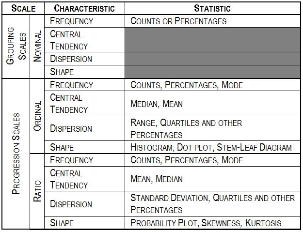
For grouping (nominal scale) variables, look at the frequencies of the groups. You’ll want to know if there are enough observations in each group to break them out for further analysis. For progression (continuous) scales, look at the median and the mean. If they’re close, the frequency distribution is probably symmetrical. You can confirm this by looking at a histogram or the skewness. If the standard deviation divided by the mean (coefficient of variation) is over 1, the distribution may be lognormal, or at least, asymmetrical. Quartiles and deciles will support this finding. Look at the measures of central tendency and dispersion. If the dispersion is relatively large, statistical testing may be problematical.
Graphs are also a good way, in my mind, the best way to explore population characteristics. Never calculate a statistic without looking at its visual representation in a graph, and there are many types of graphs that will let you do that.

What you look for in a graph depends on what the graph is supposed to show – distribution, mixtures, properties, or relationships. There are other things you might look for but here are a few things to start with.
For distribution graphs (box plots, histograms, dot plots, stem-leaf diagrams, Q-Q plots, rose diagrams, and probability plots), look for symmetry. That will separate many theoretical distributions, say a normal distribution (symmetrical) from a lognormal distribution (asymmetrical). This will be useful information if you do any statistical testing later.
For mixture graphs (pie charts, rose diagrams, and ternary plots), look for imbalance. If you have some segments that are very large and others very small, here may be common and unique themes to the mix to explore. Maybe the unique segments can be combined. This will be useful information if you do break out subgroups later.
 For properties graphs (bar charts, area charts, line charts, candlestick charts, control charts, means plots, deviation plots, spread plots, matrix plots, maps, block diagrams, and rose diagrams), look for the unexpected. Are the central tendency and dispersion what you might expect? Where are big deviations?
For relationship graphs (icon plots, 2D scatter plots, contour plots, bubble plots, 3D scatter plots, surface plots, and multivariable plots), look for linearity. You might find linear or curvilinear trends, repeating cycles, one-time shifts, continuing steps, periodic shocks, or just random points. This is the prelude for looking for more detailed patterns.
Change
Change usually refers to differences between time periods but, like snapshots, it could also refer to some common conditions. Change can be difficult, or at least complicated, to analyze because you must first calculate the changes you want to explore. When calculating changes, be sure the intervals of the change are consistent. But after that, what might you do?
First, look for very large, negative or positive changes. Are the percentages of change consistent for all variables? What might be some reasons for the changes.
Calculate the mean and median changes. If the indicators of central tendency are not near zero, you might have a trend. Verify the possibility by plotting the change data. You might even consider conducting a statistical test to confirm that the change is different from zero.
If you do think you have a trend or pattern, there are quite a few things to look for. This is what What to Look for in Data – Part 2 is about.

Read more about using statistics at the Stats with Cats blog. Join other fans at the Stats with Cats Facebook group and the Stats with Cats Facebook page. Order Stats with Cats: The Domesticated Guide to Statistics, Models, Graphs, and Other Breeds of Data Analysis at amazon.com, barnesandnoble.com, or other online booksellers.