My new book, Stats with Kittens,Growing up with data, charts, surveys, correlations, and other floofy playthings, is now available on Amazon.
Everybody needs to understand statistics. It’s an essential part of everyday life in America, more so than any other type of higher math. Statistics isn’t just mathematics, it’s inductive reasoning with numbers. It’s a fundamental component of modern literacy.
Stats with Kittens is aimed at readers who want to understand statistics well enough to avoid misleading data analyses and the media articles about them. It describes the many ways in which they can be misleading and shows how to identify those issues so you become an informed consumer of statistics. It explains why many students have to take an introductory course in statistics to get their degree or professional certification.
Stats with Kittens has an average Flesch-Kincaid Grade Level of 11.5 (11th grade), which is considered suitable for 16 year olds and above. Its readability ranges from 9.6 (Chapter 2 on Probability) to 12.6 (Chapter 8 on Data Models). In its 524 pages, Stats with Kittens has 75 technical figures, 41 tables, and over 500 pictures of kittens. The kittens are provided to ease math anxiety and make your reading experience tolerable if not enjoyable. The book uses metaphors and analogies, real-life examples, and step-by-step approaches to explain how to understand presentations about statistical analyses. It also has a Glossary of over a thousand definitions to facilitate comprehension.
Stats with Kittens explains how you can deal with the jargon you’ll hear in presentations involving statistics. Some of the jargon involves repurposed words, that is, English words with alternative meanings. These may be difficult to identify because you have to consider the context in which the words appear. The easiest to spot are eponyms (terms named after a person) and special words (unique words used exclusively in statistics). These are less common, at least until you get to more advanced levels of statistics.
Stats with Kittens discusses a variety of fundamental questions individuals new to statistics may have. Examples include:
How is statistics used to analyze data? There are five approaches—describing, classifying, testing, predicting, and explaining (Chapter 1).
Where do probabilities come from? Probabilities come from four sources—logic, data, models, and oracles (Chapter 2).
How are data measured? Data measurement involves three elements—benchmark, process, and judgment (Chapter 3).
How is data variability controlled in statistics? Variance control involves the three Rs—Reference, Replication, and Randomization (Chapter 3).
What is important to look for in statistical graphics? Statistical graphics are defined by the three Fs—Foundation, Framework, and Facade (Chapter 4).
Why do people often incorrectly criticize polls? Six reasons people criticize polls are too few participants, they didn’t ask me, only landline users were interviewed, they asked the wrong questions, the results were predetermined, and the results were wrong (Chapter 5).
Are there different kinds of data relationships? There are at least nine types of data relationships: direct, feedback, common-cause, mediated, stimulated, suppressed, inverse, threshold, and complex (Chapter 7).
What is important to look for in data relationships? Look for trends (temporal, spatial, categorical, hidden, and multivariate), patterns (shocks, steps, shifts, cycles, and clusters), and anomalies (censoring, unequal variances, and outliers) (Chapter 7).
It also provides steps for how to approach a variety of challenges in understanding data, including: what to look for in statistical surveys; how to decide if correlation implies causation; how to evaluate statistical presentations; and how to become a critical thinker.
Stats with Kittens consists of nine chapters that describe what you’ll need to know to be an informed consumer of statistics. Included are traditional topics like probability, descriptive statistics, graphing, hypothesis testing, and regression, as well as topics taught less often, such as the history of statistics, causality, critical thinking, evidence, fallacies, and bad science. The Chapters are:
Chapter 1. Introduction. Why you should learn about statistics and what you should know before starting.
Chapter 2. Probability. What probability and odds are, where they come from, and how they influence our lives.
Chapter 3. Description. How describing datasets is easier than describing people once you know what to look for.
Chapter 4. Graphs. What you need to know about statistical graphics to assess their validity. It’s much more than you were taught in HS.
Chapter 5. Surveys. How to measure intangible, changing opinions. Everybody thinks surveys are easy to conduct but they are, in fact, the most difficult type of statistical analysis to get right.
Chapter 6. Comparisons. How to find significant and meaningful differences between populations represented by data. Statistical testing has been used for centuries but tests are complicated and easy to get wrong.
Chapter 7. Relationships. How data metrics can be related and why it’s hard to tell when correlation implies causation.
Chapter 8. Models. How statistical models of a data relationship are created and how to spot common faults that others may overlook.
Chapter 9. Literacy. How to recognize possible issues in data and statistical analyses to assess the validity of information and arguments presented in technical reports and media stories.
Stats with Kittens is not a textbook, but it is still a valuable resource for students, professionals, and everyone in between. It provides help for comprehending the data-driven analytics you might encounter in sports, social media, the news, and most anything you follow in life. It is an asset for those looking to expand their knowledge of the world.
Creating science is like making cookies—you need a recipe, ingredients, and tools to combine the ingredients and bake the dough.
The recipe is the scientific method.
The ingredients are the knowledge of the discipline and the data from the experiments.
The tools are logic and philosophical principles.
The dough is the raw results.
The cookies are the interpreted results that have been peer-reviewed, reported in professional publications, and debated in the discipline community.
If you’ve ever made cookies, you know that if you use quality ingredients and follow the recipe, everything will probably turn out fine. It helps if you have some experience with the tools you’ll use and with making cookies in general. Making science is kind of like that.
The Internet has scores of websites that aim to explain the scientific method, often as infographics. Some are more detailed than others, some have steps that others don’t. Even so, in real life, it’s more complex than you might imagine.
The scientific method is not a rigid formula, it’s more of a guideline for what things to include in research and when to include them. It’s different from “scientists’ methods,” which are just practices individual researchers use often because they have found them to work in the past. For example, they might limit their experiments to thirty samples because that’s what they were told by their thesis advisor. They’re like how every experienced cookie maker will put their own personal stamp on their results, say by decorating their products.
Although the scientific method doesn’t change, how it is implemented does. For one, how researchers design and implement an observational study is very different from how they design and implement an experimental study. Different mindsets, different populations and phenomena, and different hypotheses, but both types of study still rely on the scientific method.
Statistical studies follow the same basic steps as for the scientific method, only there is more attention paid to fundamental statistical concepts, such as populations, scales of measurement, variance control, and statistical assumptions.
Here’s what the scientific method for statistical studies looks like:
Make an observation, have a thought, or get in an argument on Twitter.
Do background research. Somebody may have already invented that wheel. Remember the geologist’s old adage, a month in the field will save you an hour in the library.
Define the research question to be investigated. Determine if the research will be observational or experimental as this will establish what statistical designs will be applicable. Note whether the question involves data description, comparison, or relationships as this will influence what statistical techniques will be applicable.
Depending on the information available on the research question, either: A. Collect more observations anecdotally to refine the question for a preliminary study, or B. Design a preliminary study to answer the question and identify needs for additional data, or C. Design a confirmatory study to answer the question definitively.
Define the phenomenon to be investigated and the metrics that will be used to characterize the phenomenon. Identify the instruments and procedures for generating data on the metrics. Determine if the procedures and instruments will provide appropriate accuracy and precision. Identify scales of measurement for all metrics as this will influence what statistical techniques will be applicable.
Define the characteristics of the population to be investigated. Decide what kinds of inferences might be made to the population. Identify an appropriate sampling scheme for obtaining a representative sample from the population. Select sample collection locations, frame, or group assignments, as appropriate. Identify appropriate variance control approaches of reference, replication, and randomization.
Develop a hypothesis that can be tested. Write Null and Alternative hypotheses (see Chapter 6). Estimate the number of samples that will be needed for the analysis considering the number of grouping variables and tests to be carried out.
Collect data using appropriate quality control and variance reduction procedures. This is the crux of the research. If the data collection is faulty, either because of a bad design or implementation, the research study is a failure. If the data analysis is problematical, it can be repeated so long as the data are good.
Process and analyze the data. All analyses start with data scrubbing and an exploratory data analysis. Further analyses will depend on the objective of the study—classify/identify, compare, predict/explain, or explore. Look for violations of assumptions.
Test the hypothesis and reevaluate as necessary. Make and test predictions based on the hypothesis. Draw conclusions and report findings.
Both the scientific method and cookie making can be viewed as either once-and-done or iterative processes depending on the scope of the goal. Deep scientific research usually involves many experiments based on evolving knowledge, but so too can the search for the very best recipe for peanut butter cookies. Some scientific research involves a single, straightforward experiment, just to find out something. Sometimes you make cookies just to try out a new recipe.
The ingredients of the scientific method are domain expertise (i.e., the knowledge of the discipline) and the data from the experiments. Even before you think about collecting data from an experiment, you need to know your stuff. You can’t make cookies if you don’t know where the kitchen is.
You need domain expertise to create hypotheses and generate data, and you need data to test hypotheses and create results. Data are the main ingredient. They are the evidence that will support or refute your research hypothesis.
There are many ways that data go wrong just as there are many ways that baking ingredients can be stale or contaminated. When you’re making cookies, it’s not uncommon to substitute for an ingredient if you don’t have it or if you want to try something different. You might substitute non-gluten flour for all-purpose flour or add cinnamon just because you like the taste. With data, you might correct errors, replace outliers, or add data transformations. You have to use the best ingredients you can.
The tools of the scientific method are the logic and philosophical principles that are used to construct the research question, hypothesis, and experimental design. Logic is more than just the fallacies, it encompasses methods of reasoning and constructing arguments. Philosophical principles are like goals or guidelines for developing a research project. Examples include:
Empiricism. Knowledge comes from experience and observation.
Rationalism. Science must be based on facts and logical reasoning rather than on opinions, emotions, and belief.
Inclusiveness. Incorporating all aspects of domain knowledge into a research question.
Universality. Being true or appropriate for all situations.
Parsimony. Simplicity of a research question. Also referred to as Occam’s Razor or the Law of Economy.
Reductionism. Simplifying a complex phenomenon into discrete, fundamental elements.
Refutability. The ability of a hypothesis to be disproven. In statistical testing, this is managed with effect size, confidence, power, and other test details.
These tools of the scientific method aren’t discussed much, but clearly, they are essential elements in creating science. Like tools used in making cookies, mixers and ovens, for instance, you don’t have to know a lot about how they work if you’re just licking the beaters.
If you’re making cookies, once you finish making the dough, you bake it to complete the process. If you’re conducting research, once you finish analyzing the data, you document your work to complete the process. Reporting research results is like baking cookie dough—it puts all the efforts into parts that can be consumed by anyone, any time, any place.
There’s no guarantee that either a research report or a cookie will be good or even “as expected.” There might have been accommodations or shortcuts taken that affected the results. The research design, the recipe, may have been inferior. There may have been steps taken to optimize research results, like searching for significance (Chapter 6). That’s adding extra sugar to a cookie recipe; it seems good but others won’t be able to use the recipe and get the same results.
How results get packaged will affect how they are perceived. Cookies can be cut into shapes and decorated, then arrayed on a platter or stored in a zipper-storage bag. Research reports can be kept private or released to the public. They can be aimed at a particular audience, from non-technical to expert. They can be placed in peer-reviewed journals or reported in the main-stream media. Each type of publication appears different to the readers. There will be different types of comments, debates, and follow-up. Some people will be satisfied and some will want more.
Expectations matter, though they shouldn’t. Reports written by experts that appear in prestigious publications are accepted without challenge just as cookies from professional bakers are expected to be good tasting. But these expectations are not always fulfilled. Sometimes the recipes aren’t followed adequately or the ingredients are substandard. Some results are bad to begin with and some go stale over time. When that happens, just make more cookies
What is necessary with both research and cookies is to be an unbiased, informed consumer. But this is often not easy. As Carl Sagan once said, “We live in a society exquisitely dependent on science and technology, in which hardly anyone knows anything about science and technology.” In that regard, research and baking are quite different.
Science is our perception of how things work. The scientific method is how we determine what is the current state of our science. Science is the product of the successful application of the scientific method. They are not the same. For one thing, while science changes; the scientific method is constant.
When people say “trust the science” what they really mean to say, or should mean to say, is “trust the scientific method.” Science is constantly in a state of flux. It is never settled because there are always new things to learn. In the 1950s, I was taught that there were electrons having a negative charge, protons having a positive charge, and neutrons having no charge. My grandparents never learned about any of these when they went to school, it was all too new and unsettled. Today, there are more subatomic particles than I can count. I don’t even know what is taught about them in high school.
There are many ways that the scientific method can be perverted, if not ignored altogether, to produce erroneous results. Most research characterized as bad science is probably the result of bias on the part of the researcher. Sometimes, it is a consequence of the topic not having a theoretical basis or being near the limits of our current understanding. And, of course, in rare cases, it is intentional.
Categories of bad science go by many names, all of which are pejorative. Category definitions vary between sources and some topics have been given as examples in more than one category. Sometimes the negative connotations are used to discredit research that challenges mainstream scientific ideas. Like an ad hominem argument, invoking terms related to bad science have been used to silence dissenters by preventing them from receiving financial support or publishing in scientific journals.
Pathological science occurs when a researcher holds onto a hypothesis despite valid opposition from the scientific community. This isn’t necessarily a bad thing. Most scientific hypotheses go through periods when they are ignored in favor of the accepted hypothesis. It is only with persistence and further research that a hypothesis will be accepted. Sometimes the change is evolutionary and sometimes the change is revolutionary. The change from the Expanding-Earth hypothesis to the Continental-Drift hypothesis was revolutionary; the change from the Continental-Drift hypothesis to Plate Tectonics was evolutionary.
The pathological part of pathological science occurs when the researcher deviates from strict adherence to the scientific method in order to favor the desired hypothesis or incorporate wishful thinking into interpretation of the data. Usually, the hypothesis is experimental in nature and is developed after some research data have been generated. The effects of the results are near the limits of detectability. Sometimes, other researchers are recruited to perpetuate the delusion.
Researchers involved in pathological science tend to have the education and experience to conduct true science so their initial results may be accepted as legitimate. Eventually, though, failure to replicate the results damages its credibility.
Cold fusion is considered by some to be an example of pathological science because all or most of the research is done by a closed group of scientists who sponsor their own conferences and publish their own journals.
Pseudoscience involves hypotheses that cannot be validated by observation or experimentation, that is, are incompatible with the scientific method, but still are claimed to be scientifically legitimate. Pseudoscience often involves long-held beliefs that pre-date experiments, consequently, it is often based on faulty premises. While less likely to be popular in the scientific community, pseudoscience may find support from the general public.
Examples that have been characterized as pseudoscience include numerology, free energy, dowsing, Lysenkoism, graphology , body memory, human auras, crystal healing, grounding therapy, macrobiotics, homeopathy, and near-death experiences.
The term pseudoscience is often used as an inflammatory buzzword for dismissing opponents’ data and results.
Fringe science refers to hypotheses within an established field of study that are highly speculative, often at the extreme boundaries of mainstream studies. Proponents of some fringe sciences may come from outside the mainstream of the discipline. Nevertheless, they are often important agents in bringing about changes in traditional ways of thinking about science, leading to far-reaching paradigm shifts.
Some concepts that were once rejected as fringe science have eventually been accepted as mainstream science. Examples include heliocentrism (sun-centered solar system), peptic ulcers being caused by Helicobacter pylori, and chaos theory. The term protoscience refers to topics that were at one point mainstream science but fell out of favor and were replaced by more advanced formulations of similar concepts. The original hypothesis then became a pseudoscience. Examples of protosciences are astrology evolving into the science of astronomy, alchemy evolving into the science of chemistry, and continental drift evolving into plate tectonics.
Other examples of fringe science include Feng shui, Ley lines, remote viewing, hypnotherapy and psychoanalysis, subliminal messaging, and the MBTI (Myers–Briggs Type Indicator). Some areas of complementary medicine, such as mind-body techniques and energy therapies, may someday become mainstream with continuing scientific attention.
The term fringe science is considered to be pejorative by some people but it is not meant to be.
Barely science might be perfectly acceptable science except that it is too underdeveloped to be released outside the scientific community. Barely science may be based on a single study, or pilot studies that lack the methodological rigor of formal studies, or studies that don’t have enough samples for adequate resolution, or studies that haven’t undergone formal peer review. Researchers under pressure to demonstrate results to sponsors or announce results before competitors are the sources. Consumers see barely science more than they know.
Junk science refers to research considered to be biased by legal, political, ideological, financial, or otherwise unscientific motives. The concept was popularized in the 1990s in relation to legal cases. Forensic methods that have been criticized as junk science include polygraphy (lie detection), bloodstain-pattern analysis, speech and text patterns analysis, microscopic hair comparisons, arson burn pattern analysis, and roadside drug tests. Creation sciences, faith healing, eugenics, and conversion therapy are considered to be junk sciences.
Sometimes, characterizing research as junk science is simply a way to discredit opposing claims. This use of the term is a common ploy for devaluing studies involving archeology, complementary medicine, public health, and the environment. Maligning analyses as junk science has been criticized for undermining public trust in real science.
Tooth-Fairy science is research that can be portrayed as legitimate because the data are reproducible and statistically significant but there is no understanding of why or how the phenomenon exists. Placebos, endometriosis, yawning, out-of-place artifacts, megalithic stonework, ball lightning, and dark matter are examples. Chiropractic, acupuncture, homeopathy, therapeutic touch, and biofield tuning may also be considered to be tooth-fairy sciences
Cargo-cult science involves using apparatus, instrumentation, procedures, experimental designs, data, or results without understanding their purpose, function, or limitations, in an effort to confirm a hypothesis. Examples of cargo-cult experimentation might involve replication studies that use lower-grade chemical reagents, instruments not designed for field conditions, or data obtained using different populations and sampling schemes. In a case of fraudulent science involving experimental research on Alzheimer’s disease, over a decade of research efforts were wasted by relying on the illegitimate results.
Coerced science occurs when researchers are compelled by authorities to study sometimes-objectionable topics in ways that promote speed in reaching a desired result over scientific integrity. There are many notable examples. During World War II, virtually every major power pushed their scientists and engineers to achieve a variety of desired results. In the 1960s, JFK successfully pressured NASA to land a man on the Moon. In the 1980s, Reagan prioritized efforts on his Strategic Defense Initiative (SDI) even though the goal was considered to be unachievable by experts. Many governments restrict research on their country’s cultural artefacts to individuals who agree to severe preconditions including censorship of announcements and results.
Businesses, especially in the fields of medicine and pharmaceutics, place great pressure on research staff to achieve results. For example, Elizabeth Holmes, founder of the medical diagnostic company Theranos, was convicted of fraud and sentenced to 111⁄4 years in prison. Businesses are also known to conceal data that would be of great benefit to society if they were available. Examples include results of pharmaceutical studies (e.g., Tamiflu, statins) and subsurface exploration for oil and mineral resources.
Academic institutions predicate tenure appointments in part on journal publications and grant awards, both of which rely on researchers finding statistical significance in their analyses (p-hacking, see Chapter 6).
Taboo science refers to areas of research that are limited or even prohibited either by governments or funding organizations. Sometimes this is reasonable and good. For example, research on humans has become more and more restrictive after the atrocities that occurred during World War II. During the Cold War, U.S. military and intelligence agencies obstructed independent research on national security topics, such as encryption.
Some taboos, however, are promoted by special-interest groups, such as political and religious organizations. Examples of topics that are difficult for researchers to obtain funding for include: effectiveness of methods to control gun violence; ancient civilizations, archeological sites, artefacts, and STEM capabilities; health benefits of cannabis and psychedelics; resurrecting extinct species; and some topics in human biology such as cloning, genetic engineering, chimeras, synthetic biology, scientific aspects of racial and gender differences, and causes and treatments for pedophilia.
Fraudulent science consists of research, experimental or observational, in which data, results, or even whole studies are faked. Creation of false data or cases is called fabrication; misrepresentation of data or results is called falsification. Plagiarism and other forms of information theft, conflicts of interest, and ethical violations are also considered aspects of fraudulent science. The goals of fraudulent science are usually for the researcher to acquire money including funding and sponsorships, and enhance reputation and power within the profession.
Unfortunately, there are too many examples of fraudulent science. Perhaps the most notorious is the 1998 case of Andrew Wakefield, a British expert in gastroenterology, who claimed to have found a link between the MMR vaccine, autism and inflammatory bowel disease. His paper published in The Lancet, which was retracted in 2010, is thought to have caused worldwide outbreaks on measles after a substantial decline in vaccinations. Wakefield later became a leader in the anti-vaxx movement in the U.S.. Another infamous example involves faked images in a 2006 experimental study of memory deficits in mice, which subsequently led to an unproductive diversion of funding for Alzheimer’s research.
Sometimes, fraudulent actions are subtle and go unnoticed even by experts. Examples include pharmaceutical studies designed to accentuate positive effects while concealing undesirable side effects. Sometimes, well-meaning actions have unforeseen ramifications, such as when definitions of medical conditions are changed resulting in patients being treated differently. Examples include obesity, diabetes, and cardiac conditions.
From 2000 to 2020, 37,780 professional papers have been retracted because of fraud (The Retraction Watch Database [Internet]. New York: The Center for Scientific Integrity. 2018. ISSN: 2692-465X. Accessed 4/13/2023. Available at: http://retractiondatabase.org/). Those retractions are considered to represent only a fraction of all fraudulent science.
It’s Not All Bad
Clearly, science and scientists are wrong on occasion even when they don’t intend to be. That is to be expected. Even if the scientific method isn’t all that difficult to understand it is incredibly difficult to put into practice, simplified flowcharts notwithstanding. As a consequence, scientific studies are too often poorly designed, poorly executed, misleading, or misinterpreted. Most of the time, this is inadvertent though sometimes not.
While this may seem like a fairly dismal portrayal of science, bear in mind that the vast majority of today’s science is real and legitimate. The difference between bad science and true science that strictly follows the scientific method is that true science will eventually correct illegitimate results.
It’s probably true that everybody has taken a survey at some point or other. What’s also probably true is that most people think polling is easy. And why not? Google has a site for creating polls. Social media sites and blogging sites provide capabilities for conducting polls. There are also quite a few free online survey tools. Why wouldn’t people believe that just anybody could conduct a survey.
Perhaps as a consequence of do-it-yourself polling, there is no end to truly bad, amateur polls. But, there are also well-prepared polls meant to mislead, some overtly and some under the guise of unbiased research. Some people have accordingly come to believe that information derived from all polls is biased, misleading or just plain useless. Familiarity breeds contempt.
Like any other complex practice like medicine, statistical polling isn’t an exact science and can unexpectedly and unintentionally fail. But for the most part, it is legitimate and reliable even if the public doesn’t understand it. However, ignorance breeds contempt too.
Ignorance leads to fear and fear leads to hate.
People are comfortable with polls that confirm their preconceived notions, confirmation bias, yet they lambaste polls that don’t confirm their beliefs because they don’t understand the science and mathematics behind statistical surveying. This is experienced equally by both sides of the political spectrum. Nonetheless, surveys are relied on extensively throughout government and business to support their work. And, of course, politicians live and die by poll results.
Poll haters usually focus on six kinds of criticisms:
The results were decided before the poll was conducted.
The poll only included 1,000 people out of 300,000,000 Americans
The results should only apply to the people questioned
The poll didn’t include me
The poll only interviewed subjects who had landlines
The poll didn’t ask fair questions
I didn’t make these criticisms up. I compiled them from Twitter threads that involved political polls. I explain why these criticism might be correct or not at the end of the article.
If you want to assess whether a political poll really is legitimate, there are four things you should look at. It helps if you know some key survey concepts, including population, frame, sample and sample size, interview methods, question types, scales, and demographics. If you do, skip to the last section of this article for the hints. Otherwise, read on.
The terms poll and survey are often used synonymously. Traditionally, polls were simple, one-question, interviews often conducted in person. Surveys were more elaborate, longer, data gathering efforts conducted with as much statistical rigor as possible. Political “who-do-you-plan-to-vote-for” polls have evolved into expansive instruments to explore preferences for policies and politicians. You can blame the evolution of computers, the internet, and personal communications for that.
Polls on social media are for entertainment. Serious surveys of political preferences are quite different. There is a lot that goes into creating a scientifically valid survey. Scores of textbooks have been written on the topic. Furthermore, the state-of-the-art is constantly improving as technology advances and more research on the psychology of survey response is conducted.
Here are a few critical considerations in creating surveys.
As you might expect, the source of a political survey is important. Before 1988, there were on average only one or two presidential approval polls conducted per month. Within a decade, that number had increased to more than a dozen. By 2021, there were 494 pollsters who conducted 10,776 political surveys. Fivethirtyeight.com graded 93% of the pollsters with a B or better; 2% failed. Of the pollsters, two-fifths lean Republican and three-fifths lean Democratic. Notable Republican-leaning pollsters include: Rasmussen; Zogby; Mason-Dixon; and Harris. Notable Democratic-leaning pollsters include: Public Policy Polling; YouGov; University of New Hampshire; and Monmouth University.
The topics of a political survey are simply what you want to know about certain policies, events, or individuals. Good surveys define what they mean by the topics they are investigating and do not push biases and misinformation. They account for the relevance, changeability, and controversiality of the topic in the ways they organize the survey and ask the questions.
The population for a survey is the group to which you want to extrapolate your findings. For political surveys in the U.S., the population of a survey is simply the population of the country, or at least the voters. The Census Bureau provides all the information on the demographics (e.g., gender, age, race/ethnicity, education, income, party identification) of the country that surveys need.
The frame is a list of subjects in the population that might be surveyed. Frames are more difficult to assemble than population characteristics because the information sources are more diverse and not centralized. Sources might include telephone directories, voters lists, tax records, membership lists of public organizations, and so on.
The survey sample is the individuals to be interviewed. More individuals are needed than the number of samples desired for the survey because some individuals will decline to participate. The sample is usually selected from the frame by some type of probability sampling. Usually, stratified-random sampling is used to ensure all the relevant population demographics are adequately represented. This establishes survey accuracy.
Getting the population, frame, and sample right is the most fundamental aspect of a survey that can go wrong. Professional statisticians agonize over it. When something goes wrong, it’s the first place they look because everything else is pretty straightforward. Sometimes identifying problems in surveys is near impossible.
Sample size is simply the number of individuals who respond to the survey. Sample size (and a few other survey characteristics) determine the precision of the results. One of the first things critics of political polls cite is how few subjects are interviewed. A challenge in survey design is to select a large enough sample size to provide adequate precision yet not too many samples that would increase costs.
Most political polls use 500 to 1,500 individuals to achieve margins-of-error between .5% and 2.6%. (If you’ve taken Stats 101, the margin-of-error is the 95% confidence interval around an average survey response.) Using more than 1,500 individuals is expensive and doesn’t increase precision much (as shown in the chart).
There are many methods used to provide questions to individuals in a survey, including: in-person, telephone, recorded message, mail and email, and websites. Each has its own advantages and limitations. Some surveys use more than one method in order to test the influence of the interview.
The questions that are included in a survey are often a focus of critics. The construction of survey questions is an arduous process involving eliciting information on a topic so to not influence the resulting answer. It sounds simple but to a professional survey designer, it seldom is. The structure of questions shouldn’t be vague, leading, or compound, nor should it employ double negatives. The choice of individual words is also important to ensure they do not introduce bias, are not offensive or emotion-laden, nor may be misleading, unfamiliar, or have multiple meanings. Jargon, slang, and abbreviations/acronyms are particularly taboo. Sometimes surveys have to be presented in different languages besides English depending on the frame. Questions also have to be designed to facilitate the analysis and presentation of results.
Asking a question in plain conversation doesn’t require the rigor that is needed for survey questions. In a conversation, you can rephrase and follow-up when you don’t get an answer that can be used in an analysis. You don’t have that flexibility in a survey; you only get once chance. You have to construct each question so that respondents are forced to categorize their responses into patterns that can be analyzed. There are quite a few ways to do this.
The most flexible type of question is the open-ended question, which has no predetermined categories of responses. This type of question allows respondents to provide any information they want, even if the researcher had never considered such a response. As a consequence, open-ended questions are notably difficult to analyze. They are almost never used in legitimate political polls.
Closed-ended questions all have a finite number of choices from which the respondent has to select. There are many types of closed-ended questions, including the following eight.
1. Dichotomous Questions — either/or questions, usually presented with the choices yes or no.
Dichotomous questions are easy for survey participants to understand. Responses are easy to analyze. Results are easy to present. The drawback of dichotomous questions is that they don’t provide any nuances to participant answers.
2. Single-Choice Questions — a vertical or horizontal list of unrelated responses, sometimes presented as a dropdown menu. The responses are often presented in sequences that are randomized between respondents.
Single-choice questions are easy for survey participants to understand. Responses are easy to analyze. Results are easy to present. The drawback of single-choice questions is that they can’t always provide all the choices that might be relevant. In the sample question, for example, there are a lot more issues that a participant might think are more important than the seven listed.
3. Multiple-choice Questions — like a single choice question except that the respondent can select more than one of the responses. This presents a challenge for data presentation because percentages of responses won’t sum to 100%
Multiple-choice questions are somewhat more difficult for survey participants to understand because participants can check more than one response box. Survey software helps to validate the responses. Those responses are more difficult to analyze because it’s almost like having a dichotomous question for each response checkbox. Results are more difficult to present clearly because percentages can be misleading. The advantage of multiple-choice questions is that they provide some comparative information about the choices in an efficient way.
4. Ranking Questions — questions in which respondents are supposed to place an order on a list unrelated items.
Ranking questions are relatively easy for survey participants to understand but rank-ordering takes more thought than just picking a single response. Responses are much more difficult to analyze and present. The advantage of ranking questions is that they provide more comparative information about the choices than multiple-choice questions.
5. Rating Questions — questions in which respondents are supposed to assign a relative score on unrelated items. The score is on some type of continuous scale. Responses might be written in or indicated on a slider.
Rating questions are relatively easy for survey participants to understand, although anything requiring survey participants to work with numbers presents a risk of failure. Responses are easy to analyze and results are easy to present, though. The drawback of rating questions is that they take participants longer to respond to than Likert-scale questions.
6. Likert-scale Questions— like a single-choice question in which the choices represent an ordered spectrum of choices. An odd number of choices allows respondents to pick a middle-of-the-road position, which some survey designers avoid because it masks true preferences.
Likert-scale questions are easy for survey participants to understand. Responses are easy to analyze and present. The drawback of Likert-scale questions is that they are less precise than rating questions.
7. Semantic-differential Questions — like a Likert or rating scale question in which the choices represent a spectrum of preferences, attitudes, or other characteristics, between two extremes (e.g., agree-disagree, conservative-progressive, important-unimportant). It is thought to be easier for respondents to understand.
Semantic-differential questions are easy for survey participants to understand. Responses are easy to analyze once the responses are coded. Results are easy to present. The drawback of semantic-differential questions is that they are not supported by some survey software.
8. Matrix Questions — Questions that allow two aspects of a topic to be assessed at the same time. Matrix questions are very efficient but also too complex for some respondents.
Matrix questions are very efficient but also difficult for some survey participants to understand. Responses are easy to analyze and present because they are like multiple Likert-scale questions.
Issues with Questions
One common issue with questions in political surveys is constrained lists, in which only a few of many possible choices are provided. Then the results are presented as the only choices selected by respondents. This happens with multiple-choice, ranking, and matrix questions. For example, a survey might ask “what’s the most important issues facing the country?” with the only choices being “abortion,” “immigration,” “marriage,” and “election fraud,” and then reporting that Americans believe abortion is a major national issue. Constrained questioning is not soundly-acquired, legitimate survey information.
There are many other issues that question creators have to consider.
It is preferable to construct questions similarly to facilitate respondent understanding.
The types and complexities of the questions and the number of choices will influence the type of interview and the length of the survey.
Long surveys suffer from participant drop-out. This may cause questions to have different precisions (because of different sample sizes) and even different demographic profiles.
When questions are not answered by respondents, the missing data that must be considered in the analysis. Requiring answers is not a good solution because it may cause some respondents to leave the survey, worsening the drop-out rate.
If the order of the questions or the order of the choices for each question may be influential, they should be randomized.
Some questions may need an other option, which is difficult to analyze.
Demographic questions must be included in the survey so that comparison to the population is possible.
Interviewee anonymity must be preserved while still including demographic information.
Focus groups, pilot studies, and simultaneous use of alternative survey forms are sometimes used for evaluating survey effectiveness.
Creating survey questions is not as simple as critics think it is.
People criticize political polls all the time. Some criticisms are reasonable and valid based on flawed methods, and others are just a reflection of the poll results being different from what the critic believes. Critics fall on all sides of the political spectrum.
Most people probably wouldn’t criticize, or for that matter, even care about political polls if they didn’t have preconceived notions about what the results should be. If they do see a poll that doesn’t agree with their preconceived notions, they are quick to find fault. Some of their criticisms could have merit, but usually not. Here are six examples.
Critics of political polls can’t seem to understand that a sample of only a few hundred individuals can be extrapolated to the whole population of the U.S., over 300 million, if the survey frame and sample are appropriate. What the number of survey participants does influence is the survey precision. So, this criticism would be true if the sample size were small, say less than 100. This would make the margin of error about ±10%, which would be fairly large for comparing preferences for two candidates. However, most legitimate political polls include at least 500 participants, making the margin of error about ±4.5%. Large political polls might include 1,500 participants resulting in a ±2.6% margin-of-error. This criticism is almost always unjustified.
If the survey frame and sample are appropriate, the demographic of the critic is already represented. This criticism is always unjustified.
The first political poll dates back to the Presidential election of 1824. Probability and statistical inference for other applications is hundreds of years older than that. The science behind extrapolating from a sample representative of a population to the population itself is well established.
This criticism is about the frustration a critic has when the survey results don’t match their expectations. It is a form of confirmation bias. The results just mean that the opinion of the critic doesn’t match the population.
This criticism has to do with how technology affects the selection of a frame and a sample. The issue dates back to the 1930 and 1940s when telephone numbers were used to create frames. The problem was that only wealthy households owned telephones so the frame wasn’t representative of the population. Truman defeated Dewey regardless of what the polls predicted.
The issue repeated in the 1990s and 2000s when cell phones began replacing landlines. For that period, neither mode of telephony could be relied on to be representative of the U.S. population. By the 2010s, cell phone users were sufficiently representative of the population to be used as a frame.
Today, using telephone lists exclusively to create frames is a known issue. Most big political surveys use several different sources to create frames that are representative of the population.
This criticism probably isn’t about gathering information about the wrong topics. It is probably critics thinking that the questions were biased or misleading in some ways. It’s probably true that this criticism is made without the critic actually reading the questions because that information is seldom available in news stories. It has to be uncovered in the original survey analysis report.
This criticism may have merit if the poll didn’t clearly define terms, or used slang or jargon. Professional statisticians usually ask simple and fair survey questions but may on occasion use vocabulary that is unfamiliar to participants.
This is a bold criticism that isn’t all that difficult to invalidate. First, no professional pollster is likely to commit fraud, regardless of the reward, just because their business and career would be in jeopardy. Look at the source. If it is any nationally known pollster who has been around for a while, the criticism is unlikely.
If the source is an unknown pollster, look at the report on the survey methods. They might suggest poor methods but that wouldn’t necessarily guarantee a particular set of results. If there was an obvious bias in the methods, like surveying attendees at a gun show, it should be apparent.
If there is no background report available on the survey methods, this criticism would merit attention. In particular, if the survey results were prepared by a non-professional for a specific political candidate or party, skepticism would be appropriate.
There are many things that can go wrong with a survey. Criticisms that a political poll is wrong are usually suppositions based on confirmation bias. Compare the poll to other polls researching the same topics during the same timeframe. If the results are close, within the margins-of-error, the polls are probably legitimate.
Criticisms based on suspect survey methods are difficult to prove. The only way to determine that a political poll was truly wrong is to wait until after the election and conduct a post-mortem.
Don’t get fooled into believing results you agree with or disbelieving results you don’t, called confirmation bias. Don’t get distracted by the number of respondents. You have to dig deeper to assess the legitimacy of a poll.
You won’t be able to tell from a news story if a poll is likely to be valid. You have to find a link to the documentation of the original poll. If there is none, search the internet for the polling organization, topic, and date. If there is no link to the poll, or if the link is dead or leads to a paywall, the legitimacy of the poll is suspect.
When you find the poll documentation, look for four things:
Who conducted the poll? Are they independent, unbiased, and reputable? Try searching the internet and visiting https://projects.fivethirtyeight.com/pollster-ratings/. A poll conducted for a candidate or a political party is not likely to be totally legitimate.
What was the progression from population to frame to sample? This is very difficult for non-statisticians to assess; it’s even difficult for statisticians to work out. It’s not just a matter of polling whoever answers a phone or visits a website. Participants have to be weighted for population demographics and cleared from any potential biases. In short, if the process is complex and described in detail, it is more likely to have been valid than not.
Were the questions simple and unbiased? Was the sentence structure of the questions understandable? Were any confusing or emotion-laden words used? Did the questions directly address the topics of the survey? Were the questions presented in close-ended types so that the results were unambiguous? You have to actually see the questions documented in the survey analysis report to tell. Also, check to see how the interviews were conducted, whether autonomously or in person. It probably won’t matter. Sophisticated surveys might use more than one interview method and compare the results.
Does it explore demographics? Any legitimate political survey will explore the background of the respondents, things like sex, age, race, party, income, and education. Researchers use this information to analyze patterns in subgroups of the sample. If the poll doesn’t ask about that information, it’s probably not legitimate.
There will always be something that might adversely affect the validity of a poll. Even professional statisticians make mistakes or overlook minor details. But, these glitches will probably be impossible for most readers to spot. If you as an average consumer see something in the population, frame, sample, or questions that is dubious, you may have cause to critique. Otherwise, don’t expose your ignorance by complaining about not having enough participants.
Learn how to think critically and make it your first reaction to any questionable poll you may encounter.
Nine patterns of three types of relationships that aren’t spurious.
When analysts see a large correlation coefficient, they begin speculating about possible reasons. They’ll naturally gravitate toward their initial hypothesis (or preconceived notion) which set them to investigate the data relationship in the first place. Because hypotheses are commonly about causation, they often begin with this least likely type of relationship using the most simplistic of relationship pattern, a direct one-event-causes-another.
A topology of data relationships is important because it helps people to understand that not all relationships reflect a cause. They may just be the result of an influence or an association or even mere coincidence. Furthermore, you can’t always tell what type and pattern of relationship a data set represents. There are at least 27 possibilities not even counting spurious relationships. That’s where numbercrunching ends and statistical-thinking shifts into high-gear. Be prepared.
Types of Data Relationships
Besides causation, relationships can also reflect influence or association.
Causes
A cause is a condition or event that directly triggers, initiates, makes happen, or brings into being another condition or event. A cause is a sine qua non; without a cause a consequent will not occur. Causes are directional. A cause must precede its consequent.
Influences
An influence is a condition or event that changes the manifestation of an existing condition or event. Influences can be direct or mediated by a separate condition or event. Influences may exist at any time before or after the influenced condition or event. Influences may be unidirectional or bidirectional.
Associations
Associations are two conditions or events that appear to change in a related way. Any two variables that change in a similar way will appear to be associated. Thus, associations can be spurious or real. Associations may exist at any time before or after the associated condition or event. Unlike causes and influences, associated variables have no effect on each other and may not exist in different populations or in the same population at different times or places.
Associations are commonplace. Most observed correlations are probably just associations. Influences and causes are less common but, unlike associations, they can be supported by the science or other principles on which the data are based. The strength of a correlation coefficient is not related to the type of relationship. Causes, influences, and associations can all have strong as well as weak correlations depending on the efficiency of the variables being correlated and the pattern of the relationship.
Patterns of Data Relationships
Direct relationships are easy to understand and, if there are no statistical obfuscations, should exhibit a high degree of correlation. In practice, though, not every relationship is direct or simple. Some are downright complex.
Here are nine relationships that I could think of. There may be more. These relationships involve events or conditions termed A, B, and C.
Direct Relationship
Most discussions of correlation and causation focus on the simple, direct relationship that one event or condition, A, is related to a second event or condition, B. The relationship proceeds in only one direction. For example, gravitational forces from the Moon and Sun cause ocean tides on the Earth. A causes B but B does not cause A. Another direct relationship is that age influences height and weight. Age doesn’t cause height and weight but we tend to grow larger as we age so A influences B.B does not influence A.
Feedback Relationship
In a feedback relationship, A and B are linked in a loop. A causes or influences B, which then causes or influences A, and so on. Feedback relationships are bidirectional. They will be correlated. For example, poor performance in school or at work (A) creates stress (B) which degrades performance further (A) leading to more stress (B) and so on.
In a stimulated relationship, A causes or influences B but only in the presence of C. Stimulated relationships may not appear to be correlated using a Pearson correlation coefficient but may using a partial correlation. There are many examples of this pattern, such as metabolic and chemical reactions involving enzymes or catalysts.
Suppressed Relationship
In a suppressed relationship, A causes or influences B but not in the presence of C. As with stimulated relationships, suppressed relationships may only appear to be correlated using a partial correlation coefficient. Medicine has many examples of suppressed and stimulated relationships. For example, pathogens (A) cause infections (B) but not in the presence of antibiotics (C). Some drugs (A) cause side effects (B) only in certain at-risk populations (C).
Inverse Relationship
In inverse relationships, the absence of A causes or influences B, OR the presence of A minimizes B. Correlation coefficients for inverse relationships are negative. For example, vitamin deficiencies (A) cause or influence a wide variety of symptoms (B).
Threshold Relationship
In threshold relationships, A causes or influences B only when A is above a certain level. For example, rain (A) causes flooding (B) only when the volume or intensity is very high. These relationships aren’t usually revealed by correlation coefficients.
Complex Relationship
In complex relationships, many A factors or events contribute to the cause or influence of B. Numerous environmental processes fit this pattern. For example, A variety of atmospheric and astronomical factors (A) contribute to influencing climate change (B). Even many correlation coefficients may not explain this type of relationship; it takes more involved statistical analyses.
Spurious Data Relationships
There are also a variety of spurious relationships in which Aappears to cause or influence B, but does not. Often the reason is that the relationship is based on anecdotal evidence that is not valid more generally. Sometimes spurious relationships may be some other kind of relationship that isn’t understood. Here are five other reasons why spurious relationships are so common.
Misunderstood relationships
The science behind a relationship may not be understood correctly. For example, doctors used to think that spicy foods and stress caused ulcers. Now, there is greater recognition of the role of bacterial infection. Likewise, hormones have been found to be the leading cause of acne rather than diet (i.e., consumption of chocolate and fried foods).
Misinterpreted statistics
There are many examples of statistical relationships being interpreted incorrectly. For example, the sizes of homeless populations appear to influence crime. Then again, so do the numbers of museums and the availability of public transportation. All of these factors are associated with urban areas, but not necessarily crime.
Misinterpreted observations
Incorrect reasons are attached to real observations. Many old wives tales are based on credible observations. For example, the notion that hair and nails continue to grow after death is an incorrect explanation for the legitimate observation.
Urban legends
Some urban legends have a basis in truth and some are pure fabrications, but they all involve spurious relationships. For example, In South Korea, it is believed that sleeping with a fan in a closed room will result in death.
Biased Assertions
Some spurious relationships are not based on any evidence, but instead, are claimed in an attempt to persuade others of their validity. For example, the claim that masturbation makes you have hairy palms is not only ludicrous but also easily refutable. Likewise, almost any advertisement in support of a candidate in an election contains some sort of bias, such as cherry picking.
Coincidences
Mother Nature has a wicked sense of humor. Don’t believe every correlation coefficient you calculate.
History isn’t always clear-cut. It’s written by anyone with the will to write it down and the forum to distribute it. It’s valuable to understand different perspectives and the contexts that created them. The evolution of the term Data Science is a good example.
I learned statistics in the 1970s in a department of behavioral scientists and educators rather than a department of mathematics. At that time, the image of statistics was framed by academic mathematical-statisticians. They wrote the textbooks and controlled the jargon. Applied statisticians were the silent majority, a sizable group overshadowed by the academic celebrities. For me, reading Tukey’s 1977 book Exploratory Data Analysis was a revelation. He came from a background of mathematical statistics yet wrote about applied statistics, a very different animal.
My applied-statistics cohorts and I were a diverse group—educational statisticians, biostatisticians, geostatisticians, psychometricians, social statisticians, and econometricians, nary a mathematician in the group. We referred to ourselves collectively as data-scientists, a term we heard from our professor. We were all data scientists, despite our different educational backgrounds, because we all worked with data. But the term never stuck and faded away for over the years.
Applied statistics had been very important during World War II, most notably in code breaking but also in military applications and more mundane logistics and demographic analyses. After the war, the dominance of deterministic engineering analysis grew and drew most of the public’s attention. There were many new technologies in consumer goods and transportation, especially aviation and the space race, so statistics wasn’t on most people’s radar. Statistics was considered to be a field of mathematics. The public’s perception of a statistician was a mathematician, wearing a white lab coat, employed in a university mathematics department, who was working on who-knows-what.
One of the technologies that came out of WWII was ENIAC, which led to the IBM/360 mainframes of the early 1960s. These computers were still huge and complex, but compared to ENIAC, quite manageable. They were a technological leap forward and inexpensive enough to become part of most university campuses. Mainframes became the mainstays of education. Applied statisticians and programmers led the way; computer rooms across the country were packed with them.
In 1962, John Tukey wrote in “The Future of Data Analysis”
“For a long time, I have thought I was a statistician, interested in inferences from the particular to the general. But as I have watched mathematical statistics evolve, I have had cause to wonder and to doubt…I have come to feel that my central interest is in data analysis, which I take to include, among other things: procedures for analyzing data, techniques for interpreting the results of such procedures, ways of planning the gathering of data to make its analysis easier, more precise or more accurate, and all the machinery and results of (mathematical) statistics which apply to analyzing data.”
I read that paper as part of my graduate studies. Perhaps applied statisticians saw this paper as an opportunity to develop their own identity, apart from determinism and mathematics, and even mathematical statistics. But it really wasn’t an organized movement, it just evolved.
One of my cohorts and I discussing data science.
So as my cohorts and I understood it, the term data-sciences was really just an attempt to coin a collective noun for all the number-crunching, just as social-sciences was a collective noun for sociology. anthropology, and related fields. The data sciences included any field that analyzed data,regardless of the domain specialization,as opposed to pure mathematical manipulations. Mathematical statistics was NOT a data science because it didn’t involve data. Biostatistics, chemometrics, psychometrics, social and educational statistics, epidemiology, agricultural statistics, econometrics, and other applications were part of data science. Business statistics, outside of actuarial science, was virtually nonexistent. There were surveys but business leaders preferred to call their own shots. Data-driven business didn’t become popular until the 21st century. But if it had been a substantial field, it would have been a data science.
Computer programming might have involved managing data but to statisticians it was not a data science because it didn’t involve any analysis of data. There was no science involved. At the time, it was called data processing. It involved getting data into a database and reporting them, but not analyzing them further. Naur (1974) had a different perspective. Naur was a computer scientist who considered data science to encompass dealing with existing data, and not how the data were generated or were to be analyzed. This was just the opposite of the view of applied statisticians. Different perspectives.
Programming in the 1950s and 1960s was evolving from the days of flipping switches on a mainframe behemoth, but was still pretty much limited to Fortran, COBOL, and a bit of Algol. There were issues with applied statisticians doing all their own programming. They tended to be less efficient than programmers and were sometimes unreliable. To paraphrase Dr. McCoy, I’m an applied statistician not a computer programmer.” This philosophy was reinforced by British statistician Michael Healy when he said:
No single statistician can be expected to have a detailed knowledge of all aspects of statistics and this has consequences for employers. Statisticians flourish best in teams—a lone applied statistician is likely to find himself continually forced against the edges of his competence.
So when the late 1960s brought statistical-software-packages, most notably BMDP and later SPSS and SAS, applied statisticians were in Heaven. Still, the statistical packages were expensive programs that could only run on mainframes, so only the government, universities, and major corporations could afford their annual licenses, the mainframes to run them, and the operators to care for the mainframes. I was fortunate. My university had all the major statistical packages that were available at the time, some of which no longer exist. We learned them all, and not just the coding. It was a real education to see how the same statistical procedures were implemented in the different packages.
Waiting for the mainframe to print out my analysis.
Throughout the 1970s, statistical analyses were done on those big-as-dinosaurs, IBM/360 mainframe computers. They had to be sequestered in their own climate-controlled quarters, waited on command and reboot by a priesthood of system operators. No food and no smoking allowed! Users never got to see the mainframes except, maybe, through a small window in the locked door. They used magnetic tapes. I saw ‘em.
Conducting a statistical analysis was an involved process. To analyze a data set, you first had to write your own programs. Some people used standalone programming languages, usually Fortran. Others used the languages of SAS or SPSS. There were no GUIs (Graphical User Interfaces) or code writing applications. The statistical packages were easier to use than the programming languages but they were still complicated
Once you had handwritten the data-analysis program, you had to wait in line for an available keypunch machine so you could transfer your program code and all your data onto 3¼-by-7⅜-inch computer punch-cards. After that, you waited so you could feed the cards through the mechanical card-reader. On a good day, it didn’t jam … much. Finally, you waited for the mainframe to run your program and the printer to output your results. Then the priesthood would transfer the printouts to bins for pickup. When you picked up your output sometimes all you got was a page of error codes. You had to decipher the codes, decide what to do next, and start the process all over again. Life wasn’t slower back then, it just required more waiting.
In the 1970s, personal computers, or what would eventually evolve into what we now know as PCs, were like mammals during the Jurassic period, hiding in protected niches while the mainframe dinosaurs ruled. Before 1974, most PCs were built by hobbyists from kits. The MITS Altair is generally acknowledged as the first personal computer, although there are more than a few other claimants. Consumer-friendly PCs were a decade away. (My first PC was a Radio Shack TRS-80, AKA Trash 80, that I got in 1980; it didn’t do any statistics but I did learn BASIC and word processing.) Big businesses had their mainframes but smaller businesses didn’t have any appreciable computing power until the mid-1980s. By that time, statistical software for PCs began to spring out of academia. There was a ready market of applied statisticians who learned on a mainframe using SAS and SPSS but didn’t have them in their workplaces.
Statistical analysis changed a lot after the 1970s. Punch cards and their supporting machinery became extinct. Mainframes were becoming an endangered species, having been exiled to specialty niches by PCs that could sit on a desk. Secure, climate-controlled rooms weren’t needed nor were the operators. Now companies had IT Departments. The technicians sat in their own areas, where they could eat and smoke, and went out to the users who had a computer problem. It was as if all the Doctors left their hospital practices to make house calls.
Inexpensive statistical packages that ran on PCs multiplied like rabbits. All of these packages had GUIs; all were kludgy and even unusable by today’s standards. Even the venerable ancients, SAS and SPSS, evolved point-and-click faces (although you could still write code if you wanted). By the mid-1980s, you could run even the most complex statistical analysis in less time than it takes to drink a cup of coffee … so long as your computer didn’t crash.
PC sales had reached almost a million per year by 1980. But then in 1981, IBM introduced their 8088 PC. Over the next two decades, the number of IBM-compatible PCs that were sold increased annually to almost 200 million. From the early 1990s, sales of PCs had been fueled by Pentium-speed, GUIs, the Internet, and affordable, user-friendly software, including spreadsheets with statistical functions. MITS and the Altair were long gone, now seen only in museums, but Microsoft survived, evolved, and became the apex predator.
The maturation of the Internet also created many new opportunities. You no longer had to have access to a huge library of books to do a statistical analysis. There were dozens of websites with reference materials for statistics. Instead of purchasing one expensive book, you could consult a dozen different discussions on the same topic, free. No dead trees need clutter your office. If you couldn’t find website with what you wanted, there were discussion groups where you could post your questions. Perhaps most importantly, though, data that would have been difficult or impossible to obtain in the 1970s were now just a few mouse-clicks away, usually from the federal government.
So, with computer sales skyrocketing and the Internet becoming as addictive as crack, it’s not surprising that the use of statistics might also be on the rise. Consider the trends shown in this figure. The red squares represent the number of computers sold from 1981 to 2005. The blue diamonds, which follow a trend similar to computer sales, represent revenues for SPSS, Inc. So at least some of those computers were being used for statistical analyses.
Another major event in the 1980s was the introduction of Lotus 1-2-3. The spreadsheet software provided users with the ability to manage their data, perform calculations, and create charts. It was HUGE. Everybody who analyzed data used it, if for nothing else, to scrub their data and arrange them in a matrix. Like a firecracker, the life of Lotus 1-2-3 was explosive but brief. A decade after its introduction, it lost its prominence to Microsoft Excel, and by the time data science got sexy in the 2010s, it was gone.
With the availability of more computers and more statistical software, you might expect that there may be more statistical analyses being done. That’s a tough trend to quantify, but consider the increases in the numbers of political polls and pollsters. Before 1988, there were on-average only one or two presidential approval polls conducted each month. Within a decade, that number had increased to more than a dozen. In the figure, the green circles represent the number of polls conducted on presidential approval. This trend is quite similar to the trends for computer sales and SPSS revenues. Correlation doesn’t imply causation but sometimes it sure makes a lot of sense.
Perhaps even more revealing is the increase in the number of pollsters. Before 1990, the Gallup Organization was pretty much the only organization conducting presidential approval polls. Now, there are several dozen. These pollsters don’t just ask about Presidential approval, either. There are a plethora of polls for every issue of real importance and most of the issues of contrived importance. Many of these polls are repeated to look for changes in opinions over time, between locations, and for different demographics. And that’s just political polls. There has been an even faster increase in polling for marketing, product development, and other business applications. Even without including non-professional polls conducted on the Internet, the growth of polling has been exponential.
Statistics was going through a phase of explosive evolution. By the mid-1980s, statistical analysis was no longer considered the exclusive domain of professionals. With PCs and statistical software proliferating and universities requiring a statistics course for a wide variety of degrees, it became common for non-professionals to conduct their own analyses. Sabermetrics, for example, was popularized by baseball professionals who were not statisticians. Bosses who couldn’t program the clock on a microwave thought nothing of expecting their subordinates to do all kinds of data analysis. And they did. It’s no wonder that statistical analyses were becoming commonplace wherever there were numbers to crunch.
Big Data cat.
Against that backdrop of applied statistics came the explosion of data wrangling capabilities. Relational databases and Sequel (SQL) data retrieval became the vogue. Technology also exerted its influence. Not only were PCs becoming faster but, perhaps more importantly, hard disk drives were getting bigger and less expensive. This led to data warehousing, and eventually, the emergence of Big Data. Big data brought Data Mining and black-box modeling. BI (Business Intelligence) emerged in 1989, mainly in major corporations.
Then came the 1990s. Technology went into overdrive. Bulletin Boards Systems (BBSs) and Internet Relay Chat (IRC) evolved into instant messaging, social media, and blogging. The amount of data generated by and available from the Internet skyrocketed. Google and other search engines proliferated. Data sets were now not just big, they were BIG. Big Data required special software, like Hadoop, not just because of its volume but also because much of it was unstructured.
At this point, applied statisticians and programmers had symbiotic, though sometimes contentious, relationships. For example, data wranglers always put data into relational databases that statisticians had to reformat into matrices before they could be analyzed. Then, 1995-2000 brought the R programming language. This was notable for several reasons. Colleges that couldn’t afford the licensing and operational costs of SAS and SPSS began teaching R, which was free. This had the consequence of bringing programming back to the applied-statistics curriculum. It also freed graduates from worrying about having a way to do their statistical modeling at their new jobs wherever they might be.
Conducting a data analysis in the 1990s was nowhere near as onerous as it was twenty years before. You could work at your desk on your PC instead of camping out in the computer room. Many companies had their own data wranglers who built centralized data repositories for everyone to use. You didn’t have to enter your data manually very often, and if you did, it was by keyboarding rather than keypunching. Big companies had their big data but most data sets were small enough to handle in Access if not Excel. Cheap, GUI-equipped statistical software was readily available for any analysis Excel couldn’t handle. Analyses took minutes rather than hours. It took longer to plan an analysis than it did to conduct it. Anyone who took a statistics class in college began analyzing their own data. The 1990s produced a lot of cringeworthy statistical analyses and misleading chartsand graphs. Oh, those were the days.
The 2000s brought more technology. Most people had an email account. You could bring a library of ebooks anywhere. Cell phones evolved into smartphones. Flash drives made datasets portable. Tablets augmented PCs and smartphones. Bluetooth facilitated data transfer. Then something else important happened—funding.
Donoho captured the sentiment of statisticians in his address at the 2015 Tukey Centennial workshop:
“Data Scientist means a professional who uses scientific methods to liberate and create meaning from raw data. … Statistics means the practice or science of collecting and analyzing numerical data in large quantities.
To a statistician, [the definition of data scientist] sounds an awful lot like what applied statisticians do: use methodology to make inferences from data. … [the] definition of statistics seems already to encompass anything that the definition of Data Scientist might encompass …
The statistics profession is caught at a confusing moment: the activities which preoccupied it over centuries are now in the limelight, but those activities are claimed to be bright shiny new, and carried out by (although not actually invented by) upstarts and strangers.
Feline statistician observing feline data scientist.
The rest of the story of Data Science is more clearly remembered because it is recent. Most of today’s data scientists hadn’t even graduated from college by the 2010s. They might remember, though, the technological advances, the surge in social connectedness, and the money pouring into data science programs in anticipation of the money that would be generated from them. Those factors led to a revolution.
The average age of data scientists in 2018 was 30.5, the median was lower. The younger half of data scientists were just entering college in the 2000s, just when all that funding was hitting academia. (FWIW, I’m in the imperceptibly tiny bar on the upper left of the chart along with 193 others.) But KDnuggets concluded that:
“… rather than attracting individuals from new demographics to computing and technology, the growth of data science jobs has merely creating [sic] a new career path for those who were likely to become developers anyway.”
The event that propelled Data Science into the public’s consciousness, though, was undoubtedly the 2012 Harvard Business Review article that declared data scientist to be the sexiest job of the 21st century. The article by Davenport and Patil described a data scientist as “a high-ranking professional with the training and curiosity to make discoveries in the world of big data.” Ignoring the thirty-year history of the term, though not the concept which was new, the article notes that there were already “thousands of data scientists … working at both start-ups and well-established companies” in just five years. I doubt they were all high-ranking.
Davenport and Patil attributed the emergence of data-scientist as a job title to the varieties and volumes of unstructured Big Data in business. But a consistent definition of data scientist proved to be elusive. Six years later in 2018, KDnuggets described Data Science as an interdisciplinary field at the intersection of Statistics, Computer Science, Machine Learning, and Business, quite a bit more specific than the HBR article. There were also quite a few other opinions about what data science actually was. Everybody wanted to be on the bandwagon that was sexy, prestigious, and lucrative.
…
The numbers of Google searches related to topics concerning data reveal the popularity, or at least the curiosity, of the public. Topics related to search term statistics—most notably statistics, data mining, and data warehouse—all decreased in popularity from about 80 searches per month in 2004 to 25 searches per month in 2020. Six Sigma and SQL were somewhat more popular than these topics between 2004 and 2011. Computer Programming rose in popularity slightly from 2014 to 2016. Business Intelligence followed a pattern similar to SQL but had 10 to 30 more searches per month.
Topics related to the search term data science—Data Science, Big Data, and Machine Learning—had fewer than 20 searches per month from 2004 until 2012 when they began increasing rapidly. Big Data peaked in 2014 then decreased steadily. Data Science and Machine Learning increased until about 2018 and then leveled off. The term Python has increased from about 35 searches per month in 2013 to 90 searches per month in 2020. The term Artificial Intelligence decreased from 70 searches per month in 2004 to a minimum of 30 searches per month from 2008 to 2014, then increased to 80 searches per month in 2019.
While people believe Artificial Intelligence is a relative recent field of study, mostly an idea of science fiction, it actually goes back to ancient history. Autopilots in airplanes and ships date back to the early 20th century, now we have driverless cars and trucks. Computers, perhaps the ultimate AI, were first developed in the 1940. Voice recognition began in the 1950s, now we can talk to Siri and Cortana. Amazon and Netflix tell us what we want to do. But perhaps the e single event that caught the public’s attention was in 1997 when Deep Blue became the first computer AI to beat a reigning, world chess champion, Garry Kasparov. This led to AI being applied to other games, like Go and Jeopardy, which increased the public’s awareness of AI.
Aviation went from its first flight to landing on the moon in 65 years. Music went from vinyl to tape to disk to digital in 30 years. Data science overtook statistics in popularity in less than a decade.
It is interesting to compare the patterns of searches for the terms: statistics; AI; big data; ML; and data science. Everybody knows what statistics is. They see statistics every day on the local weather reports. AI entered the public’s consciousness with the game demonstrations and movies, like Terminator and Star Wars. Big data isn’t all that mysterious, especially since the definition is rock solid even if new V-definitions appear occasionally. But ML and data science are more enigmatic. ML is conceptionally difficult to understand because, unlike AI, it is far from what the public sees. The definition of data science, however, suffers from too much diversity of opinion. In the 1970s, Tukey and Naur had diametrically-opposed definitions. Many others since then have added more obfuscation than clarity. Fayyad and Hamutcu conclude that “there is no commonly agreed on definition for data science,” and furthermore, “there is no consensus on what it is.”
So, universities train students to be data scientists, businesses hire graduates to work as data scientists, and people who call themselves data scientists write articles about what they do. But as professions, we can’t agree on what data science is. As Humpty Dumpty said:
“When I use a word,” Humpty Dumpty said, in rather a scornful tone, “it means just what I choose it to mean—neither more nor less.” “The question is,” said Alice, “whether you can make words mean so many different things.” “The question is,” said Humpty Dumpty, “which is to be master—that’s all.”
Lewis Carroll (Charles L. Dodgson), Through the Looking-Glass, chapter 6, p. 205 (1934). First published in 1872.
The term data scientist has never had a consistent meaning. Tukey’s followers thought it applied to all applied statisticians and data analysts. Naur’s followers thought it referred to all programmers and data wranglers. Those were both collective nouns, but they were exclusive. Tukey’s definition excluded data wranglers. Naur’s definition excluded data analysts. Almost forty years later, Davenport and Patil used the term for anyone with the skills to solve problems using Big Data from business. Some of today’s definitions specify that individual data scientists must be adept at wrangling, analysis, modeling, and business expertise. Of course there are disagreements.
Skills—Some definitions redefine what the skills are. Statistics is the primary example. Some definitions limit statistics to hypothesis testing even though modeling and prediction have been part of the discipline for over a century. The implication is that anything that isn’t hypothesis testing isn’t statistics.
Data—Some definitions specify that data science uses Big Data related to business. The implication is that smaller data sets from non-business domains are not part of data science.
Novelty—Some definitions focus on new, especially state-of-the-art technologies and methods over traditional approaches. Data generation is the primary example. Modern technologies, like automatic web scraping with Python, are key methods of some definitions of data science. The implication is that traditional probabilistic sampling methods are not part of data science.
Specialization—Some definitions require data scientists to be multifaceted, generalist, jacks-of-all-trades. This strategy of skills has been abandoned by virtually all scientific professions. As Healy suggested, you can’t expect a computer programmer to be a statistician any more than you can expect a statistician to be a programmer. Yes, there still are generalists, nexialists, interdisciplinarians; they make good project managers and maybe even politicians. But, would you go to a GP (general practitioner) for cancer treatments?
These disagreements have led to some disrespectful opinions—you’re not a real data scientist, you’re a programmer, statistician, data analyst, or some other appellation. So, the fundamental question is whether the term data science refers to a big tent that holds all the skills, and methods, and types of data that might solve a problem or it refers to a small tent that can only hold the specific skills useful for Big Data from business.
What’s in a name? That which we call a rose by any other name would smell as sweet.
William Shakespeare, Romeo and Juliet, Act II, Scene II
A group of blind men heard that a strange animal, called an elephant, had been brought to the town, but none of them were aware of its shape and form. Out of curiosity, they said: “We must inspect and know it by touch, of which we are capable”. So, they sought it out, and when they found it they groped about it. The first person, whose hand landed on the trunk, said, “This being is like a thick snake”. For another one whose hand reached its ear, it seemed like a kind of fan. As for another person, whose hand was upon its leg, said, the elephant is a pillar like a tree-trunk. The blind man who placed his hand upon its side said the elephant, “is a wall”. Another who felt its tail, described it as a rope. The last felt its tusk, stating the elephant is that which is hard, smooth and like a spear.
Data science is an elephant. The harder we try to define it the more unrecognizable it becomes. Is it a collective noun or an exclusionary filter? There is no consensus. But that’s the way the world works. Maybe in fifty years, colleges will have programs to train Wisdom Oracles to take the work of pedestrian data scientists and turn it into something really useful.
Anything that is in the world when you’re born is normal and ordinary and is just a natural part of the way the world works. Anything that’s invented between when you’re fifteen and thirty-five is new and exciting and revolutionary and you can probably get a career in it. Anything invented after you’re thirty-five is against the natural order of things.
Personally identifiable information (PII) is any data that can be used to identify a specific individual. PII is used mainly within the U.S.; Personal Data is the approximate equivalent of PII in Europe. Examples of PII include:
Full name. This depends on your name and the population you’re looking in. If you’re looking for Charlie Kufs in the U.S., you’ll find just one. If you’re looking for John Smith in the world, you’ll find quite a few.
Home address. A full address is usually unique although there may be aliases. A name plus a home address is good enough for a voter registration.
Date of birth. A lot of people have the same date-of-birth but tie it to a name and you’ll probably have a unique identification.
Email addresses and telephone numbers. Everybody seems to have many, some of which may be linked back to a real person.
Personal IDs. Social security number, passport number, driver’s license number, and credit card numbers. These are unique and will identify a specific individual even better than a name.
Computer-related details. Log-in and usage information, device IDs, IP addresses, GPS tracking, cell phone records, and social media links. Police caught the BTK killer because he sent them a document that had his name and location in the metadata.
Biometric data. Finger and palm prints, retinal scans, and DNA profile. They’ll find you; they always do.
To these PII elements I would add information that would not be able to identify a specific person unless combined with other information. Examples include: gender, race, age range, former address, and education and work history. There is also personal information that might be a password security question—first pet, grandmother’s maiden name, least favorite boss, first person you kissed, favorite teacher—although I don’t know why this information would be in a database.
PII can come from a variety of sources. You can generate PII by conducting surveys, for instance. You can obtain it from a caretaker, like a Human Resources Department of an organization, Or, you can collect it in a variety of ways from the Internet.
Once you have your PII, you have to scrub it, which is a whole other discussion. Ultimately, you have to decide what is worth keeping for your analysis and what should be deleted immediately to prevent its loss. If you keep it for analysis, be sure you have a plan for what analyses you plan to conduct and how you’re going to safeguard the data when you’re not actively using it.
I’ve analyzed a lot of data in my career in both the private sector and in government. Federal PII requirements are much more strict, by a lot. We had to complete training on PII and computer security every year. I wasn’t supposed to keep PII on my work computer or in the cloud; it was only supposed to reside on the secure government server. The data set had to be password-protected and not shared with co-workers without a “business need to know.” And I wasn’t working for the NSA either. This was the General Services Administration. They manage federal buildings and provide office supplies and other things. They have some sensitive data (SBU) but nothing classified as even Secret. Nonetheless, I used some types of PII data quite often.
I obtained data from a variety of sources. My co-workers in our data analytics group (I can’t remember what it was called; it went through several name changes) provided most of the internal business data. I often supplemented that with data from sources on the Internet, usually other government databases, some public and some restricted. PII data came from Human Resources, usually requiring approvals from at least one higher level of management. Sometimes requests had to go through Headquarters offices in Washington D.C. I also conducted my own surveys, which also had to be approved by Headquarters. With all those different sources, data compilation and scrubbing was always an adventure.
The data sets I analyzed were miniscule by big-data standards. I almost always had fewer than thousands of rows and hundreds of columns. Typically, I had just hundreds of rows and dozens of columns. Most of the PII data I analyzed came from individuals in the same organization I worked in, though I did do a few analyses for outside organizations. Consequently, I was usually able to develop a good rapport with my data.
I rarely received social security numbers and other personal ID numbers. They may have been useful for sorting and data merges but there were always other data elements that could be used instead. I’ve never had a reason to use them so I deleted them immediately. I also routinely deleted log in details, telephone numbers, and all but one of the multiple versions of name and email address that might be in a data set, mostly because they were an extraneous nuisance. Other PII that I saw often was an employee’s ID number and organizational unit, which I usually kept, and their supervisor, which I usually deleted as superfluous.
My analyses that involved PII covered a range of business issues involving staff, both individually and in groups. Examples included: staff recruitment, hiring, , demographics, engagement, satisfaction, morale, productivity, capabilities, and workload; telework and wanderwork; and usage and preferences for data, cell phones, and computer hardware and software.
For these analyses, I used name, email address, and employee ID number for sorts and merges. I used home address for one analysis to assess employee commutes. I used race on one occasion to assess hiring practices. Getting that information was involved and required a lot of persistence. I used log-in information for online surveys to evaluate survey difficulty and patterns of responses.
I used sex and date-of-birth on almost every analysis I conducted concerning staff. In all those analyses, sex was never a significant factor. Still, it was important to verify that non-significance. I used birth date to calculate age. From that I could also determine the age they joined the agency and a few other age-related employment factors. Age was a significant fact in a great many of my analyses. I also used age to evaluate employees’ generations. My boss was a Gen-Xer who was convinced Millennials did not behave like older staff members. None of the analyses he had me do suggested that generation was any more than a minor factor. In those cases, the ratio-scaled age was a much better explanatory variable.
One time during a slow period over the end-of-year holidays I decided to have some fun and calculated the zodiac signs for the staff from the birth dates, then I conducted the same analyses of staff characteristics and preferences that I had previously completed. Not surprisingly, nothing related to astrological sign was significant, but now at least I have analytical evidence.
Data analysts are only interested in population characteristics. You are of no real interest as an individual. It’s true, “you’re just a statistic” unless you are some kind of crazy outlier. In that case, you might be interesting.
Probability is the core of statistics. You hear the phrase “what’s the probability of …” all the time in statistics. You also hear that phrase in everyday life, too. What’s the probability of rain tomorrow? What’s the probability of winning the lottery? You also hear the phrase “what are the odds …? What are the odds my team will win the game? What are the odds I’ll catch the flu? It sounds just like probability, but it’s not.
Probability is defined as the number of favorable events divided by the total number of events. Probabilities range from 0 (0%) to 1 (100%). To convert from a probability to odds, divide the probability by one minus that probability.
Odds are defined as the number of favorable events divided by the number of unfavorable events. This is the same as saying that odds are defined as the probability that the event will occur divided by the probability that the event will not occur. Odds range from 0 to infinity. To convert from odds to a probability, divide the odds by one plus the odds.
A probability of 0 is the same as odds of 0. Probabilities between 0 and 0.5 equal odds less than 1.0. A probability of 0.5 is the same as odds of 1.0. As the probability goes up from 0.5 to 1.0, the odds increase from 1.0 to infinity.
Probability and odds are expressed in several ways, as a fraction, as a decimal, as a percentage, or in words. Words used to express probability are “out of” and “in.” For example, a probability could be expressed as 1/5, 0.2, 20%, 1 out of 5, or 1 in 5. The words used to express odds are “-” and “to.” For example, odds could be expressed as 1/4, 0.25, 25%, 1-4, or 1 to 4. There are even more ways to express odds for gambling, but you won’t have to know about them to pass Stats 101. In fact, you might not even hear about expressing uncertainty using odds in an introductory statistics course. Odds become important in more advanced statistics classes in which odds ratio and relative risk are discussed.
Odds, like probabilities, come from four sources—logic, data, oracles, and models. Perhaps the best-known examples of odds creation come from the oracles in Las Vegas. Those oracles, called bookmakers, decide what the odds should be for a particular bet. Historically, before computers, bookmakers would compile as much information as they could about prior events and conditions related to the bet, then make educated guesses about what might happen based on their experience, intuition, and judgment. With computers, this job has become bigger, faster, more complicated, and more reliant on statistics and technology. The field of sports statistics has exploded since the 1970s when baseball statistics (sabermetrics) emerged. Modern gambling odds even fluctuate to take account of wagers placed before the actual event. To keep up with the demand, bookmakers now employ teams of Traders who compile the data and use statistical models to estimate the odds. But you’ll never have to know that for Stats 101.
Next, the answer to the question “which came first, the model or the odds?”
The postings on this blog are my own (except as noted) and do not necessarily represent the positions, strategies or opinions of my current, past, and future employers, cats and other family members, relatives, social-media friends, real friends, Charlie Sheen, people who sit next to me on public transportation, or myself when I’m in my right mind.


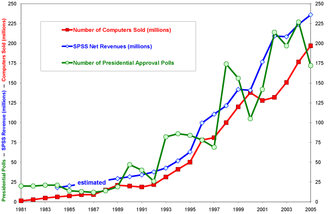
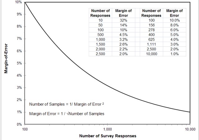


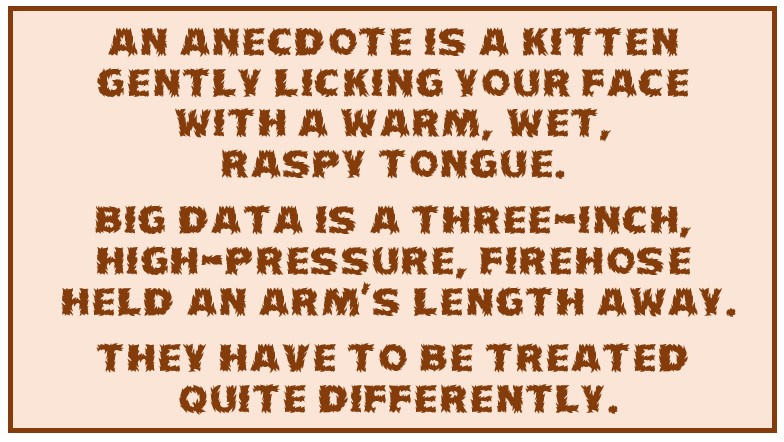


