

I’m looking for clues.
You probably were taught how to graph data in high school. Depending on your work, you may frequently plot data yourself or look at graphs prepared by others. Even if you don’t use graphs on your job, you may run into them during your leisure time, reading the newspaper, managing your finances, or playing Dungeons and Dragons. But there’s a big difference between looking at someone else’s graph and preparing one yourself. When you were learning how to graph in school, the teachers told you what kind of graph to use. They gave you carefully selected data that was matched to the graph you were supposed to create. There was help available if you had any questions. Now, it’s just you and your computer. So if you have no clue as to where to begin, here are a few tips that may help.
First let’s get past the jargon of plots, charts, graphs, and diagrams. All of these terms are defined as visual representations of data. All are used synonymously. All are used as both nouns and verbs. All have other meanings. To split hairs:
- Plots tend to place more emphasis on individual data points.
- Charts tend to involve lines and areas more than individual points.
- Graphs tend to be more mathematically complex than charts and plots.
- Diagrams tend to be more artistic and fill the entire data space.
Not everyone would agree with this, of course. That being said, you can usually refer to visual representations of data by any of the four terms without being called out by a smart-aleck critic. If you’re referring to a specific kind of visual representations of data, one of the four terms usually is preferred, for example, bar charts, scatter plots, and block diagrams. Most specific kinds of visual representations of data are called plots or charts, and to a much lesser extent, diagrams. The term graph is used mostly in a general sense, which is how it is used in this blog.
A Graph a Minute
The first thing you’ll need to do is figure out what kinds of graphs you could draw. Start by answering these questions:
- Is your focus on variables or samples? Do you want to show how a number of samples are related to each other on the basis of one or more variables or do you want to show how a number of variables are related to each other for a very small number of samples?
- Will you plot individual points or group means? How many data points do you have to plot? Do you want to show the points individually or do you want to show the averages of groups of data points (this is useful when you have a large number of data points)?
-
What is the aim of the graph? There are many reasons to plot data and most graphs have multiple goals. For simplicity, decide whether the primary aim is to show:
- Data frequency and distribution
- Relative proportions of the components of a mixture
- Properties or values of data points
- Trends, patterns, or other relationships among variables.
- Data frequency and distribution
- How many axes will you need? How many variables do you have? Are they measured on the same or different scales? Are the scales discrete or continuous?
Once you can answer those questions, you can use this table to help you choose some of the more common kinds of graphs to try with your data. There are, of course, a virtually uncountable number of kinds of graphs, subspecies of graphs, variations and extensions of graphs, and combinations of graphs. To start, focus on simple graphs you can get from the software you have available. Later, you can prepare the Piper plots you used to justify your purchase of that specialized piece of software you wanted.
Common Types of Graphs for General Data Analysis.
|
Data Scales |
||||||
|
Chart |
Used to Show |
Chart |
Horizontal Axis |
Vertical |
Additional |
Availability |
| Box Plot |
Distribution |
Rectangular |
Categorical, continuous (sample size) |
Continuous |
Specialized software |
|
| Dot Plot |
Distribution |
Rectangular |
Ordinal, continuous |
Ordinal |
Specialized software |
|
| Histogram |
Distribution |
Rectangular |
Ordinal, continuous |
Ordinal |
Spreadsheet software |
|
| Probability Plot |
Distribution |
Rectangular |
Ordinal, continuous |
Continuous |
Specialized software |
|
| Q-Q Plot |
Distribution |
Rectangular |
Ordinal |
Ordinal |
Specialized software |
|
| Stem-Leaf Diagram |
Distribution |
Rectangular |
Ordinal |
Ordinal, continuous |
Specialized software |
|
| Ternary Plot |
Mixtures |
Triangular |
Continuous (percentages) |
Continuous (percentages) |
Continuous (Percentages) |
Specialized software |
| Pie Chart |
Mixtures |
Circular |
Categorical |
Continuous (percentages) |
Spreadsheet software |
|
| Area Chart |
Properties |
Rectangular |
Ordinal, continuous |
Continuous |
Spreadsheet software |
|
| Bar Chart |
Properties |
Rectangular |
Categorical |
Continuous |
Spreadsheet software |
|
| Candlestick Chart |
Properties |
Rectangular |
Continuous |
Continuous |
Develop from scatter plot |
|
| Control Chart |
Properties |
Rectangular |
Continuous |
Continuous |
Specialized software |
|
| Deviation Plot |
Properties |
Rectangular |
Continuous |
Continuous |
Develop from scatter plot |
|
| Line Chart |
Properties |
Rectangular |
Categorical, ordinal |
Continuous |
Spreadsheet software |
|
| Map |
Properties |
Rectangular |
Continuous |
Continuous |
Any |
Specialized software |
| Matrix Plot |
Properties |
Rectangular |
Nominal |
Nominal |
Text |
Develop from table |
| Means Plot |
Properties |
Rectangular |
Continuous |
Continuous |
Develop from scatter plot |
|
| Spread Plot |
Properties |
Rectangular |
Continuous |
Continuous |
Develop from scatter plot |
|
| Block Diagram |
Properties |
Cubic |
Nominal |
Nominal |
Nominal |
Specialized software |
| Rose Diagram |
Properties |
Circular |
Ordinal, continuous |
Continuous |
Specialized software |
|
| Multivariable Plot |
Relationships |
Rectangular, circular, other |
Any |
Continuous |
Continuous |
Specialized software |
| Bubble Plot |
Relationships |
Rectangular |
Continuous |
Continuous |
Continuous |
Spreadsheet software |
| Contour Plot |
Relationships |
Rectangular |
Continuous |
Continuous |
Continuous |
Specialized software |
| Icon Plot |
Relationships |
Rectangular |
Continuous |
Continuous |
Multivariable plot* |
Specialized software |
| Scatter Plot: 2D |
Relationships |
Rectangular |
Continuous |
Continuous |
Spreadsheet software |
|
| Scatter Plot: 3D |
Relationships |
Cubic |
Continuous |
Continuous |
Continuous |
Specialized software |
| Surface Plot |
Relationships |
Cubic |
Continuous |
Continuous |
Continuous |
Specialized software |
| * (e.g., Radar Plot, Sun Chart, Star Plot, Side-by-side bar charts, Polygon Plot, Sparklines, Chernoff faces) | ||||||
You Can’t Spell Chart without Art
There are competing philosophies of graphing, divided to some extent by perceptions about the audience for a graph. The philosophy of many art directors of newspapers and magazines is to keep the graph simple, interesting, and attractive in order to engage the reader. Look no further than USA Today, Newsweek, or Time to see three dimensional exploded pie charts and bar charts made of little soldier icons or dollar bills or some other cutesy graphic. In contrast, Edward Tufte, perhaps the preeminent expert in informational graphics, espouses a philosophy that assumes the audience is knowledgeable and interested. Graphs should provide as much information as needed as efficiently as possible. Tufte makes many good points in his books, The Visual Display of Quantitative Information (1983, 2001), Envisioning Information (1990), Visual Explanations (1997), and Beautiful Evidence (2006), including:
- The dimension of a chart must not be greater than the dimension of the data. For example, if you’re plotting two variables on a Cartesian (rectangular) graph, don’t add an extra axis (dimension) for depth. It may be visually appealing but it’s scientifically misleading.
- Data must be presented in context. You shouldn’t show just part of a data set.
- Label everything you need to make sure the data are presented accurately and meaningfully.
- Maximize the data density and the data-ink ratio. Put enough data in your graph to make it worthwhile. Eliminate everything on the chart that isn’t data or contributes to the interpretation of the data.
- Eliminate chart junk, the unnecessary pictures, dimensionality, grid lines, fill patterns, and other objects that clutter a graph while adding no scientific value.
Tufte believes he has the audience’s attention while the art directors believe they have to compete for it. Then there are authors like David McCandless (www.informationisbeautiful.net) who look at presenting data from an artistic perspective. Their graphics are truly works of art though the graphs are based on data and aimed at engaged audiences. All of these graph developers make valid points. They simply have different perspectives, different audiences, different aims, and different data.
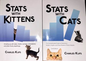
Read more about using statistics at the Stats with Cats blog. Join other fans at the Stats with Cats Facebook group and the Stats with Cats Facebook page. Order Stats with Cats: The Domesticated Guide to Statistics, Models, Graphs, and Other Breeds of Data Analysis at Wheatmark, amazon.com, barnesandnoble.com, or other online booksellers.


Pingback: Ten Tactics used in the War on Error | Stats With Cats Blog
Pingback: Five Things You Should Know Before Taking Statistics 101 | Stats With Cats Blog
Pingback: HOW TO WRITE DATA ANALYSIS REPORTS. LESSON 1—KNOW YOUR CONTENT. | Stats With Cats Blog
Pingback: How to Write Data Analysis Reports. Lesson 4—Get Their Attention. | Stats With Cats Blog
This was great! Thanks for sharing.
Pingback: Ten Ways Statistical Models Can Break Your Heart | Stats With Cats Blog
Pingback: How to Write Data Analysis Reports in Six Easy Lessons | Stats With Cats Blog
Pingback: Searching for Answers | Stats With Cats Blog
Pingback: How to write data analysis reports. Lesson 4 – Get their attention – Big Data Made Simple – One source. Many perspectives.
Pingback: WHAT TO LOOK FOR IN DATA – PART 1 | Stats With Cats Blog
Pingback: The Evolution of Data Science … As I Remember It | Stats With Cats Blog
Pingback: AI News - The evolution of Data Science … as I remember it