Probability is the core of statistics. You hear the phrase “what’s the probability of …” all the time in statistics. You also hear that phrase in everyday life, too. What’s the probability of rain tomorrow? What’s the probability of winning the lottery? You also hear the phrase “what are the odds …? What are the odds my team will win the game? What are the odds I’ll catch the flu? It sounds just like probability, but it’s not.
Probability is defined as the number of favorable events divided by the total number of events. Probabilities range from 0 (0%) to 1 (100%). To convert from a probability to odds, divide the probability by one minus that probability.
Odds are defined as the number of favorable events divided by the number of unfavorable events. This is the same as saying that odds are defined as the probability that the event will occur divided by the probability that the event will not occur. Odds range from 0 to infinity. To convert from odds to a probability, divide the odds by one plus the odds.
A probability of 0 is the same as odds of 0. Probabilities between 0 and 0.5 equal odds less than 1.0. A probability of 0.5 is the same as odds of 1.0. As the probability goes up from 0.5 to 1.0, the odds increase from 1.0 to infinity.
Probability and odds are expressed in several ways, as a fraction, as a decimal, as a percentage, or in words. Words used to express probability are “out of” and “in.” For example, a probability could be expressed as 1/5, 0.2, 20%, 1 out of 5, or 1 in 5. The words used to express odds are “-” and “to.” For example, odds could be expressed as 1/4, 0.25, 25%, 1-4, or 1 to 4. There are even more ways to express odds for gambling, but you won’t have to know about them to pass Stats 101. In fact, you might not even hear about expressing uncertainty using odds in an introductory statistics course. Odds become important in more advanced statistics classes in which odds ratio and relative risk are discussed.
Odds, like probabilities, come from four sources—logic, data, oracles, and models. Perhaps the best-known examples of odds creation come from the oracles in Las Vegas. Those oracles, called bookmakers, decide what the odds should be for a particular bet. Historically, before computers, bookmakers would compile as much information as they could about prior events and conditions related to the bet, then make educated guesses about what might happen based on their experience, intuition, and judgment. With computers, this job has become bigger, faster, more complicated, and more reliant on statistics and technology. The field of sports statistics has exploded since the 1970s when baseball statistics (sabermetrics) emerged. Modern gambling odds even fluctuate to take account of wagers placed before the actual event. To keep up with the demand, bookmakers now employ teams of Traders who compile the data and use statistical models to estimate the odds. But you’ll never have to know that for Stats 101.
Next, the answer to the question “which came first, the model or the odds?”
Whether you’re in high school, college, or a continuing education program, you may have the opportunity, or be required, to take an introductory course in statistics, call it Stats 101. It’s certainly a requirement for degrees in the sciences and engineering, economics, the social sciences, education, criminology, and even some degrees in history, culinary science, journalism, library science, and linguistics. It is often a requirement for professional certifications in IT, data science, accounting, engineering, and health-related careers. Statistics is like hydrogen, it’s omnipresent and fundamental to everything. It’s easier to understand than calculus and you’ll use it more than algebra. In fact, if you read the news, watch weather forecasts, or play games, you already use statistics more than you realize.
Language isn’t very precise in dealing with uncertainty. Probably is more certain than possibly, but who knows where dollars-to-doughnuts falls on the spectrum. Statistics needs to deal with uncertainty more quantitatively. That’s where probability comes in. For the most part, probability is a simple concept with fairly straightforward formulas. The applications, however, can be mind bending.
Where Do Probabilities Come From?
The first question you may have is “were do probabilities come from?” They sure don’t come from arm-waving know-it-alls at work or anonymous memes on the internet. Real probabilities come from four sources:
Logic – Some probabilities are calculated from the number of logical possibilities for a situation. For example, there are two sides to a coin so there are two possibilities. Standard dice have six sides so there are six possibilities. A standard deck of playing cards has 52 cards so there are 52 possibilities. The formulas for calculating probabilities aren’t that difficult either. By the time you finish reading this blog, you’ll be able to calculate all kinds of probabilities.
Data – Some probabilities are based on surveys of large populations or experiments repeated a large number of times. For example, the probability of a random American having a blood type of A-positive is 0.34 because approximately 34% of the people in the U.S. have that blood type. Likewise, there are probabilities that a person is a male (0.492), a non-Hispanic white (0.634), having brown eyes (0.34) and brown hair (0.58). The internet has more data than you can imagine for calculating probabilities.
Oracles – Some probabilities come from the heads of experts. Not the arm-wavers on the internet, but real professionals educated in a data-driven specialty. Experts abound. Sports gurus live in Las Vegas, survey builders reside largely in academia, and political prognosticators dwell everywhere. Some experts make predictions based on their knowledge and some use their knowledge to build predictive models. Probabilities developed from expert opinions may not all be as reliable as probabilities based on logic or data, but we rely heavily on them.
Models – A great many probabilities are derived from mathematical models, built by experts from data and scientific principles. You hear meteorological probabilities developed from models reported every night on the news, for instance. These models help you plan your daily life, so their impact is great. Perhaps even more importantly, though, are the probabilistic models that serve as the foundation of statistics itself, like the Normal distribution.
Turning Probably Into Probability
Probabilities are discussed in terms of events or alternatives or outcomes. They all refer to the same thing, something that can happen. A few basic things you need to know about the probability of events are:
The probability of any outcome or event can range only from 0 (no chance) to 1 (certainty).
The probability of a single event is equal to 1 divided by the number of possible events.
If more than one event is being considered as favorable, then the probability of the favorable events occurring is equal to the number of favorable events divided by the number of possible events.
These rules are referred to as simple probability because they apply to the probability of a single independent, disjoint event from a single trial. (Independent and disjoint events are described in the following paragraphs.) A trial is the activity you preform, also called a test or experiment, to determine the probability of an event. If the probability involves more than one trial, it is called a joint probability. Joint probabilities are calculated by multiplying together the relevant simple probabilities. So, for example, if the probability of event A is 0.3 (30%) and the probability of event B is 0.7 (70%), the joint probability of the two events occurring is 0.3 times 0.7, or 0.21 (21%). The probability of a brown-eyed (0.34), brown-haired (0.58), non-Hispanic-white (0.63) male (0.49) having A-positive blood (0.34), for instance, is only 2%, quite rare. Joint probabilities also range only from 0 to 1. Events can be independent of each other or dependent on other events. For example, if you roll a dice or flip a coin, there is no connection between what happens in each roll or flip. They are independent events. On the other hand, if you draw a card from a standard deck of playing cards, your next draw will be different from the first because there are now fewer cards in the deck. Those two draws are called dependent events. Calculating the probability of dependent events has to account for changes in the number of total possible outcomes. Other than that, the formula for probability calculations is the same.
Some outcomes don’t overlap. They are one-or-the-other. They both can’t occur at the same time. These outcomes are said to be mutually exclusive or disjoint. Examples of disjoint outcomes might involve coin flips, dice rolls, card draws, or any event that can be described as either-or. For a collection of disjoint events, the sum of the probabilities is equal to 1. This is called the Rule of Complementary Events or the Rule of Special Addition.
Some outcomes do overlap. They can both occur at the same time. These outcomes are called non-disjoint. Examples of non-disjoint outcomes include a student getting a grade of B in two different courses, a used car having heated seats and a manual transmission, and a playing card being a queen and in a red suit. For a collection of non-disjoint events, the sum of the simple probabilities minus the probability in common for the events is equal to 1. This is called the Rule of General Addition. The joint probability of non-disjoint events is called a Conditional Probability.
There is a LOT more to probability than that, but that’s enough to get you through Stats 101. Read through the examples to see how probability calculations work.
You’ve Probably Thought of These Examples
Probability does not indicate whatwillhappen, it only suggests howlikely, on a fixed numerical scale, something is to happen. If it weredefinitive, it would be called certainility not probability. Here are some examples.
Coins. Find a coin with two different sides, call one side A and the other side B.
What is the probability that B will land facing upward if you flip the coin and let it land on the ground?
Probability = number of favorable events / total number of events
Probability = 1 / 2
Probability = 50% or 0.5 or ½ or 1 out of 2.
This is a probability calculation for two independent, disjoint outcomes. Coin edges aren’t included in the total-number-of-events because the probability of flipping a coin so it lands on an edge is much much smaller than the probability of flipping a coin so it lands on a side. Alternative events have to have an observable (non-zero) probability of occurring for a calculation to be valid.
Probability can be expressed in several ways — as a percentage, as a decimal, as a fraction, or as the relative frequency of occurrence.
Using the same coin, record the results of 100 coin-flips. Count the number of times theresults were the A-side and how many times the results were the B-side. Then flip the coin one more time.
What is the probability that side B will land facing upward?
Probability = number of favorable events / total number of events
Probability = 1 / 2
Probability = 50% or 0.5 or ½ or 1 out of 2.
Each coin flip is independent of the results of every other coin flip. So, whether you flip the coin 100 times or a million times, the probability of the next flip will always be ½. When you flipped the coin 100 times, for instance, you might have recorded 53 B-sides and 47 A-sides. The probability of the B-side facing upward after a flip would NOT be 53/100 because the flips are independent of each other. What happens on one flip has no bearing on any other flip.
Toast. Make two pieces of toast and spread butter on one side of each. Eat one and toss the other into the air.
What is the probability that the buttered side will land facing upward?
Probability = number of favorable events / total number of events
Probability = 1 / 2
Probability = 50% or 0.5 or ½ or 1 out of 2.
WRONG. You knew this was wrong because the buttered side of a piece of toast usually lands facing down. That’s the result of the buttered side being heavier than the unbuttered side. The two sides aren’t the same in terms of characteristics that will dictate how they will land. For probability calculations to be valid, each event has to have a known, constant chance of occurring. Unlike a coin, the toast is “loaded” so that the heavier side faces downward more often. Now, say you knew the buttered side landed downward 85% of the time. You could calculate the probability that the buttered side of your next toast flip will land facing upward as:
Probability = number of favorable events / total number of events
Probability = (100-85) / 100 = 15 / 100
Probability = 15% or 0.15 or 3/20 or 1 out of 6⅔.
To make this calculation valid, all you would have to do is establish that, when tossed into the air, buttered toast will land with its unbuttered-side upward a constant percentage of the time. So, make 100 pieces of toast and butter one side of each …. Let me know how this turns out.
Standard Dice. Standard dice are six-sided with a number (from 1 to 6) or a set of 1 to 6 small dots (called pips) on each side. The numbers (or number of pips) on opposite sides sum to 7.
What is the probability that a 6 (or 6 pips) will land facing upward when you toss the dice?
Probability = number of favorable events / total number of events
Probability = 1 / 6
Probability = 17% or 0.167 or ⅙ or 1 out of 6.
This is a probability calculation for 6 independent, disjoint outcomes.
What is the probability that an even number (2, 4, or 6) will land face upward when you toss the dice?
Probability = number of favorable events / total number of events
Probability = 3 / 6
Probability = 50% or 0.5 or ½ or 1 out of 2.
This calculation considers 3 sides of the dice to be favorable outcomes.
What is the probability that a 1 will land face upward on two consecutive tosses of the dice?
Probability = (Probability of Event A) times (Probability of Event B)
Probability = (1 / 6) times (1 / 6)
Probability = 3% or 0.28 or 1/36 or 1 out of 36.
This calculation estimates the joint probability of 2 independent, disjoint outcomes occurring based on 2 rolls of 1 dice.
What is the probability that, using 2 dice, you will roll “snake eyes” (only 1 pip on each dice)?
Probability = (Probability of Event A) times (Probability of Event B)
Probability = (1 / 6) times (1 / 6)
Probability = 3% or 0.28 or 1/36 or 1 out of 36.
This calculation also estimates the joint probability of 2 independent, disjoint outcomes occurring based on 1 roll of 2 dice.
What is the probability that a 6 will land face upward on 3 consecutive rolls of the dice?
Probability = (Probability of Event A) times (Probability of Event B) times (Probability of Event C)
Probability = (1 / 6) times (1 / 6) times (1 / 6)
Probability = 0.5% or 0.0046 or 23/5,000 or 1 out of 216.
Roll 1 dice 3 times or 3 dice 1 time, if you get 666 either the dice is loaded or the Devil is messing with you.
DnD Dice. Dice used to play Dungeons and Dragons (DnD) have different numbers of sides, usually 4, 6, 8, 10, 12, and 20.
What is the probability that 6 will land facing upward when you throw a 20-sided (icosahedron) dice?
Probability = number of favorable events / total number of events
Probability = 1 / 20
Probability = 5% or 0.05 or 1/20 or 1 out of 20.
This is a probability calculation for 20 independent, disjoint outcomes.
What is the probability that a 6 will land face upward on 3 consecutive tosses of the 20-sided (icosahedron) dice?
Probability = (Probability of Event A) times (Probability of Event B) times (Probability of Event C)
Probability = (1 / 20) times (1 / 20) times (1 / 20)
Probability = 0.01% or 0.000125 or 1/8,000 or 1 out of 8,000.
So, you have a smaller chance of summoning the Devil by rolling 666 if you use a 20-sided DnD dice instead of a standard 6-sided dice.
What is the probability that 6 will land facing upward when you throw a 4-sided (tetrahedron, Caltrop) dice?
Probability = number of favorable events / total number of events
Probability = 0 / 4
Probability = 0% or 0.0 or 0/4 or 0 out of 4.
There is no 6 on the 4-sided dice. Not everything in life is possible.
Playing Cards. A standard deck of playing cards consists of 52 cards in 13 ranks (an Ace, the numbers from 2 to 10, plus a jack, queen, and king) in each of 4 suits – clubs (♣), diamonds (♦), hearts (♥) and spades (♠).
What is the probability that you will draw a 6 of clubs from a complete deck?
Probability = number of favorable events / total number of events
Probability = 1 / 52
Probability = 2% or 0.019 or 1/52 or 1 out of 52.
This is a probability calculation for 52 disjoint outcomes. The draw is independent because only one card is being drawn.
What is the probability that you will draw a 6 from a complete deck?
Probability = number of favorable events / total number of events
Probability = 4 / 52
Probability = 8% or 0.077 or 1/13 or 1 out of 13.
This is a probability calculation for 4 favorable disjoint outcomes out of 52 because there is a 6 in each of the 4 suits.
What is the probability that you will draw a club (♣), from a complete deck?
Probability = number of favorable events / total number of events
Probability = 13 / 52
Probability = 25% or 0.25 or ¼ or 1 out of 4.
This is a probability calculation for 13 favorable disjoint outcomes out of 52 because there are 13 club cards in the deck.
What is the probability that you will draw a club (♣), from a partial deck?
You can’t calculate that probability without knowing what cards are in the partial deck.
Tarot Cards. A deck of Tarot cards consists of 78 cards, 22 in the Major Arcana and 56 in the Minor Arcana. The cards of the Minor Arcana are like the cards of a standard deck except that the Jack is also called a Knight, there are 4 additional cards called Pages, 1 in each suit, and the suits are Wands (Clubs), Pentacles (Diamonds), Cups (Hearts), and Swords (Spades).
What is the probability that you will draw a Major Arcana card from a complete deck?
Probability = number of favorable events / total number of events
Probability = 22 / 78
Probability = 28% or 0.282 or 11/39 or 1 out of 3.54.
This is a probability calculation for 22 disjoint outcomes. The draw is independent because only 1 card is being drawn.
What is the probability that you will draw a Knight from a complete deck?
Probability = number of favorable events / total number of events
Probability = 4 / 78
Probability = 5% or 0.051 or 2/39 or 1 out of 19.5.
This is a probability calculation for 4 disjoint outcomes. The draw is independent because only 1 card is being drawn.
What is the probability that you will draw Death (a Major Arcana card) from a complete deck?
Probability = number of favorable events / total number of events
Probability = 1 / 78
Probability = 1% or 0.0128 or 1/78 or 1 out of 78.
If the Death card turns up a lot more than 1% of the time, maybe seek professional help.
Assuming you have already drawn Death, what is the probability that you will draw either The Tower, Judgement, or The Devil (other Major Arcana cards) from the same deck?
Probability = number of favorable events / total number of events
Probability = 3 / 77
Probability = 4% or 0.039 or 3/77 or 1 out of 25.7.
This is a probability calculation for 77 disjoint outcomes. The draw is dependent because one card (Death) has already been drawn, leaving the deck with 77 cards. If a The Tower, Judgement, or The Devil card does turn up after you have already drawn Death, definitely get professional help. Do NOT use a Ouija Board to summons help.
What is the probability that you will draw Death followed by Judgement from a complete deck on sequential draws?
Probability = (Probability of Event A) times (Probability of Event B)
Probability = (1 / 78) times (1 / 77)
Probability = 0.02% or 0.0002 or 167/1.000,000 or 1 out of 6,006.
If you draw Death and Judgement consecutively, you are toast. Refer to the second example.
Candy Bars, Your son has just returned from trick-or-treating. He inventories his stash and has: 5 Snickers; 6 Hershey’s bars; 4 Pay Days; 5 Kit Kats; 3 Butterfingers; 2 Charleston Chews; 5 Tootsie Roll bars; a box of raisins; and an apple. You throw away the apple because it’s probably full of razor blades. He throws away the raisins because they’re raisins. After the boy is asleep, you sneak into his room and, without turning on the light, find his stash. Putting your hand quietly into the bag, you realize that it’s too dark to see and all the bars feel alike.
What’s the probability that you’ll pull a Snickers out of the bag?
Probability = number of favorable events / total number of events
Probability = 5 / 30
Probability = 17% or 0.167 or 1/6 or 1 out of 6.
This is a probability calculation for 30 independent disjoint outcomes. The draw is independent because only 1 bar is being drawn.
What’s the probability that you’ll pull out a Snickers on your next attempt if you put back any bar you pull out that isn’t a Snickers?
Probability = number of favorable events / total number of events
Probability = 5 / 30
Probability = 17% or 0.167 or 1/6 or 1 out of 6.
This is called probability with replacement because by returning the non-Snickers bars to the bag, you are restoring the original total number of bars. The outcomes are independent of each other.
How many bars do you have to pull out before you have at least a 50% probability of getting a Snickers if you put the bars you pull out that aren’t Snickers into a separate pile (not back into the bag)?
Probability = number of favorable events / total number of events
1st bar pulled Snickers probability = 5 / 30 = 17%
2nd bar pulled Snickers probability = 5 / 29 = 17%
3rd bar pulled Snickers probability = 5 / 28 = 18%
4th bar pulled Snickers probability = 5 / 27 = 19%
5th bar pulled Snickers probability = 5 / 26 = 19%
6th bar pulled Snickers probability = 5 / 25 = 20%
7th bar pulled Snickers probability = 5 / 24 = 21%
8th bar pulled Snickers probability = 5 / 23 = 22%
9th bar pulled Snickers probability = 5 / 22 = 23%
10th bar pulled Snickers probability = 5 / 21 = 24%
11th bar pulled Snickers probability = 5 / 20 = 25%
12th bar pulled Snickers probability = 5 / 19 = 26%
13h bar pulled Snickers probability = 5 / 18 = 28%
14th bar pulled Snickers probability = 5 / 17 = 29%
15th bar pulled Snickers probability = 5 / 16 = 31%
16th bar pulled Snickers probability = 5 / 15 = 33%
17th bar pulled Snickers probability = 5 / 14 = 36%
18th bar pulled Snickers probability = 5 / 13 = 38%
19th bar pulled Snickers probability = 5 / 12 = 42%
20th bar pulled Snickers probability = 5 / 11 = 45%
21th bar pulled Snickers probability = 5 / 10 = 50%
22th bar pulled Snickers probability = 5 / 9 = 56%
23th bar pulled Snickers probability = 5 / 8 = 63%
24th bar pulled Snickers probability = 5 / 7 = 71%
25th bar pulled Snickers probability = 5 / 6 = 83%
26th bar pulled Snickers probability = 5 / 5 = 100%
This is called probability without replacement. The outcomes are dependent on how many bars have already been taken out of the bag. You would have to try 21 times until you get to 50% probability. 11 Tries will get you to 25% probability. Still, if you returned the bars to the bag you would never have better than a 17% chance of grabbing a Snickers.
Say you picked a Snickers on your first grab. What’s the probability that you’ll pull out a Snickers on subsequent grabs?
Probability = number of favorable events / total number of events
1st bar pulled is a Snickers
2nd bar pulled Snickers probability = 4 / 29 = 14%
3rd bar pulled Snickers probability = 4 / 28 = 14%
4th bar pulled Snickers probability = 4 / 27 = 15%
5th bar pulled Snickers probability = 4 / 26 = 15%
6th bar pulled Snickers probability = 4 / 25 = 16%
7th bar pulled Snickers probability = 4 / 24 = 17%
8th bar pulled Snickers probability = 4 / 23 = 17%
9th bar pulled Snickers probability = 4 / 22 = 18%
10th bar pulled Snickers probability = 4 / 21 = 19%
11th bar pulled Snickers probability = 4 / 20 = 20%
Once you do grab a Snickers, the probability that you’ll get another goes down because there are fewer Snickers in the bag. So, the lesson is: Don’t Be Greedy!
You are allergic to peanuts. What’s the probability that you’ll pull out a peanut-free bar (i.e., Charleston Chews, Tootsie Rolls, Kit Kats, or Hershey’s bars)?
Probability = number of favorable events / total number of events
Probability = 18 / 30
Probability = 60% or 0.6 or 3/5 or 1 out of 1.67.
Watch out for the bars that may have been produced in facilities that also process peanuts.
What’s the probability that your son will notice you raided his stash?
Probability = 1.0 or 100%.
Are you kidding?
Next, consider “What Are The Odds?”
Read more about using statistics at the Stats with Cats blog at https://statswithcats.net. Order Stats with Cats: The Domesticated Guide to Statistics, Models, Graphs, and Other Breeds of Data Analysis at Amazon.com or other online booksellers.
Sometimes you have to do things when you have no idea where to start. It can be a stressful experience. If you’ve ever had to analyze a data set, you know the anxiety.
Deciding how and where to start exploring a new data set can be perplexing. Typically. the first thing to consider is the objective you, your boss, or your client have in analyzing the dataset. That will give you a sense of where you need to go. Then you have to ensure the data set is reasonably free of errors. After that, you decide whether to look at snapshots, population or sample characteristics, changes over time or under different conditions, and multi-metric trends and patterns. This blog will give you some ideas for where and how to start.
When you take your first statistics class, your professor will be a kind person who cares about your mental well-being. OK, maybe not, but what the professor won’t do is give you real-world data sets. The data may represent things you find in the real world but the data set will be free of errors. Real-world data is packed full of all kinds of errors – in individual data points and pervasive within metrics in the data set – that can be easy to find or buried deep in the details about the data (i.e., called metadata).
There are a dozen different kinds of information, some more prone to errors than others. Therefore, real-world data has to be scrubbed before it can be analyzed. Data cleansing is an unfortunate misnomer that is sometimes applied to removing errors from a data set. The term implies that a data set can be thoroughly cleaned so it is free of errors. That doesn’t really happen. It’s like taking a shower. You remove the dirt and big stuff but there’s still a lot of bacteria left behind. Data scrubbing can be exhausting and often takes 80% of the time spent on a statistical analysis. With all the bad things that can happen to data it’s remarkable that statisticians can produce any worthwhile analyses at all.
Here are 35 kinds of errors you’ll find in real-world data sets, divided for convenience into 7 categories. Some of these errors may seem simplistic, but looking at every entry of a large data set can be overwhelming if you don’t know what to look for and where to look, and then what to do when you find an error.
Invalid data are values that are originally generated incorrectly. They may be individual data points or include all the measurements for a specific metric. Invalid data can be difficult to identify visually but may become apparent during an exploratory statistical analysis. They generally have to be removed from the data set.
Data can be recorded incorrectly, usually randomly in a data set, by the person creating or transcribing the data. These errors may originate on a data collection or data entry form, and thus, are difficult to detect without considerable cross checking. If they are identified, they have to be removed unless the real information can be discerned allowing replacement. Ambiguous votes in the 2000 presidential election in Florida are examples.
Bad coding
Bad coding results when information for a nominal-scale or ordinal-scale metric is entered inconsistently, either randomly or for an entire metric. This is especially troublesome if there are a large number of codes for a metric. Detection can be problematical. Sometimes other metrics can present inconsistencies that will reveal bad coding. For example, a subject’s sex coded as “male” might be in error if other data exist pointing to “female” characteristics. Colors are especially frustrating. They can be specified in a variety of ways – RGB, CMYK, hexadecimal, Munsell, and many other systems – all of which produce far too many categories to be practical. Plus, people perceive colors differently. Males see six colors where females see thirty. Bad coding can be replaced if it can be detected.
Wrong thing measured
Measuring the wrong thing seems ridiculous but it is not uncommon. The wrong fraction of a biological sample could be analyzed. The wrong specification of a manufactured part could be measured. And in surveys, the demographic defining the frame could be off-target. This can occur for an individual data point or the whole data set. Identification can be challenging if not impossible. Detected errors have to be removed.
Data quality exceptions
Some data sets undergo independent validation in addition to the verification conducted by the data analyst. While “verification is a simple concept embodied in simple yet time-consuming processes, … validation is a complex concept embodied in a complex time-consuming process.” A data quality exception might occur, for instance, when a data point is generated under conditions outside the parameters of a test, such as on an improperly prepared sample or at an unacceptable temperature. Identifying data quality exceptions is easy only because it is done by someone else. Removal of the exception is the ultimate fix.
Missing and Extraneous Data
Sometimes data points don’t make it into the data set. They are missing. This is a big deal because statistical procedures don’t allow missing data. Either the entire observation or the entire metric with the missing data point has to be excluded from the analysis OR a suitable replacement for the missing value has to be included in its place. Neither is a great alternative. Why the data points are missing is critical.
The opposite of missing values, extra data observations, also can appear in datasets. These most often occur for known reasons, such as quality control samples and merges of overlapping data sets. Missing data tends to affect metrics. Extra data points tend to affect observations.
Missing data
Data don’t just go missing, they (usually) go missing for a reason. It’s important to explore why data points for a metric are missing. If the missing values are truly random, they are said to be missing completely at random. If other metrics in the data set suggest why they are missing, they are said to be missing at random. However, if the reason they are missing is related to the metric they are missing from, that’s bad. Those data values are said to be missing not at random.
Missing-completely-at-random (MCAR) data
If there is no connection between missing data values for a metric and the values of that metric or any other metric in the data set (i.e., there is no reason for why the data point is missing), the values are said to be Missing Completely at Random (MCAR). MCAR values can occur with or without any explanation. An automated meter may malfunction or a laboratory result might be lost. A field measurement may be forgotten before it is recorded or just not recorded. MCAR data can be replaced by some appropriate value (there are several approaches for doing this), but they are usually ignored. In this case, either the metric or the observation has to be removed from the analysis.
Missing-at-random (MAR) data
If there is some connection between missing data values for a metric and the values of any of the other metrics in the data set (but not the metric with the missing values), the values are said to be Missing at Random (MAR). The true value of a MAR data point has nothing to do with why the value is missing, although other metrics do explain the omission. MAR data can occur when survey respondents refuse to answer questions they feel are inappropriate. For example, some females may decline to answer questions about their sexual history while males might answer readily (although not necessarily honestly). The sex of the respondent would explain why some data are missing and others are not. Likewise, a meter might not function if the temperature is too cold, resulting in MAR data. MAR data can be replaced by some appropriate value (there are several approaches for doing this), in which case, the pattern of replacement can be analyzed as a new metric. If the MAR data are ignored, either the metric or the observation has to be removed from the analysis.
Missing-not-at-random (MNAR) data
If there is some connection between a missing data value and the value of that metric, the values are said to be Missing Not at Random (MNAR). This is considered the worst case for a missing value. It has to be dealt with. For example, like MAR data, MNAR data can occur when survey respondents refuse to answer questions they feel are inappropriate, only in the MNAR case, because of what their answer might be. Examples might include sexual activity, drug use, medical conditions, age, weight, or income. Likewise, a meter might not function if real data are outside its range of measurement. These data are also said to be “censored.” MNAR data can be replaced by some appropriate value (there are several approaches for doing this), in which case, the pattern of replacement must be analyzed as a new metric. MNAR data should not be ignored because the pattern of their occurrence is valuable information.
Uncollected data
Some data go missing because they simply weren’t collected. This occurs in surveys that branch, in which different questions are asked of participants based on their prior responses. In these cases, data sets are reconstructed to analyzed only the portions of the branch that has no missing data. Another example is when a conscious decision is made not to collect certain data or not collect data from certain segments of a population because “ignorance is bliss.” The decisions to limit testing for Covid-19 and not record details of the imprisonment of illegal alien families are current examples. The data that are missing can never be recovered. Worse, generations in the future when such data are reexamined, the biases introduced by not collecting the data may be unrecognized.
Replicates
More than one suite of data from the same observational unit (e.g., individual, environmental sample, manufactured part, etc.) are sometimes collected to evaluate variability. These multiple results are called duplicates, triplicates, or in general, replicates. Intentionally collected replicates are usually consolidated into a single observation by averaging the values for each metric. Replicates can also be created when two overlapping data sets are merged. In these cases, the replicated observations should be identical so that only one is retained.
QA/QC samples
Additional observations are sometimes created for the purpose of evaluating the quality of data generation. Examples of such Quality Assurance/Quality Control (QA/QC) samples focus on laboratory performance, sample collection and transport, and equipment calibration. These results may be included in a data set when the data set is created as a convenience. They should not be part of any statistical analysis; they must be evaluated separately. Consequently, QA/QC samples should be removed from analytical data sets.
Extraneous unexplained
Rarely, extra data points may spontaneously appear in a data set for no apparent reason. They are idiopathic in the sense that their cause is unknown. They should be removed.
Dirty Data
Dirty data includes individual data points that have erroneous characters as well as whole metrics that cannot be analyzed because of some inconsistency or textual irregularity. Dirty data can usually be identified visually; they stand out. Unfortunately, most of these types of errors appear randomly so the entire dataset has to be searched, although there are tricks for doing this.
Incorrect characters
Just about anything can end up being an incorrect character, especially if data entry was manual. There are random typos. There are lookalike characters, like O for 0, l for 1, S for 5 or 8, and b for 6. There are digits that have been inadvertently reversed, added, dropped, or repeated. These errors can be challenging to detect visually, especially if they are random. Once detected though, they are east to repair manually.
Problematic characters
Problematic characters can be either unique or common but in a different context. Unique characters include currency symbols, icons used as bullets, and footnote symbols. Common characters that are problematic include leading or trailing spaces and punctuation marks like quotes, exclamation points, asterisks, parentheses, ampersands, carets, hashes, at signs, and slashes. Extra or missing commas wreak havoc when importing csv files. This can happen when commas are used instead of periods for dollar values. These errors can be challenging to detect visually, especially if they are random. Once detected though, they are east to repair manually.
Concatenated data
Some data elements include several pieces of information in a single entry that may need to be extracted to be analyzed. Examples include timestamps, geographic coordinates, telephone numbers, zip plus four, email addresses, social security numbers, account numbers, credit card numbers, and other identification numbers. Often, the parts of the values are delimited with hyphens, periods, slashes, or parentheses. These data metrics are easy to identify and process or remove.
Aliases and misspellings
IDs, names, and addresses are common places to find aliases and misspellings. They’re not always easy to spot, but sorting and looking for duplicates is a start. Upper/lower case may be an issue for some software depending on the analysis to be done. Fix the errors by replacing all but one of the data entries.
Useless data
Any metric that has no values or has values that are all the same are useless in an analysis and should be removed. Metrics with no values can occur, for instance, from filtering or from importing a table with breaker columns or rows. Some metrics may be irrelevant to an analysis or duplicate information in another metric. For example, names can be specified in a variety of formats, such as “first last.” “last, first,” and so on. Only one format needs to be retained. Useless data can be removed unless there is some reason to keep the original data set metrics intact.
Invalid fields
All kinds of weird entries can appear in a dataset, especially one that is imported electronically. Examples include file header information, multi-row titles from tables, images and icons, and some types of delimiters. These must all be removed. Data values that appear to be digits but are formatted as text must also be reformatted.
Out-of-Spec Data
Some data may appear fine at first glance but are actually problematical because they don’t fit expected norms. Some of these errors apply to individual data points and some apply to all the measurements for a metric. Identification and recovery depend on the nature of the error.
Out-of-bounds data
Some data errors involve impossible values that are outside the boundaries of the measurement. Examples include pH outside of 0 to 14, an earthquake larger than 9 on the Richter scale, a human body temperature of 115°F, negative ages and body weights, and sometimes, percentages outside of 0% to 100%. Out-of-bounds data should be corrected, if possible, or removed if not.
Data with different precisions
Data should all have the same precision, though this is not always the case. Currency data is often a problem. For example, sometimes dollar amounts are recorded in cents and sometimes in much larger amounts, This adds extraneous variability to calculated statistics.
Data with different units
Data for a metric should all be measured and reported in the same units. Sometimes, measurements can be made in both English and metric units but not converted when included into a dataset. Sometimes, an additional metric is included to specify the unit, however, this can lead to confusion. A famous example of confusion over units was when NASA lost the $125 million Mars Climate Orbiter in 1999. Fixing metrics that have inconsistent units is usually straightforward.
Data with different measurement scales
Having data measured on different scales for a metric is rare but it does happen. In particular, a nominal-scale metric can appear to be an ordinal-scale metric if numbers are used to identify the categories. Time and location scales can also be problematic. Compared to fixing metrics with inconsistent units, fixing metrics with inconsistent scales can be challenging.
Data with large ranges
Data with large ranges, perhaps ranging from zero to millions of units, are an issue because they can cause computational inaccuracies. Replacement by a logarithm or other transformation can address this problem.
Messy Data
Messy data give statisticians nightmares. Untrained analysts would probably not even notice these problems. In fact, even for statisticians, they can be difficult to diagnose because expertise and judgment are needed to establish their presence. Once identified, additional analytical techniques are needed to address the issues. And then, there may not be a consensus on the appropriate response.
Outliers
Outliers are anomalous data points that just don’t fit with the rest of the metric in the data set. You might think that outliers are easy to identify and fix, and there are many ways to accomplish those things, but there is enough judgment involved in those processes to allow damning criticism from even untrained adversaries. That is a nightmare for an applied statistician. They can be 100% in the right yet still made to appear as a con artist.
Large variances
Some data are accurate but not precise. That is a nightmare for a statistician because statistical tests rely on extraneous variance to be controlled. You can’t find significant differences between mean values of a metric if the variance in the data is too large. A large variance in a metric of a data set is easy to identify just by calculating the standard deviation and comparing it to the mean for the metric (called the coefficient of variation). There are methods to adjust for large variances, but the best strategy is prevention.
Non-constant variances
The variance of some metrics occasionally changes with time or with changes in a controlling condition. For example, the variance in a metric may diminish over time as methods of measurement improve. Some biochemical reactions become more variable with changes in temperature, pressure, or pH. This is a nightmare for a statistician because statistical modeling assumes homoskedasticity (i.e., constant variances). Heteroskedasticity in a metric of a data set is easy to identify by calculating and plotting the variances between time periods or categories of other metrics. There are methods to adjust for non-constant variances but they introduce other issues.
Censored data
Some data can’t be measured accuracy because of limitations in the measurement instrument. Those data are reported as “less than” (<) or “greater than” (>) the limit of measurement. They are said to be censored. Very low concentrations of pollutants, for example, are often reported as <DL (less than the detection limit) because the instrument can detect the pollutant but not quantify its concentration. There are a variety of ways to address this issue either by replacing affected data points or by using statistical procedures that account for censored data. Nevertheless, censored data are a nightmare for applied statisticians because there is no consensus on the best way to approach the problem in a given situation.
Corrupted Data
Corrupted data are created when some improper operation is applied, either manually or by machine, to data needing refinement after it is generated. These errors can be detected most easily at the time they are created. They tend not to be obvious if they are not identified immediately after they occur.
Electronic glitches
Electronic glitches occur when some interference corrupts a data stream from an automated device. These errors can be detected visually if the data are reviewed. Often, however, such data streams are automated so they do not have to be reviewed regularly. Removal is the typical fix.
Bad extraction
It is not uncommon for data elements to have to be extracted from a concatenated metric. For example, a month might have to be extracted from a value formatted as mmddyy (e.g., 070420), or a zip code have to be extracted from a value formatted as a zip code plus four. Such extractions are usually automated. If an error is made in the extraction formula, however, the extracted data will be in error. These errors are usually noticeable and can be replaced by correct data by running a revised extraction formula.
Bad processing
As with extraction, It is not uncommon for metrics to have to be processed to correct errors or give them more desirable properties. Such processing is usually automated. If an error is made in the processing algorithm, the resulting data will be in error. For example, NASA has occasionally had instances in which processing photogrammetric data has caused space debris to appear as UFOs and planetary landforms to appear as alien structures (e.g., the Cydonia Region on Mars). These errors are usually noticeable, at least by critics. Processing errors can be replaced by corrected data by running a revised processing algorithm.
Bad reorganization
Data sets are often manipulated manually to optimize their organizations and formatting for analysis. Cut and paste operations are often used for this purpose. Occasionally, a cut/paste operation will go awry. Detection is easiest at the moment it occurs, when it can be reversed effortlessly. These errors tend not to be so obvious or easy to fix if they are not identified immediately after they occur.
Mismatched Data
A great many statistical analyses rely on data collected and published by others, usually organizations dedicated to a cause, and often, government agencies. There is usually a presumption that these data are error-free and, at least for government sources, unbiased. They are, of course, neither, but data analysts are limited to using the tools they have at hand. Some errors, or at least inconsistencies, in these data sets are attributable to differences in the nature of the data being measured, differences in data definitions, and differences related to the passage of time. These differences can be overtly stated in metadata or buried deep in the way the creation of the data evolved. In either case, the errors aren’t always visible in the actual data points; they have to be discovered. And even if you discover inconsistencies, you may not be able to fix them.
Different sources
Errors in data sets built from published data take a variety of forms. First, everything that can happen in the creation of a locally-created data set can happen in a published data set, so there could be just as wide a variety of errors. Reputable sources, however, will scrub out invalid data, dirty data, out-of-spec data, corrupted data, and extraneous data. Most will not address missing data. None will deal with messy data. Missing and messy data are the responsibility of the data analyst. Second, different sources will have assembled their data using different contexts – data definitions, data acquisition methods, business rules, and data administration policies. None of these is usually readily apparent. Some errors may also occur when data sets from different sources are merged. Examples of such errors include replicates and extraction errors. It goes without saying that merging data from different sources can be satisfying yet terrifying, like bungy jumping, cave diving, and registering for Statistics 101. So what could go wrong in your analysis if you don’t consider the possibility of mismatched data?
Different definitions
When you combine data from different sources, or even evaluate data from a single source, be sure you know how the data metrics were defined. Sometimes data definitions change over time or under different conditions. For example, some counts of students in college might include full-time students at both two-year and four-year colleges, other counts may exclude two-year colleges but include part-time students. Say you’re analyzing the number of diabetics in the U.S. The first glucose meter was introduced in 1969, but before 1979, blood glucose testing was complicated and not quantitative. In 1979, a diagnoses of diabetes was defined as a fasting blood glucose of 140 mg/dL or higher. In 1997 the definition was changed to 126 mg/dL or higher. Today, a level of 100 to 125 mg/dL is considered prediabetic. Data definitions make a real difference. So, if you’re analyzing a phenomenon that uses some judgement in data generation, especially phenomena involving technology, be aware of how those judgments might have evolved.
Different contexts
In addition to different data definitions, the context under which a metric was created may be relevant. For example, in 143 years, the Major League Baseball (MLB) record for most home runs in a season has been held by 8 men. The 4 who have held the record the longest being: Babe Ruth (60 home runs, 1919 to 1960); Roger Maris (61 home runs, 1961 to 1997); Ned Williamson (27 home runs, 1884 to 1918); and Barry Bonds (73 home runs, 2001 to 2019). The other 4 recordholders held their record for fewer than 5 years each. During that time, there have been changes in rules, facilities, equipment, coaching strategies, drugs, and of course, players, so it would be ridiculous to compare Ned Williamson’s 27 home runs to Barry Bonds’ 73 home runs. Consider also how perceptions of race and gender might be different in different sources, say a religious organization versus a federal agency. Even surveys by the same organization of the same population using different frames can produce different results. Be sure you understand the contexts data have been generated under when you merge files.
Different times
Time is perhaps the most challenging framework to match data on. In business data, for example, relevant parameters might include: fiscal and calendar year; event years (e.g., elections, census, leap years); daily, monthly, and quarterly cutoff days, and seasonality and seasonal adjustments. Data may represent snapshots, statistics (e.g., moving averages, extrapolations), and planned versus reprogramed values. And sometimes, the rules change over time. The first fiscal year of the U.S. Government started on January 1, 1789. Congress changed the beginning of the fiscal year from January 1 to July 1 in 1842, and from July 1 to October 1 in 1977. Time is not on your side.
Summary
There seems to be an endless number of ways that data can go bad. There are at least 35. That realization is soul-crushing for most statisticians, so they come by it slowly. Some do come to grips with the concept that no data set is error-free, or can be error-free, but still can’t imagine the creativity nature has for making this happen. This blog is an attempt to enumerate some of these hazards.
Data errors can occur in individual data points and whole data metrics (and sometimes observations). They can be identified visually, using descriptive statistics, or statistical graphics, depending on the type of error.
The manner of dataset creation provides insight into the types of errors that might be present. Original datasets, one-time creations that become a source of data, are prone to invalid data, dirty data, out-of-spec data, and missing data. Combined datasets (also referred to as merged, blended, fused, aggregated, concatenated, joined, and united) are built from multiple sources of data, either manually or by automation, at one time, periodically, or continuously. These data sets are more prone to corrupted and mismatched data
Read more about using statistics at the Stats with Cats blog at https://statswithcats.net. Order Stats with Cats: The Domesticated Guide to Statistics, Models, Graphs, and Other Breeds of Data Analysis at Amazon.com or other online booksellers.
My three indoor cats are all seniors now, so I’m even more concerned that they have a healthy diet. I feed them both wet and dry food. They share most of two cans of wet food per day and have dry food, kibble, available all the time. Kibble is like snack time. Fortunately, they are more disciplined than I am; they are all of normal weight despite having access to all that food.
With their advanced age, I was concerned that the kibble be easy on their digestive systems. I had been feeding them Iams for the past six years since I rescued them and they seemed content with it. Nevertheless, I went to Chewy to see if they had any alternatives for senior cats with sensitive stomachs. To say the least, I was quite surprised that Chewy had so many brands catering to what I thought was a limited feline demographic. So much for an exhaustive experiment I envisioned, this was going to be a pilot test limited to just a few brands.
If this were a critical scientific experiment that would face peer review and replication, there would be a lot to consider in planning. But this is just a small, personal experiment between just me and my cats. We’ll all be satisfied with the results whatever they may be. So, with that said, here’s the outline of the experiment.
Population
The population for the experiment is small; it’s just my three indoor cats – Critter. Poofy, and Magic. Critter (AKA Ritter Critter) was rescued by my daughter from outside the Ritter building at Temple University when she was a kitten in 2006. Poofy (AKA Poofygraynod) was rescued from my back yard in 2013 when (the vet thought) she was about 6. Magic (AKA Black Magic) was also rescued (with Poofy) from my back yard in 2013 when (the vet thought) she was about 2. Critter and Magic were born in the wild; Poofy might have been a stray. At the time of the experiment, Critter and Poofy were about 14 and Magic was about 10. Poofy weighs about 13 pounds, Critter weighs about 11 pounds, and Magic weighs about 8 pounds, Poofy eats mostly kibble but also some wet food. Critter eats mostly wet food (ocean whitefish is her favorite) but also some kibble. Magic eats both kibble and wet food equally, in good feral fashion.
Because the population consists of only three individuals, and it’s their composite response that is of interest, the experiment actually involves measuring the cats’ preferences repeatedly over the course of the experiment. This is a census (rather than a survey) of the population. The sampling design is systematic, one set of measurements of kibble eaten by brand for the duration of the experiment. This is called a repeated measures design.
Phenomenon
The phenomenon being evaluated is preference for selected brands of kibble. Each cat may have a different preference, even changing day-by-day, but only the composite preference is important because I purchase the kibble in the aggregate. Preference is measured by the amount of each brand of kibble consumed in a 24-hour period.
Research Questions
I had four research questions I wanted to answer.
What kinds of kibble do my indoor cats like to eat?
I hypothesized that they might prefer Iams since that is the brand they had been eating for the prior seven years.
I hypothesized that they might like seafood best because this preference is often depicted in cat-related cliche.
Protein, Fat, Fiber. I hypothesized that they might prefer the highest protein content.
I hypothesized that they might like kibble that was smaller and more rounded so that it was easier to swallow.
How much do they eat in a day? I hypothesized that they would eat less that three cups of food per day based on prior feeding patterns. I provided a total of about twice that amount during the experiment, one cup of kibble for each of the six brands each day.
Do they prefer variety or will they eat the same kibble consistently? I hypothesized that they would eat a variety of the brands because I like variety in MY diet. My vet disagreed. He thought they would eat what they were most familiar with.
Will a different kibble reduce their barfing? I hypothesized that there would be no difference because they were already eating Iams kibble for cats with sensitive stomachs.
Kibble Brands
I was surprised by how many different brands there are of dry food for senior cats with sensitive stomachs available from just one vendor (Chewy). I decided to test just six because of cost and test logistics. They were:
Iams – because that’s the brand I had been feeding the cats for the last seven years; it was my “control group” brand. It is the least expensive of the brands and consists primarily of chicken and turkey, corn, rice, and oats.
Purina – because I wanted a well-known national brand available in supermarkets. I selected two Purina products, Focus and True Nature, to see if there was a difference between kibble formulations from the same company. They have the largest kibble, high protein, high calories, and tend to be more expensive. Focus is chicken and turkey flavored and contains rice, oats, and barley. True Nature is salmon and chicken flavored, and is grain free.
Hills Science Diet – because I wanted a well-known, highly-rated, vet-recommended brand sold mostly in pet stores. It is high density and high calorie but lower protein than the other brands. It is chicken flavored and contains corn, soy, and oats.
Halo – Perhaps the first “holistic” cat food, having been introduced in the 1980s, it purports to be ultra-digestible because of its use of fresh meats, vitamins, probiotics, and other healthy ingredients. It is seafood flavored and contains oats, soy, and barley.
I and Love and You – A newer formulation of holistic ingredient, it is grain-free, includes prebiotics and probiotics for healthy digestion, and has the longest ingredient list by far. It contains seafood and chicken/turkey.
Experimental Procedure
The experimental set up consisted of six paper bowls, one for each brand of kibble. The positions of the bowls were randomized so that the cats wouldn’t associate a certain kibble brand with a position. Every 24 hours, at 8 PM, the bowls were filled with one cup of kibble and weighed. (They still got their can of wet food at 5 AM when they wake me up.) The cats were then allowed to eat the kibble as they wanted for 24 hours. It was clear from the beginning of the experiment that the cats did prefer certain brands, though they would try others.
At the end of 24 hours, the bowls were reweighed. Remaining kibble was transferred to a bucket to be fed to my three outdoor feral cats, who will eat anything. The bowls were then filled and weighed again, and placed in their new randomized position.
Data Recorded each day included:
Day of experiment and time
Kibble brand
Bowl position
Weight of kibble not eaten
Weight of kibble provided for the next day
An informal inspection of the house was also conducted to identify any barfs that may have occurred.
Planned Analysis
The dependent variable for the analysis was the brand of kibble. The independent variable for the analysis was the weight of kibble eaten, calculated as:
Weight of kibble eaten = Weight of kibble provided – Weight of kibble left over
The position of the bowls was a blocking factor used to control extraneous variance. The day-of-the-experiment was a repeated-measures factor. This design is a two-way repeated-measures Analysis of Variance (ANOVA).
Depending on the results of the exploratory analysis, global ANOVA tests were planned for detecting differences between the brands, with the effects of bowl position and day of the experiment held constant. A priori tests were also planned to detect any differences between individual brands and the control brand, Iams.
Results
Though not what I expected, it was obvious after a couple of days that the cats had a clear preference for Hills Science Diet. Consequently, I ended the experiment after two weeks.
Descriptive Summary
The following table summarizes the amount of each brand that the cats ate over the two-week experiment.
Statistical Testing
While the design of the experiment is technically a two-way repeated-measures Analysis of Variance (ANOVA), the large differences in brands and the lack of differences in bowl position and day of the experiment made calculating the model unnecessary. This solved the problem of my not having appropriate software to conduct that part of the analysis. Instead, the following sections describe two-way ANOVA results for the brand versus bowl position and the brand versus day of the experiment models. Statistical comparisons of the amounts of each brand eaten are also summarized, with emphasis on differences between each brand and the “control” brand, Iams.
The global ANOVA test for the brands was significant when the effects of the day of the experiment was controlled for. The day of the experiment had no impact on the amount of kibble eaten. No surprise there.
The global ANOVA test for the brands was significant when the effects of bowl position was controlled for. Bowl position had no impact on the amount of kibble eaten. Again, that’s not a big surprise although you can never be sure of a hypothesis when you’re working with cats.
The following table summarizes the statistical tests between the brands. The important tests are the comparisons between each brand and the control brand, Iams, highlighted in yellow. The only significant tests were the comparisons between Hills Science Diet versus Iams and Purina True Nature versus Iams. This means that my cats like Hills and True Nature a lot more than what I’ve been feeding them for the last few years. Time to switch brands. I could have done worse had I fed them one of the other brands instead of Iams, but not significantly so.
Findings
First, things don’t always go the way you think they will. This is true in any experiment … and life in general. There was really no need to conduct the sophisticated ANOVA that I had planned, so I didn’t bother. Oh well, next time.
Second, my three cats eat about 135 grams (4.8 oz) of kibble in a day. Now I can use the automatic reorder feature on Chewy and save a few dollars.
Third, You know how you tend to eat a lot more after you come home with new groceries? Cats do it too. They ate a lot more on the first day of the experiment when they had five new brands of kibble to taste.
Fourth, I randomized bowl position as a way of controlling extraneous variation for the ANOVA. It seems that the middle positions had more kibble eaten per bowl than the outer positions. I have no explanation for this pattern and the cats aren’t talking.
Fifth, I can’t say that it reduced barfing because I had no baseline. My daughter, who doesn’t like cats, led me to believe that they barf about every twenty minutes. Still, there were only three barfs during the two-week experiment, which I considered not to be so bad.
Sixth, my cats clearly prefer Hill’s Science Diet as their kibble of choice. They don’t seem to want a variety of brands. I don’t know why my cats preferred Hills. It doesn’t appear to be the flavor, texture, or protein content since other brands had different combinations of these factors. If you look at reviews of other brands of kibble, you’ll find people who swear that their cat(s) likes the-brand-that-they-buy best. They’re probably right. Every cat or population of cats may have different tastes. I, myself, like pineapple on my pizza.
Finally, my experiment wasn’t large or sophisticated enough to isolate and analyze hypotheses about ingredients. If I could figure out why cats prefer one brand of kibble over another, though, I could probably get a job with Purina.
Further Research
It’s always a good practice to describe additional research that could be done to make the world a better place. Who knows if somebody with money might see it and fund your further research? In this case, further research might involve testing different brands, especially if the brands could be selected to explore a variety of flavors, kibble shapes, sizes, densities, and types and concentrations of protein. Finally, I would recommend using many, many more cats if you can. My daughter won’t let me have any more.
So, if you find yourself with some time on your hands, consider conducting your own experiment on your cats. You might be surprised at what you learn. It’ll be fun.
What to Look for in Data– Part 1 discusses how to explore data snapshots, population characteristics, and changes. Part 2 looks at how to explore patterns, trends, and anomalies. There are many different types of patterns, trends, and anomalies, but graphs are always the best first place to look.
Patterns and Trends
There are at least ten types of data relationships – direct, feedback, common, mediated, stimulated, suppressed, inverse, threshold, and complex – and of course spurious relationships. They can all produce different patterns and trends, or no recognizable arrangement at all.
There are four patterns to look for:
Shocks,
Steps
Shifts
Cycles.
Shocks are seemingly random excursions far from the main body of data. They are outliers but they often reoccur, sometimes in a similar way suggesting a common, though sporadic cause. Some shocks may be attributed to an intermittent malfunction in the measurement instrument. Sometimes they occur in pairs, one in the positive direction and another of similar size in the negative direction. This is often because of missed reporting dates for business data.
Steps are periodic increases or decreases in the body of the data. Steps progress in the same direction because they reflect a progressive change in conditions. If the steps are small enough, they can appear to be, and be analyzed as, a linear trend.
Shifts are increases and/or decreases in the body of the data like steps, but shifts tend to be longer than steps and don’t necessarily progress in the same direction. Shifts reflect occasional changes in conditions. The changes may remain or revert to the previous conditions, making them more difficult to analyze with linear models.
Cycles are increases and decreases in the body of the data that usually appear as a waveform having fairly consistent amplitudes and frequencies. Cycles reflect periodic changes in conditions, often associated with time, such as daily or seasonal cycles. Cycles cannot be analyzed effectively with linear models. Sometimes different cycles add together making them more difficult to recognize and analyze.
Simple trends can be easier to identify because they are more familiar to most data analysts. Again, graphs are the best place to look for trends.
Linear trends are easy to see; the data form a line. Curvilinear trends can be more difficult to recognize because they don’t follow a set path. With some experience and intuition, however, they can be identified. Nonlinear trends look similar to curvilinear trends but they require more complicated nonlinear models to analyze. Curvilinear trends can be analyzed with linear models with the use of transformations.
There are also more complex trends involving different dimensions, including:
Temporal
Spatial
Categorical
Hidden
Multivariate
Temporal Trends can be more difficult to identify because Time-series data can be combinations of shocks, steps, shifts, cycles, and linear and curvilinear trends. The effects may be seasonal, superimposed on each other within a given time period, or spread over many different time periods. Confounded effects are often impossible to separate, especially if the data record is short or the sampled intervals are irregular or too large.
Spatial Trends present a different twist. Time is one-dimensional; at least as we now know it. Distance can be one-, two-, or three-dimensional. Distance can be in a straight line (“as the crow flies”) or along a path (such as driving distance). Defining the location of a unique point on a two-dimensional surface (i.e., a plane) requires at least two variables. The variables can represent coordinates (northing/easting, latitude/longitude) or distance and direction from a fixed starting point. At least three variables are needed to define a unique point location in a three-dimensional volume, so a variable for depth (or height) must be added to the location coordinates.
Looking for spatial patterns involves interpolation of geographic data using one of several available algorithms, like moving averages, inverse distances, or geostatistics.
Categorical Trends are no more difficult to identify than any trend except you have to break out categories to do it, which can be a lot of work. One thing you might see when analyzing categories is Simpson’s paradox. The paradox occurs when trends appear in categories that are different from the overall group. Hidden Trends are trends that appear only in categories and not the overall group. You may be able to detect linear trends in categories without graphs if you have enough data in the categories to calculate correlation coefficients within each.
Multivariate Trends add a layer of complexity to most trends, which are bivariate. Still, you look for the same things, patterns and trends, only you have to examine at least one additional dimension. The extra dimension may be an additional axis or some other way of representing data, like icon type, size, or color.
Anomalies
Sometimes the most interesting revelations you can garner from a dataset are the ways that it doesn’t fit expectations. Three things to look for are:
Censoring
Heteroskedasticity
Outliers
Censoring is when a measurement is recorded as <value or >value, indicating that the measurement instrument was unable to quantify the real value. For example, the real value may be outside the range of a meter, counts can’t be approximated because there are too many or too few, or a time can only be estimated as before or after. Censoring is easy to detect in a dataset because they should be qualified with < or >.
Heteroskedasticity is when the variability in a variable is not uniform across its range. This is important because homoscedasticity (the opposite of heteroskedasicity) is assumed by probability statements in parametric statistics. Look for differing thicknesses in plotted data.
Influential observations and outliers are the data points that don’t fit the overall trends and patterns. Finding anomalies isn’t that difficult; deciding why they are anomalous and what to do with them are the really tough parts. Here are some examples of the types of outliers to look for.
How and Where to Look
That’s a lot of information to take in and remember, so here’s a summary you can refer to in the future if you ever need it.
And when you’re done, be sure to document your results so others can follow what you did.
Some activities are instinctive. A baby doesn’t need to be taught how to suckle. Most people can use an escalator, operate an elevator, and open a door instinctively. The same isn’t true of playing a guitar, driving a car, or analyzing data.
When faced with a new dataset, the first thing to consider is the objective you, your boss, or your client have in analyzing the dataset.
Objective
How you analyze data will depend in part on your objective. Consider these four possibilities, three are comparatively easy and one is a relative challenge.
Conduct a Specific Analysis – Your client only wants you to conduct a specific analysis, perhaps like descriptive statistics or a statistical test between two groups. No problem, just conduct the analysis. There’s no need to go further. That’s easy.
Answer a Specific Question – Some clients only want one thing — answer a specific question. Maybe it’s something like “is my water safe to drink” or “is traffic on my street worse on Wednesdays.” This will require more thought and perhaps some experience, but again, you have a specific direction to go in. That makes it easier.
Address a General Need – Projects with general goals often involve model building. You’ll have to establish whether they need a single forecast, map or model, or a tool that can be used again in the future. This will require quite a bit of thought and experience but at least you know what you need to do and where you need to end up. Not easy but straightforward.
Explore the Unknown – Every once in a while, a client will have nothing specific in mind, but will want to know whatever can be determined from the dataset. This is a challenge because there’s no guidance for where to start or where to finish. This blog will help you address this objective.
If your client is not clear about their objective, start at the very end. Ask what decisions will need to be made based on the results of your analysis. Ask what kind of outputs would be appropriate – a report, an infographic, a spreadsheet file, a presentation, or an application. If they have no expectations, it’s time to explore.
Got data?
Scrubbing your data will make you familiar with what you have. That’s why it’s a good idea to know your objective first. There are many things you can do to scrub your data but the first thing is to put it into a matrix. Statistical analyses all begin with matrices. The form of the matrix isn’t always the same, but most commonly, the matrix has columns that represent variables (e.g., metrics, measurements) and rows that represent observations (e.g., individuals, students, patients, sample units, or dates). Data on the variables for each observation go into the cells. Usually this is usually done with spreadsheet software.
Data scrubbing can be cursory or exhaustive. Assuming the data are already available in electronic form, you’ll still have to achieve two goals – getting the numbers right and getting the right numbers.
Getting the numbers right requires correcting three types of data errors:
Alphanumeric substitution, which involves mixing letters and numbers (e.g., 0 and o or O, 1 and l, 5 and S, 6 and b), dropped or added digits, spelling mistakes in text fields that will be sorted or filtered, and random errors.
Specification errors involve bad data generation, perhaps attributable to recording mistakes, uncalibrated equipment, lab mistakes, or incorrect sample IDs and aliases.
Inappropriate Data Formats, such as extra columns and rows, inconsistent use of ND, NA, or NR flags, and the inappropriate presence of 0s versus blanks.
Getting the right numbers requires addressing a variety of data issues:
Variables and phenomenon. Are the variables sufficient to explore the phenomena in question?
Variable scales. Review the measurement scales of the variables so you know what analyses might be applicable to the data. Also, look for nominal and ordinal scale variables to consider how you might segment the data.
Representative sample. Considering the population being explored, does the sample appear to be representative.
Replicates. If there are replicate or other quality control samples, they should be removed from the analysis appropriately.
Censored data. If you have censored data (i.e., unquantified data above or below some limit), you can recode the data as some fraction of the limit, but not zero.
Missing data. If you have missing data, they should be recoded as blanks or use another accepted procedure for treating missing data.
Data scrubbing can consume a substantial amount of time, even more than the statistical calculations.
What To Look For
If statistics wasn’t your major in college or you’re straight out of college and new to applied statistics, you might wonder where you might start looking at a dataset? Here are five places to consider looking.
Snapshot
Population or Sample Characteristics
Change
Trends and Patterns
Anomalies
Start with the entire dataset. Look at the highest levels of grouping variables. Divide and aggregate groupings later after you have a feel for the global situation. The reason for this is that the number of possible combinations of variables and levels of grouping variables can be large, overwhelming, each one being an analysis in itself. Like peeling an onion, explore one layer of data at a time until you get to the core.
Snapshot
What does the data look like at one point. Usually it’s at the same point in time but it could also be common conditions, like after a specific business activity, or at a certain temperature and pressure. What might you do?
Snapshots aren’t difficult. You just decide where you want a snapshot and record all the variable values at that point. There are no descriptive statistics, graphs, or tests unless you decide to subdivide the data later. The only challenge is deciding whether taking a snapshot makes any sense for exploring the data.
The only thing you look for in a snapshot is something unexpected or unusual that might direct further analysis. It can also be used as a baseline to evaluate change.
Population Characteristics
It’s always a good idea to know everything you can about the populations you are exploring. Here’s what you might do.
This is a no-brainer; calculate descriptive statistics. Here’s a summary of what you might look at. It’s based on the measurement scale of the variable you are assessing.
For grouping (nominal scale) variables, look at the frequencies of the groups. You’ll want to know if there are enough observations in each group to break them out for further analysis. For progression (continuous) scales, look at the median and the mean. If they’re close, the frequency distribution is probably symmetrical. You can confirm this by looking at a histogram or the skewness. If the standard deviation divided by the mean (coefficient of variation) is over 1, the distribution may be lognormal, or at least, asymmetrical. Quartiles and deciles will support this finding. Look at the measures of central tendency and dispersion. If the dispersion is relatively large, statistical testing may be problematical.
Graphs are also a good way, in my mind, the best way to explore population characteristics. Never calculate a statistic without looking at its visual representation in a graph, and there are many types of graphs that will let you do that.
What you look for in a graph depends on what the graph is supposed to show – distribution, mixtures, properties, or relationships. There are other things you might look for but here are a few things to start with.
For distribution graphs (box plots, histograms, dot plots, stem-leaf diagrams, Q-Q plots, rose diagrams, and probability plots), look for symmetry. That will separate many theoretical distributions, say a normal distribution (symmetrical) from a lognormal distribution (asymmetrical). This will be useful information if you do any statistical testing later.
For mixture graphs (pie charts, rose diagrams, and ternary plots), look for imbalance. If you have some segments that are very large and others very small, here may be common and unique themes to the mix to explore. Maybe the unique segments can be combined. This will be useful information if you do break out subgroups later.
For properties graphs (bar charts, area charts, line charts, candlestick charts, control charts, means plots, deviation plots, spread plots, matrix plots, maps, block diagrams, and rose diagrams), look for the unexpected. Are the central tendency and dispersion what you might expect? Where are big deviations?
For relationship graphs (icon plots, 2D scatter plots, contour plots, bubble plots, 3D scatter plots, surface plots, and multivariable plots), look for linearity. You might find linear or curvilinear trends, repeating cycles, one-time shifts, continuing steps, periodic shocks, or just random points. This is the prelude for looking for more detailed patterns.
Change
Change usually refers to differences between time periods but, like snapshots, it could also refer to some common conditions. Change can be difficult, or at least complicated, to analyze because you must first calculate the changes you want to explore. When calculating changes, be sure the intervals of the change are consistent. But after that, what might you do?
First, look for very large, negative or positive changes. Are the percentages of change consistent for all variables? What might be some reasons for the changes.
Calculate the mean and median changes. If the indicators of central tendency are not near zero, you might have a trend. Verify the possibility by plotting the change data. You might even consider conducting a statistical test to confirm that the change is different from zero.
If you do think you have a trend or pattern, there are quite a few things to look for. This is what What to Look for in Data – Part 2 is about.
The postings on this blog are my own (except as noted) and do not necessarily represent the positions, strategies or opinions of my current, past, and future employers, cats and other family members, relatives, social-media friends, real friends, Charlie Sheen, people who sit next to me on public transportation, or myself when I’m in my right mind.

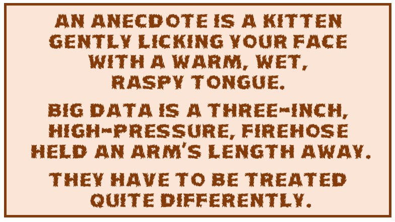


 Probabilities are discussed in terms of events or alternatives or outcomes. They all refer to the same thing, something that can happen. A few basic things you need to know about the probability of events are:
 Events can be independent of each other or dependent on other events. For example, if you roll a dice or flip a coin, there is no connection between what happens in each roll or flip. They are independent events. On the other hand, if you draw a card from a standard deck of playing cards, your next draw will be different from the first because there are now fewer cards in the deck. Those two draws are called dependent events. Calculating the probability of dependent events has to account for changes in the number of total possible outcomes. Other than that, the formula for probability calculations is the same.

 This is a probability calculation for two independent, disjoint outcomes. Coin edges aren’t included in the total-number-of-events because the probability of flipping a coin so it lands on an edge is much much smaller than the probability of flipping a coin so it lands on a side. Alternative events have to have an observable (non-zero) probability of occurring for a calculation to be valid.
 Toast. Make two pieces of toast and spread butter on one side of each. Eat one and toss the other into the air.
 Standard Dice. Standard
 Playing Cards. A standard deck of playing cards consists of 52 cards in 13 ranks (an Ace, the numbers from 2 to 10, plus a jack, queen, and king) in each of 4 suits – clubs (♣), diamonds (♦), hearts (♥) and spades (♠).
 Tarot Cards. A deck of Tarot cards consists of 78 cards, 22 in the Major Arcana and 56 in the Minor Arcana. The cards of the Minor Arcana are like the cards of a standard deck except that the Jack is also called a Knight, there are 4 additional cards called Pages, 1 in each suit, and the suits are Wands (Clubs), Pentacles (Diamonds), Cups (Hearts), and Swords (Spades).
 Candy Bars, Your son has just returned from trick-or-treating. He inventories his stash and has: 5 Snickers; 6 Hershey’s bars; 4 Pay Days; 5 Kit Kats; 3 Butterfingers; 2 Charleston Chews; 5 Tootsie Roll bars; a box of raisins; and an apple. You throw away the apple because it’s probably full of razor blades. He throws away the raisins because they’re raisins. After the boy is asleep, you sneak into his room and, without turning on the light, find his stash. Putting your hand quietly into the bag, you realize that it’s too dark to see and all the bars feel alike.


 My three indoor cats are all seniors now, so I’m even more concerned that they have a healthy diet. I feed them both wet and dry food. They share most of two cans of wet food per day and have dry food, kibble, available all the time. Kibble is like snack time. Fortunately, they are more disciplined than I am; they are all of normal weight despite having access to all that food.

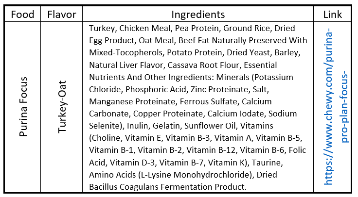


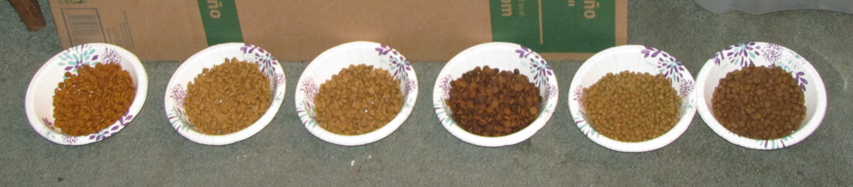

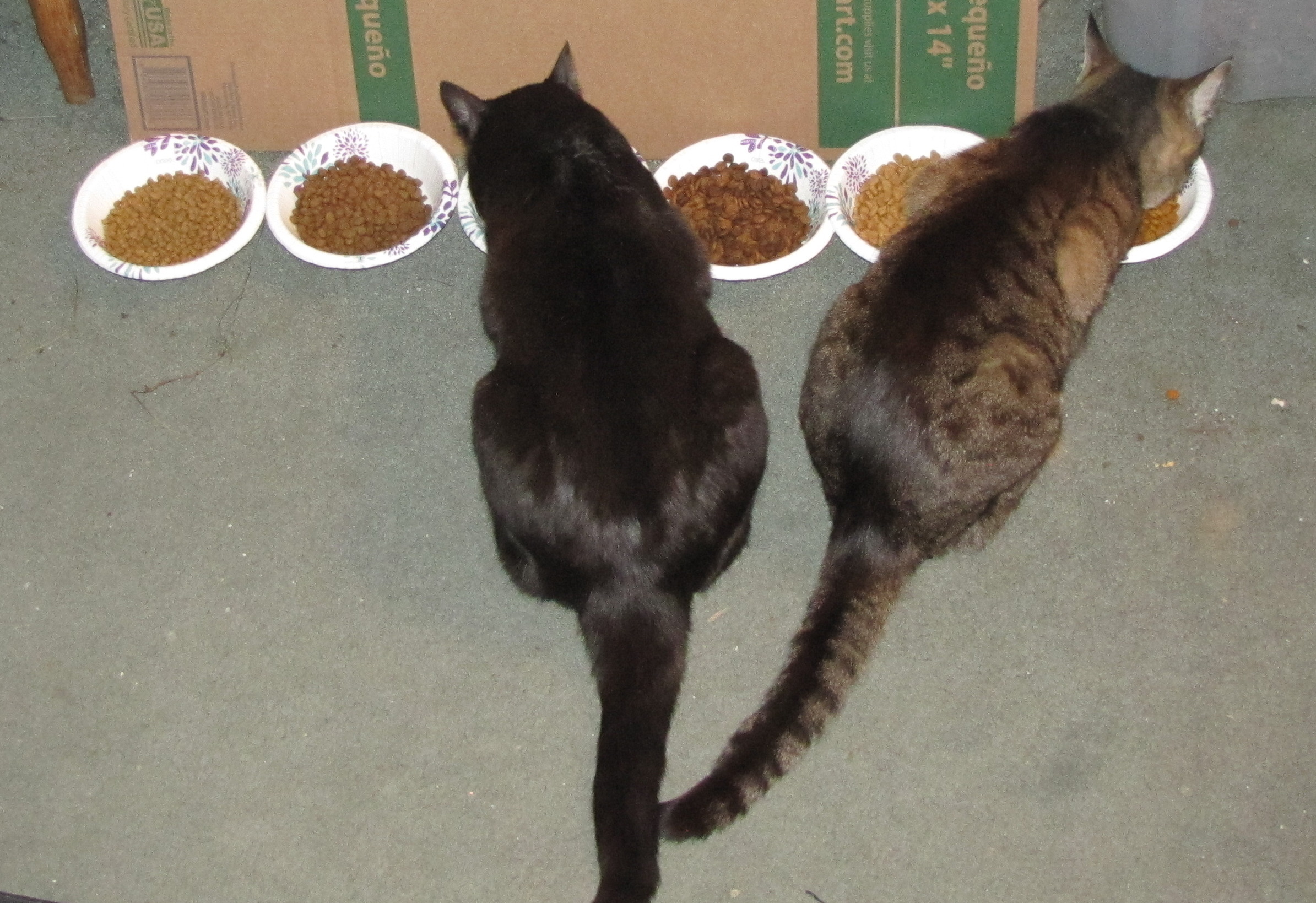
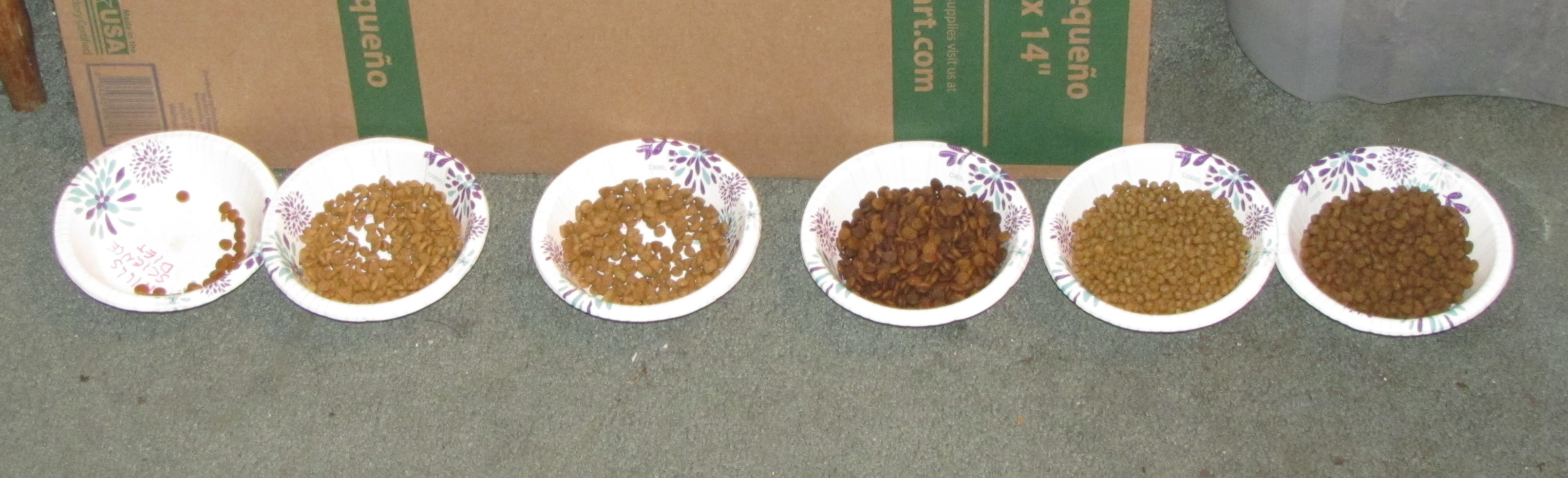
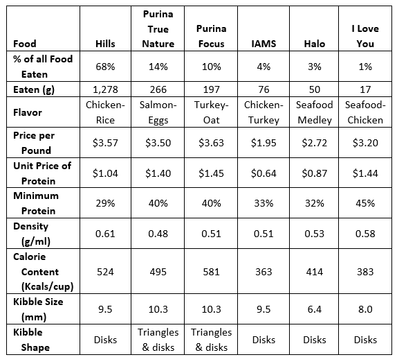
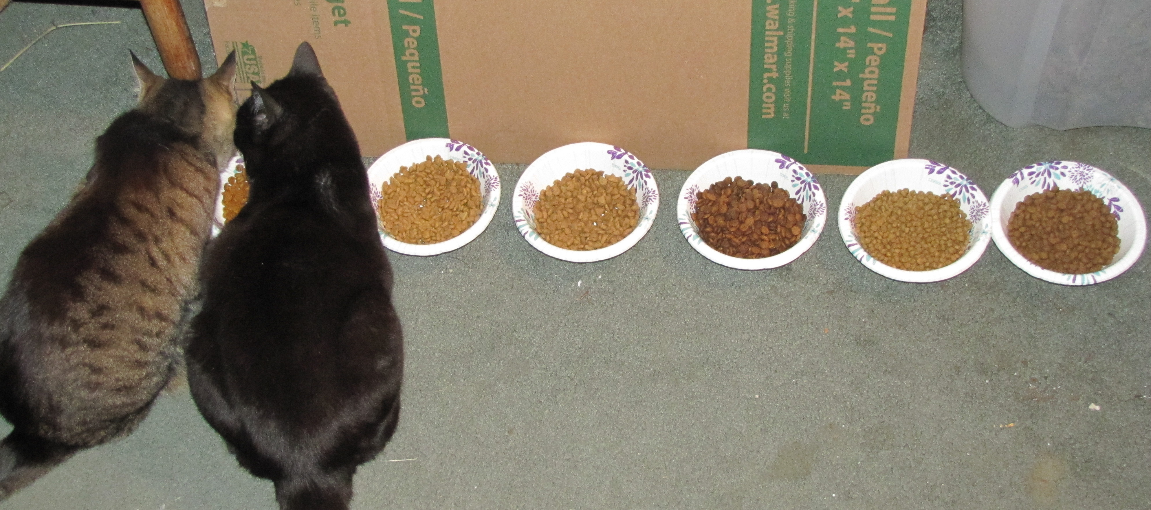


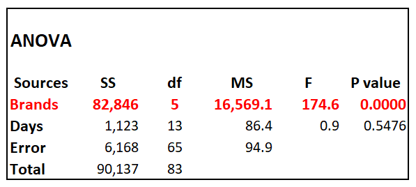


 What to Look for in Data – Part 1 discusses how to explore data snapshots, population characteristics, and changes. Part 2 looks at how to explore patterns, trends, and anomalies. There are many different types of patterns, trends, and anomalies, but graphs are always the best first place to look.
 There are four patterns to look for:
 Simple trends can be easier to identify because they are more familiar to most data analysts. Again, graphs are the best place to look for trends.
 Linear trends are easy to see; the data form a line. Curvilinear trends can be more difficult to recognize because they don’t follow a set path. With some experience and intuition, however, they can be identified. Nonlinear trends look similar to curvilinear trends but they require more complicated nonlinear models to analyze. Curvilinear trends can be analyzed with linear models with the use of
  Temporal
 Spatial Trends present a different twist. Time is one-dimensional; at least as we now know it. Distance can be one-, two-, or three-dimensional. Distance can be in a straight line (“as the crow flies”) or along a path (such as driving distance). Defining the
 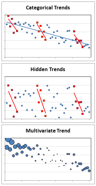 Categorical Trends are no more difficult to identify than any trend except you have to break out categories to do it, which can be a lot of work. One thing you might see when analyzing categories is
 Anomalies
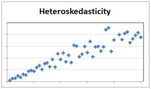
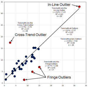
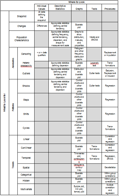

 Some activities are instinctive. A baby doesn’t need to be taught how to suckle. Most people can use an escalator, operate an elevator, and open a door instinctively. The same isn’t true of playing a guitar, driving a car, or analyzing data.
 Scrubbing your data will make you familiar with what you have. That’s why it’s a good idea to know your objective first. There are many things you can do to scrub your data but the first thing is to put it into a matrix. Statistical analyses all begin with matrices. The form of the matrix isn’t always the same, but most commonly, the matrix has columns that represent variables (e.g., metrics, measurements) and rows that represent observations (e.g., individuals, students, patients, sample units, or dates). Data on the variables for each observation go into the cells. Usually this is usually done with spreadsheet software.
 What To Look For
 Snapshots aren’t difficult. You just decide where you want a snapshot and record all the variable values at that point. There are no descriptive statistics, graphs, or tests unless you decide to subdivide the data later. The only challenge is deciding whether taking a snapshot makes any sense for exploring the data.

 For properties graphs (bar charts, area charts, line charts, candlestick charts, control charts, means plots, deviation plots, spread plots, matrix plots, maps, block diagrams, and rose diagrams), look for the unexpected. Are the central tendency and dispersion what you might expect? Where are big deviations?


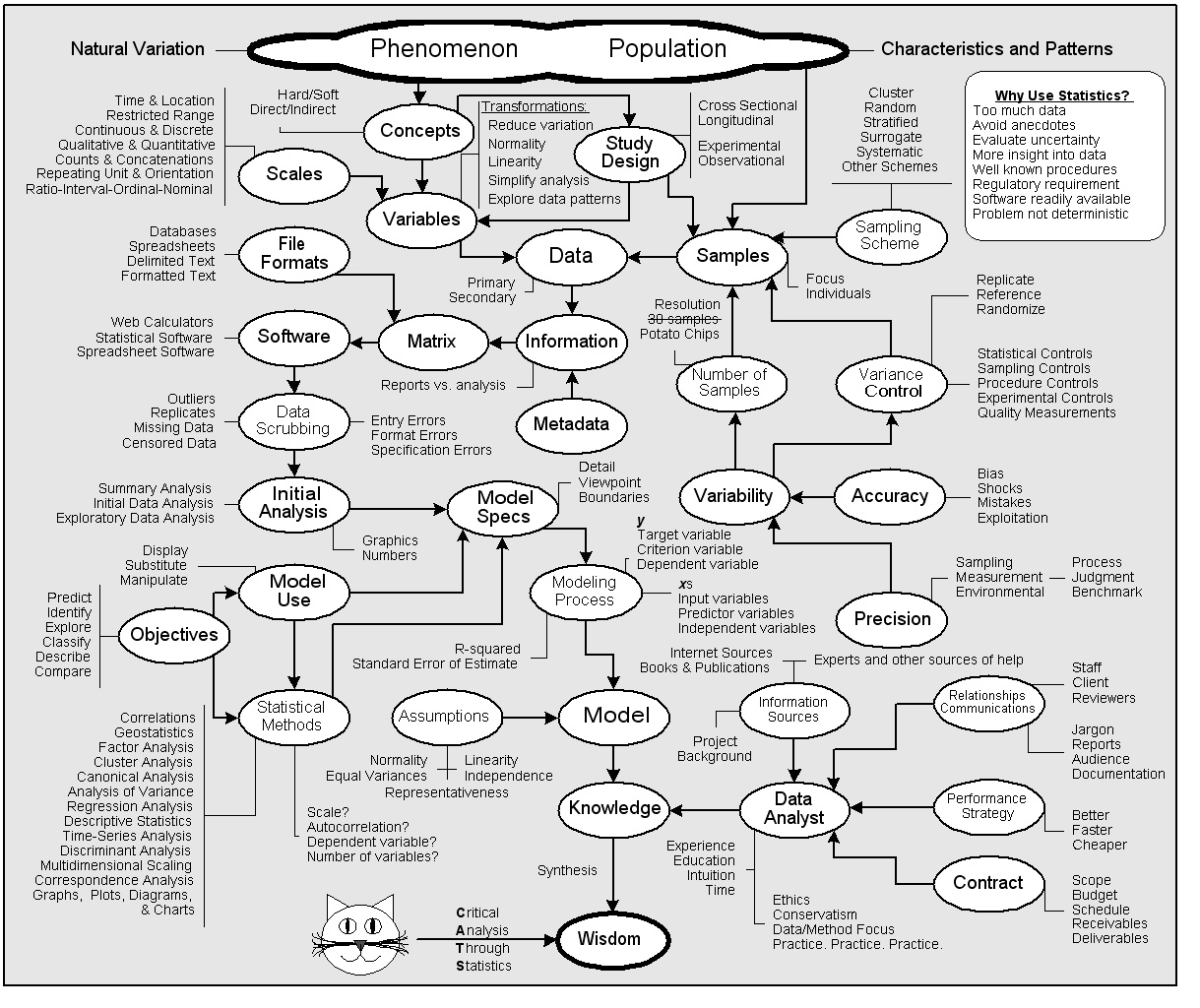