
 Part 3 of Dare to Compare shows how one-population statistical tests are conducted. Part 4 extends these concepts to two-population tests.
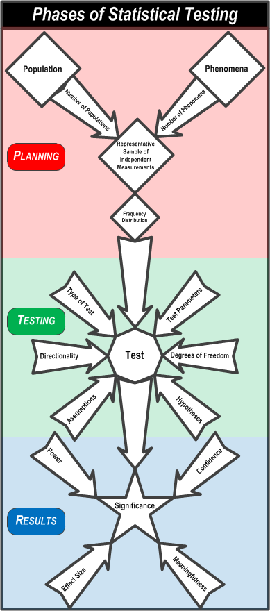
To review, this flowchart summarizes the the process of statistical testing.
First, you PLAN the comparison by understanding the populations you will take a representative sample of individuals from and measure the phenomenon on. Then you assess the frequency distributions of the measurements to see if they approximate a Normal distribution.
Second, you TEST the measurements by considering the test parameters, the type of test, the hypotheses, the test dimensionality, degrees of freedom, and violations of assumptions.
Third, you review the RESULTS by setting the confidence, determining the effect size and power of the test, and assessing the significance and meaningfulness of the test.
Now imagine this.
You’re a sophomore statistics major at Faber College and you need to sign up for the dreaded STATS 102 class. The class is taught in the Fall and the Spring by two different instructors (Dr. Statisticus and Prof. Modearity) as either three, one-hour sessions on Mondays, Wednesdays, and Fridays, or as two, hour and a half sessions on Tuesdays and Thursdays. You wonder if it makes a difference which class you take. Having completed STATS 101, you know everything there is to know about statistics, so you get the grades from the classes that were taught last year. Here are the data.
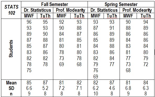
What class should you take to get the highest grade? Dr. Statisticus gave out the highest grades in the Fall; Prof. Modearity gave out a higher grade in the Spring. On the other side of the coin, only one person flunked (grade below 75) Dr. Statisticus’ classes but six people flunked Prof. Modearity’s classes. Three students flunked in the Fall while four students flunked in the Spring. Two people flunked TuTh classes and five people flunked MWF classes. This is complicated.
Looking at the averages, you think that taking Dr. Statisticus’ Tuesday-Thursday class in the fall would be your best bet. However, is a two or three point difference worth the class conflicts and scheduling hassles you might have? Does it really matter?
Maybe it’s time for some statistical testing? But these would be two-population tests because you have to compare two semesters, two instructors, and two class lengths.
Two Population t-Tests
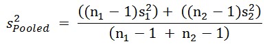
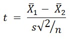
In a two-population test, you compare the average of the measurements in the first population to the average of the second population, using the formula:
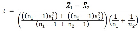
 This is a bit more complicated than the formula for a one-population test because you can have different standard deviations and different numbers of measurements in the two populations.
Here’s what’s happening. The numerator (top part of the formula) is the same in both t-test formulas. The leftmost term in the denominator calculates a weighted average of the variances, called a pooled variance.
 If the number of measurements taken of the two populations is the same, the test design is said to be balanced. If the variances of the measurements in the two populations are the same, the leftmost term in the denominator reduces to s2. So, the formula for a balanced two-population t-test with equal variances is:
 Much more simple but not as useful as the more complicated formula. You might be able to control the number of samples from the populations but you can’t control the variances.
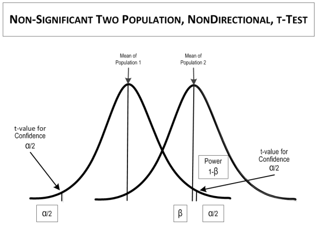
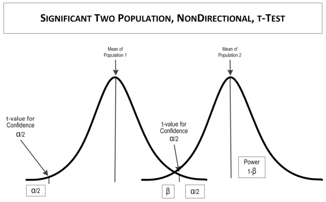
Once you calculate a t value, the rest of the test is similar to a one-population test. You compare the calculated t to a t-value from a table or other reference for the appropriate number of tails, the confidence (1- α), and the degrees of freedom (the number of samples in the sample of the population minus 1).
If the calculated t value is larger than the table t value, the test is SIGNIFICANT, meaning that the means are statistically different. If the table t value is larger than the calculated t value, the test is NOT SIGNIFICANT, meaning that the means are statistically the same.
Example
Back to the example. You want to compare the differences between semesters, instructors, and class days. You have no expectations for what the best semester, instructor, or class day would be. To be conservative, you’ll accept a false positive rate (i.e., 1-confidence, α) of 0.05. Your null hypotheses are:
цFall Semester = цSpring Semester
цDr. Statisticus = цProf. Modearity
цMWF = цTuTh
Now for some calculations, first the semesters.
XFall Semester      = 84.0
XSpring Semester  = 83.5
NFall Semester      = 33
NSpring Semester  = 35
S2Fall Semester    = 49.7 (S = 7.05)
S2Spring Semester = 41.7 (S = 6.46)
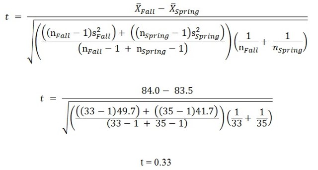
And the tabled value is:
t(2-tailed, 0.05 confidence, 65 degrees of freedom) = 1.997
You can do these calculations in Excel with the formula:
=T.TEST(array1,array2,tails,type)
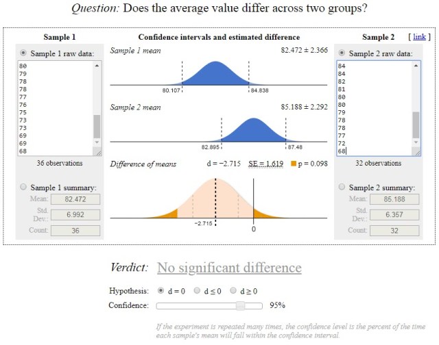
Where type=3 is a t-test for two-samples with unequal variances. There are also a few online sites for the calculations, such as https://www.evanmiller.org/ab-testing/t-test.html, from which this graphic was produced.
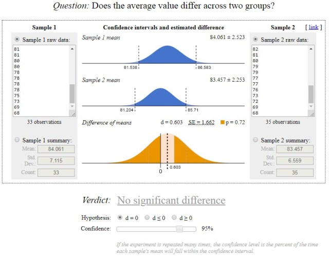
 So there is no statistically significant difference between the Fall semester classes and the Spring semester classes.
Now for the instructors:
XDr. Statisticus    = 85.4
XProf. Modearity   = 82.0
NDr. Statisticus     = 35
NProf. Modearity   = 33
S2Dr. Statisticus   = 37.5 (S = 6.12)
S2Prof. Modearity = 48.5 (S = 6.96)
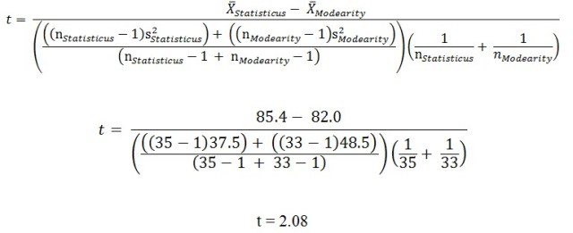
And the tabled value is:
t(2-tailed, 0.05 confidence, 66 degrees of freedom) = 1.996
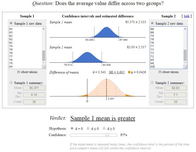
So there is a statistically significant difference between instructors. Dr. Statisticus gives higher grades than Prof. Modearity.
From www.evanmiller.org/:
 Now for the days of the week:
XMWF                = 82.4
XTuTh                = 85.2
NMWF                = 36
NTuTh                 = 32
S2MWF               = 47.8 (S = 6.91)
S2TuTh               = 39.4 (S = 6.28)
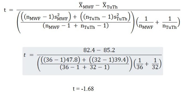
So there is no statistically significant difference between the one-hour classes on Mondays, Wednesdays, and Fridays and the hour-and-a-half classes on Tuesdays and Thursdays.
From www.evanmiller.org/:
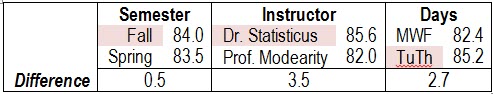
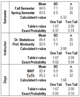
 Here is a summary of the three tests.
So take Dr, Statisticus’ class when ever it fits in your schedule.
ANOVAs
 So what do you do if you have more than two populations or more than one phenomenon or some other weird combinations of data? You use an Analysis of Variance (ANOVA).
ANOVA includes a variety of statistical designs used to analyze differences in group means. It is a generalization of the t-test of a factor (called maineffect or treatments in ANOVA) to more than two groups (called levels in ANOVA). In an ANOVA, the variances in the levels of factors being compared are partitioned between variation associated with the factors in the design (called model variation) and random variation (called error variation). ANOVA is conceptually similar to multiple two-population t-tests, but produces fewer type I (false positive) errors. While t-tests use t-values from the t-distribution, ANOVAs use F-tests from the F-distribution. An F-test is the ratio of the model variation the error variation. When there are only two means to compare, the t-test and the ANOVA F-test are equivalent according tp the relationship F = t2.
Types of ANOVA
There are many types of ANOVA designs. One-way and multi-way ANOVAs are the most common.
One-Way ANOVAs
One-way ANOVA is used to test for differences among three or more independent levels of one effect. In the example t-test, a one-way ANOVA might involve more than two levels of one of the three factors. For example, a one-way ANOVA would allow testing more than two instructors or more than two semesters.
 Multi-Way ANOVAs
Multi-way ANOVAs (sometimes called factorial ANOVAs) are used to test for differences between two or more effects. A two-way ANOVA tests two effects, a three-way ANOVA tests three effects, and so on. Multi-way ANOVAs have the advantage of being able to test the significance of interaction effects. Interaction effects occur when two or more effects combine to affect measurements of the phenomenon. In the example t-test, a three-way ANOVA would allow simultaneous analysis of the semesters, instructors, and days, as well as interactions between them.
Other Types of ANOVA
There are numerous other types of ANOVA designs, some of which are too complex to explain in a sentence or two. Here are a few of the more commonly used designs.
Repeated Measures ANOVAs (also called as within-subjects ANOVA) are used when the same subjects are used for each treatment effect, as in a longitudinal study. In the example, if the scores for the students were recorded every month of the semester, it could be analyzed with a Repeated Measures ANOVA.
Some ANOVAs use design elements to control extraneous variance. The significance of the design elements is not important to the dependent variable so long as it controls variability in the main effects. If the design element is a nominal-scale variable, it is called a blocking effect. If the design element is a continuous-scale variable, it is called a covariate and the model is called an Analysis of Covariance (ANCOVA). In the example, if students’ year in college (freshman, sophomore, junior, or senior, an ordinal scale measure) were added as an effect to control variance, it would be a blocking factor. If students’ GPA (grade point average, a continuous scale measure) as a covariate, it would be a ANCOVA design.
 Random Effects ANOVAs assume that the levels of a main effect are sampled from a population of possible levels so that the results can be extended to other possible levels. The Instructors main effect in the example could be a random effect if other instructors were considered part of the population that included Dr. Statisticus and Prof. Modearity. If only Dr. Statisticus and Prof. Modearity were levels of the effect, it would be called a fixed effect. If a design included both fixed and random effects, it is called a mixed effects design.
Multivariate analysis of variance (MANOVA) is used when there is more than one set of measurements (also called dependent variables or response variables) of the phenomenon.
Now What?
Dare to Compare is a fairly comprehensive summary of statistical comparisons. You may not hear about all of these concepts in Stats 101 and that’s fine. Learn what you need to to pass the course. Some topics are taught differently, especially hypothesis development and the normal curve. Follow what your instructor teaches. He or she will assign your grade.
Believe it or not, there’s quite a bit more to learn about all of the topics if you go further in statistics. There are special t-tests for proportions, regression coefficients, and samples that are not independent (called paired sample t-tests). There are tests based on other distributions besides the Normal and t-distributions, such as the binomial and chi2 distributions. There are also quite a few nonparametric tests, based on ranks. And, of course, there are many topics on the mathematics end and o2n more metaphysical concepts like meaningfulness.
Statistical testing is more complicated than portrayed by some people but it’s still not as formidible as, say, driving a car. You might learn to drive as a teenager but not discover statistics and statistical testing until college. Both statistical testing and driving are full of intracacies that you have to keep in mind. In testing you consider an issue once, while in driving you must do it continually. When you make a mistake in testing, you can go back and correct it. If you make a mistake in driving, you might get a ticket or cause an accident. After you learn to drive a car, you can go on to learn to drive motorcycles, trucks, busses, and racing vehicles. After you learn simple hypothesis testing, you can go on to learn ANOVA, regression, and many more advanced techniques. So if you think you can learn to drive a car, you can also learn to conduct a statistical test.

Read more about using statistics at the Stats with Cats blog. Join other fans at the Stats with Cats Facebook group and the Stats with Cats Facebook page. Order Stats with Cats: The Domesticated Guide to Statistics, Models, Graphs, and Other Breeds of Data analysis at amazon.com, barnesandnoble.com, or other online booksellers.
 Parts 1 and 2 of Dare to Compare summarized fundamental topics about simple statistical comparisons. Part 3 shows how those concepts play a role in conducting statistical tests. The importance of these concept are highlighted in the following table.


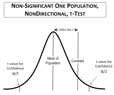
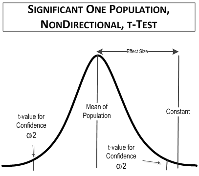

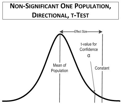
 In this comparison, the table t-value you would use is for a one-tailed (directional) test at 90% confidence for 10 samples, t(1-tailed, α = 0.1, 9 degrees of freedom) = 1.383. For comparison, the value of t(2-tailed, 0.9 confidence, 9 degrees of freedom), which was used in the first example, is equal to 1.833, as is t(1-tailed, 0.95 confidence, 9 degrees of freedom). The reason is that you only have to look in half of the t-distribution area in a one-tailed test compared to a two-tailed test. That means that if you use a directional test you can have a smaller false positive rate.
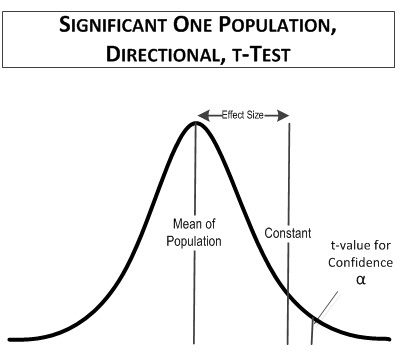

 The American Statistical Association has identified
 Part 1 of Dare to Compare summarized several fundamental topics about statistical comparisons.
 Statistical tests that don’t rely on the distributions of the phenomenon in the populations are called nonparametric tests. Nonparametric tests often involve converting the data to ranks and analyzing the ranks using the median and the range.
 When you conduct a statistical test, the result does not mean you prove your hypothesis. Rather, you can only reject or fail to reject the null hypothesis. If you reject the null hypothesis, you adopt the alternative hypothesis. This would mean that it is more likely that the null hypothesis is not true in the populations. If you fail to reject the null hypothesis, it is more likely that the null hypothesis is true in the populations.
 After you conduct the test, there are two pieces of information you need to determine – the sensitivity of the test to detect differences, called the effect size, and the power of the test. The power of the test will depend on the sample size, the confidence, and the effect size. The effect size also provides insight into whether the test results are meaningful. Meaningfulness is important because a test may be able to detect a difference far smaller than what might of interest, such as a difference in mean student heights less than a millimeter. Perhaps surprisingly, the most common reason for being able to detect differences that are too small to be meaningful is having too large a sample size.
 z-Tests and t-Tests
 χ2 Tests
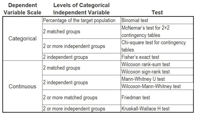

 In school, you probably had to line up by height now and then. That wasn’t too difficult. There weren’t too many individuals being lined up and they were all in the same place at the same time. An individual’s place in line was decided by comparing his or her height to the heights of other individuals. The comparisons were visual; no measurements were made. Everyone made the same decisions about the height comparisons. You didn’t need statistics to solve the problem. So why might you ever need statistics to compare heights?
 Fortunately, you don’t have to measure every individual in the population so long as you measure a representative sample of the individuals in the populations. You can improve your chances of getting a representative sample by using the three Rs of variance control —
  A bell curve is usually assumed to represent a Normal distribution. The average and the variance of the values are called parameters of the distribution because they are in the mathematical formula that defines the form of the distribution.
 Read more about using statistics at the
  Whether you know it or not, you deal with models every day. Your weather forecast comes from a meteorological model, usually several. Mannequins are used to display how fashions may look on you. Blueprints are drawn models of objects or structures to be built. Maps are models of the earth’s terrain. Examples are everywhere.
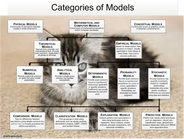

 Models can also be expressed in words and pictures. These are used in virtually all fields to convey mental images of some mechanism, process, or other phenomenon that was or will be created. Blueprints, flow diagrams, geologic fence diagrams, anatomical diagrams are all conceptual models. So are the textual descriptions that go with them. In fact, you should always start with a simple text model before you embark on building a complex physical or mathematical model.
 Theoretical Models
 Probability Models
 In statistical comparison models, the dependent variable is a grouping-scale variable (one measured on a nominal
  Clustering models do not have a nominal-scale dependent variable, but most classification models do.
  Factor Analysis
 Some models are created to predict new values of a dependent variable or forecast future values of a time-dependent variable. To be useful, a prediction model must use prediction variables that cost less to generate than the prediction is worth. So the predictor variables and their scales must be relatively inexpensive and easy to create or obtain. In prediction models, accuracy tends to come easy while precision is elusive. Prediction models usually keep only the variables that work best in making a prediction, and they may not necessarily make a lot of conceptual sense.
 Step 1 – Start at top of the Catalog of Models figure. Decide whether you want to create a physical, mathematical, or conceptual model. Whichever you choose, start by creating a brief conceptual model so you have a mental picture of what your ultimate goal is and can plan for how to get there.
 Say you wanted to describe someone you see on the street. You might characterize their sex, age, height, weight, build, complexion, face shape, hair, mouth and lips, eyes, nose, tattoos, scars, moles, and birthmarks. Then there’s clothing, behavior, and if you’re close enough, speech, odors, and personality. Your description might be different if you’re talking to a friend or a stranger, of the same or different sex and age. Those are a lot of characteristics and they’re sometimes hard to assess. Individual characteristics aren’t always relevant and can change over time. And yet, without even thinking about it, we describe people we see every day using these characteristics. We do it mentally to remember someone or overtly to describe a person to someone else. It becomes second nature because we do it all the time.


 Shape refers to the frequency of the values in a dataset at selected levels of the scale, most often depicted as a graph. For ordinal scales, the graph is usually a histogram. For continuous scales, the graph is usually a probability plot, although sometimes histograms are used. Shapes of continuous scale data can be compared to mathematical models (equations) of frequency distributions. It’s like comparing a person to some well-known celebrity; they’re not identical but are similar enough to provide a good comparison. There are dozens of such distribution models, but the most commonly used is the
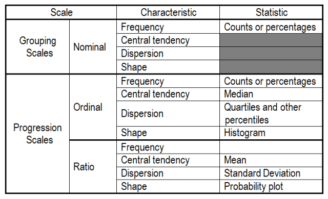


 -ended responses on surveys, social networking sites, email, online reviews, public comments, notations (e.g., medical, customer relations), documents and text files, or even recorded and transcribed interactions. But before anything can happen, you have to accomplish three tasks:
 e are several ways that you can
  ll want to aggregate them to make things easier. If you have text on a website, you can usually highlight it and copy it using <ctrl-C>. If the passage is long, you can use <ctrl-A> to select everything before copying it, but you’ll have to edit out the extraneous material. You can do these operations in most word processors.
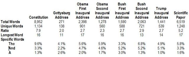

 Step 4 – Count the Fragments Assigned to Each Descriptor
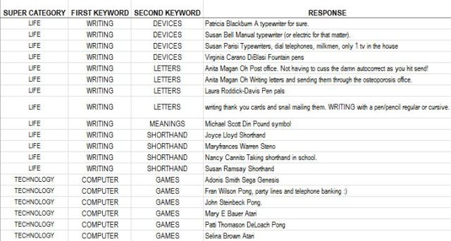


