How to Write Data Analysis Reports. Lesson 6—Get Acceptance.

Source: http://animal-backgrounds.com/animals/cats-fighting-animal-wallpaper.html and 1,196 other sites.Data analysis reports have to go through one more hurdle after they are completely written. They have to be approved for acceptance by a gatekeeper. The approval for acceptance may involve allowing report distribution, starting the publishing process, issuing payment for your services, or just acknowledging that your work is done. The gatekeeper may be your client, your supervisor, your publisher, or for blog writers, you. To get that approval, formal reports usually have to be reviewed by reviewers. Reviewers are usually individuals the gatekeeper chooses based on their technical background or role in the gatekeeper’s organization. Sometimes, reviewers are individuals the gatekeeper is forced to listen to, like regulatory reviewers. In academic publishing, you may not even know who the peer reviewers are.

Logically, the acceptance review shouldn’t take too long compared to the time you took to analyze the data and write the report. After all, the reviewers only have to read it. In practice, though, reviews take far longer than report preparation. The report you wrote in a month may take six months to be reviewed. Don’t panic. It’s just the way things seem to happen.

The number of comments you get from the reviewers is inconsequential. Great reports can get dozens of highly critical comments. Again, don’t panic. The only review you should be concerned about is the one that provides no comments. That usually signals a lack of interest by the reviewers and the gatekeeper.

Six Tips for Responding to Reviewers from Editage Insights

When the review is complete, be sure to get the comments in writing. If you don’t, some comments may be forgotten or misunderstood. If there is more than one reviewer, compile all the comments together. This is essential because sometimes reviewers provide conflicting comments. The gatekeeper may compile the comments for you if he or she wants to control the process. The comments should be placed in the order they correspond to in the report. Be sure to identify the source of each comment. If a single comment has many parts, break the comment apart so you can respond to each part individually.

Then comes the challenging part—you must respond to each comment separately. Create a new document listing all the compiled comments. For each comment in this document, either describe what you’ll do in response or explain why you won’t make any changes. Start with the easy comments, such as those involving grammar and spelling. As you describe your response to a comment in the document, make the associated change in the report. Proceed through increasingly more difficult comments until you are done. For very complex comments, try to parse the ideas and respond to each separately. If a particular comment is very difficult to address, you may have to conduct additional analyses or information research. Cite information sources if appropriate.

When you’re done, reread both the response document and the changes in the report. Be sure all the changes were made in the report and that they are consistent with the rest of the report. Also, make sure the tone of your response is even; be stoic.

Nine Tips for Responding to Criticism by Alain Briot

If you’ve written an informal piece, like a blog, you don’t have to go through the grueling process of responding to formal comments from an acceptance review. Since you are the gatekeeper, you can release your blog whenever you feel it is done. But after you release the blog, you may well get comments. That’s good because it shows that people are reading your blog. Furthermore, there’s no pressure to compile these comments and document your responses. Unfortunately, at least some of the comments will come from spammers, trolls, 13-year-olds, head cases, angry arguers, and other individuals who won’t be providing constructive criticism. Therefore, first consider the source of each comment. In some cases, you won’t have to respond to any of them. Your blogging software will allow you to delete unwelcome comments. Beware of the overly gracious comments, too. Sometimes malicious commenters use addresses that link to spam or malware. If you don’t trust your instincts, just delete the comment.

Source: http://www.smscs.com/photo/funny_cat_desktop_wallpaper/22.html#.UjTi79KTia8 and 2 other sites.Don’t get upset by reviewers pointing out flaws in your report. That’s what they’re supposed to do. Having been on both sides of the writer/reviewer divide, I can tell you that creating a report takes a hundred times more knowledge, creativity, effort, and time than reviewing a report. Providing constructive criticism on a report requires a hundred times more experience, situational awareness, and interpersonal sensitivity than creating a report. Good writing combined with constructive reviewing makes a data analysis report the best it can be.

You can read the entire six-part blog, albeit with fewer cats, at How to Write Data Analysis Reports in Six Easy Lessons.

Read more about using statistics at the Stats with Cats blog. Join other fans at the Stats with Cats Facebook group and the Stats with Cats Facebook page. Order Stats with Cats: The Domesticated Guide to Statistics, Models, Graphs, and Other Breeds of Data Analysis at Wheatmarkamazon.com,  barnesandnoble.com, or other online booksellers.

Posted in Uncategorized | Tagged , , , , , , , , , , , , , , , , , , | 5 Comments

How to Write Data Analysis Reports. Lesson 5—Get It Done.

Source: http://fotki.yandex.ru/users/shikarnay2007/album/18681/ and  309 other sources.Perhaps the hardest part of writing a data analysis report is just getting it completed. It takes discipline and persistence to stay on track. Even so, it’s easy to get distracted. Sometimes the problem is that the story of the analysis hasn’t been thought all the way through. Sometimes there are gaps in the analysis that necessitate stopping to complete more calculations. Sometimes there are too many interruptions and distractions to maintain focus. Sometimes, the process of writing becomes boring and requires a great effort to continue.

Writer’s block is an impediment experienced by all writers. Writer’s block might be attributable to not knowing what to write next, trying to write text that is perfect, or fear of failure. Any of these reasons may be applicable to the report writer. Here are ten ways to fight off writer’s block.

1. Stick with a routine. Keep writing even if you are dissatisfied with what you’ve written. You can, and should, edit your draft after you’re done. Try to identify your productivity tipping point. For some people, accomplishing a specific goal by a certain time in a day helps ensure the rest of your day is productive. For example, my productivity tipping point is beginning to write by 8AM. If I do, I’ll be writing productively all day.

2. Visualize. If you’ve never used visualization techniques before, now is a good time to develop the skill. The idea is to close your eyes, get relaxed, and think about what you want to do or see. Start by visualizing what the next few sentences you have to write might look and sound like. Eventually, you’ll be able to visualize what paragraphs, sections, and even the entire final product will look like.

Source: http://foter.com/photo/sleepy-tabby-2-full-size/ and 33 other sites.3. Eschew perfection. If it’s not perfect the first time you write it, leave it alone. Let it age while you write the rest of the report. You can reevaluate and rewrite it later when you know more about the rest of the report.

4. Write in parallel. Some parts of reports, like introductions and summaries, and descriptions of variables and other details, are almost formulaic. Write all the similar parts at the same time. Set up a second file in your word processing software to serve as a staging area for the repeated parts. Then, copy and paste the standardized parts to your report and edit the text as appropriate.

5. Grow the outline. Instead of trying to write the report section by section, try using the outline as a template rather than a map. Add key phrases, instructions, notes, sentences, and even paragraphs to the template-outline. You can skip around the template-outline as you come up with ideas for what to write. Eventually, you can consolidate these ideas into paragraphs and then sections. Continue to expand the template-outline until it ultimately becomes the complete report.

6. Tiptoe through the tables. Create all or most of your graphics (i.e., tables and figures) before starting to write. Lay the graphics out in your word processing software and write the text that would go with each graphic. Then, go back and fill in the gaps between graphics. Continue joining the pieces until the report is complete.

7. Chunk it up. Don’t try to write the entire report by yourself. Break it up into pieces and get help.

8. Set deadlines. Sometimes it helps to be able to work towards an interim goal. Set deadlines for sections or other tasks you have to accomplish. Make them challenging but achievable.

9. Give it a rest. Absence makes the mind grow sharper. Consider taking some time off from report writing, but make sure you use the time productively. Schedule that colonoscopy you’ve been putting off. Clean the garage and paint the house. Visit your in-laws. Don’t just play video games or watch Netflix.

Source: http://kittentoob.com/cat-galleries/a-gallery-of-cats-wearing-sunglasses/16

10. Do something different. If your routine isn’t working, try doing something different. If you can’t get anywhere because you’re pressing, work on something else or take some time off. If you can’t get anywhere because you’re slacking, try researching. If you can’t get anywhere because you’re stuck on writing, pull together graphics or the appendices. If you can’t get anywhere because you’re procrastinating, ask yourself why.

Read more about using statistics at the Stats with Cats blog. Join other fans at the Stats with Cats Facebook group and the Stats with Cats Facebook page. Order Stats with Cats: The Domesticated Guide to Statistics, Models, Graphs, and Other Breeds of Data Analysis at Wheatmarkamazon.com,  barnesandnoble.com, or other online booksellers.

Posted in Uncategorized | Tagged , , , , , , , , , | 2 Comments

How to Write Data Analysis Reports. Lesson 4—Get Their Attention.

http://fukung.net/v/31241/1cc4abbcdfc83041ef9a1beb28136c26.jpgIf you’re writing a report about statistics, you have to expect that many readers will lose interest after a while, if they even had it to begin with. So, in writing the report, think about how you might engage your audience. Here are five ideas.

  • Find Common Ground.  Every relationship begins with having something in common. Fighting a common foe or solving a common problem can form the strongest and longest lasting of bonds. So the first thing you should try to establish in your report is that common ground. This isn’t so difficult if you are working on an analysis at the behest of a client. The client is already immersed in the data and has invested in you to help solve the problem. Establishing common ground is not so easy if you are proffering an uninvited message. Some people, perhaps subconsciously, don’t really want the message you are offering, especially when you’re analyzing data in their area of expertise. Try to establish common ground in other areas. Perhaps your analysis touches on a similar or analogous issue the reader might have. Maybe the analysis procedure could be used on a different problem the reader might have.
  • Clear the Decks. Get rid of everything that doesn’t add to the progression of the report. That doesn’t necessarily mean you have to omit the content. You can relegate it to an appendix, which is pretty much the same thing. Unless required to be in the body of the report, things like the data, data collection surveys and forms, and scrubbing and analysis procedures should all be put in an appendix.
  • http://cutestcatpics.com/excited-grey-cat/Set the Tone. Your writing style can either add to or detract from the readability of your report. A formal tone, with strict adherence to grammar rules, complex sentence structures, use of third-person point-of-view and passive voice, and plentiful jargon, is appropriate for most data analysis reports. Formal tones are good for describing details, specifications, and step-by-step instructions. However, formal tones can be more difficult to understand, especially for individuals not accustomed to reading technical reports. An informal tone, with simple grammar and vocabulary, colloquialisms, contractions, analogies, and humor, works well for blogs. Informal tones are good for discussing ideas and concepts, and for inspiring readers or communicating a vision. They are more engaging and tend to be easier for most individuals to understand. If you’re being paid to write the report, a formal tone is usually more appropriate. This is problematical, of course, because formal writing is usually harder to read and maintain an interest in.
  • Add Mind Candy. A Harry Potter novel consisting of page-after-page of text will keep readers, young and old, transfixed for hours. A data analysis report consisting of page-after-page of text will put readers into a coma faster than a handful of barbiturates taken with a glass of warm milk in a tub of hot water while meditating. The difference is that the novel engages readers with mental images. Data analysis reports need to use visual imagery, which for the most part means good graphics. Granted, most readers won’t understand anything more complicated than a pie chart or a bar chart, but don’t add to the confusion. Three-dimensions are a no-no. Avoid graphing data in more than a few categories to avoid making the slices and bars uninterpretable. And most importantly, make sure they add to the analysis. You can do more, too. Break up the text with subheadings and bullets. Reiterate information nuggets in boxes instead of just letting them get lost in the text. Use tables for explaining differences in data groups and not just for number buckets. Add footnotes or hyperlinks to explain collateral concepts.

July 22 2013 028

  • Make it Better. Just when you think you’re done writing, you’re not. That’s the time when you have to do even more to make the report better. First, take some time off if you can. Then, read it through again making improvements along the way. Read it aloud if you need to, even record it when you read it aloud and then play it back so you can engage both your vision and hearing. Consider getting a second opinion, especially if you can’t distance yourself from the report by setting it aside for a few days. A second opinion may come from a data analysis peer, but don’t ignore nontechnical editors. A good editor can help with spelling, grammar, punctuation, word choice, style and tone, formatting, references, and accessibility. It’s usually worth the effort. This is the time to go for perfection.

Read more about using statistics at the Stats with Cats blog. Join other fans at the Stats with Cats Facebook group and the Stats with Cats Facebook page. Order Stats with Cats: The Domesticated Guide to Statistics, Models, Graphs, and Other Breeds of Data Analysis at Wheatmarkamazon.com,  barnesandnoble.com, or other online booksellers.

Posted in Uncategorized | Tagged , , , , , , , , , , , , , | 4 Comments

How to Write Data Analysis Reports. Lesson 3—Know Your Route.


ROUTE Cat in a maze
You’ve been taught since high school to start with an outline. Nothing has  changed with that. However, there are many possible outlines you can follow depending on your audience and what they expect. The first thing you have to decide is what the packaged report will look like.

Will your report be an executive brief (not to be confused with a legal brief), a letter report, a summary report, a comprehensive report, an Internet article or blog, a professional journal article, or a white paper to name a few. Each has its own types of audience, content, and whiting style. Here’s a summary of the differences.

Report tableWriting a report is like taking a trip. The message is the asset you want to deliver to the ultimate destination, the audience. The package is the vehicle that holds the message. Now you need a map for how to reach your destination. That’s the outline.

Just as there are several possible routes you could take with a map, there are several possible outline strategies you could use to write your report. Here are six.

  • The Whatever-Feels-Right Approach. This is what inexperienced report writers do when they have no guidelines. They do what they might have done in college or just make it up as they go along. This might work out just fine or be as confusing as The Maury Show on Father’s Day. Considering that the report involves statistics, you can guess which it would be.
  • The Historical Approach. This is another approach that inexperienced report writers use. They do what was done the last time a similar report was produced. This also might work out fine. Then again, the last report may have been a failure, ineffective in communicating its message.
  • The “Standard” Approach. Sometimes companies or organizations have standard guidelines for all their reports, even requiring the completion of a formal review process before the report is released. Many academic and professional journals use such a prescriptive approach. The results may or may not be good, but at least they look like all the other reports.
  • The Military Approach. You tell ‘em what you’re going to tell ‘em, you tell ‘em, and then you tell ‘em what you told ‘em. The military approach may be redundant and boring, but some professions live by it. It works well if you have a critical message that can get lost in details.
  • Cat-on-a-MapThe Follow-the-Data Approach. If you have a very structured data analysis it can be advantageous to report on each piece of data in sequence. Surveys often fall into this category. This approach makes it easy to write the report because sections can be segregated and doled out to other people to write, before being reassembled in the original order. The disadvantage is that there usually is no overall synthesis of the results. Readers are left on their own to figure out what it all means.
  • The Tell-a-Story Approach. This approach assumes that reading a statistical report shouldn’t be as monotonous as mowing the lawn. Instead, you should pique the reader’s curiosity by exposing the findings like a murder mystery, piece by piece, so that everything fits together when you announce the conclusion. This is almost the opposite of the follow-the-data approach. In the tell-a-story approach, the report starts with the simplest data analyses and builds, section by section, to the great climax—the message of the analysis. Analyses that are not relevant to the message are omitted. There are usually arcs, in which a previously introduced analytical result is reiterated in subsequent sections to show how it supports the story line. Graphics are critical in this approach; outlines are more like storyboards. There may be the equivalent of one page of graphics for every page of text. Telling a story usually takes longer to write than the other approaches but the results are more memorable if your audience has the patience to read everything (i.e., don’t try to tell a story to a Bypasser.)

So, be sure that you have an appropriate outline but don’t let it constrain you. Having a map doesn’t mean you can’t change your route along the way, you just need to get to the destination. In building the outline, try to balance sections so the reader has periodic resting points. Within each section, though, make the lengths of subsections correspond to their importance.

59502Read more about using statistics at the Stats with Cats blog. Join other fans at the Stats with Cats Facebook group and the Stats with Cats Facebook page. Order Stats with Cats: The Domesticated Guide to Statistics, Models, Graphs, and Other Breeds of Data Analysis at Wheatmarkamazon.com,  barnesandnoble.com, or other online booksellers.

Posted in Uncategorized | Tagged , , , , , , , , , | 1 Comment

How to Write Data Analysis Reports. Lesson 2—Know Your Audience.

AUDIENCE many-cat-cats-islandEvery self-help article about technical writing starts by telling readers to consider their audience. Even so, probably few report writers do.

In a statistical analysis, you usually start by considering the characteristics of the population about which you want to make inferences. Similarly, when you begin to write a report on an analysis, you usually start by considering the characteristics of the audience with which you want to communicate. You have to think about the who, what, why, where, when, and how of the key people who will be reading your report. Here are some things to consider about your audience.

Who

Audience is often defined by the role a reader plays relative to the report. Some readers will use the report to make decisions. Some will learn new information from the report. Others will critique the report in terms of what they already know. Thus, the audience for a statistical report is often defined as decision makers, stakeholders, reviewers, or generally interested individuals.

Some reports are read by only a single individual but most are read by many. All kinds of people may read your report. As a consequent, there can be primary, secondary, and even more levels of audience participation. This is problematical; you can’t please everyone. So in defining your audience, focus first on the most important people to receive your message and second on the largest group of people in the audience.

What

Once you define who you are targeting with your report, you should try to understand their characteristics. Perhaps the most important audience characteristic for a technical report writer is the audience’s understanding of both the subject matter of the report and the statistical techniques being described. You may not be able to do much about their subject matter knowledge but you can adjust how you present statistical information. For example, audiences a data analyst might encounter include:

  • Mathphobes. Fear numbers but may listen to concepts. Don’t use any statistical jargon. Don’t show formulas. Use numbers sparingly. For example, substitute “about half” for any percentage around 50%. The extra precision won’t be important to a Mathphobe.
  • Bypassers. Understand some but have little interest. Don’t worry about Bypassers, they won’t read past the summary. Be sure to make the summary pithy and highlight the most important finding otherwise they might key on something relatively inconsequential.
  • Tourists. Understand some and are interested. Be gentle. Use only essential jargon that you define clearly. Using numbers is fine just don’t use too many in a single table. Round off values so you’re not implying false precision. Stick with nothing more sophisticated than pie charts, bar graphs, and maybe an occasional scatter chart. Don’t use any formulas.
  • Hot Dogs. Know less than they think and want to show it. Using jargon is fine so long as you define what you mean. Even a Hot Dog may learn something. In the same vein, using numbers, statistical graphics, and formulas is fine so long as you clearly explain their meanings. Hot Dogs may come to erroneous conclusions if not guided.
  • Associates. Other analysts who understand the basic jargon. Anything is fine so long as you clearly explain what you mean.
  • Peers. Other data analysts who understand all the jargon. Anything goes.

The audience characteristics provide guidance for report length and writing tone and style

Why

Are readers likely to be very interested in your report or just curious about it (if they have no interest, they won’t be readers)? Be honest with yourself. Why would anyone be interested in reading your report? What is the objective of the who you defined as your audience? What will they do with your findings? Will they get informed? Will they make a decision or take an action? Is this a big thing for them or just something they have to tune in to?

audience Man-Built-a-Sanctuary-for-Homeless-Cats-5Where

Is the report aimed at a finite, confined group, like the organization the analysis was conducted for, or will anyone be able to read it? Is the report aimed at the upper levels of the organization or the rank-and-file (i.e., bottom up or top down)? Are there any concerns for security or confidentiality, either on the individual or organizational levels?

When

When does the population need to see your report? Who has to review the report and how long might they take before the report is released? How firm are the deadlines? How much time does this leave you to write the report? Will there be enough time to think through what you need to write? Will there be time to conduct additional analyses needed to fill in gaps in the report outline? Will you be outraged when the time taken to review your report is twice as long as the time you took to write it?

Here’s some advice you should take to heart. Never, never, never submit a draft report for review that isn’t your fully complete, edited, masterpiece. I tell myself to follow this rule with every report I write. Unfortunately, like most people, I don’t listen to what I say.

How

Finally, consider how the report should be presented so that the audience will get the most out of it. Here are five considerations:

  • Package. How will your writing be packaged (i.e., assembled into product for distribution)? Will it be a short letter report, a  comprehensive report, a blog or an Internet article, a professional journal article, a white paper, or will your writing be included as part of another document?
  • Format. Will your report be distributed as an electronic file of as a paper document? If it will be an electronic document, will it be available on the Internet? Will it be editable? Will it be restricted somehow, such as with a password?
  • Appearance. Will the report be limited to black-and-white or will color be included? What will be the ratio of graphics to text? Will the report be conventional or glitzy, like a marketing brochure? Will there be 11”x17” foldout pages or oversized inserts like maps.
  • Specialty items. Will you need to provide some items apart from the report, such as electronic data files, analysis scripts or program codes, and outputs? Will you have to create a presentation from the contents of the report? Will your graphics be used for courtroom or public presentations?
  • Accessibility. Do you need to follow the guidelines of Section 508 of the Rehabilitation Act of 1973, which may affect your use of headings, tables, graphic objects, and special characters? Should you account for common forms of color blindness in your color graphics?

X images (5)Take a Few Moments

You won’t have to address all of these details in evaluating your audience and many will only require a few moments of thought. But, if you think through these considerations, you’ll have a much better idea of who you are writing the report for and how you should write it.

Read more about using statistics at the Stats with Cats blog. Join other fans at the Stats with Cats Facebook group and the Stats with Cats Facebook page. Order Stats with Cats: The Domesticated Guide to Statistics, Models, Graphs, and Other Breeds of Data Analysis at Wheatmarkamazon.com,  barnesandnoble.com, or other online booksellers.

Posted in Uncategorized | Tagged , , , , , , , , , | 2 Comments

How to Write Data Analysis Reports. Lesson 1—Know Your Content.

WRITE Morris295222284_nIn every data analysis, putting the analysis and the results into a comprehensible report is the final, and for some, the biggest hurdle. The goal of a technical report is to communicate information. However, the technical information is difficult to understand because it is complicated and not readily known. Add math anxiety and the all too prevalent notion that anything can be proven with statistics and you can understand why reporting on a data analysis is a challenge.

The ability to write effective reports on a data analysis shouldn’t be assumed. It’s not the same as writing a report for a class project that only the instructor will read. It’s not uncommon for data analysts to receive little or no training in this style of technical writing. Some data analysts have never done it, and they fear the process. Some haven’t done it much, and they think every report is pretty much the same. Some learned under different conditions, like writing company newsletters, and figure they know everything there is to know about it. And worst of all, some have done it without guidance and have developed bad habits, but don’t know it.

It’s a pretty safe bet that if you haven’t taken college classes or professional development courses, haven’t been mentored on the job, and haven’t done some independent reading, you have a bit to learn about writing technical reports. Report writing is like any other skill, you get better by learning more about the process and by practicing. Here are four things you can try to improve your skills.READ JC 561445_460814310610242_552613593_n

  • Educate yourself. Learn what other people think about technical writing. Visit websites on “statistical analysis reports” and “technical writing,” there are millions of them. Take online or local classes. Read books and manuals. Join Internet groups, such as through Yahoo, Google, or LinkedIn. Immerse yourself in the topic as you did when you were in school.
  • Understand criticism. Over the course of your career, you’ll give and receive a lot of criticism on technical reports. Not all criticism is created equal. First, consider the source. Some critics have never written a report on a data analysis and some have never even analyzed data. Still, if the critic is the one paying the bills you have to deal with it. For your part, you should learn how to provide constructive criticism. Unless a report you are reviewing is a complete mess, respect the report writer’s discretion for structure and format. Focus on content. Be nice.
  • Download examples. Search the internet for examples of data analysis reports (Hint: adding pdf and download to the search might help). Critique them. Who’s the audience? What’s the message? What’s good and bad about each report? Which reports do you think are good examples? What do they do that you might want to do yourself in the future?
  • Find what’s right for you. When you search the Internet for advice on technical writing or take a few classes from knowledgeable instructors, you’ll hear some different opinions. Everyone will talk about audience and content but most will have more limited views of report organization, writing style, and how you work at writing. Ignore what the experts tell you to do if it doesn’t feel right. Just be sure that the path you eventually choose works for you and the audiences who will read your reports.

If you’ve done all that, it’s just a matter of practice. You’ll learn something from each report you write. If you are new to the process of reporting on a data analysis, consider these six easy lessons:

  • Lesson 1—Know your content
  • Lesson 2—Know your audience
  • Lesson 3—Know your route
  • Lesson 4—Get their attention
  • Lesson 5—Get it done
  • Lesson 6—Get acceptance.

Lesson 1—Know your Content

CONTENT busy-cat-19Start with what you know best. In writing a data analysis report, what you know best would be the statistics, graphing, and modeling you did.

You should be able to describe how you characterized the population, how you generated the data or the sources that provided them, what problems you found in the data during your exploratory analysis, how you scrubbed the data, what you did to treat outliers, what transformations you applied, what you did about dropouts and replicates, and what you did with violations of assumptions and non-significant results.

From that, you’ll need to determine what’s important, and then, what’s important to the reader. Unless you’re writing the report to your Professor in college or your peers in a group of professional data analysts, you can be pretty sure that no one will want to hear about all the issues you had to deal with, the techniques you used, or how hard you worked on the analysis. No one will care if your results came from Excel or an R program you wrote. They’ll just want to hear your conclusions. So, what’s the message you want to deliver? That’s the most important thing you’ll have to keep in mind while writing.

Once you work out your message, write an overview to the report so you’ll know where you’re going. It will help you stay on track. Your summary might take one of three forms:

  • Executive Summary. Aimed at decision makers and people with not enough time or patience to read more than 400 words. Limit your summary to less than one-page, do not use any jargon, and provide only the result the decision maker needs to know to take an appropriate action (i.e., the message you want to convey).
  • Overview. Aimed at most people, whether they would read the report or not. An overview is an abridged version of what is in the report, with a focus on the message you want to convey. The overview shouldn’t be more than a few pages.
  • Abstract.  Aimed at peers and other people who understand data analysis. An abstract summarizes in a page or less everything of importance that you did, from defining the population through assessing effect sizes. Abstracts are most often used in academic articles.

BLOCK fs-cat-birthday-card-2Once you understand who your audience is, you can rewrite the summary to catch the attention of your readers.

Read more about using statistics at the Stats with Cats blog. Join other fans at the Stats with Cats Facebook group and the Stats with Cats Facebook page. Order Stats with Cats: The Domesticated Guide to Statistics, Models, Graphs, and Other Breeds of Data Analysis at Wheatmarkamazon.com,  barnesandnoble.com, or other online booksellers.

Posted in Uncategorized | Tagged , , , , , , , , | 6 Comments

What Type of Data Scientist are You?

I’m the Sexiest Cat  of the 21st Century  (www.jokeroo.com)

I’m the Sexiest Cat
of the 21st Century
http://www.jokeroo.com

Read any popular business magazine and you’re sure to find an article about how data science is the wave of the future. Since 2011, after fifty years of wandering through the halls of academia, real world employment of data scientists has skyrocketed. Last year, the Harvard Business Review declared the job of Data Scientist to be the Sexiest Job of the 21st Century. Unfortunately, there is no consensus on what being a data scientist actually means.

Data scientists come from the ranks of statisticians, mathematicians, accountants, data engineers, programmers, database managers, data miners, business analysts, risk assessors, and specialists in visualization, machine learning, pattern recognition, simulation, predictive modeling, and quality management (e.g., Six Sigma Green and Black Belts). Programmers might specialize in any of a dozen different languages. Even within statistics, there are data scientists from very disparate branches based on domain expertise and methods, such as: survey statistics; mathematical statistics; biostatistics; chemometrics; geostatistics; epidemiology, business statistics; psychometrics; and econometrics. No individual data scientist knows and uses but a small fraction of the hundreds of methods available for managing and analyzing data. Is it any wonder, then, that it’s impossible to define what a data scientist does except in very general terms. Even universities can’t agree on what a curriculum for training data scientists should look like.

So how might a data scientist describe his or her interests and skills succinctly in a field in which practitioners come from so many different backgrounds? This is a problem akin to typologies for personality assessment, like the Myers-Briggs Type Indicator (MBTI). Such typologies don’t cover every possible characteristic, but rather, summarize a few key dimensions.

In this typology of data scientists, there are five sets of descriptors representing spectra of preferences, skills, or predominant activities. Each data scientist chooses the categories that best describe his or her skills and preferences. An individual data scientist might have many skills and preferences, but only certain of them would predominate. They might also change over time. A typology of data scientists would be a simple way to identify key characterize that others can quickly understand and use to facilitate working together.

So, here’s what a typology of data scientists might look like.

Method Base

We’re organizers.

We’re organizers.

Every data scientist has a set of methods he or she is familiar with, usually based on training and reinforced by experience. The methods a data scientist uses could be said to fall into two categories — organization and analysis — although there is overlap. Data scientists tend to use methods that are predominately one type or the other. Organizers favor methods involving programming, data warehousing, database management, data parsing, merging, extracting, sorting, filtering, clustering and classification. They tend to be computer scientists, programmers, database managers, data miners, and mathematicians. They often work with Big Data that is compiled, validated, and processed in real time. Analyzers favor methods involving data description, hypothesis testing, and predictive modeling. They tend to be statisticians, business analysts, quality managers, risk assessors, and predictive modelers. They usually work with static datasets that have been extensively scrubbed in preparation for analysis.

Practice

I'm an Analyzer.

I’m an Analyzer.

There are many different methods a data scientist can rely on, be they programming languages or analysis techniques. In practice, each data scientist tends to have a set of core methods that he or she uses routinely. Usually, the methods are what they learned in school or have found to be successful in their work. Sometimes, the methods are research favorites or specialties they offer for an advantage over business competitors. That leads to two types of data scientist on a spectrum of work practice — generalists and specialists. Generalists will use a variety of methods and software, even going so far as to learn new analysis techniques or programming languages that might be applicable to a given dataset. Specialists will rely on techniques they know well and have used extensively in the past, modifying design elements and method specifications to find the best result for a dataset.

Focus

Data scientists also have a tendency to focus on either the domain of the data or a method’s fundamental characteristics. Domain experts honor the sources, meanings, and limitations of the data elements they are studying. They tend to be goal oriented and methodologically flexible. They are often willing to “bend the rules” a bit in order to conduct an analysis. They will use data transformations and other model optimization techniques. They will examine violations of assumptions to assess the severity of impact and possible corrective measures before foregoing a planned analysis. They’ll even consider using unconventional and controversial approaches if they believe the action is warranted. Methods experts understand the mathematical foundation of their analysis technique and how it is implemented by software. They often write their own code, even for routine tasks. They tend to follow rigorous plans and procedures. They “play by the rules.” They avoid deleting outliers and using transformations and stepwise techniques that might capitalize on chance. They will switch to alternative analytical methods upon violation of a method’s assumptions.

Credentials

I have my methods.

I have my methods.

Credentials are embodied in education and experience, the more the better, at least in general. Beyond that, it’s impossible to quantify credentials. Education stresses theory; experience stresses application. A good education involves brief exposure to a wide variety of ideas; experience involves a much longer exposure to fewer ideas. A degree represents a package of learning that may or may not be relevant to a job. On the job experience is always relevant but may represent either a continually advancing set of skills or the same set of skills repeated again and again.

Data scientists almost always have a relevant degree to begin in the profession. After that, each additional year in school is probably worth two to four years of experience, some say more and some say less. Experience has to be progressive. The first five years is often spent learning about the working world, such as what to do when the boss tells you to make a pie chart. The next five to fifteen years is learning how data scientists solve problems. From fifteen to thirty years, you lead projects using data science to solve problems. You also get to bedevil recent graduates by telling them to summarize their regression-on-principal-components model in a single PowerPoint slide. After thirty years, you just tell stories about how you used to do ANOVAs with a pencil and paper.

So, characterize credentials with the combination of degree+experience. Recognize, though, that credentials are difficult to express in a word like the other characteristics of data scientists. Furthermore, degrees and experience are different for every type of data scientist. A BS+1 programmer or mathematician might be on the verge of a major breakthrough. Bill Gates, for example, didn’t have any credentials when he started Microsoft. In contrast, an MS+5 applied statistician is just starting out.

Communications

The final characteristic of a data scientist is how they communicate, or at lease prefer to communicate, not in terms of media, but rather, in terms of audience and content. Think of the audience as either:

  • Inward. Communications inward involves your peers in school, at work, and in the data science profession. These are people who you could show computer code or matrix formulas to and expect that they would be interested.
  • Outward. Communications outward involves people who aren’t data scientists but may be interested in what you do, though not in your code or formulas. They may be co-workers, a class you teach, an invisible audience on the internet, or the general public.
I’m a Top-Down communicator.

I’m a Top-Down communicator.

Content can be categorized as:

  • Top-down. High level, top-down communications that usually involve ideas, concepts, trends, patterns, summaries, mathematical laws, and other general information.
  • Bottom-up. Communications involving specific methods, formulas, code, data structures, programming practices, data elements, and other details of data science.

These distinctions form four categories.

Top Down

Communications involving Overviews

Bottom Up

Communications involving Details

Inward


Peer Communications

These communicators are often experts, visionaries, and leaders in the data science profession. They can also be people selling software and services to data scientists. These communicators are often journal authors, specification writers, and others who provide documentation for program code, database structures, and analysis methods and results.

Outward


Public Communications

These communicators are often bloggers, reporters, columnists, teachers, and others who present information to the public. They can also be individuals who present data science information to decision makers who are not data scientists. These communicators are most often college professors and expert witnesses because there aren’t many audiences that consist of individuals who are not data scientists but who want to hear about some details of data science.

Pick the category of communications that you do the most, are best at, or are most comfortable with. That’s your data scientist communication style. And remember the following:

The ability to visualize and communicate data is critical, because even with good data and rigorous statistical techniques, if the results of an analysis are poorly visualized, they will not convince: whether it’s an academic discovery or a business proposal.

The Three Sexy Skills of Data Geeks, by mike, May 27th, 2009, http://www.dataspora.com/2009/05/sexy-data-geeks/

I know my Type. What’s yours?

I know my Type. What’s yours?

So, whether you’re recent graduate data engineer (e.g., a BS+0 specialist organizer with a method-focus and a bottom up-inward communication style), or you are an experienced applied statistician (e.g., an MS+35 generalist analyzer with domain focus and a top down-outward communication style), you can express what kind of data scientist you are in just a few words. But more importantly, you can also appreciate how many different types of data scientist there are and where you fit into the profession.

Read more about using statistics at the Stats with Cats blog. Join other fans at the Stats with Cats Facebook group and the Stats with Cats Facebook page. Order Stats with Cats: The Domesticated Guide to Statistics, Models, Graphs, and Other Breeds of Data Analysis at Wheatmarkamazon.com,  barnesandnoble.com, or other online booksellers.

Posted in Uncategorized | Tagged , , , , , , , , , , , | 12 Comments

All Information is Actionable

Angry grey cat

I sez it’s actionable.

Business managers occasionally complain that information they are presented with isn’t actionable. This usually pisses off the data analysts who spent a great deal of effort acquiring data and turning them into information.

Data analysts will tell you that actionable information is:

  • Trusted — Based on credible data, generated in a way or obtained from a source that provided adequate quality checks.
  • Representative — Based on enough of the data elements and observations/subjects that are relevant to the problem to establish accurate and precise findings.
  • Time Sensitive — Based on data from an appropriate time period, whether it be long-term, current, or a specific period.
  • Accurate — Neither the data nor the analysis are biased in any way.
  • Precise — Consistent, having a known, controlled, and minimum variance.
  • Qualified — Variance is reported as uncertainties and risks.

Data analysts believe they build these characteristics into all the analyses they do. They take good data processed through a good analysis to produce good information. Consequently, saying the information from their analysis is not actionable is calling their baby ugly.

Decision makers have a totally different perspective on actionable information. They are consumers not producers. They don’t even consider the characteristics that data analysts accept as the foundation of actionable information. They’ll tell you that actionable information is:

  • Interpreted — Not just compiled, graphed, and reported.
  • Relevant — Usable for making a specific business decision.
  • Understandable — Presented in a clear and convincing format (i.e., pie charts).
  • Indicative — Translatable into possible actions for consideration.
  • Predictive — Forward-looking, able to set a new course.

Salesmen recognize this dichotomy as the difference between features and benefits. Manufacturers, like data analysts, build all kinds of features into their product. Ultimately though, consumers, like decision makers, are only interested in benefits. That’s why salesmen sell benefits, not features. Still, without the associated feature, there would be no benefit at all.

Perspective

I haz my own perspective

So, the definition of actionable information depends on whom you ask. All trusted, representative, time sensitive, accurate, precise, and qualified information is, in one sense, actionable. In another sense, it is actionable if it is also interpreted and presented in a relevant and understandable manner so that decision makers can translate the information into actions that will allow them to effect change. That puts the burden on both data analysts and decision makers. But, just as a certain benefit may not be of value to a particular consumer, information actionable to a data analyst may not be actionable to a decision maker.

The definition of what information is actionable is usually taken from the perspective of the decision maker, the consumer of the information. With that prevailing notion, though, also comes some responsibility. Decision makers must be clear on what their goal is. They can’t just grab a data analysis off the shelf and expect it to suit their need. They must confirm that they are the ones who should take the action, and if so, judge whether the action is even worth taking. Not agreeing with the information or not wanting to make a decision the information indicates, however, is not cause for declaring that the information isn’t actionable. The inability to use information to make a decision may rest at the feet of the decision maker, not the information itself.

Lawyers don’t understand any of this; anything actionable goes to Court.

ACTIONABLE jumping_cats39

I iz actionable!

Read more about using statistics at the Stats with Cats blog. Join other fans at the Stats with Cats Facebook group and the Stats with Cats Facebook page. Order Stats with Cats: The Domesticated Guide to Statistics, Models, Graphs, and Other Breeds of Data Analysis at Wheatmarkamazon.com,  barnesandnoble.com, or other online booksellers.

Posted in Uncategorized | 7 Comments

I Can Haz Collaboration

Collaboration can bring many rewards.

Collaboration can bring many rewards.

Collaboration means different things to different people. Many experts describe collaboration as people working together to solve a problem or achieve a common goal. In contrast, many people in business use collaboration to refer to any meeting of minds between individuals, whether the purpose is to deliberate plans or solutions to problems, negotiate differences, administrate work assignments, and just communicate information. Collaboration used to just be called teamwork but the addition of three syllables adds more gravitas.

Communication Models 2-1-2013 1
Communicate

The simplest model of collaboration is one-way communication, in which information is conveyed from a leader or other knowledgeable source to other individuals. Often, this model is manifest as a supervisor relating news or other information to subordinates. Information transfer is one-way, from source to recipient, and the information is not contingent on anything the recipient does or says. Some people don’t consider communication to be collaboration, but meeting a common goal requires everyone to know the same information, so in that sense, it certainly is part of the process. Also, gossip sounds better if you call it collaboration.

Administrate

Communication Models 2-1-2013 2Administrative collaboration involves a two-way communication between a source and a recipient. The information the source conveys is contingent on feedback from the recipient. For example, a supervisor may assign work or give instructions on procedures to follow based on what a subordinate reports. There is no essential feedback between recipients. Some people don’t consider administration to be collaboration, but having everyone understand their role in a collaborative process is essential. When the quarterback calls a play in the huddle, you can be sure he’s hoping for a successful collaboration.
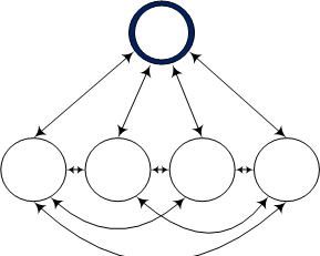
Communication Models 2-1-2013 3Deliberate

The classic model of collaboration consists of a group of individuals all communicating with each other to achieve some goal. Brainstorming is an example of this form of collaboration. Usually, there is a leader, facilitator, or at least, a recorder. Everyone deliberates together and occasionally comes upon a solution for a pressing problem, such as what to have for lunch.

Negotiate
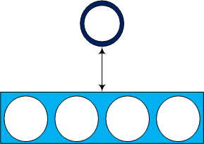
Communication Models 2-1-2013 4Negotiations may involve two or more individuals, two or more groups of individuals represented by spokespersons, or some combinations of those. Interactions in negotiations are far more complex than other forms of collaboration because speakers often represent many opinions and may not even agree with what they are told to say. Sports agents and defense attorneys fall into this latter category.

Organization of Collaboration

Collaboration is a meeting of minds.

Collaboration is a meeting of minds.

Business collaboration normally requires somebody to be in charge. That person might be an organizational leader, a trained facilitator, or just an informed employee who acts as the originator of the process. If you read pop business articles on collaboration, you’ll usually see a picture of a group of young, attractive, well-dressed individuals gathered around a meeting table (now called collaboration tables). The leader is the young, attractive, well-dressed individual wearing glasses, hence, having greater intelligence. Originators and informed employees are usually active contributors to collaboration; facilitators guide the process; managers take credit and assign blame. Some collaborative efforts are tightly organized to the point of being scripted and having little flexibility. Other collaboration efforts are spontaneous, having a goal but no guidelines, thus putting them one goal ahead of most business meetings.

Participants in Collaboration

Success in collaboration depends on listening to other participants.

Success in collaboration depends on listening to other participants.

Collaboration requires at least two participants but also can involve an unlimited number of participants. If specific individuals are invited to collaborate, such as at a meeting, the number of participants would surely be limited. That’s both an advantage and a disadvantage to meetings. Collaboration using the internet, such as through a discussion forum, can involve numerous participants. The disadvantage of forums, especially those that allow open and anonymous participation, are trolls who post ignorant and inflammatory messages. Trolls are everywhere, even in private, in-house , networking forums having no anonymity. Some people just have troll personalities.

Logistics of Collaboration

Ask most people about collaboration and they’ll describe it as a face-to-face interaction. It doesn’t have to be. In fact, there are many great examples of collaboration in which the participants were separated by space or time. Foreign diplomacy used to be, and in some cases still is, conducted this way. There’s probably no better example of collaborating at different times and locations than Kennedy and Khrushchev working out a solution to the Cuban Missile Crisis even though they were located 4,857 miles and nine time zones apart. Likewise, it is possible, and sometimes ever preferable, for collaborators to contribute their ideas at different times from different locations. This also allows greater flexibility for more interesting office misadventures.

Interaction in Collaboration

Give quiet collaborators a chance to add their thoughts.

Give quiet collaborators a chance to add their thoughts.

Perhaps the first characteristic people think about when collaborating is how they will interact with others. There are several ways to communicate – by voice, text, and graphics. Vocal communication is simple but can have problems. If you’ve ever been on a conference call or virtual meeting in which speakers mumble or are drowned out by rustling papers and snoring, you know what I mean. Text can be less ambiguous if the message is honest and clearly written Text is also easier to archive than conversations, But text is a less efficient way to communicate than voice. It takes more time to plan and write a text message than it is to just babble. Likewise with graphics, you can present information more effectively but they are more laborious to prepare.

Hearing a variety of different opinions can help solve difficult problems.

Hearing a variety of different opinions can help solve difficult problems.

Two-thirds of workers in a typical office prefer face-to-face collaboration, perhaps because they can hear voices and read facial expressions and body language. Video chat isn’t quite the same as an in-person meeting because the subtle non-verbal cues can’t be recognized on the small, sometimes pixilated, and often interrupted-motion image on a computer screen. But face-to-face communications also have disadvantages. Some people are difficult to understand because they mumble or have strong accents. Some people are intimidated or annoyed by attempts to read body language. Some people can be misleading, usually much more often by voice than by writing. Some people dominate interactions and discourage others from participating, even when the introverts outnumber the extroverts. But the greatest disadvantage of face-to-face collaboration is the prevalent belief that it is the only effective way to collaborate.

Documentation of Collaboration

It’s beneficial to have a record of what happened during a collaboration session. Meeting minutes, for example, are a common way to document the ideas that were discussed. But, meeting notes are subject to the memory, interpretation, and bias of the note taker. Some collaboration methods, on the other hand, such as email, discussion forums, and videos, not only record everything that happened but do so automatically.

Methods of Collaboration

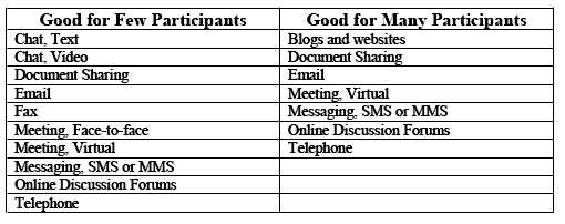
People often associate collaboration with meetings involving real time, face-to-face discussions at close quarters. There may be dozens of participants or just a few. But, there are many other ways to collaborate besides physical meetings. Telephone calls, both person-to-person and in a conference, are also tools for collaborating. There’s also the ancient but still useful fax technology.  The greatest growth in methods for collaboration, however, is attributable to the Internet. Ideas can be exchanged using blogs and websites, online discussion forums, document sharing in the Cloud, virtual meetings, text and video chat, messaging, both SMS and MMS, and of course the old reliable mainstay of business communications, email.

The following table summarizes the characteristics of common methods of collaboration.

Communication MethodsTable

Selecting a Collaboration Model

You can accomplish any collaboration objective — communication, administration, deliberation, or negotiation — in a variety of ways. Consider your time frame. If you have a deadline for the results of your collaboration, is it close or far in to the future? Is the deadline flexible or inflexible? A flexible deadline far into the future will allow you more options for collaboration than a firm, immediate deadline.

Here’s a good place for a meeting.

Here’s a good place for a meeting.

Some collaboration leaders aren’t very imaginative when it comes to selecting a model for how to implement their process. The always decide to call a meeting. You’ve seen the results — meetings that are rescheduled again and again to accommodate key participants, meeting rooms that are too small for the number of participants, and meeting durations that are interminably long or too short to accomplish the goals of the collaboration.

The Internet allows you to collaborate with experts you may not even know.

The Internet allows you to collaborate with experts you may not even know.

In selecting a model for collaboration, a primary consideration should be the participants and their logistics. First, do you want a few specific participants or everyone who is interested in your project? That is a fundamental decision that some collaboration leaders don’t even think about. They just invite participants who are at the same level in the organization or are in their own work. It’s important to include decision makers and other stakeholders but there are usually other informed individuals available who can add to the discussions.

Table 1

You also need to consider the availability of the participants, both in time and location. Sometimes the most appropriate participants for a collaboration can’t travel to attend a meeting or don’t have the time to participate. Those situations don’t have to exclude their participation. There are several methods of collaboration that work wherever the participants reside or whenever they are available to interact.
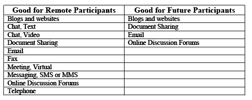
Table 2

Find a way to work toward a common goal.

Find a way to work toward a common goal.

The objective, schedule, and participants in a collaboration should determine what methods may be appropriate. You might also consider the preferences of your participants. In a typical office, almost everyone will be able to collaborate by telephone and email. About three-quarters will be able to share documents and chat. Half will follow company blogs and websites. A third will be active in online discussion forums and messaging. Three-quarters prefer collaborating with specific individuals and half prefer same-time collaboration. Two-thirds believe their productivity depends on collaborating with their co-workers but only a quarter link their productivity to their supervisors. And perhaps not surprisingly, a quarter of workers in a typical office would prefer to work on their own rather than collaborating. Half will be introverts who might not be comfortable interacting in an open forum (no, I didn’t make this up; I have survey results).

So, select a collaboration method, or better, a combination of methods, based on the types of interaction they offer to you and your participants. Then, plan your effort. But be aware that there are a few common dilemmas in planning a collaboration effort. Here are some examples:

  • Impending Deadline – You need some answers quickly. Keep the solution simple. Use the telephone, chat, or messaging.
  • Participants Unavailable – You find it difficult to schedule meetings or conference calls because key participants have other obligations. Don’t wait for the perfect time or place. Schedule a virtual meeting or share documents to focus discussions for when you do meet.
  •  Unidentified Expertise – You know what you want to do but don’t know how to do it or who can help. This is a perfect opportunity to use a discussion forum. You won’t know when or where your answer will come, but it probably will.
  • Low Priority – You want to collaborate on some issue but you’re just too busy to devote enough time to it. Share a document, write a blog, or post to a discussion forum.
  • Lack of Engagement – Your meetings are dominated by certain individuals while others are reluctant to interact. Share a summary document after the meeting where the quiet participants can record their ideas

In the 1900s, few people owned or could use a telephone. Today, most teenagers carry a cell phone with them everywhere. In contrast, the fax machine entered most every office in the 1970s but is now passé. In the 1980s, few people in business had access to email. A decade later, corporate managers were still having their secretaries printing out all their emails so they could read them. Today, email has matured. Even ninety-year-old great grandmothers have multiple email addresses. In a generation, though, email may become obsolete. The point is that we can be sure that new methods of collaborating will arrive and either replace or augment older methods. To be successful, business must adapt and professional must learn new skills for collaboration.

We can haz collaboration.

We can haz collaboration.

Read more about using statistics at the Stats with Cats blog. Join other fans at the Stats with Cats Facebook group and the Stats with Cats Facebook page. Order Stats with Cats: The Domesticated Guide to Statistics, Models, Graphs, and Other Breeds of Data Analysis at Wheatmarkamazon.com,  barnesandnoble.com, or other online booksellers.

Posted in Uncategorized | Tagged , , , , , , , , , , , | 1 Comment

The Foundation of Professional Graphs

Some people are content with visualizing their data sets using pie charts and bar charts. If you really want to analyze data, though, you need to know how to pick the best graph for the job. Here’s the first step in doing just that.

Creating a professional quality graph requires thinking about three elements:

Like cats, you can never have too many graphs.

Like cats, you can never have too many graphs.

  • Foundation — The fundamental type of graph selected on the basis of the characteristics of the variables to be plotted.
  • Framework — The specifications of the coordinate system, the axes, the points being plotted, and the aim of the graph.
  • Appearance — The labeling and other details that make the chart easier to understand.

This blog concerns the first of the three elements — the foundation of a graph.

Variables and Samples

To understand graphs, you have to understand two terms — variables and samples. Variables contain the pieces of information, the data, you collect from or about each of your samples. Variables are also called measures, metrics, scores, and attributes. Variables are represented by the axes of your graph.

A sample in statistics is usually thought of as a portion of a population. In graphing, samples are the individual pieces of a statistical sample-of-a-population. These individual pieces might be referred to as observations, subjects, patients, students, objects, items, measurements, entities, records, cases, or individuals. There are many terms for samples because there are many different types of populations. Medical studies have samples who are patients but may also collect blood (or other types of) samples. Education studies have samples that are students, classes, schools, and so on. Environmental studies may collect samples of air, soil or rock, plants or animals, or water. Samples in sports are usually players, athletes, or teams. Industrial samples are usually items or products. Get the idea? Samples are the points that will appear on your graph.

So in a sentence, variables determine where on a graph the samples are to be placed.

Variable Scales

The first thing you’ll need to do to create a professional graph is to select the foundation — the underlying type of graph. This foundation is based on the scales on which the variables are measured.

Cats understand what scales are for.

Cats understand what scales are for.

Scales describe the relationship between successive levels of a measurement of a variable. Just as there are many different types of musical scales based on the intervals between steps of pitch, there are different measurement scales based on the intervals between scale values. For graphing, there are three types of scales to consider:

  • Nominal scales describe categories with no mathematical relationship with each other.
  • Ordinal scales have ordered categories, like counts, but the intervals between the steps may or may not be equal.
  • Continuous scales have no breaks between steps and the intervals between steps are equal.
Ordinal scale cats.

Ordinal cats.

Think of nominal scales as stepping stones, they can be arrayed in any manner. Ordinal scales are like stairs; steps occur in an order with gaps between them. Continuous scales are like ramps having a smooth and continuous transition from low to high.

Take Olympic boxing as an example. Gold Medalist Katie Taylor of Ireland is a 132-pound (continuous scale) lightweight (125-132 pound interval of an unequal-interval ordinal scale) woman (nominal scale). Another example is the length of a football (American) game. Games are divided into four quarters (equal-interval ordinal scale) each fifteen minutes long (continuous scale, though the fractions of minutes are converted to seconds), which in real time typically lasts about four hours (continuous scale).

Time scales are especially important in graphing because they are the basis for so many statistical relationships. Time is always measured on at least an ordinal scale, but the intervals between time periods are not always equal. Geologic time, for example, has more to do with rock layers and fossils than with age even though the unit of the time scale is years. Real time can be measured in years, months, weeks, days, hours, minutes, and seconds. As long as you don’t mix the units, the intervals will be equal.

Plotting ordinal scales can be problematical when the intervals the scales represent are not equal. Worse, there are cases in which the sizes of the intervals are unknown. Consider these examples:

Equal intervals: Counts, annual measurements
Unknown intervals: Likert scales, many biomedical and psychometric scales
Unequal intervals: Geologic time, mineral hardness, weight classes in sports, civil service pay grades

Ordinal scales are often used for describing obscure concepts like satisfied-unsatisfied and good-bad which are used often on opinion surveys. No one can say whether differences between the scale levels are equal or not. Still, it may appear that way when graphed leading to misleading interpretations.

Transforming Scales

Changing the scale of a variable to be graphed is feasible in most cases and useful in some, but not always a good idea. That’s because by changing scales you are changing the information content of the variable, and hence, it’s meaning.

Converting a continuous scale to an ordinal scale leaves information by the wayside. You reduce precision, and sometimes, accuracy. Still, there are reasons for doing so, most typically, to reduce extraneous measurement variability.

Catzilla awaits an opponent in his weight class.

Catzilla awaits an opponent in his weight class.

Katie Taylor’s lightweight weight class is a good example. If Katie (or anyone else for that matter) were to weigh themselves repeatedly over the course of a day, they would find that their weight would fluctuate by a few pounds just due to normal bodily processes, like sweating. An intense workout can reduce weight by several pounds while rehydrating by drinking fluids will add weight. Consequently, using an ordinal scale weight class can reduce the apparent variability. Katie’s weight may change but not her weight class. Using an ordinal scale can also facilitate comparisons. It is much easier to find Katie a lightweight opponent than it would be to find her a 132-pound opponent.

Histograms are another example of how converting from a continuous scale to an ordinal scale can facilitate comparisons, in this case, between a distribution of data measurements and a theoretical mathematical model. However, the interval you choose for the ordinal scale can greatly affect the appearance of the graph. There are better ways to compare sample distributions to theoretical models but they are more complicated than histograms.

Converting an ordinal scale to a continuous scale requires the addition of information. This can be a difficult but useful process because graphing is simpler if your variables are measured on continuous scales. Three commonly used conversion processes are:

Cat indexing cash.

Cat indexing cash.

  • Standardization to percentages by dividing each measurement by the total of the measurements. The converted data will fall into the range 0% to 100%.
  • Normalization to z-scores by subtracting the man of a variable from each measurement and then dividing by the variable’s standard deviation. Most of the converted data will be close to 0 and fall into the range -2 to 2.
  • Indexing to a more representative value by dividing each measurement by values that facilitate comparisons. A good example is the Consumer Price Index.

There are many other ways to convert ordinal scales to continuous scales, for instance, by multiplying or dividing two ordinal scale variables. But, only make the conversion if it makes theoretical sense for your analysis.

Basic Types of Graphs

There are more kinds of graphs than most people, even data analysts, would ever need to know about, but they are really all just variations of a few basic graphs.

Scatter plots: Plots of two continuous-scale variables. Usually only points are shown without connecting line.
Line plots: Plots with an ordinal-scale variable on the horizontal axis and an ordinal or continuous-scale variable on the vertical axis. Points usually are connected by lines.
Bar charts: Plots with an ordinal or continuous-scale variable on the vertical axis and a nominal or ordinal-scale variable on the horizontal axis. Sometimes the axes are reversed. Data are usually represented by bars instead of points.

Start with these basic types. As you consider the framework of the plots (i.e., axes, focus, objective, data dimensions, and priority) you’ll see how the basic graph types can easily take on many different appearances.

Scales and Types of Graphs

Cats love bar charts.

Cats love bar charts.

In graphing, selecting an appropriate type of graph depends on whether the variables you want to plot are measured on ordinal or continuous scales or both. Nominal scales don’t enter into selecting a type of graph even though they are used often in graphing, usually to compare groups of data.

Here is an overview of the relationships between variable scales and the types of graphs they can be used with.

First Variable Scale

Second Variable Scale

Appropriate Graphs

Continuous Ordinal: equal intervals Line, scatter if the ordinal variable has many levels
Continuous Ordinal: unequal intervals Bars
Ordinal: equal intervals Ordinal: equal intervals Line, scatter if the ordinal variables have many levels
Ordinal: equal intervals Ordinal: unequal intervals Bars
Ordinal: unequal intervals Ordinal: unequal intervals Bars
HINT: Start simply, usually with no more than two variables. Experiment with the framework and appearance of the graph to make it tell the story.
Always be sure you have a good foundation.

Always be sure you have a good foundation.

Once you understand the scales of your variables, you can choose the basic kind of graph that will work best with your data. But remember, there are other types of graphs, subspecies of the basic graphs, variations and extensions of these graphs, combinations of graphs, and graphs that go by a variety of different names. For now, focus on the basic types of graphs. Make sure you start with a good foundation.

Read more about using statistics at the Stats with Cats blog. Join other fans at the Stats with Cats Facebook group and the Stats with Cats Facebook page. Order Stats with Cats: The Domesticated Guide to Statistics, Models, Graphs, and Other Breeds of Data Analysis at Wheatmark, amazon.com,  barnesandnoble.com, or other online booksellers.

Posted in Uncategorized | Tagged , , , , , , , , , , , , , | 11 Comments