Many Paths Lead to Models

I know where I am and where I want to go.

If you’ve never created a statistical model before, you might be surprised to find that the process involves a lot more than statistics. It’s like traveling. You don’t start by thinking about your transport, the plane, train, or bus you might take. You start by knowing where you are and where you want to go. Only then do you create your itinerary, select a carrier, buy a ticket, pack your belongings, and make the trip. Likewise, modeling starts with the phenomenon you’re trying to model and ends with the model. Between those two points, though, there are many possible routes.

For example, after studying a phenomenon, you might decide how you would use a model, and from that, decide what the model should focus on, what data you’ll need, what statistical method you’ll use, and how you’ll calibrate the model. Or, you may be given a dataset by a client, and from the samples and variables, you determine what models could be created, and what statistical methods would be required. Sometimes, you decide what you want the model to do, but the variables would be too difficult or costly to collect, so you have to revise the model specifications and reconsider the samples and variables. Similarly, you might find that the statistical method you want to use will require different data or model boundaries, so you have to reconsider your plans. It’s not uncommon to iterate through these considerations several times before you’re ready to advance to the actual modeling process.
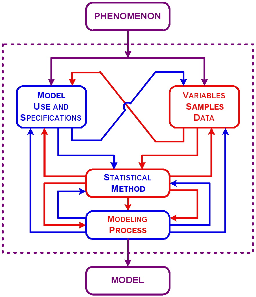
As you model more and more phenomena, you’re likely to take these paths and many more. Each excursion through the maze of modeling elements will be a new and different adventure for you to learn from. If you get lost, find someone to give you directions. Here are a few to get you started.

The Phenomenon

The first thing you’ll have to do is to think about the phenomenon you want to model. This may sound trivial, but it’s not. Even if you were assigned the work by your boss or academic advisor, you’re going to have to make a lot of decisions on your own. If they were going to make all the decisions, they wouldn’t have given the project to you.

The nature of the phenomenon has to do first with how tangible the phenomenon is. Is the phenomenon an object that can be seen and touched? Is it a process that can be watched and interacted with or a behavior that can be observed but not necessarily manipulated? Is it a condition that can be monitored, or if not visible, at least measurable (like radioactivity)? Or, is it an opinion that can’t be seen or touched, and may not even be measurable directly?

The nature of the phenomenon also has to do with how changeable the phenomenon is. Is it something that is fixed and unchangeable? If it changes, what is the rate of change? Is it too slow or too fast to be observable? Does the phenomenon exist in states of equilibrium and disequilibrium? Can changes be manipulated by an experimenter? Thinking about the nature of the phenomenon will help you narrow your options for what form might be appropriate for the model. For example, would it be possible to build a physical model or will the model have to be a less tangible written model, blueprint, computer application or mathematical equation? It’s not uncommon for several types of models to be developed to display, manipulate, or substitute for the phenomena. Automakers, for example, make many types of models of the automobiles they sell, from the styling, to the performance, to the marketing.

Model Use and Specifications

After the phenomenon, you’ll need to think about what you want to do with the model and how it will be designed. You can use a model to:

  • Display—use the model to describe or characterize the sample or the population.
  • Substitute—use the model in place of the phenomenon, such as for prediction.
  • Manipulate—use the model to explain aspects of the phenomenon.

As a point of reference, most models involve the simple display of descriptive information. If you plan to use them for substitution or manipulation, you’ll have to know more about the phenomenon, more about modeling, and more about statistics.

Whatever your planned use, you’ll have to think about how you want to approach the modeling. Three factors you ought to consider are the viewpoint you’ll take to develop the model, the level of detail of the model, and the boundaries of the model relative to the phenomenon.

Modeler’s Viewpoint

Your viewpoint in modeling is how you plan to approach the effort, that is, either from the top down or the bottom up. A top-down viewpoint will require you to understand the big picture, things like what the phenomena is associated with. This viewpoint is more correlative and is commonly used in statistical models, especially predictive models. A bottom-up viewpoint will require you to understand the details, the conditions that cause or affect the phenomena. This viewpoint is more deterministic and is commonly used in theoretical models and in statistical models for explanation.

Top-down models usually don’t require as many variables as bottom-up models so long as they are the right variables. The problem with top-down models is that sometimes relationships appear to be oversimplified or obscure. Why should skirt length predict stock prices, for example? It makes no sense, but a high correlation has been found between the two measures.

Bottom-up models tend to require more variables to characterize all the facets of a phenomenon. Larger numbers of variables, in turn, require greater levels of effort than for top-down models. Furthermore, many of the details included in a bottom-up model are often found not to have a significant impact on the overall model. Hence, bottom-up modeling tends to be labor intensive and inefficient, but in the end, at least you know how everything fits together.

Some modelers take their viewpoint as an extension of their own personalities. Big picture people think of a phenomenon in terms of general concepts, mechanisms, trends, and patterns and tend to model from the top down. They don’t care if their favorite team has weaknesses as long as the team’s winning percentage is high. Details people think of discrete parts or elements that make up a phenomenon, and tend to model from the bottom up. They believe the whole is equal to the sum of the parts. Their team could be in first place, but they’re concerned about one player who is in a slump.

Often both viewpoints work equally well for modeling a phenomenon. Sometimes, though, one or the other viewpoint will work better, be easier, or even be the only feasible approach. For example, say you want to model the performance of an automobile. Using a top-down viewpoint, you might focus on acceleration, gas mileage, top speed, and so on. You might be able to model how the automobile will perform under certain driving conditions, but you won’t learn anything about how the components of the automobile work together. Using a bottom-up viewpoint, you might focus on number of cylinders, gear ratios, timing, and so on. You might be able to model how changing a component could boost or diminish its function, but you won’t know if the change would provide the same effect to the automobile’s overall performance. You have to be sure that your viewpoint is appropriate for how you plan to use the model or else the model won’t be useful. At every step in your modeling effort, ask yourself, “will I be able to do what I need to do with the results of the model?”

Model Details

Every phenomenon complex enough to have to be modeled assuredly has many levels of detail. You have to decide how much detail to put in your model, especially if your viewpoint is bottom-up. Still, there are practical limits imposed by restrictive budgets and schedules or by what is known about the phenomenon. For example, if you want to model the performance of an automobile, do you concentrate on the engine or also consider aerodynamics, steering, braking, and other components? If you concentrate on the engine, do you focus on the internal combustion components or also consider the pollution control devices, the electrical system, and other components? If you concentrate on the internal combustion components, do you focus on the pistons or also consider the spark plugs and the fuel?

Model Boundaries

Where will your model end? This is easy to visualize with location and time; you can draw a line on a map or block out dates on a calendar. Many phenomena aren’t so easy to isolate, though. Processes, in particular, often use inputs from other processes or contain subprocesses that can’t be isolated. In modeling the performance of an automobile, for example, do you include different makes (e.g., Ford, Honda), different models (e.g., sedans, SUVs), different options (e.g., engines, transmissions), different drivers, different types of road conditions, and so on.

These determinations will affect everything else you do.

Other Model Specifications

There are many other things about your model that might have a bearing on the variables and samples you select, the statistical methods you use, and how you go about optimizing the model. Here are a few specifications that may be relevant to your model:

  • Users—Who will be using the model? If it’s just you, the model may not need to have a polished appearance and extensive documentation. If others will be using the model, though, consider that audience. You may not have to build a comprehensive user interface, but you’ll at least need to try to make it understandable and sufficiently documented. Don’t try to make it idiot-proof; it’s not worth the effort. God is just too good at making idiots.
  • Frequency of Use—If the model will be used on a recurring basis, make sure there will be some provision for you or some other qualified individual to review the model periodically to ensure it is being used correctly and is still appropriate for representing the phenomenon.
  • Accuracy and Precision—As a general rule, statistical models tend to be fairly accurate but never as precise as you need them to be. Have some notion of the accuracy and precision you want. That way you’ll know when either you’re done or it’s time to quit. A good way to specify the precision you want is to start from a gut feeling and specify the precision as a percentage, for example, ±5 percent or ±10 percent. Then you’ll have to control variance and manipulate the number of samples and the confidence level so that a confidence interval is close to your target precision.
  • Limit of Complexity—Some models were not meant to be. If you can’t fit the model to the data, you have to be prepared to call it quits. In a way, this is equivalent to a Do Not Resuscitate order in medicine, and likewise, it can be a sensitive subject. It’s usually easier to create new variables or try some other statistical manipulation than it is to give the bad news, and the bill, to the client.

So, those are some of the issues you’ll want to consider when you build a statistical model. There’s much more to think about, of course, especially when you start collecting the provisions for your model—the samples, variables, and data. Now to be candid, you’ll give some of these topics only a few nanoseconds of thought before you jump into the maelstrom of model building. Some you’ll think about constantly throughout your modeling effort. Some will just be what they turn out to be. Model building is an adventure. Every journey is unique so savor the experiences.

Read more about using statistics at the Stats with Cats blog. Join other fans at the Stats with Cats Facebook group and the Stats with Cats Facebook page. Order Stats with Cats: The Domesticated Guide to Statistics, Models, Graphs, and Other Breeds of Data Analysis at Wheatmark, amazon.combarnesandnoble.com, or other online booksellers.

Posted in Uncategorized | Tagged , , , , , , , , | 6 Comments

Secrets of Good Correlations

If you’ve ever seen a correlation coefficient, you’ve probably looked at the number and wondered, is that good? Is a correlation of -0.73 good but not a correlation of +0.58? Just what is a good correlation and what makes a correlation good?

Negative Feline Correlation

The strength of the relationship between two variables is usually expressed by the Pearson Product Moment correlation coefficient, denoted by r. Pearson correlation coefficients range in value from -1.0 to +1.0, where:

-1.0 represents a perfect correlation in which all measured points fall on a line having a negative slope

No Feline Correlation

0.0 represents absolutely no linear relationship between the variables

+1.0 represents a perfect correlation of points on a line having a positive slope.

Positive Feline Correlation

If you have a dataset with more than one variable, you’ll want to look at correlation coefficients.

The Pearson correlation coefficient is used when both variables are measured on a continuous (i.e., interval or ratio) scale. There are several variations of the Pearson Product correlation coefficients. The multiple correlation coefficient, denoted by R, indicates the strength of the relationship between a dependent variable and two or more independent variables. The partial correlation coefficient indicates the strength of the relationship between a dependent variable and one or more independent variables with the effects of other independent variables held constant. The adjusted or shrunken correlation coefficient indicates the strength of a relationship between variables after correcting for the number of variables and the number of data points. There are also correlation coefficients for variables measured on noncontinuous scales. The Spearman R, for instance, is computed from ordinal-scale ranks.

Types of Correlation Coefficients.

So, what is a good correlation? It depends on who you ask.

  • I once asked a chemist who was calibrating a laboratory instrument to a standard what value of the correlation coefficient she was looking for. “0.9 is too low. You need at least 0.98 or 0.99.” She got the number from a government guidance document.
  • I once asked an engineer who was conducting a regression analysis of a treatment process what value of the correlation coefficient he was looking for. “Anything between 0.6 and 0.8 is acceptable.” His college professor told him this.
  • I once asked a biologist who was conducting an ANOVA of the size of field mice living in contaminated versus pristine soils what value of the correlation coefficient he was looking for. He didn’t know, but his cutoff was 0.2 based on the smallest size difference his model could detect with the number of samples he had.

Is 0.2 a good correlation or does a good correlation have to be at least 0.6 or even 0.98? As it turns out, the chemist, the engineer, and the biologist were all right. Those correlations were all good for those uses. So, the meaningfulness of a correlation coefficient depends, in part, on the expectations of the person using it.

But how do you know what value of a correlation coefficient you should expect for it to be good? One answer is to look at the square of the correlation coefficient, called the coefficient of determination, R-square, or just R2. R-square is an estimate of the proportion of variance in the dependent variable that is accounted for by the independent variable(s). It is used commonly to interpret the strength of the relationship between variables and to compare alternative statistical models.

You might be able to decide how good your correlation is from a gut feel for how much of the variability you wanted a relationship to account for. For example, correlation coefficient values between approximately -0.3 and +0.3 account for less than 9 percent of the variance in the relationship between two variables, which might indicate a weak or non-existent relationship. Values between -0.3 and -0.6 or +0.3 and +0.6 account for 9 percent to 36 percent of the variance, which might indicate a weak to moderately strong relationship. Values between -0.6 and -0.8 or +0.6 and +0.8 account for 36 percent to 64 percent of the variance, which might indicate moderately strong to strong relationship. Values between -0.8 and -1.0 or +0.8 and +1.0 account for more than 64 percent of the variance, which might indicate very strong relationship.

That’s only part of the story, though. Two other things you have to do to decide if a correlation is good are plot the data and conduct a statistical test.

Plots—You should always plot the data used to calculate a correlation to ensure that the coefficient adequately represents the relationship. The magnitude of r is very sensitive to the presence of nonlinear trends and outliers. Nonlinear trends in the data cause the magnitude of the relationship to be underestimated. You can often use transformations to straighten any nonlinear patterns you see (https://statswithcats.wordpress.com/2010/11/21/fifty-ways-to-fix-your-data/). Outliers (i.e., data values not representative of the population) that are located perpendicular to the data trend cause the relationship to be underestimated. Outliers parallel to the data trend cause the relationship to be overestimated.

Tests—Every calculated correlation coefficient is an estimate. The “real” value may be somewhat more or somewhat less. You can conduct a statistical test to determine if the correlation you calculated is different from zero. If it’s not, there is no evidence of a relationship between your variables. This test looks at the absolute value of the correlation coefficient and the number of data pairs used to calculate it. The larger the value of the correlation and the greater the number of data pairs, the more likely the correlation will be significantly different from zero. For example, a correlation of 0.5 would be significantly greater than zero based on about 11 data pairs but a correlation of 0.1 wouldn’t be significantly different from zero with 380 data pairs. That’s why all statistical software outputs the number of data pairs and the test probability with a correlation. With some software, you can also calculate a confidence interval around your estimate to see if the interval includes the value you set as a goal. But one way or the other, you have to consider the variability of your calculated estimate to decide if the correlation is good.

Correlation coefficients have a few other pitfalls to be aware of. For example, the value of a multiple or partial correlation coefficient may not necessarily meet your definition of a good correlation even if it is significantly different from zero. That’s because the calculated values will tend to be inflated if there are many variables but only a few data pairs, hence the need for that shrunken correlation coefficient. Then there’s the paradox that a large correlation isn’t necessarily a good thing. If you are developing a statistical model and find that your predictor variables are highly correlated with your dependent variable, that’s great. But if you find that your predictor variables are highly correlated with each other, that’s not good, and you’ll have to deal with this multicollinearity in your analysis. Finally, if you’re calculating many correlation coefficients from a large data set, you might find that the number of data pairs is different for each calculation because of missing data. Some statisticians believe it is acceptable to compare correlations calculated with different numbers of data pairs and other statisticians believe it is unwarranted, nonsensical, dishonest, fraudulent, heinous, and sickeningly evil.

What to Look for in Correlations.

What makes a good correlation, then, depends on what your expectations are, the value of the estimate, whether the estimate is significantly different from zero, and whether the data pairs form a linear pattern without any unrepresentative outliers. You have to consider correlations on a case-by-case basis. Remember too, though, that “no relationship” may also be an important finding.

Read more about using statistics at the Stats with Cats blog. Join other fans at the Stats with Cats Facebook group and the Stats with Cats Facebook page. Order Stats with Cats: The Domesticated Guide to Statistics, Models, Graphs, and Other Breeds of Data Analysis at Wheatmark, amazon.combarnesandnoble.com, or other online booksellers.

Posted in Uncategorized | Tagged , , , , , , , , , , , , , , , , , , | 36 Comments

Fifty Ways to Fix your Data

Fifty Ways to Fix your Data

(Sing to the tune of “Fifty Ways to Leave Your Lover” by Paul Simon)

The problem is all about your scales, she said to me
The R-squares will be better if you’ve matched ’em mathematically
It’s just a way to make your model fit nicely
There must be fifty ways to fix your data

She said it’s really not my preference to transform
‘Cause sometimes, the new scales confuse, overfit, or misinform
But I’ll Box-Cox ’em all if it means they’ll fit the norm
There must be fifty ways to fix your data
Fifty ways to fix your data

Take the tails for a trim, Kim
Try a replace, Grace
You can use the rank, Hank
Just try ’em and see
Make it more smooth, Suz
Lots of functions you can choose
A higher degree, Dee
Will get you more fee.

There must be fifty ways to fix your data.

In exploring a dataset, you need to be sure that you have the right numbers and that those numbers are right. You need to find and fix problems with individual data points like errors and outliers. You need to find and fix problems with observations like censored data and replicates. And you need to find and fix problems with variables like their frequency distributions and their correlations with other variables. Often, rehabilitating variables involves transformations, methods of changing the scales of your variables that might further your analyses.

As part of this process, you should consider what other information you can add that might be relevant to your analysis. This is especially important if you are planning to develop an exploratory statistical model. Experience will tell you when expanding your dataset might make a difference and when it won’t. If you don’t have that experience yet, start by learning about why you might transform variables and how it can be done. Then practice; try a variety of different techniques and learn along the way. But first you need to understand some of the pros and cons of what you might do to your dataset.

Transformations: Yes But No But Yes

There is some controversy over the use of transformations (and other methods of creating new variables) that has caused a few statisticians to argue forcefully either for or against their use. The three most common arguments that have been made against the use of transformations involve:

  • Analyze what you measure. Don’t complicate the analysis unnecessarily. Stick to what the instrument was designed to measure in the way it was designed to measure it.
  • Use scales consistently. Don’t confuse your readers unnecessarily. Report results in the same units that you used to measure the data.
  • Let the data decide. Don’t capitalize on chance by overfitting your model. Your results should work on other samples from the same population.

There is a single simple argument for the use of transformations—they work better than the original variable scales. If they don’t work better, you don’t use them. William of Ockham would have liked that argument. So what constitutes working better? Consider these examples of the three ways that transformations are used.

One, perhaps the most important use of transformations is to reduce the effects of violations of statistical assumptions. If you plan to do any statistical analysis that involves using a Normal (or other) distribution as a model of your dependent variable, it’s important to use a scale that makes the data fit the distribution as closely as possible. If the data aren’t a good fit for the distribution, probabilities calculated for some tests and statistics will be in error. Because costly or risky decisions may be made from these probabilities, inaccuracies can be a big deal. So using a transformation to correct violations of statistical assumptions is a very important use.

Two, perhaps the most common use of transformations is to find scales that optimize the linear correlation between data for a dependent variable and data for independent variables. Statistical model building almost always benefits from this use of transformations. Everybody does it.

Three, perhaps the most overlooked use of transformations is, in a word, convenience. Sometimes transformations are used to convert measured data to more familiar units, improve computational efficiency, eliminate replicates, reduce the number of variables, and other actions that facilitate, but not necessarily improve, the analysis.

Now that you’ve been warned, here are four things you can do that might further your analyses:

  • Sample Adjustments—methods for fixing missing, erroneous, or unrepresentative data points.
  • Dependent Variable Transformations—methods for changing the scale of the dependent variable to minimize the effects of violations of statistical assumptions.
  • Independent Variable Transformations—methods for creating new variables from the original independent variables, which have better correlations with the dependent variable.
  • Supplemental Variables—methods for creating new variables from untapped data sources.

There is nothing sacred about this classification. Some of the categories might overlap or omit other ideas, so use these examples to stimulate your own thinking. In time, you’ll develop a sense of what you need for a particular analysis.

Sample Adjustments

Sample adjustments involve changing individual data points for a variable. Unlike most transformations which result in the creation of a new variable, sample adjustments leave the original variable intact. You use adjustments to correct errors, fill in missing data, reveal censored data, rein in unrepresentative replicates, and accommodate outliers. Using sample adjustments is a good place to start enhancing your data set. They are like digging out weeds and filling in holes before you plant a new lawn. It wouldn’t make sense to do it later, or worse, not at all.

Dependent Variable Transformations

After you’ve filled all the holes in your data matrix with sample adjustments, the next thing you should do is to make sure the dependent variable approximates a Normal distribution. If you haven’t looked at histograms and other indicators of Normality, always do that first. Then if your data distribution differs enough from the Normal distribution to make you nervous about your analysis, try a transformation of the dependent variable. Try several, in fact. Transformations of dependent variables create new variables but you’ll keep only one of the candidate dependent variables for an analysis. You want to pick the candidate dependent variable that fits a theoretical distribution best so that calculations of test probabilities are most accurate. If the frequency distribution of your dependent variable is skewed toward higher values, try a root transformation. If the frequency distribution is skewed toward lower values, try a power transformation. Better yet, try a Box-Cox transformation. Box-Cox transformations include the most commonly used transformations—roots, powers, reciprocals, and logs—as well as an infinite number of minor variations in between. The only downside is that the process is labor intensive if you don’t have statistical software that performs the analysis.

Independent Variable Transformations

Once you have the dependent variable you want to work with, you can go on to examine all the relationships between that dependent variable and the independent variables. While the target for transforming a dependent variable is the Normal frequency distribution, the target for transforming independent variables is a straight-line correlation between the dependent variable and each independent variable. This can be a lot of work. Remember, you have to look at correlations and plots, perhaps even for special groupings of the data. That’s the reason you always start by finding a scale for the dependent variable that fits a Normal distribution. You wouldn’t want to repeat this process for more than one dependent variable if you didn’t have to.

Variable Adjustments

Variable adjustments are changes, some quite minor, made to all the values for a variable (as opposed to just modifying specific samples as in sample adjustments). All variable adjustments create new independent variables for analysis. Examples of variable adjustments include:

  • Differencing. Differencing involves subtracting the value of a variable from a subsequent value of the same variable, usually used to highlight differences. Durations in a time-series are calculated by differencing.
  • Smoothing. Smoothing is the opposite of differencing and usually involves some type of averaging. Smoothing is used to suppress data noise so patterns become more evident.
  • Shifting. Data shifting involves moving data up or down one or more rows in a data matrix to produce new variables called lags (when previous times are shifted to the current time) or leads (when subsequent times are shifted to the current time). Shifting all the data by one row is called a first-order lag or lead. Shifting data for a variable by k rows is called a k-order lag or lead.
  • Standardizing. Standardizing involves equating the scales of some variables, usually by dividing the values by a reference value. Examples include adjusting currency for inflation, and calculating z-scores and percentages. differencing, data shifting, smoothing, and standardizing.

Variable Rescaling

Sometimes it can be useful to change the scale or units of a variable to simplify or facilitate an analysis, by:

  • Rescaling for computational efficiency
  • Converting units, either with or without adding information
  • Converting quantitative scales to qualitative scales
  • Increasing the number of scale divisions
  • Decreasing the number of scale divisions

Changing the scale of a variable is different from changing the units of a variable. Both are important. Changing units usually involves only simple mathematical calculations with or without the addition or deletion of information. Rescaling variables involves adding or removing information or changing a point of reference. Rescaling usually involves making changes based on logic but may include mathematical calculations as well. Recoding is perhaps the most common way of rescaling a variable. Some statistical software have utilities to facilitate recoding.

Variable Linearization

Improving the correlation between a dependent variable and an independent variable is a big part of statistical modeling. The objectives of this type of transformation are (1) to persuade the data to follow a straight line, and (2) minimize the scatter of the data around the line. Here are a few examples of mathematical functions used as transformations.


Variable Combinations

Variable combinations are new variables created from two or more existing variables using simple arithmetic operations (sums, differences, products, and ratios) or more complex mathematical functions. Variable combinations should be based on theory rather than created for convenience. Usually the variables combined should have the same units (e.g., dollars), although units can be standardized using z-scores.

Supplemental Variables

You won’t necessarily just add variables at the beginning of your analysis. You may add them continuously throughout your analysis as you learn more about your data. Some variables may turn out to be critical to the analysis and others will just facilitate reporting or some other ancillary function. Supplemental variables can be creating by concatenating or partitioning existing variables, or by adding new information from metadata or external references (e.g., federal census data).

You Can Teach Old Data New Tricks

When your instructor gave you a dataset in Statistics 101, that was it. You did what the assignment called for, got the desired answer, and you were finished. But it doesn’t work that way in the real world overflowing with data but lacking in wisdom. Sometimes you have to put more effort into making sense of things. Statistics is the mortar that brings data and metadata together to make building blocks of information into a temple of wisdom. Transformations are like mason’s tools. They can smooth, reshape, adjust, add texture, augment, condense, and on and on. Suffice it to say that with transformations, there must be at least fifty ways to fix your data.


Read more about using statistics at the Stats with Cats blog. Join other fans at the Stats with Cats Facebook group and the Stats with Cats Facebook page. Order Stats with Cats: The Domesticated Guide to Statistics, Models, Graphs, and Other Breeds of Data Analysis at Wheatmark, amazon.combarnesandnoble.com, or other online booksellers.

Posted in Uncategorized | Tagged , , , , , , , , , , , , , , , , , , , , | 31 Comments

You Can Lead a Boss to Data but You Can’t Make Him Think

The most carefully planned data analysis may not survive the intervention of a boss (or a client or other reviewer), whether well intentioned or not. Your aim may be to generate sound data and conduct a thorough and valid analysis, but your boss may have different motives and concerns. He or she may have budget or schedule constraints, not to mention business vulnerabilities and office politics to contend with. So be prepared when the unthinkable happens … like just a few days before you planned to start collecting data your boss calls you into his office and says:

Change This Before You Start

Add a sample, reword a procedure, drop a measurement, and other requests that will defile the perfect data collection and analysis plan you spent so much time creating. What do you do?

Adding a sample or measurement may not be a problem so long as you have the equipment and sampling supplies available. Changing a survey shouldn’t be a big deal if you haven’t already printed the questionnaires. Do what the boss wants and don’t worry about it too much.

Changing sampling procedures or rewording survey questions may or may not be a problem. Keep an open mind. It’s when the validity of the sampling procedure or meaning of the survey question is changed that you have to be careful. Sometimes the changes may seem subtle. For example, changing the order in which samples are collected may seem inconsequential but it may have an impact on the results. Asking survey respondents if they do something once a week is not the same as asking if they do something often. Asking if something is good, is not the same as asking if something is better than expected.

Dropping a measurement or question is problematical. If you didn’t need it, you wouldn’t have included it in the first place, but your boss won’t see it that way. Metadata and supporting measurements seem to be a favorite target of bosses looking to put their stamp on your plan. They might not understand that you really need those survey questions that characterize the respondents. These omissions are tough to lose but it’s better to have something over nothing. Make sure the boss knows what he’ll be losing and go with what you can.

We Can’t Afford This

That’s more than I expected to spend is a mantra statisticians hear often. You may even have said it yourself to the dealer of that hot red convertible you want, or to the plumber who came to fix your broken water main, or to the tax preparer you finally cornered at 5:00 pm on April 15. Did you pay up, pass on the offer, or negotiate something in between? Likewise, there are three things that your boss can do in this situation:

  • Relent and pay for the study
  • Negotiate a reduced price
  • Cancel the study (or get someone cheaper to do it).

You want the first thing to happen and can live with the second, but the third would be a disaster.

So put yourself in your boss’s position. Is the analysis something he has to do? If so, gently review the consequences of not doing it. What is it he doesn’t want but might get if the study isn’t done? Will his boss be upset? Will a regulatory agency come calling? Paint a picture of the cost of the consequences compared to the cost of the study. If the analysis is something he doesn’t have to do, you’ll have to convince him that it is something he wants to do it, or even better, he needs to do. Consider what the boss is looking to do with the results. Show him how your data analysis will add value to his operation. Give him a clear vision of what the payback will be.

If that doesn’t work, try working out a compromise. Just remember, a cut in price has to be balanced by a cut in scope, otherwise you’ll have no credibility. If the cuts will impair the analysis so much that little will be gained, it’s better to pass on the study and survive to analyze another day.

That’s Too Many Samples

Having your boss (or client) ask if you can get by with fewer samples is almost a given. Unless the boss understands statistics and variability, it’s unlikely he’ll see the need for as many samples as you planned to collect. Agreeing to reduce the number of samples is a self-inflicted but nonfatal wound. The margin of error will be bigger but quantifiable. Let the boss know what he’ll be getting. He should appreciate the concept of trade-offs since he has to deal with them all the time in his own work. This assumes, of course, that the boss is at least in the same ballpark as you. If you want 800 samples, and he was thinking of just asking a few customers some questions over lunch, you’re toast.

Here Are the Samples You Should Take

After spending a lot of time ensuring that your samples will be truly representative of your population, your boss gives you his list of samples to be collected. Will your boss’ list fairly represent the population or is there some perhaps unintentional bias? Does the boss want you to survey the biggest or oldest customers, or worse, the customers who will give the best reviews? Does he want you to sample only the processes or waste streams that he knows are already within specifications? What do you do?

This can be a deal breaker from your perspective. There’s no reason to collect data and do a statistical analysis with a judgment sample let alone a highly biased judgment sample. You’ll only be deluding your boss and yourself. Try to convince your boss that his directed samples will invalidate the study. If you can’t, take a list as a window onto your boss’s real reason for conducting the survey. He may just want something flattering to show his boss. If you still have to analyze the results even with the biased list, be sure to caveat your findings.

We’re Not Going to Do This After All

There are two common reasons the boss will pull the plug on a survey he asked for. The first is that he didn’t get approvals from his bosses. If you raise the level of attention of the survey in the organization early in the process, like when you go in search of data, this shouldn’t be a problem.

The second reason is funding. Some bosses relax during the first two quarters of the fiscal year then suddenly realize in the third quarter that they aren’t going to make their business plan unless they take drastic measures. Your survey will be the first thing to go, deferred if you’re lucky, canceled if you’re not. Try to schedule your survey for early in the fiscal year.

The Results Aren’t What We Expected

If your boss says he is surprised with your results, it could mean a couple of different things.

If the boss says either that the results were too general to tell anybody anything or that the results were too detailed for anybody to figure out, it’s a presentation problem. That’s actually a good thing. It can be fixed. Don’t be reluctant to get a communications specialist to help translate your work into a better presentation. You will benefit from more people being able to understand what you did.

If the boss is surprised by your results, and it’s not the presentation, it’s a virtual certainty that the results are unfavorable. There are at least four possible scenarios to consider:

  • The boss is really surprised by the results because he is out of touch with his business or whatever it is you studied. In this case, watch how he reacts as you explain some of the intricacies of the findings. As long as he doesn’t become defensive, it could be a great opportunity for both of you. If he does become defensive, try stressing that the results don’t take into consideration all the constraints he is under. Protect his fragile ego. You need him to take the next step and do something positive.
  • The boss is really surprised by the results because he thinks there may be a problem with the data or analysis. Double-check your work to be sure nothing is amiss statistically, and keep an open mind. The boss may be aware of some aspects of the data that may have skewed your results.
  • The boss is not surprised by the results but doesn’t want to admit it because he was hoping for something different. He’s playing dumb. This is his way of trying to deflect some responsibility away from himself. Play along. Remember, the only important thing is that he takes some positive action based on your results.
  • The boss was not surprised by the results but doesn’t want to admit it because the results don’t match what his boss wants to see. There’s not much you can do about this. The boss will probably take the results, and you’ll never hear of it again. Consider it a valuable life experience.

Just Give Me the Results; I’ll Take Care of the Rest

Everybody who has a boss has lived this alternative reality, whether you’re analyzing customer satisfaction data for the CEO or wrapping burgers for hungry customers. You give your work to the boss who becomes the face of the product. The boss gets all the accolades, and perhaps, an occasional complaint, while you get little if any recognition.

True, some bosses do this to try to claim credit for work they didn’t do, but this is usually transparent to anyone who matters. The CEO knows your boss neither conducted the analysis nor has the knowledge or the time to have done it. He is responsible, though, for the work you do. You know when you go to a restaurant that the host didn’t prepare the food. You know when the politician cuts the ribbon at the opening of the new library that he didn’t build the building or shelve the books. Those people represent the work of many.

Just give me the tuna. I’ll take care of the rest.

But a boss may want to be the spokesperson for your work for other reasons. He may want to bury unfavorable results. He may want to control access to the results because knowledge is power. Even more important, he may want to control access to you. Your demonstrated skills make your boss even more powerful. Finally, it’s possible that your boss doesn’t want you involved in decisions made as a result of your work. While this judgment is usually blamed on ego flexing, it may also be attributable to self-loathing over the decision-making process. If you think data analysis is messy, you should see what decision makers do. They are often illogical and inconsistent. They choose paths of least resistance over avenues of greatest effectiveness. They pay more attention to anecdotes than data. They worry about obscure possibilities and ignore likely consequences. They have a penchant for inaction and a desire to preserve the status quo. Unless you have a frustration deficit in your life, it might be better to let this one go.

One big issue with this response is that you don’t get any feedback. It’s nice to get recognition for your work but it’s absolutely essential that you get feedback. That’s how you grow as a professional and as an individual. If you can’t get any feedback from your boss, look elsewhere. Do any of your colleagues have opinions about the study? How did the high priest of the database like working with you? Do you ever run into the CEO or other managers in the hallway who might be familiar with what you did? Take whatever you can get (without making your boss paranoid) and put the knowledge to good use.

Read more about using statistics at the Stats with Cats blog. Join other fans at the Stats with Cats Facebook group and the Stats with Cats Facebook page. Order Stats with Cats: The Domesticated Guide to Statistics, Models, Graphs, and Other Breeds of Data Analysis at Wheatmark, amazon.combarnesandnoble.com, or other online booksellers.

Posted in Uncategorized | Tagged , , , , , , , , , , , , | 3 Comments

Ten Fatal Flaws in Data Analysis

1. Where’s the Beef?

In a way, the worst flaw a data analysis can have is no analysis at all. Instead, you get data lists, sorts and queries, and maybe some simple descriptive statistics but nothing that addresses objectives, answers questions, or tells a story. If that’s all you want, that’s fine. But a data report is not a data analysis. Reports provide information; analyses provide knowledge. It’s like with your bank account. Sometimes you just want a quick report of your balance. That information has to be readily available whenever you might need it and both you and the bank have to be working with exactly the same data. If you want to assess patterns in your spending, though, you have to conduct an analysis. Say you want to figure out how much more you’re spending on commuting over the past five years, you’ll have to compile the data and scrub out anomalies, like the cross-country driving you did on vacation, to look for patterns. Analyses involve much more than a glance (https://statswithcats.wordpress.com/2010/08/22/the-five-pursuits-you-meet-in-statistics/). They take time, sometimes, a lot of time. To make sure you’re getting what you need, look beyond the data tables for models, findings, conclusions, and recommendations. If they’re not there, you didn’t get an analysis.

2. Phantom Populations

If there were to be a fatal flaw in an analysis, it would probably involve how well the samples represent the population. Sometimes data analysts don’t give enough thought to the populations they want to analyze. They use observations to make inferences to a population that doesn’t exist. Populations must be based on some identifiable commonalities that would meaningfully affect some characteristic. A group of anomalies would not be a population. Opinion polls sometimes suffer from phantom populations. Say you surveyed people wearing red shirts. Could you then generalize to everyone who wears red shirts? Canadian researchers found one such phantom population when they tried to create a control group of men who had not been exposed to pornography (http://www.telegraph.co.uk/relationships/6709646/All-men-watch-porn-scientists-find.html). Make sure the population being analyzed is more than an illusion.

3. Wow, Sham Samples

Sometimes the population is real and well defined, but the samples don’t represent it adequately. This is a common criticism of opinion polls, especially election polls. It was the reason cited for why exit polls during the presidential election of 2004 indicated that John Kerry won many precincts that ballot counts later awarded to George Bush. Medical and sociological studies may have sham samples because it is often difficult to select subjects to match some target demographic. Likewise, environmental studies can suffer from inconsistencies between soil types or aquifers. To identify sham samples, look for three things: (1) a clear definition of a real population, (2) a description of how samples were selected so that they represent the population, and (3) information about any changes that occurred during sampling, such as subjects being dropped or samples moved.

4. Enough Is Enough

The number of samples always seems to be an issue in statistical studies (https://statswithcats.wordpress.com/2010/07/17/purrfect-resolution/). For too few samples, question confidence and power; for too many samples, question meaningfulness (https://statswithcats.wordpress.com/2010/07/26/samples-and-potato-chips/). Usually analysts are ready for this question but beware if they cite the old familiar fable about using 30 samples (https://statswithcats.wordpress.com/2010/07/11/30-samples-standard-suggestion-or-superstition/). It may indicate their understanding of statistics is not as formidable as you supposed. Also, if they appear to be using a reasonable number of samples but then break out categories for further analysis, make sure each category has an appropriate number of samples for the analysis they are doing.

5. Indulging Variance

Most people don’t appreciate variance. They don’t even know it’s there (https://statswithcats.wordpress.com/2010/08/01/there%E2%80%99s-something-about-variance/). If their candidate for office is up by two percentage points in a poll, they figure the election is in the bag. Even professionals like scientists, engineers, and doctors don’t want to deal with it. They ignore it whenever they can and just address the average or most common case. Business people talk about variances all the time, only they mean differences rather than statistical dispersion. Baseball players thrive on variance. Where else can you have two failures out of every three chances and still be considered a star? Data analysts have to understand variance and address it at every step of a project. Look for how variance will be controlled in study plans (https://statswithcats.wordpress.com/2010/09/05/the-heart-and-soul-of-variance-control/
https://statswithcats.wordpress.com/2010/09/19/it%E2%80%99s-all-in-the-technique/). Look for variance to be reported with results. And most importantly, look for some assessment of how uncertainty affects any decisions made from the analysis.

6. Madness to the Methods

NASA uses checklists to ensure that every astronaut does things correctly, completely, and consistently. Make sure the analysis you are doing or reviewing takes the same care. If there are multiple data collection points or times, be sure there is a standard protocol or script for generating the data. Be especially concerned if the data are collected over multiple years. Better and cheaper methods and equipment are continuously being developed so be sure they are compatible (https://statswithcats.wordpress.com/2010/09/12/the-measure-of-a-measure/). Be sure the data had been scrubbed adequately of errors, censored and missing data, replicates, and outliers (https://statswithcats.wordpress.com/2010/10/17/the-data-scrub-3/). Finally, be sure the data analysis method is appropriate for the numbers and natures of the variables and samples (https://statswithcats.wordpress.com/2010/08/27/the-right-tool-for-the-job/).

7. Torrents of Tests

If a statistical test is conducted in a study, false positives and false negatives can be controlled, or at least, evaluated. But if there are many tests, you can bet there will be false results just because of Mother Nature’s sense of humor. In groundwater testing, for example, there may be a test for every combination of well, analytes, and sampling rounds, resulting in literally hundreds of tests. There are strategies for dealing with this type of situation, such as hierarchical testing and the use of special tests (look for the term Bonferroni). Be careful of bad decisions based on a small proportion of the tests being (apparently) significant.

8. Significant Insignificance and Insignificant Significance

Here’s where you have to use your gut feel. If a test is statistically significant and you don’t believe it should be, ask about the confidence level and whether the size of the difference is meaningful. Just as correlation doesn’t necessarily imply causation, significance doesn’t
necessarily imply meaningfulness. If something is not statistically significant and you believe it should be, ask about the power of the test and the size of the difference the test should have detected. Be sure the study looked at violations of assumptions (https://statswithcats.wordpress.com/2010/10/03/assuming-the-worst/). Also, look for what’s not there. Sometimes studies do not report nonsignificant results. Such results could be exactly what you’re looking for.

9. Extrapolation Intoxication

Make sure the data spans the parts of the variable scales about which you want to make predictions. If a study collects test data at ambient indoor temperature, beware of predictions made under freezing conditions. Likewise, be careful of tests on rabbits that are extrapolated to humans, maps showing information beyond the limits observed, surveys of one demographic extrapolated to another, and the like. Perhaps the only example of extrapolation that is even grudgingly accepted by statisticians is time-series analysis (https://statswithcats.wordpress.com/2010/08/15/time-is-on-my-side/). You have to extrapolate to predict the future. The issue is how far
into the future is reasonable, which will depend on the degree of autocorrelation, the stability of the data, and the model.

10. Misdirected Models

Models are great tools for helping you understand your data (https://statswithcats.wordpress.com/2010/08/08/the-zen-of-modeling/). Statistical models are based on data. Deterministic models, though, rely on theories, mainly the theories believed by the researcher using the model. But deterministic models are no better than the theories on which they are based. Misdirected models involve researchers creating models based on biased or mistaken theories, and then using the model to explain data or observed phenomena in a way that fits the researchers preconceived notions. This flaw is more common in areas that tend to be more observational than experimental.

Any Questions?

Read more about using statistics at the Stats with Cats blog. Join other fans at the Stats with Cats Facebook group and the Stats with Cats Facebook page. Order Stats with Cats: The Domesticated Guide to Statistics, Models, Graphs, and Other Breeds of Data Analysis at Wheatmark, amazon.combarnesandnoble.com, or other online booksellers.

Posted in Uncategorized | Tagged , , , , , , , , , , , , , , , , , , , , , , | 43 Comments

Resurrecting the Unplanned

Even if you took a class in statistics or another form of data analysis, you probably didn’t hear about frankendata. Frankendata is created when data, collected by different people, at different times and locations, analyzed with different procedures and equipment, and reported in different ways, are conglomerated together to use in a new analysis.

… the cat is cryptic, and close to strange things which men cannot see. –H.P. Lovecraft, The Cats of Ulthar.

In statistics classes, students are provided the same data sets so they all have at least some chance of getting the same answer. Government agencies put great effort into producing consistent data, even while knowing that the data will be harassed, abused, and tortured before the next election. So where does Frankendata come from? Your boss. Your client. Your dissertation adviser. And maybe even your own evil inner twin.

Unlike the saintly sages of statistics who teach in their university utopias, your analysis overlords expect you to be able to make any conglomeration of data into a profitable analysis. Often, this is because your boss sold the client on the idea of cobbling together all the data from the consultants who had the project before your company was hired. The client totally bought into you being able to make sense of the data mishmash.

It is not uncommon that data for a statistical analysis are generated without the prior input of a statistician. Sometimes, even the statistical analysis is an afterthought, coming shortly after the investigator realizes that the data defy interpretation by any means known to him or her. In these cases, you have two possible courses of action. You can try to dodge the bullet, perhaps by explaining the problems with the dataset, and then declining the assignment. This never works. Your Boss wants the Client’s money. The sick-relative gambit works better and is a lot easier to explain, only you can’t use it very often. Most consultants, though, are simply incapable of saying no. This is not just for the money. It’s because they become consultants because they like to solve problems. And believe me, doing a statistical analysis using data that were generated without the oversight of a statistician is a problem.

To non-statisticians, data are data. Concepts like populations and representativeness and randomization and variability aren’t relevant. But data generated without statistical oversight are like cookies made by unsupervised kindergartners. You can’t expect that they followed a recipe since they can’t read yet. You can’t even assume that they know the differences between sugar and salt, or flour and baking powder, or cooking oil and motor oil. You won’t t know what you might have until you take a bite. Scary thought, huh!

So what do you do if faced with this situation? You can swallow hard and not take the assignment. Recognize, though, that someone else will. If it’s an issue that’s important to you, you’ll have more control over what gets done if you’re involved. You might start by following this recipe:

  • What are the ingredients? — How were samples picked relative to the population of interest? Were any steps taken to minimize variability and bias? How many good samples do you have? Are the variables appropriate for solving the problem? Are outliers and missing data likely to be issues? Can other information be included to augment the analysis?
  • Is it safe to eat? — What can you do with the data given the number of samples and variables? If a complete analysis isn’t feasible, can an exploratory/pilot study or partial analysis be done?
  • Where’s the Maalox? — What are the limits/caveats/uncertainties of the analysis? Will the results satisfy the client and other reviewers?

If you can think through an approach that will at least get the client to the next step, it’s probably a good idea to take the assignment. If you do, be sure the client has a clear idea of what you think you can do

I once had a client who was considering buying some property. They were looking at several parcels in an industrialized area of several square miles. The client wanted to know if the groundwater of the area was contaminated because they did not want to get caught up in a regional problem not of their making. The traditional method for answering this type of question would have been to install and sample wells on each property and then develop contour maps for each pollutant of concern. Because of the size of the area and the large number of chemicals to be analyzed for, such an approach would have been prohibitively expensive.

There were, however, scores of industrial facilities in the area that did have groundwater monitoring data, which was publicly available under a State program. The problem was that each site was a different size, from an acre to hundreds of acres, and had different numbers of wells that were sampled on different schedules for different chemical analytes. Each facility used different chemicals, and so, had different monitoring requirements imposed by the State. No analyte was being tested for in even half of the several hundred wells. In a nutshell, nothing was comparable.

Resurrecting this data involved having groundwater specialists review the data from all of the wells in the area. For each of the wells, the specialists determined whether any of the analytes tested for exceeded the standards established by the State. Wells with groundwater that exceeded a standard were coded as 1; wells that did not exceed a standard were coded as 0. The 0s and 1s were then used to produce a contour map of the probability that the groundwater of the area was contaminated. So the client got the information they needed at a price they could afford, and never had to face a village of angry stakeholders with their torches and pitchforks.

Read more about using statistics at the Stats with Cats blog. Join other fans at the Stats with Cats Facebook group and the Stats with Cats Facebook page. Order Stats with Cats: The Domesticated Guide to Statistics, Models, Graphs, and Other Breeds of Data Analysis at Wheatmark, amazon.combarnesandnoble.com, or other online booksellers.

Posted in Uncategorized | Tagged , , , , , , , | 3 Comments

Tales of the Unprojected

We have a habit in writing articles published in scientific journals to make the work as finished as possible, to cover up all the tracks, to not worry about the blind alleys or describe how you had the wrong idea first, and so on. So there isn’t any place to publish, in a dignified manner, what you actually did in order to get to do the work.

Richard Feynman, Nobel Lecture, 1966

Communications and relationships always seem to be the biggest problems.

No plan survives implementation. So whether you plan to conduct a data analysis, manage subordinates analyzing data, review results produced by other data analysts, or just have a data analysis conducted for you, there are a few situations that you should be aware of. These are the unexpected events that have little or nothing to do with statistics that can place you in the middle of an awkward if not mean-spirited conflict.

As you might expect, most tales of the unprojected comes down to the quirks of the project participants. Yes, everyone has horror stories of corrupted data, lost files, computer crashes, and the like, but people—how they behave and communicate—are usually what send statisticians screaming in disbelief, frustration, and rage.

Here are seven ways project participants can derail your data analysis project.

The Statistician’s Organization

You would think that communications within your own organization wouldn’t be a big issue. Well, people are people. I once did a project for a manager who said he had an urgent deadline. But first, he delayed a week in providing the data. Then he demanded a partial draft report well ahead of the scheduled review date. He tried to use the hurriedly prepared report to convince his superiors that poor quality work by the staff was making the client dissatisfied. As it turned out, his superiors had already figured out that it was his own incompetence and rude behavior that was upsetting the client. I was lucky; he wasn’t. He was fired shortly after the project was completed successfully. In business, the players don’t wear jerseys. You can’t always tell who’s on your side.

The Client and the Statistician

This is the relationship that you as the statistician have the greatest chance to manage. Usually the relationship is a good one or else you wouldn’t have been selected to do the work. During the project, be sure you are clear on any differences between what the client wants, what the client asks for, and what the client needs. Be sure you are clear on how the client plans to use the results. You don’t want the results misrepresented in a way that will affect your reputation. There are many examples of clients repackaging results in ways you might not expect. I had one client use a report I prepared for a conference presentation. Although he knew nothing about statistics, the karaoke PowerPoint got him management approval to travel on the company’s tab. Fortunately for me, conference attendees tend to zone out when you put numbers on the screen so it wasn’t a big deal. I had another client reuse a spreadsheet I created to conduct some statistical tests on data they supplied. The Client’s Project Manager didn’t realize that I had manually entered some intervening results (viz., tests for Normality and outliers) from another application. That apparently continued for a decade until a new Project Manager from the Client’s office called me to ask how the spreadsheet worked. Sometimes what you don’t know can hurt you.

The Client’s Organization

No matter who your client contact is, he or she works for someone else who in turn works for someone else and so on. Within their organization, then, there may be a variety of competing interests. Even your contact may not be aware of some of the office politics. Management may want a quick answer. Accounting may want documentation of your work before paying you. The legal department may want you to guarantee your results or have your report phrased in certain ways. The plant manager may resent the intrusion of the home office who you work for. I once worked for a client who in turn worked for the ultimate, bill-paying client. The contract I had with my client specified that I had sixteen weeks from the time they supplied the final analysis-ready dataset to complete the analysis. However, my client had agreed to deliver the report to their client by a firm deadline. My client’s project manager held the kickoff meeting and then disappeared leaving the project in the hands of an experienced subordinate. A few months later, the subordinate was reassigned to another project leaving the project to the junior-lever staffer who had been collecting the data. I finally got the data four days, not four months, before the firm deadline specified by my client’s client. Guess who got the blame. So beware, you may be the one who has to accommodate all the different interests in getting your work done.

The Client and the Stakeholders

You and your analysis may never be seen by anyone outside the client’s organization. Your client, on the other hand, may have to make a decision based on your work that is of great interest to shareholders; employees; customers; neighbors; local action groups; the media, and even the public. Consequently, you have to be sensitive to the client’s thinking about how your results will be perceived by the stakeholders. He or she may present your results in simplistic terms that may not be technically correct. I had a client with whom I was conducting an annual employee satisfaction survey. Previous surveys had used five-level scales (i.e., very satisfied, somewhat satisfied, neither satisfied nor dissatisfied, somewhat dissatisfied, and very dissatisfied) which indicated that about forty percent of the employees were satisfied, ten percent were dissatisfied, and about half were sitting on the fence. We wanted to know if the prevalence of neither satisfied nor dissatisfied responses was attributable to apathy or paranoia (there was a no opinion option so that wasn’t a factor), so we switched to a four-level scale by eliminating the middle choice. The responses for the four-level scale indicated that about sixty percent of the employees were satisfied and forty percent were dissatisfied. My client’s boss presented the results to the company’s management and staff as a twenty point improvement in employee satisfaction and nominated several people for company awards. Even the most innocent of actions can invoke the law of unintended consequences.

The Client and the Reviewer

There may be reviewers for your work that are not part of the client’s organization. Some reviewers may be linked to the client, such as a legal firm hired by the client for advice. Other reviewers may be independent or even antagonistic to the client, such as regulatory or law enforcement agencies. Sometimes clients dig in their heels and refuse reviewer requests. This can cause delays that can wreck havoc with your schedule and staffing. Sometimes clients tell you to just give the reviewer whatever he or she wants. This can involve out-of-scope work that might impact your budget. The strangest client-reviewer dynamic I have ever seen involved a client-reviewer relationship that was alternately cooperative and adversarial. When the client was obliging, the reviewer, who represented a regulatory agency, was demanding. When the reviewer was acquiescent, the client was obstinate. I was told to stop work, then start again, then stop, then go. As it turned out, the regulatory agency was trying to extract a larger settlement from the client who, as a large multinational corporation, was perceived to have deep pockets. What the reviewer (and I) didn’t know was that the client was in the process of declaring bankruptcy and was stalling so any settlement with the agency wouldn’t complicate their filing. In the end, there was no settlement, the multinational corporation was liquidated, and the regulatory agency had to start over with the successors. They ended up settling for a small fraction of what the bankrupt client had first offered. You can’t win if everybody is playing by different rules.

The Statistician and the Reviewer

Don’t assume that the reviewer knows as much about statistics as you do. He or she may just have been the only person available to review your work. Even so, most of the time relationships between statisticians and reviewers are fairly straightforward. There may be differences of opinion over an approach or the number or sources of study samples, but usually this relationship is handled professionally by both sides. There are times, though, when inflated egos and hidden agendas cause conflict. One reviewer I worked with agreed to an analysis plan that called for a specific statistical procedure. After the data were collected and the analysis was completed, the reviewer refused to approve the report because “the analysis didn’t work out the way [he thought] it should.” After trying two other procedures with the same result, he relented. On another project that involved a statistical comparison to a control group, the reviewer was surprised that the difference was not significant, even though he had participated in the selection of the control group. He demanded and got a new analysis on new samples from a new control group. The results were the same and he backed down. Yet another reviewer refused to approve an analysis unless published references were provided for the analytical procedure. When the references were provided, the reviewer refused to approve the analysis unless additional statistical studies were done to support the analysis. When the statistical studies supported the analysis, even the reviewer’s support staff encouraged her to approve the analysis. She refused because she “didn’t understand it.” Sometimes, no matter how correct you are, no matter how patient you are, you can’t win.

The Reviewer’s Organization

You usually can’t do much to change interactions in the reviewer’s organization. I’ve had cases in which the reviewer was told to reject the report before it was even submitted. One reviewer I worked with, a university professor contracted with a regulatory agency, provided unusual comments on a statistical analysis. Each part of the review consisted of a few paragraphs of eloquent prose describing some statistical issue related to the analysis followed by one paragraph containing an unintelligible tirade against the analysis, the statistician, and the client. On a hunch, I searched the Internet and found the textbook the professor was using to teach one of his graduate courses. The well-written comments provided by the reviewer were taken verbatim from the textbook. When I informed the Agency the reviewer worked for about his plagiarism, they withdrew the comments but elected not to take any action against the professor. If you can walk away from an engagement with your sanity and a few dollars in your pocket, consider it a success.

Read more about using statistics at the Stats with Cats blog. Join other fans at the Stats with Cats Facebook group and the Stats with Cats Facebook page. Order Stats with Cats: The Domesticated Guide to Statistics, Models, Graphs, and Other Breeds of Data Analysis at Wheatmark, amazon.combarnesandnoble.com, or other online booksellers.

Posted in Uncategorized | Tagged , , , , , , , , , , , , , | 4 Comments

The Data Scrub

Garbage in, garbage out is a saying that dates back to the early days of computers but is still true today, perhaps even more so. If the numbers you use in a statistical analysis are incorrect (garbage), so too will be the results. That’s why so much effort has to go into getting the numbers right. The process of checking data values can be divided into two parts — verification and validation.

Verification addresses the issue of whether each value in the dataset is identical to the value that was originally generated. Twenty years ago, verification amounted to a check of the data entry process. Did the keypunch operator enter all the data as it appeared on the hard copy from the person who generated the data? Today, it includes making sure automated devices and instruments generate data as they were designed to. Sometimes, for example, electrical interference can cause instrumentation to record or output erroneous values. Verification is a simple concept embodied in simple yet time-consuming processes.

CAT_55

I’m the oversight contractor. Give me all your QA/QC records … and a can of tuna.

Validation addresses the issue of whether the data were generated in accordance with quality assurance specifications. In other words, validation is a process to determine if the data are of a known level of quality that is appropriate for the analyses to be conducted and the decisions that will be made as a result. An example of a validation process is the assignment of data quality flags to each analyte concentration reported by an analytical chemistry laboratory. Validation is a complex concept embodied in a complex time-consuming process.

Changes in data points create a dilemma for statisticians. Change one data point and you’ve changed the entire analysis. It probably won’t change your conclusions, but all those means and variances, and other statistics not to mention the graphs and maps will be incorrect, or at least inconsistent with the final database. This is the most important warning I issue to my clients when I start a job. Still, on the majority of projects, some data point changes after I am well into the data analysis. It’s inevitable.

Finding Data Problems

Lots of bad things can happen in a dataset, so it’s useful to have a few tricks, tips, and tools for finding those mistakes and anomalies.

Spreadsheet Tricks

This is the point when using a spreadsheet to assemble your dataset really pays off. Most spreadsheet programs have a variety of capabilities that are well suited to data scrubbing.

Is that a 0 or an O?

Here are a few tricks:

  • Marker Rows — Before you do any scrubbing, create marker rows throughout the dataset. You can do this by coloring the cell fill for the entire row with a unique color. You don’t need a lot; just spread them through the dataset. If you make any mistakes in sorting that corrupt the rows, you’ll be able to tell. You could do the same thing with columns but columns usually aren’t sorted.
  • Original Order — Insert a column with the original order of the rows. This will allow you to get back to the original order the data was in if you need to.
  • Sorting — One at a time, sort your dataset by each of your variables. Check the top and the bottom of the column for entries with leading blanks and nonnumeric text. Then check within each column for misspellings, ID variants, analyte aliases, non-numbers, bad classifications, and incorrect dates.
  • Reformatting — Change fonts to detect character errors, such as O and 0. Change the format on any date, time, currency, or percentages and incorrect entries may pop out. For example, a percentage entered as 50% instead of 0.50 would be a text field that could not be processed by a statistical package. This trick works especially well with incorrect dates. Conditional formatting can also be used to find data that fall outside a range of acceptable values. For example, identify percentages greater than 1 by conditionally formatting them with a red font.
  • Formulas — Write formulas to check proportions, sums, differences and any other relationships between variables in your dataset. Use cell information functions (e.g., Value and Isnumber in Excel) to verify that all your values are numbers and not alphanumerics. Also, check to see if two columns are identical, in which case, one can be deleted. This problem occurs often with data sets that have been merged.

Descriptive Statistics

Even before getting involved in the data analysis, you can use descriptive statistics to find errors. Here are a few things to look for.

  • Counts — Make sure you have the same number of samples for all the variables. Otherwise, you have missing or censored data to contend with. Count the number of data values that are censored for each variable. If all the values are censored for a variable, the variable can be removed from the dataset. Also count the number of samples in all levels of grouping variables to see if you have any misclassifications.
  • Sums — If some measurements are supposed to sum to a constant, like 100%, you can usually find errors pretty easily. Fixing them can be another matter. If it looks like just an addition error, fix the entries by multiplying them by

{what the sum should be} divided by {what the incorrect sum is}

For example, if the sum should be 100% and the entries add up to 90%, multiply all the entries by 1.0/0.9 (1.11) and then they’ll all add up to 100%. There will be situations though, especially in opinion surveys, when you’ll have to try to divine the intent of the respondent. If someone entered 1%, 30%, 49%, did he mean 1%, 50%, 49%, or 1%, 30%, 69%, or even 21%, 30%, 49%? It’s like being in Florida during November of 2000. You want to use as much of the data as possible but you just have to be sure it’s the right data.

  • Min/Max — Look at the minimum and maximum for each variable to make sure there are no anomalously high or low values.
  • Dispersion — Calculate the variance or standard deviation for each variable. If any are zero, you can delete the variable because it will add nothing to your statistical analysis.
  • Correlations — Look at a correlation matrix for your variables. Look for correlations between independent variables that are near 1. These variables are statistical duplicates in that they convey the same information even if the numbers are different. You won’t need both so delete one.

There are also other calculations that you could do depending on your dataset, for example, recalculating data derived from other variables.

Plotting

Whatever plotting you do at this point is preliminary; you’re not looking to interpret the data, only find anomalies. These plots won’t make it into your final report, so don’t spend a lot of time on them. Here are a few key graphics to look at.

  • Bivariate plots — Plot the relationships between independent variables having high correlations to be sure they are not statistically redundant. Redundant variables can be eliminated. Check plots of the dependent variable versus the independent variables for outliers.
  • Time-series plots — If you have any data collected over time at the same sampling point, plot the time-series. Look for incorrect dates and possible outliers in the data series.
  • Maps — If you collected any spatially dependent samples or measurements, plot the location coordinates on a map. Have field personnel review the map to see if there are any obvious errors. If your surveyor made a mistake, this is where you’ll find it.

The Right Data for the Job

As it turns out, you’ll probably have to rebuild the dataset more than once, especially if your analysis is complex. You’ll add and discard variables more times than you can count (especially if you don’t document it). Plus, different analyses within a single project can require different data structures. Graphics especially are prone to requiring some special format to get the picture the way you want it. That’s just a part of the game of data analysis. It’s like mowing the lawn. You’re only finished temporarily.

When you do update a dataset, it usually involves creating new variables but not samples. Data for the existing samples might change, for example, you might average replicates, fill-in values for missing and censored data, or accommodate outliers, but you normally won’t add data from new samples. This is because the original samples are your best guess at a representation of the population. Change the samples and you change what you think the population is like. That might not sound too bad, but from a practical view, there are consequences. If you change samples you may have to redo a lot of data scrubbing. The new samples may affect outliers, linear relationships, and so on. It’s not just the new data you have to examine, it’s also how all the data, new and old, fit together. You have to revisit all those data scrubbing steps.

Scrubbing takes time but you have to do it.

Data scrubbing isn’t a standardized process. Some data analysts do a painstakingly thorough job, looking at each variable and sample to ensure they are appropriate for the analysis. Others just remove systematic problems with automated queries and filters, preferring to let the original data speak for themselves. That’s why it’s important to document everything you do. You may have to justify your data scrubbing decisions to a client or a reviewer. You may also need the documentation for contract modifications, presentations, and any similar projects you plan to pursue.

And that’s why it takes so long and costs so much to prepare a dataset for a statistical analysis. Be prepared, it will probably consume the majority of your project budget and schedule but you have to do it so that your analysis isn’t just garbage out.

Read more about using statistics at the Stats with Cats blog. Join other fans at the Stats with Cats Facebook group and the Stats with Cats Facebook page. Order Stats with Cats: The Domesticated Guide to Statistics, Models, Graphs, and Other Breeds of Data Analysis at Wheatmark, amazon.combarnesandnoble.com, or other online booksellers.

Posted in Uncategorized | Tagged , , , , , , | 15 Comments

Perspectives on Objectives

And I don’t want a pickerel.  /   I just want to ride on my motorsickerel.

Conducting a statistical analysis can be like traveling to a foreign country that you’ve never been to before. You had better have a map and some idea of what you want to do there or you might end up wasting a lot of time, get totally lost, or worse, get mugged and end up in the gutter. In a data analysis project, as with any kind of project, you need to be sure you’re clear on your objectives. These define where you’re starting and where you want to end up.

Project goals are usually set out by the client but may be based on regulatory requirements or guidance. Goals may involve:

  • Conducting a Specific Analysis — Some clients want to interpret their own data but lack the expertise or resources to conduct the analysis. All you might be asked to do is run the software. These assignments are common. Search monster.com for “SAS programmer” and you’ll see what I mean. Sometimes limiting the scope in this manner is a way to simplify a large and complex project. Sometimes, it is used as a way to provide security because no one data analyst would see all the results. Sometimes, it is a way to evade having to share credit with a colleague. Sometimes it’s just what your dissertation adviser wants you to do. Make sure you understand what you’re getting into before you commit.
  • Answering a Specific Question — Some clients only want one specific thing. Is their new product better than the old product or their competitor’s product? They don’t usually care about what you do so long as you answer the question. Sometimes a client will know what needs to be done, like improve a manufacturing process, but not know where or how to look for solutions. These projects are usually fairly straightforward especially if the requirements are spelled out in some government regulation or guidance document. Just be sure that that’s all you really need to do so you don’t leave your client in the lurch if they aren’t as well acquainted with the requirements as you are.

  • Addressing a General Need — Some clients have a general notion about what they want but can’t distill it into a specific question or requirement. These cases can be a bit more challenging because you not only have to ascertain what a client thinks they want but also what you believe they need. Projects with general goals often involve model building. You have to establish whether they need a single forecast, map or model, or a tool that can be used again in the future. If the client is looking for a tool, be sure you are clear on the limits of the model’s applicability so there are no misunderstandings or misapplications.
  • Exploring the Unknown — Every once in a while, a client will have nothing specific in mind, but will want to know whatever can be determined from the dataset. Usually, these projects involve examining large datasets that have been compiled, sometimes over long periods, but never analyzed in total. These projects can be two-edged swords. You can really delve into a dataset and try some of the more esoteric techniques without too much fear of backlash from hostile reviewers. On the other hand, there is usually quite a bit of pressure to come up with something no matter how messy the dataset is. There is also the danger of not being clear on budgets and schedules. Is this a job for statistical modeling, data mining, or just descriptive statistics?

Whatever you do, make sure the goals are SMART — specific, measurable, attainable, relevant, timely — and agreed to by all parties directly involved in the project. There are three situations that can muddy the waters of your objective:

  • Changing goals are common when the client has only a general goal to begin with. As you find meaning in a dataset during your analysis, the goals may shift or crystallize into something specific. That’s fine. It’s the reason for doing the analysis. Just watch the budget if the redefined objective takes you way beyond your original scope of work.
  • Multiple goals aren’t uncommon, either. Sometimes, a client might clearly instruct you to consider two or more goals. No problem. Beware of clients looking to get two for the price of one, though. A simple sounding objective might be saddled with additional effort not in your budget; a freebie perhaps only mentioned informally (oh, by the way, can you …), that can substantially affect your performance. A typical example might be something like “conduct this analysis for us, and by the way, can you give us the spreadsheet when you’re done.” You might not even have used a spreadsheet if they hadn’t asked. And it’s one thing if the client just wants the spreadsheet for documentation, but quite another if they plan on using it on a different data set. Doing the calculation might be easy but setting up a spreadsheet to handle the different kinds and amounts of data the client might have in the future would be a much larger effort. You also have to consider what professional liability you may have in such an instance.

  • Proposals are the third special situation to watch for. Some clients will ask for detailed proposals then say they decided not to do the work. In fact, they just needed a plan for doing the work themselves. They get their cake and eat yours too. You can’t obsess about this. If a client is going to do this, your only option is to decline the work which consultants rarely do unless they know something is afoot. At the same time, you don’t have to give detailed procedures and references for every analysis you might plan to conduct.

If the client isn’t entirely clear about their objectives, it may be that they are unable to articulate their goals in your language of quantitative analysis. So start at the very end. Try asking them what decisions they will need to make based on the results of your analysis. They’ll understand and be able to articulate those decision points. Then you can translate the decisions into the statistical hypotheses you’ll need to evaluate, identify the data you’ll need, and select the appropriate statistical methods.

This is where I wanted to end up.

So if you are contemplating doing a statistical analysis, know where you’re going but be prepared for where you might eventually end up.

Read more about using statistics at the Stats with Cats blog. Join other fans at the Stats with Cats Facebook group and the Stats with Cats Facebook page. Order Stats with Cats: The Domesticated Guide to Statistics, Models, Graphs, and Other Breeds of Data Analysis at Wheatmark, amazon.combarnesandnoble.com, or other online booksellers.

Posted in Uncategorized | Tagged , , , , , , , , | 5 Comments

Assuming the Worst

If you’re going to be poking around data looking for patterns and anomalies, you should be aware of the fundamental requirements you need to fulfill, or at least assume you fulfill. Consider this. All models make assumptions, an evil necessity for simplifying complex analyses. If your model deals in probabilities, like statistical models do, you’ll be making at least five assumptions:

  • Representativeness – The samples or measurements used to develop the model are representative of the population of possible samples or measurements.
  • Linearity – The model can be expressed in an intrinsically linear, additive form.
  • Independence – Errors in the model are not correlated.
  • Normality – Errors in the model are normally distributed.
  • Homogeneity of Variances – Errors in the model have equal variances for all values of the dependent variables.

Representativeness

The most important assumption common to all statistical models is that the samples used to develop the model are representative of a population of possible samples that are being investigated. Some statistics books don’t discuss this as a basic assumption because it is viewed as more of a requirement than an assumption. But, obtaining representative samples of populations can be a challenge. Unlike the other assumptions, failure to obtain a representative sample from a population under study would necessarily be a fatal flaw for any statistical analysis. You might not know it, though, because there’s no good way to determine if a sample is representative of the underlying population. To do that, you would need to know the characteristics of the population. But if you knew about the population, you wouldn’t need to bother with a sample. So, representativeness has to be addressed indirectly by building randomization and variance control into the sampling program before it is undertaken. If randomization cannot be incorporated into the sampling procedure in some way, the only alternative is to try to evaluate how the sample might not be representative. This is seldom a satisfying exercise. Making statements like “the results are conservative because only the worst cases were sampled” are usually conjectural, qualitative, and unconvincing to anyone who understands statistics.

Linearity

The linearity assumption requires that the statistical model of the dependent variable being analyzed can be expressed by a linear mathematical equations consisting of sums of arithmetic coefficients times the independent variables. The effects of nonlinear relationships are usually substantial. Applying a linear model to a nonlinear pattern of data will result in misleading statistics and a poor fit of the model to the data. Evaluating the linearity assumption is usually straightforward. Start by plotting the dependent variable versus the independent variables, calculate correlations, and go from there.

This assumption is seldom a problem for three reasons. First, in practice, most models of dependent variables can be expressed as linear mathematical equations consisting of arithmetic sums of coefficients times the independent variables. Second, the assumption will still be met when one or more of the independent variables have a nonlinear relationship with the dependent variable if a mathematical transformation can be found to make the relationship linear. The only catch is that the coefficients (termed the parameters of the model) must still be linear. These models are termed intrinsically linear. In contrast, intrinsically nonlinear models have coefficients that are nonlinear. Third, if a transformation cannot be found to correct a nonlinear relationship, you can still resort to using statistical methods for intrinsically nonlinear models. Nonlinear modeling uses different terminology and optimization processes than linear regression and usually requires specialized software.

Independence

The third assumption common to statistical models is that the errors in the model are independent of each other. Some introductory statistics textbooks describe this assumption in term of the measurements on the dependent variable. There are two reasons for this. First, it’s a lot easier for beginning students to understand, especially if they aren’t familiar with the mathematical form of statistical models and the concept of model errors. Second, and more importantly, the two approaches to describing the independence assumption are equivalent. This is because a data value can be expressed as the sum of an inherent “true” value and some random error. If you have controlled all those sources of extraneous variation, the data and the model errors should be identically distributed.

Say you were conducting a study that involved measuring the temperature of human subjects. Without your knowledge, a well-meaning assistant provides beverages in the waiting room – piping hot coffee and iced tea. When you plot a histogram of the temperature data, you might see three peaks (called modes), one centered at 98.6°F, another at a degree or so higher and a third a degree or so lower. Your data have violated the independence assumption. The subjects who drank the coffee all had their temperatures linked to the higher temperature of the coffee. The subjects who drank the iced tea all had their temperatures linked to the lower temperature of the iced tea. What are the chances you might notice this dependency? If you had a dozen or so subjects, the chances wouldn’t be good. With 100 subjects, you might notice something. With 1,000 subjects, you would almost certainly notice the effect, though if you’re providing beverages to 1,000 subjects, you might consider getting out of research and opening a coffee shop.

Assessing independence involves looking for serial correlations, autocorrelations, and spatial correlations. A serial correlation is the correlation between data points with the previously listed data points. For example, making measurements with an instrument that is drifting out of calibration will introduce a serial correlation. Spatial or temporal dependence are often present in environmental data. For example, two soil samples located very close together are more likely to have similar attributes than two samples located very far apart. Likewise, two well water samples collected a day apart are more likely to have similar attributes than two samples collected two years apart.

Most statistical software will allow you to conduct the Durban-Watson test for serial correlation as part of a regression analysis. For temporally related data, correlograms are used to assess autocorrelations and partial autocorrelations. Spatial independence can be evaluated using variograms, plots of the spatial variance versus the distances between samples. Correlograms and variograms require specialized software to produce and some experience to interpret.

When the independence assumption is violated, the calculated probability that a population and a fixed value (or two populations) are different will be underestimated if the correlation is negative, or overestimated if the correlation is positive. The magnitude of the effect is related to the degree of the correlation.

Some people confuse the independence assumption, which refers to model errors or measurements of the dependent variable, with the assumption that the independent variables (AKA, predictor variables) are not correlated. Correlations between predictor variables, termed multicollinearity, are also problematical for many types of statistical models because statistics associated with such models can be misleading.

Normality

The Normality assumption requires that model errors (or the dependent variable) mimic the form of a Normal distribution. This assumption is important because the Normal model is used as the basis for calculating probabilities related to the statistical model. If the model errors don’t at least approximate a Normal distribution, the calculated probabilities will be misleading. It would be like trying to put a square peg into a round hole.

There are many methods for evaluating the Normality of a distribution, which fall into one of three categories:

  • Descriptive Statistics – Including the coefficient of variation (the standard deviation divided by the mean), the skewness (a measure of distribution symmetry), and the kurtosis (a measure of relative frequencies in the center versus the tails of the distribution). If the coefficient of variation is less than about one, and the skewness and the kurtosis are close to zero, it’s reasonable to assume the errors approximate a Normal distribution
  • Statistical Graphics – Statistical graphics are more revealing than descriptive statistics because they indicate visually what data deviate from the Normal model. Interpreting these graphics can be somewhat subjective, however. The most commonly used statistical graphics are histograms,box plots,and probability plots. Other statistical graphics sometimes used to evaluate Normality include stem-and-leaf diagrams, dot plots, and Q-Q plots.
  • Statistical Tests – Statistical tests are more rigorous than either descriptive statistics or statistical graphics. Commonly used tests of normality include the Shapiro-Wilk test, the Chi-squared test, and the Kolmogorov-Smirnov test. One of the problems with statistical tests of Normality is that they become more and more sensitive as the sample size gets large. So, a statistical test may indicate a significant departure from Normality that is so minor it is unimportant. Thus, tests of normality may be definitive but irrelevant.

So how should you evaluate Normality? Focus on one method or decide on the basis of a preponderance of the evidence? First, you have to understand that statistical tests, statistical graphics, and descriptive statistics are like advisors. They all have an opinion, none is always correct, and they sometimes provide conflicting advice.

One approach to evaluating Normality is to first look at a histogram to get a general impression of whether the data distribution is even close to a Normal distribution. If it is, look at a test of Normality, preferably a Shapiro-Wilk test. This test assumes Normality so if there’s no significant difference, you can conclude that the data came from a Normally distributed population. If there is a significant difference, then your decision becomes problematical. Look at a probability plot to determine where the departures from Normality are. You might have a problem if the deviations are in the tails because that’s where the test probabilities are calculated. If there is an appreciable deviation from Normality in the tails of the distribution of errors, consider transforming the dependent variable or using a nonparametric procedure.

Equal Variances

The last assumption, termed homoscedasticity, means that the errors in a statistical model have the same variance for all values of the dependent variable. For models involving grouping variables, the assumption means that all groups have about the same variance. For models involving continuous-scale variables, homoscedasticity means that the variances of the errors don’t change across the entire scale of measurement.

For example, in the case of a measurement instrument, homoscedasticity requires that the error variance be about the same for measurements at the low, middle, and high portions of the instrument’s range, which can be a difficult requirement to meet. Another example would be measurements made over many years. Improvements in measurement technologies could cause more recent measurements to be less variable (i.e., more precise) than historical measurements.

Assessing homoscedasticity is more straightforward for discrete-scale variables than for continuous-scale variables because there are usually more than a few data points at each scale level. A simple qualitative approach is to calculate the variances for each group and look at the ratios of the sample sizes and the variances. There are also more sophisticated ways to evaluate homoscedasticity, such as Levene’s test.

Violations of the homoscedasticity assumption tend to affect statistical models more than do violations of the Normality assumption. Generally, the effects of violating the homogeneity-of-variances assumption will be small if the largest ratio of variances is near one and the sample sizes are about the same for all values of the independent variables. As differences in both the variances and the numbers of samples become large, the effects can be great. Violations of homoscedasticity can often be corrected using transformations. In fact, transformations that correct deviations from Normality will often also correct heteroscedasticity. Non-parametric statistics also have been used to address violations of this assumption.

So, you don’t have to assume the worst might happen in violating a statistical assumption. The effects may be minor or there may be an alternative approach you can use. You just have to know what to look for.

Posted in Uncategorized | Tagged , , , , , , , , , , , , , , | 17 Comments