It was Professor Plot in the Diagram with a Graph

Looking for clues 2008-04-04 016

I’m looking for clues.

You probably were taught how to graph data in high school. Depending on your work, you may frequently plot data yourself or look at graphs prepared by others. Even if you don’t use graphs on your job, you may run into them during your leisure time, reading the newspaper, managing your finances, or playing Dungeons and Dragons. But there’s a big difference between looking at someone else’s graph and preparing one yourself. When you were learning how to graph in school, the teachers told you what kind of graph to use. They gave you carefully selected data that was matched to the graph you were supposed to create. There was help available if you had any questions. Now, it’s just you and your computer. So if you have no clue as to where to begin, here are a few tips that may help.

First let’s get past the jargon of plots, charts, graphs, and diagrams. All of these terms are defined as visual representations of data. All are used synonymously. All are used as both nouns and verbs. All have other meanings. To split hairs:

  • Plots tend to place more emphasis on individual data points.
  • Charts tend to involve lines and areas more than individual points.
  • Graphs tend to be more mathematically complex than charts and plots.
  • Diagrams tend to be more artistic and fill the entire data space.

Not everyone would agree with this, of course. That being said, you can usually refer to visual representations of data by any of the four terms without being called out by a smart-aleck critic. If you’re referring to a specific kind of visual representations of data, one of the four terms usually is preferred, for example, bar charts, scatter plots, and block diagrams. Most specific kinds of visual representations of data are called plots or charts, and to a much lesser extent, diagrams. The term graph is used mostly in a general sense, which is how it is used in this blog.

A Graph a Minute

The first thing you’ll need to do is figure out what kinds of graphs you could draw. Start by answering these questions:

  • Is your focus on variables or samples? Do you want to show how a number of samples are related to each other on the basis of one or more variables or do you want to show how a number of variables are related to each other for a very small number of samples?
  • Will you plot individual points or group means? How many data points do you have to plot? Do you want to show the points individually or do you want to show the averages of groups of data points (this is useful when you have a large number of data points)?
  • What is the aim of the graph? There are many reasons to plot data and most graphs have multiple goals. For simplicity, decide whether the primary aim is to show:
    • Data frequency and distribution
    • Relative proportions of the components of a mixture
    • Properties or values of data points
    • Trends, patterns, or other relationships among variables.
  • How many axes will you need? How many variables do you have? Are they measured on the same or different scales? Are the scales discrete or continuous?

Once you can answer those questions, you can use this table to help you choose some of the more common kinds of graphs to try with your data. There are, of course, a virtually uncountable number of kinds of graphs, subspecies of graphs, variations and extensions of graphs, and combinations of graphs. To start, focus on simple graphs you can get from the software you have available. Later, you can prepare the Piper plots you used to justify your purchase of that specialized piece of software you wanted.

Common Types of Graphs for General Data Analysis.

Data Scales

Chart

Used to Show

Chart
Axes

Horizontal Axis

Vertical
Axis

Additional
Axes

Availability

Box Plot

Distribution

Rectangular

Categorical, continuous (sample size)

Continuous

Specialized software

Dot Plot

Distribution

Rectangular

Ordinal, continuous

Ordinal

Specialized software

Histogram

Distribution

Rectangular

Ordinal, continuous

Ordinal

Spreadsheet software

Probability Plot

Distribution

Rectangular

Ordinal, continuous

Continuous

Specialized software

Q-Q Plot

Distribution

Rectangular

Ordinal

Ordinal

Specialized software

Stem-Leaf Diagram

Distribution

Rectangular

Ordinal

Ordinal, continuous

Specialized software

Ternary Plot

Mixtures

Triangular

Continuous (percentages)

Continuous (percentages)

Continuous (Percentages)

Specialized software

Pie Chart

Mixtures

Circular

Categorical

Continuous (percentages)

Spreadsheet software

Area Chart

Properties

Rectangular

Ordinal, continuous

Continuous

Spreadsheet software

Bar Chart

Properties

Rectangular

Categorical

Continuous

Spreadsheet software

Candlestick Chart

Properties

Rectangular

Continuous

Continuous

Develop from scatter plot

Control Chart

Properties

Rectangular

Continuous

Continuous

Specialized software

Deviation Plot

Properties

Rectangular

Continuous

Continuous

Develop from scatter plot

Line Chart

Properties

Rectangular

Categorical, ordinal

Continuous

Spreadsheet software

Map

Properties

Rectangular

Continuous

Continuous

Any

Specialized software

Matrix Plot

Properties

Rectangular

Nominal

Nominal

Text

Develop from table

Means Plot

Properties

Rectangular

Continuous

Continuous

Develop from scatter plot

Spread Plot

Properties

Rectangular

Continuous

Continuous

Develop from scatter plot

Block Diagram

Properties

Cubic

Nominal

Nominal

Nominal

Specialized software

Rose Diagram

Properties

Circular

Ordinal, continuous

Continuous

Specialized software

Multivariable Plot

Relationships

Rectangular, circular, other

Any

Continuous

Continuous

Specialized software

Bubble Plot

Relationships

Rectangular

Continuous

Continuous

Continuous

Spreadsheet software

Contour Plot

Relationships

Rectangular

Continuous

Continuous

Continuous

Specialized software

Icon Plot

Relationships

Rectangular

Continuous

Continuous

Multivariable plot*

Specialized software

Scatter Plot: 2D

Relationships

Rectangular

Continuous

Continuous

Spreadsheet software

Scatter Plot: 3D

Relationships

Cubic

Continuous

Continuous

Continuous

Specialized software

Surface Plot

Relationships

Cubic

Continuous

Continuous

Continuous

Specialized software

* (e.g., Radar Plot, Sun Chart, Star Plot, Side-by-side bar charts, Polygon Plot, Sparklines, Chernoff faces)


You Can’t Spell Chart without Art

There are competing philosophies of graphing, divided to some extent by perceptions about the audience for a graph. The philosophy of many art directors of newspapers and magazines is to keep the graph simple, interesting, and attractive in order to engage the reader. Look no further than USA Today, Newsweek, or Time to see three dimensional exploded pie charts and bar charts made of little soldier icons or dollar bills or some other cutesy graphic. In contrast, Edward Tufte, perhaps the preeminent expert in informational graphics, espouses a philosophy that assumes the audience is knowledgeable and interested. Graphs should provide as much information as needed as efficiently as possible. Tufte makes many good points in his books, The Visual Display of Quantitative Information (1983, 2001), Envisioning Information (1990), Visual Explanations (1997), and Beautiful Evidence (2006), including:

  • The dimension of a chart must not be greater than the dimension of the data. For example, if you’re plotting two variables on a Cartesian (rectangular) graph, don’t add an extra axis (dimension) for depth. It may be visually appealing but it’s scientifically misleading.
  • Data must be presented in context. You shouldn’t show just part of a data set.
  • Label everything you need to make sure the data are presented accurately and meaningfully.
  • Maximize the data density and the data-ink ratio. Put enough data in your graph to make it worthwhile. Eliminate everything on the chart that isn’t data or contributes to the interpretation of the data.
  • Eliminate chart junk, the unnecessary pictures, dimensionality, grid lines, fill patterns, and other objects that clutter a graph while adding no scientific value.

Tufte believes he has the audience’s attention while the art directors believe they have to compete for it. Then there are authors like David McCandless (www.informationisbeautiful.net) who look at presenting data from an artistic perspective. Their graphics are truly works of art though the graphs are based on data and aimed at engaged audiences. All of these graph developers make valid points. They simply have different perspectives, different audiences, different aims, and different data.

Read more about using statistics at the Stats with Cats blog. Join other fans at the Stats with Cats Facebook group and the Stats with Cats Facebook page. Order Stats with Cats: The Domesticated Guide to Statistics, Models, Graphs, and Other Breeds of Data Analysis at Wheatmark, amazon.combarnesandnoble.com, or other online booksellers.
Posted in Uncategorized | Tagged , , , , , , , , , , , , , | 12 Comments

It’s All in the Technique

To err is human, to purr feline.        Robert Byrne

You can’t understand your data unless you control extraneous variance attributable to the way you select samples, the way you measure variable values, and any influences of the environment in which you are working. Using the concepts of reference, replication and randomization, you can control, minimize, or at least be able to assess the effects of extraneous variability in five ways:

  • Procedural Controls — used primarily to prevent measurement variability by reference.
  • Quality Samples and Measurements — used primarily to identify sources of measurement and environmental variability by reference.
  • Sampling Controls — used primarily to correct sampling variability by reference and randomization.
  • Experimental Controls — used primarily to correct measurement and environmental variability by reference and randomization.
  • Statistical Controls — used primarily to correct environmental variability by reference.

Procedural Controls

Procedural controls include the field, office, and laboratory procedures that specify how activities related to data generation should be carried out. Forms of procedural control include Standard Operating Procedures (SOPs), chain-of-custody (CoC) procedures, survey scripts and instructions, checklists, calibration procedures, training courses and so on. Procedural controls are the main way to minimize extraneous variation before it occurs.

Quality Samples and Measurements

When a physical sample is collected, especially for laboratory analysis, there are a variety of samples that can be collected to verify that the analyses produce valid results. The aim of quality tests is to identify quality problems and sources of undesirable variability. Some quality samples and tests allow corrections to data points to correct bias. Quality samples used to assess variability in the collection and measurement of the experimental samples include:

  • Replicate samples — multiple samples collected of the same subject to assess variability. Replicate samples may be collected by splitting a large sample into two or more subsamples (called split samples). Alternatively, discrete samples may be collected sequentially (called co-located samples). Most replicates are co-located samples because they are less time-consuming to collect. Co-located samples of mixable media (e.g., fluids like water and air) will usually be very similar compared to co-located samples of non-mixable media (e.g., solids like soil). Duplicate is a generic term for a replicate sample that may be either a split sample or a co-located sample.
  • Blind samples — split samples submitted with unique sample identifiers so they appear to be from different sources. Blind samples are an independent check of laboratory methods.
  • Trip blanks — distilled water placed in sample containers and sealed in the lab. Trip blanks are carried by the field sampling team and returned to the lab with the test samples. If any aspect of the sample handling and transport process might have compromised the quality of the samples within their containers, the effect should be detectable in the trip blank. It is very rare for trip blanks to contain contaminants.
  • Rinse blanks — distilled water that has been poured over reusable sampling equipment that has been decontaminated. Rinse blanks are sometimes called field blanks, rinsate blanks, equipment blanks, or decontamination blanks because they are a test of the cleanliness of the sampling equipment.
  • Atmosphere blanks — distilled water placed in sample containers that are opened during sample collection. Atmosphere blanks are a test of whether any air pollutants or windblown particulates might have contaminated test samples during the process of collecting the samples.
  • Water blanks — potable water used for site activities, particularly rock drilling. Water blanks are also collected from wells when domestic plumbing is being assessed for lead contamination.
  • Preservative blanks — preserved samples of distilled water. Preservative blanks are used to assess possible contamination of the acids, bases, and other reagents used to preserve test samples.

Analytical results from these samples are usually checked during data validation and exploratory data analysis. Except for replicates and blind samples (which are usually averaged), they are not included in datasets to be used for statistical analysis. Other QA/QC samples used to check laboratory procedures include:

  • Laboratory blanks — distilled water or purified solid prepared in the lab to assess contamination from reagents, glassware, and analytical hardware. These samples are sometimes called method blanks because they are a test of the laboratory method.
  • Performance evaluation samples — samples containing known concentrations of specific compounds. PE samples are usually used to certify laboratories for a particular type of analysis rather than check quality on a specific data collection task.
  • Calibration samples — samples containing known concentrations of an analyte similar in chemical behavior to the analytes of interest. These samples are used to calibrate instruments and assess method bias.
  • Matrix spikes — samples of the media being analyzed that have been spiked with known concentrations of a representative analyte. These samples are used to check for interferences between the analytes being tested and the sample matrix. Matrix spike duplicates are routinely analyzed by laboratories to assess measurement variability.

Analytical results from these samples are usually checked during data scrubbing. They are not included in datasets to be used for statistical analysis. Most of these QA/QC samples are used only for chemistry laboratories. Quality samples for other types of laboratory analyses (e.g., geotechnical, radiological, biological) are usually limited to replicates.

These are commonly used quality samples but there are many others possible. You create the samples to fit the experimental situation. Don’t feel limited to laboratory samples. You can use the same approach to create tests or other methods of variance assessment. If you understand the possible sources of variation in your data, you can create relevant quality tests for survey questions, industrial processes, or whatever your study will involve.

Sampling Control

Some types of samples have inherent properties that may introduce extraneous variability into data being generated. For instance, differences in sex, age, and social class, may introduce extraneous variability in sociological surveys. Environmentally related examples might include: soil type, geologic strata, species, location and depth, and season (or other time unit). Applying sampling controls involves grouping the data by the control factor and calculating statistical analyses for each homogeneous group. Stratified sampling designs are one form of sampling control.

Sampling controls can be used to prevent, identify, or correct all kinds of extraneous variation. As a consequence, they are used to some extent in most statistical studies.

Experimental Control

Statistical studies can be categorized into two types — observational and experimental. In an observational study, the phenomenon under investigation is a characteristic of the objects being sampled. The concentrations of arsenic in the soils of a waste management facility would be an example. Variability and bias in observational studies can be assessed through the use of control samples. Control samples (like quality samples) are groups of samples that don’t have the condition being tested but are otherwise identical to the experimental group. Adding an offsite (or background) area to the study of the waste management facility would be an example of a control group.

In an experimental study, the phenomenon under investigation is assigned to the objects being sampled. Testing a pollution cleanup technique on several plots of contaminated soil would be an example of an experimental study. In such a study, the cleanup techniques would be randomly assigned to the plots in a manner that would help control some of the variation in the plots.

So, the difference between experimental and observational studies is that in an:

  • Experimental study, samples are randomly assigned to controlled conditions.
  • Observational study, samples are randomly selected from preexisting conditions.

I’m not telling who got the placebo. (Cat stays in bag.)

Another way to control variability and bias is through the use of placebos. A placebo is usually thought of as a faux drug because of its association with statistical tests of pharmaceuticals, but it can be any item or action that gives the appearance of being a valid treatment. For example, give two patients blue pills, one of which has some active ingredient and the other does not. To test a new pesticide, spray two agricultural test plots, one of which contains the pesticide and the other contains just water. The key is that the subject or data generator can’t tell the difference. In Season 5, episode 14 of the television series House, the nurse can tell which patients are being given the placebo during Dr. Foreman’s drug trial because the real pharmaceutical has a strong odor. This would not be a good example of an effective placebo.

Placebos are a type of blinding. In any experiment, there are subjects or samples, experimenters, data collectors or generators, and data analysts. Sometimes, one individual will fill several roles, such as the experimenter who designs the experiment and then generates and analyzes the data. But whenever there are humans involved, there exists the possibility of intentional or unintentional bias. Blinding is simply the act of denying one or more of the study participants with information that might induce them to behave differently.

To test the effects of a pharmaceutical, for example, a single-blind study might involve not telling subjects whether they are receiving the active drug or a placebo. A double-blind study might involve not telling either the subjects or the data generators (the nurses who collect physical measurements on the subjects or the lab technicians who analyze blood samples) who received the drug and who received the placebo. A triple-blind study might involve not telling the subjects, the data generators, or the data analysts who received the drug and who received the placebo. It’s ironic that the less informed the participants are, the better the statistics. Too bad government doesn’t work that way.

Statistical Control

Special statistics and statistical procedures can be used to partition variability shared by measurements so that extraneous variability can be assessed. For example, partial correlations quantify the relationship between two variables while holding the effects of other variables constant. A covariate is a continuous variable that is incorporated into an analysis of variance design to eliminate extraneous variability so that tests of the grouping factors will be more sensitive. Statistical controls are typically used when variation cannot be controlled adequately through other means.

Read more about using statistics at the Stats with Cats blog. Join other fans at the Stats with Cats Facebook group and the Stats with Cats Facebook page. Order Stats with Cats: The Domesticated Guide to Statistics, Models, Graphs, and Other Breeds of Data Analysis at Wheatmark, amazon.combarnesandnoble.com, or other online booksellers.
Posted in Uncategorized | Tagged , , , , , , , , , , , , , , , , , | 11 Comments

The Measure of a Measure

If you can measure a phenomenon, you can analyze the phenomenon. But if you don’t measure the phenomenon accurately and precisely, you won’t be able to analyze the phenomenon accurately and precisely. So in planning a statistical analysis, once you have specific concepts you want to explore you’ll need to identify ways the concepts could be measured.

All feline phenomena should be measured with appropriate scales.

Start with conventional measures, the ones everyone would recognize and know what you did to determine. Then, consider whether there are any other ways to measure the concept directly. From there, establish whether there are any indirect measures or surrogates that could be used in lieu of a direct measurement. Finally, if there are no other options, explore whether it would be feasible to develop a new measure based on theory. Keep in mind that developing a new measure or a new scale of measurement is more difficult for the experimenter and less understandable for reviewers than using an established measure. Say, for example, that you wanted to assess the taste of various sources of drinking water. You might use standard laboratory analysis procedures to test water samples for specific ions known to affect taste, like iron and sulfate. These would be direct measures of water quality. An example of an indirect measure would be total dissolved solids, a general measure of water quality that responds to many dissolved ions besides iron and sulfate. An example of a surrogate measure would be the water’s electrical conductivity, which is positively correlated to the quantity of dissolved ions in the water. Electrical conductivity is easier and less expensive to measure than dissolved solids, which is easier and less expensive to measure than specific analytes like iron and sulfate. Developing a new measure based on theory might also be useful. Sometimes it’s beneficial to think out of the box. That’s how sabermetrics got started. So for example, you might use professional taste testers to judge the tastes of the waters. Or, more simply, you might conduct comparison surveys of untrained individuals. Clearly, what you measure and how you measure it will have a great influence on your findings.

Of the possible measures you identify, select scales of measurement and consider how difficult it would be to generate accurate and precise data. Measurement bias and variability are introduced into a data value by the very process of generating the data value. It’s like tuning an analog radio. Turn the tuning dial a bit off the station and you hear more static. That’s more variance in the station’s signal. Every measurement can be thought of consisting of three elements:

  • Benchmark – The accepted standard against which a data value is made. Scientific instruments, meters, rulers, scales, comparison charts, and survey question response options are all examples of measurement benchmarks.
  • Processes – Repetitive activities that are conducted as part of generating a data value. Equipment calibration, measurement procedures, and survey interview scripts are all examples of measurement processes.
  • Judgments – Decisions made by the individual to create the data value. Examples of measurement judgments include reading instrument scales, making comparisons to visual scales, and recording survey responses.

Consider the examples of data types shown in the following table. For any particular data type, all three of these elements change over time. Benchmarks change when new measurement technologies are developed or existing meters, gauges and other devices become more accurate and precise. Standardized tests, like the SAT, change to safeguard the secrecy of questions. Likewise, processes change over time to improve consistency and to accommodate new benchmarks. Judgments improve when data collectors are trained and gain work experience. Such changes can create problems when historical and current data are combined because variance differences attributable to evolving measurement systems can produce misleading statistics.

Understanding these three facets of measurements is important because it will help you select good measures and measurement scales for a phenomenon, as well as decide how to control extraneous variability in data collection. For example:

  • Qualities are usually more difficult to measure accurately and consistently than quantities because there is more complex judgments involved.
  • Counts are straightforward when they involve simple judgments as to what to count. Some judgments, such as species counts, though, can be relatively complex. Counts have no decimals and no negative numbers.
  • Amounts are usually more difficult to measure than counts because the judgment process is more complex. Amounts have decimals but no negative numbers unless losses are admissible.
  • Ratio measures, such as concentrations, rates, and percentages, are usually more difficult to measure than amounts because they involve two or more amounts. Ratio measures have both decimals and negative numbers.

There’s a special type of analysis aimed at evaluating measurement variance called Gage R&R. The R&R part refers to:

  • Repeatability — the ability of the measurement system to produce consistent results. The focus of repeatability is on the benchmark and process portions of the measurement system. Testing for repeatability involves using the same subject or sample, the same characteristic or other variable, the same measurement device or instrument, the same environmental setting or conditions, and the same researcher to make the measurements.
  • Reproducibility — the ability of the measurement system and the people making the measurements to produce consistent results. The focus of reproducibility is on the entire measurement system. By comparing reproducibility to repeatability, the effects of the judgments made by the people making the measurements can be assessed. Testing for reproducibility involves using the same sample, characteristic, measurement instrument, and environmental conditions, but using different researchers to make the measurements.

Gage R&R is a fundamental type of analysis in industrial statistics, where meeting product specifications requires consistent measurements, but it can be used for any measurement system from medical testing to opinion surveys.

Finally, take into account your objective and the ultimate use of your statistical models. For example, if you want to predict some dependent variable, quantitative independent variables would usually be preferable to qualitative variables because they would provide more scale resolution. Furthermore, you could dumb down a quantitative variable to a less finely divided scale or even a qualitative scale but you usually can’t go in the other direction. If you want your prediction model to be simple and inexpensive to use, don’t select predictors that are expensive and time-consuming to measure.

Consider building some redundancy into your variables if there is more than one way to measure a concept. Sometimes one variable will display a higher correlation with your model’s dependant variable or help explain analogous measurements in a related measure. For example, redundant measures are often included in opinion surveys by using differently worded questions to solicit the same information. One question might ask “Did you like [something]?” and then a later question ask “Would you recommend [something] to your friends?” or “Would you use [something] again in the future?” to assess consistency in a respondent’s opinion about a product.

Finally, take into account your objective and the ultimate use of your statistical models. For example, if you want to predict some dependent variable, quantitative independent variables would usually be preferable to qualitative variables because they would provide more scale resolution. Furthermore, you could dumb down a quantitative variable to a less finely divided scale or even a qualitative scale but you usually can’t go in the other direction. If you want your prediction model to be simple and inexpensive to use, don’t select predictors that are expensive and time-consuming to measure.

Read more about using statistics at the Stats with Cats blog. Join other fans at the Stats with Cats Facebook group and the Stats with Cats Facebook page. Order Stats with Cats: The Domesticated Guide to Statistics, Models, Graphs, and Other Breeds of Data Analysis at Wheatmark, amazon.combarnesandnoble.com, or other online booksellers.

Posted in Uncategorized | Tagged , , , , , , , , , , , | 4 Comments

The Heart and Soul of Variance Control

You can’t understand data without controlling the variance.
You can’t control variance without understanding the data.

Variance Doesn’t Go Away By Ignoring It

In an ideal universe, your dataset would contain no bias and only the natural variability you want to analyze. It never happens that way. In fact, most of the “disappointing” statistical analyses you’ll see are more likely to suffer from too much variability rather than too little accuracy. So to get a good result, whether in marksmanship or in data analysis, you have to control variation.

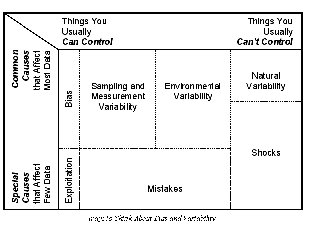
In addition to the sources of variability (see There’s Something About Variance) you can look at variability in terms of how it affects data by:

  • Control — the extent to which variability can be controlled so that data aren’t affected.
  • Influence — the proportion of data points that are affected by uncontrolled variability.

Sampling and measurement variability usually tend to be under your control. Sometimes you can control environmental variability and sometimes you can’t. These types of variability tend to affect all or most of the data. Natural variability, on the other hand, can’t be controlled and it affects all data. Biases affect all or most of a dataset and usually can be controlled if they are identifiable and unintentional. Intentional bias of only selected data is exploitation. Mistakes and errors may or may not be controllable and they tend to affect only a few data points. Shocks are uncontrollable short-duration conditions or events that can influence a few or even most of the data in a dataset. Examples of shocks include: heavy rainfall upsetting a sewage treatment plant; missing a financial processing deadline so one month has no entry and the next has two; having a meter lose calibration because of electrical interference; mailing surveys without realizing that some have missing pages; assembly line stoppages in an industrial process; and so on.

No one scheme for classifying variance will be best for all applications. Think of variance in terms of the data and the particular analyses you plan to do. You’ll know it’s right because it will help you visualize where the extraneous variability is in your analysis and what you might do to control it.

Three Rs to Remember

The fundamentals of education that we all learned in elementary school are Reading, ‘Riting, and ‘Rithmetic (obviously, not spellin’). With these concepts mastered, we are able to learn more sophisticated subjects like rocket science, brain surgery, and tax return preparation. Similarly, if you plan to conduct a statistical analysis, you’ll need to understand the three fundamental Rs of variance control — Reference, Replication, and Randomization.

Reference

The concept behind using a reference in data generation is that there is some ideal, background, baseline, norm, benchmark, or at least, generally accepted standard that can be compared to all similar data operations or results. References can be applied both before and after data collection. Probably the most basic application of using a reference to control variation attributable to data collection methods is the use of standard operating procedures (SOPs), written descriptions of how data generation processes should be done. Equipment calibration is another well-known way to use a reference before data collection to control extraneous variability.

References are also used after data collection to assess sampling variability. This use of a reference involves comparing generated data with benchmark data. The comparison doesn’t control variability, but allows an assessment of how substantial the extraneous variability is. A more sophisticated use of a reference is to measure highly correlated but differently-measured properties on the same sample, such as total dissolved solids and specific conductance in water. Deviations from the pre-established relationship may be signs of some sampling anomaly. Further, data collected on some aspect of a phenomenon under investigation can be used to control for the variability associated with the measure. Variables used solely to control or adjust for some aspect of extraneous variability are called covariates.

Perhaps the most well known application of a reference is the use of control groups. Control groups are samples of the population being analyzed to which no treatments are applied. For example, in a test of a pharmaceutical, the test and control groups would be identical (on relevant factors such as age, weight, and so on) except that patients in the test group would receive the pharmaceutical and the patients in the control group would receive a placebo.

Replication

If you can’t establish a reference point to help control variability, it may be possible to use replication, repeating some aspect of a study, as a form of internal reference.
Replication is used in a variety of ways to assess or control variability. Replicate sampling or measurements are one example. You might collect two samples of some medium and send both samples to a lab for analysis. Differences in the results would be indicative of measurement variability (assuming the sample of the medium is homogeneous).

In addition to the data source (i.e., sample, observation, or row of the data matrix) being replicated, the type of data information (i.e., attribute, variable, or column of the data matrix) can also be replicated. For example:

  • Asking survey questions in different ways to elicit the same or very similar information, such as, Did you like this …, Did this meet your expectations …, and Would you recommend this … .
  • Measuring the same property on a sample using different methods, such as pH in the field with a meter and again in the lab by titration.

Replicated samples or variables require a little extra thought during the analysis. If you are looking for a fair representation of the population, a replicated sample would constitute an over-representation. Typically, replicated samples are first compared to identify any anomalies, then, if they are similar, they are averaged. Sometimes, either the first sample or the second sample is selected instead. Never select a sample to use in the analysis on the basis of its value. For replicated variables, first compare the variables to identify any anomalies, then select only one of the variables to use in the analysis. Highly correlated variables will cause problems with many types of statistical analysis (called multicollinearity).

The concept of replication is also applied to entire studies. It is common in many of the sciences to repeat studies, from data collection through analysis, to verify previously determined results.

Randomization

Statisticians use the term “randomization” to refer specifically to the random assignment of treatments in an experimental design, but in its common sense, randomization can involve any action taken to introduce chance into a data generation effort. Randomization is desirable in statistical studies because it minimizes (but not necessarily eliminates) the possibility of having biased samples or measurements. As a consequence, randomization also minimizes extraneous variability that might be attributable to inadvertent inconsistencies in data generation. It is a wonderful irony of nature that introducing irregularities (randomization) into a data generation process can reduce irregularities (variability) in the resulting data.

Out, damn’d variance.

As with replication, randomization can be applied to both samples and variables. Samples or study participants can be chosen at random or following a scheme that capitalizes on their existing randomness. Values for variables that are not inherent to a sample can be assigned randomly. This is done routinely in experimental statistics when study participants are assigned randomly to the treatments. Random assignments are simple to make using random number tables or algorithms.

Variance doesn’t go away by ignoring it. To control variability you have to understand it. But that’s not enough. Data and variance are thoroughly intertwined. You must be proactive in planning your data collection efforts to control as much of the extraneous variability as possible.

Read more about using statistics at the Stats with Cats blog. Join other fans at the Stats with Cats Facebook group and the Stats with Cats Facebook page. Order Stats with Cats: The Domesticated Guide to Statistics, Models, Graphs, and Other Breeds of Data Analysis at Wheatmark, amazon.combarnesandnoble.com, or other online booksellers.

Posted in Uncategorized | Tagged , , , , , , , , , , , , | 11 Comments

The Right Tool for the Job

Statistics are like power tools. If you know how to use them, they are incredibly valuable and fun to use. They help you do your job better, more thoroughly, and more quickly. But if you are careless, they can cause great damage.

You work. I’ll supervise.

Think of an expert carpenter like Norm Abram on This Old House.Norm has a different tool for every possible job he might need to do in his workshop. Statistical methods are like that. There are many different types of statistical analysis. Some perform a single function, and some perform many. In the same way that there are several different types of saws, there are different statistical methods for doing exactly the same thing. And just as Norm knows when to use his table saw and when to use his band saw, a statistician knows when to use different types of statistical analysis.

If you haven’t been trained in statistics, selecting which technique to use may seem bewildering. You can usually get in the right ballpark, though, if you understand your variables and your objectives. Consider the hierarchy for selecting a statistical analysis method summarized in this flowchart. The flowchart has five major decision points:

  • How many variables do you have?
  • What is your statistical objective?
  • What scales are the variables measured with?
  • Is there a distinction between dependent and independent variables?
  • Are the samples autocorrelated?

By the time you get to this point in planning your statistical analysis, you should already have determined the answers to the first four questions.

The first decision is a no-brainer. How many variables do you have—one or more than one? It doesn’t get any simpler than that. But say you have many variables, more than you can easily remember. Then it might be advantageous to use cluster analysis to select representative variables or use a data reduction technique to create new, more efficient variables.

The second decision is “what is your statistical objective?” There are five choices—description. Identification or classification, comparison or testing, prediction, or explanation. There’s more information on these objectives in The Five Pursuits You Meet in Statistics. Once again, this should be a fairly easy decision to make.

The third decision is “what scales are the variables measured with?” This decision is a bit tougher because you have to know something about measurement scales. You might be able to get away with distinguishing only between just a few scales, like nominal (i.e., groups or categories), ordinal (i.e., a sequence of integers), and continuous scales. The more you know about the quirks of the scales the better able you will be to avoid problems. The quirks of time scales, for example, are formidable. Read Time Is On My Side and you’ll see what I mean.

The fourth decision is “is there a distinction between dependent and independent variables?” Once again, this is a decision that is a bit more sophisticated because you have to know something about statistical modeling. In particular, you have to understand why one variable might be the focus of your analysis efforts while the others would be used for support. If your objective involves prediction, you have to have a separate dependent and independent variables.

The fifth decision is “are the samples autocorrelated?” There are three ways observations or samples can be autocorrelated—by time, by location, and by sequence. If it’s important that the dependent variable is measured at a particular location or time, your data are probably autocorrelated. The autocorrelation may not be large but it will be present. There are sophisticated ways of detecting spatial and temporal autocorrelation, but this rule-of-thumb will work most of the time. Measurements can also be autocorrelated by sequence, that is, the order they were taken. Say a measurement device is drifting slowly out of calibration. Each subsequent measurement would have an increasing bias independent of the time or location of the measurement. Sequential autocorrelation isn’t necessarily harder to detect, you just have to know to look for it.

Who needs tools when you have these?

As with most generalized flowcharts for decision-making, there are exceptions. Variables based on cyclic scales, like orientations and months of the year, are an example. There are two options for treating these types of scales. You can either transform the variable into a non-repeating linear scale or use specialized techniques. The first option is usually easier but the second option usually provides better results. Also, if you have more than one dependent variable and you want to analyze all the dependent variables simultaneously, you have to use multivariate statistics. Multivariate statistics are a quantum leap more complex than univariate (i.e., one dependent variable) statistics, and are probably best left to experienced statisticians.

So if you have some notion of what statistical techniques you might apply, read more about it on the Internet and go from there. Just remember, describing all the statistical techniques you might use in an analysis would be like trying to describe all the tools used in carpentry. There are some very common tools, such as saws and hammers, as well as very specialized tools, the ones that aren’t likely to be on the shelves at your local Home Depot. Don’t worry about the very specialized tools. You can accomplish quite a lot with these off-the-shelf statistical techniques. The other thing to bear in mind is that method selection guides such as those presented here can help you decide what you could use but not what you should use. You can use a sledge hammer to drive a nail, but you’d probably be better off using a smaller hammer. That’s a matter of experience, or at least, trial and error. Good luck!

Read more about using statistics at the Stats with Cats blog. Join other fans at the Stats with Cats Facebook group and the Stats with Cats Facebook page. Order Stats with Cats: The Domesticated Guide to Statistics, Models, Graphs, and Other Breeds of Data Analysis at Wheatmark, amazon.combarnesandnoble.com, or other online booksellers.

Posted in Uncategorized | Tagged , , , , , , , , , , , , , , , | 9 Comments

The Five Pursuits You Meet in Statistics

When people think about statistical analyses, they often think only of mind-numbing number crunching that creates yet more numbers. But that’s like touring a cabinetmaker’s shop and seeing only the sawdust. A talented cabinetmaker can create beauty and function in his products. In the same way, a creative statistician can create enlightenment and utility if he or she has vision and purpose.

Statistical analyses usually aim at achieving one of five objectives:

  • Describe — characterizing populations and samples using descriptive statistics, statistical intervals, correlation coefficients, graphics, and maps.
  • Identify or Classify — classifying and identifying a known or hypothesized entity or group of entities using descriptive statistics; statistical intervals and tests, graphics, and multivariate techniques such as cluster analysis.
  • Compare or Test — detecting differences between statistical populations or reference values using simple hypothesis tests, and analysis of variance and covariance.
  • Predict — predicting measurements using regression and neural networks, forecasting using time-series modeling techniques, and interpolating spatial data.
  • Explain — Explaining latent aspects of phenomena using regression, cluster analysis, discriminant analysis, factor analysis, and other data mining techniques.

The following table provides some examples of data analysis tools that can be used for addressing the objectives.

Examples of Tools and Uses of Statistical Objectives

Objectives Commonly Used Tools Examples of Applications
Describe Text and Images Graphs Descriptive statistics Opinion surveys Demographic surveys
Compare or Test Text and Images Graphs Descriptive statistics Statistical tests Pharmaceutical effectiveness Educational methods
Identify or Classify Visual scans Filters, queries & sorts Graphs Discriminant analysis Association rules Classification trees Data Mining Biological species Tax return audits Possible criminals or terrorists
Predict Graphs Regression Neural Networks Data Mining Credit worthiness Student success in College
Explain Regression Analysis of Variance (ANOVA) Other multivariate statistics Academic research

There are other classification schemes that describe other statistical pursuits, so don’t feel constrained by these five categories. But this classification of statistical aims is a reasonable place to start. It has three features. First, it’s easy to figure out so non-statisticians can decide in which category their project fits. Second, the major statistical techniques tend to be used primarily in just one of the classifications. And third, the scheme can be thought of as an index of the professional peril a statistician could face in doing the analysis. Here’s why.

Description is relatively straightforward. You can do the calculations on spreadsheet software. All you have to be aware of are measurement scales, distributions, sampling schemes, measures of central tendency and dispersion, and methods for dealing with outliers and missing data.

Identification and classification range from simple visual recognition to the exploration of arcane mathematical dimensions where only bold number crunchers venture. It’s like finding Waldo. At a convention of funeral directors, one look would be all you needed. If he were making American flags in a candy cane forest, you might need some non-visual clues. You can determine a person’s sex by looking at him or her but not from a table of eye and hair color. On the other hand, you couldn’t tell who the best players were on a sports team from their pictures, but you could from their performance statistics. However you do it, identification is the gateway to classification. If you can do one, you can probably do the other.

Comparison is tougher even though there is ample software available for most analyses. You need to know what test to run or ANOVA design to use as well as understand probability, effect size, and violations of assumptions. There’s a much greater chance of something going wrong.

Prediction is next. In addition to all the description and comparison techniques, you’ll need to know how to use a variety of model building and assessments methods and understand the morass of prediction error. It’s easy to make a prediction. It’s hard to make an accurate prediction. It’s damn near impossible to make an accurate prediction that is also precise. Even if you did nothing wrong statistically, it’s easy to produce a poor prediction, and a poor prediction will eventually be noticed. One really good prediction and a psychic is famous; one really bad prediction and a statistician is relegated to selling insurance.

Well designed and well crafted. It’s purrfect.

Finally, explanation is the toughest of all objectives. Not only do you need to understand some of the more esoteric statistical methods, like factor analysis and canonical correlation, but you also have to understand the conceptual framework of the systems the data come from. Then, you have to have the talent to apply the knowledge creatively. You can’t explain your statistical model of stream contamination without knowing something about stream hydraulics, hydrogeology, meteorology, and environmental geochemistry. You can’t explain customer satisfaction without knowing something about demographics, marketing, business, and psychology. You’ll also probably have to integrate the information and think of it in ways that have never been thought of before. Explanation can create fundamental wisdom, although most of the time, your results will be humdrum. If you do come up with something truly consequential, though, some people will believe your results are erroneous, coincidental, or faked. Some people will claim that your finding is old news, having discovered it themselves years before, but then post it on Reddit for the karma. Most people, though, will just ignore you.

Creating a finished statistical analysis from raw data requires knowledge, experience, and often a bit of artistry. So when you conduct or review a statistical analysis, don’t let all the numbers obscure the craftsmanship and functionality of the products. And accordingly, don’t neglect to appreciate the talent and the artistry of the numbermaker.

Read more about using statistics at the Stats with Cats blog. Join other fans at the Stats with Cats Facebook group and the Stats with Cats Facebook page. Order Stats with Cats: The Domesticated Guide to Statistics, Models, Graphs, and Other Breeds of Data Analysis at Wheatmark, amazon.combarnesandnoble.com, or other online booksellers.
Posted in Uncategorized | Tagged , , , , , , , | 13 Comments

Time Is On My Side

If you do much data analysis it won’t be long before you work with data measured over a range of times. When you do see time-series data, you’ll find that time scales and time units have some very quirky properties.

Time after Time

You might think that time is measured on a ratio scale given its ever finer divisions (i.e., hours, minutes, seconds). Yet it doesn’t make sense to refer to a ratio of two times any more than the ratio of two location coordinates. The starting point is also arbitrary. So time clearly isn’t measured on a ratio scale but it can be measured on interval or ordinal scales. Time units are also used for durations; however durations can be measured on a ratio scale. Durations can be used in ratios and they have a starting point of zero.


Time measurements can be linear or cyclic. Year is linear, and can be measured on either an interval scale or an ordinal scale. For example, the year 1953 can be expressed as an integer (ordinal scale) or a decimal (interval scale). Furthermore, all values of linear time are unique. The year 1953 happened once and will never recur. Linear time is like a river. You start at some point and go with the flow. You can’t get back to your starting point, but it still exists somewhere in time.

Some time scales repeat. If day one is a Monday, then so is day eight. Likewise, month one is the same as month thirteen. So time can also be treated as being measured on a repeating ordinal scale. Durations don’t repeat; one day isn’t the same as eight days.

Does Anybody Really Know What Time It Is?

Most measurement scales are based on factors of ten. With time, though, there are 60 seconds per minute, 60 minutes per hour, and 24 hours per day. Blame the Babylonians for starting this craziness and every civilization for the next 4,000 years for being content with the status quo. In contrast, calendars have evolved from the Hellenic calendar (~850 BC), the Roman calendar (~750 BC), the Julian calendar (46 BC), to the Gregorian calendar (1582).

Everybody knows about seconds, minutes, hours, days, months, years, and even decades, centuries, and millennia, but there are many other units used for time. A jiffy is either one tick of a computer’s system clock (about 0.01 second) or the time required for light to travel one centimeter (about 33.3564 picoseconds). A New York second is the time between when a traffic signal turns from red to green and when the driver behind you honks his horn, about a second and a half. An inna minute is the time between when you ask a teenager to do something and the time he or she complies, usually about ten to thirty minutes. A warhol is being famous for fifteen minutes; a kilowarhol is being famous for approximately ten days. A moment is a medieval unit of time equal to about a minute and a half. A fortnight is two weeks. A platonic year is an astronomical unit measuring the time required for planets to align (about 26,000 calendar years).

There have been several systems in which time units were based on factors of ten, most notably by the Chinese (before the 17th century) and in France (during the 18th century). Decimal time divided a day (i.e., one rotation of the earth) into 10 metric hours, each hour into 100 metric minutes, and each minute into 100 metric seconds, sometimes termed a blink. A blink is 0.864 standard second, which is about twice the time it takes for you to blink your eye (from www.neatorama.com/2009/01/30/fun-and-unusual-units-of-measurements/)

Then there’s geologic time, which is subdivided into eon, eras, periods, epochs, and ages. The divisions are based on the rocks that were formed at the time and the fossils that occur within them. Consequently, the divisions aren’t all the same lengths and there aren’t the same number subdivisions in each division. For example, the Paleozoic era is twice as long as the Mesozoic era, and four times longer than the Cenozoic era (which admittedly is still in progress). Likewise, some periods are four times longer than others. Moreover, the lengths of the divisions can change as more is learned about the history of the Earth. The units of the scale are also different in different parts of the world. Geologic time is an ordinal scale devised because measurements of the interval scale on which it is based (i.e., years) lacks accuracy and precision.

Astronomical time is confusing, relatively, and it’s different if you’re on board the Enterprise or the Galactica. So the point is this—measuring time is complicated, not to mention time-consuming. But there’s even more to it than that.

Time Of The Season

Selecting an appropriate time scale is especially important because the scale can dictate the resolution and types of analyses that can be done. Resolution is an important matter. Select an interval that is too small and your database may become unmanageably large. Select an interval that is too large and you may not have enough resolution to investigate the time unit you are interested in. A good rule-of-thumb is to select an interval that is at least one time unit smaller than your unit of interest. For example, if you are interested in yearly trends, collect measurements every month. If you only collect measurements yearly, you won’t be able to assess the variability that occurs within a year. If you collect measurements more often than daily, you may have to rollup the data to make it manageable.

Take Your Time

Time formats can be difficult to deal with. Most data analysis software offer a dozen or more different formats for what you see. Behind the spreadsheet format, though, the database has a number, which is the distance the time is from an arbitrary starting point, in an arbitrary unit of time, almost always days. Convert a date-time format to a number format, and you’ll see what I mean. The software formatting allows you to recognize values as times while the numbers allow the software to calculate statistics. This quirk of time formatting also presents a potential for disaster if you use more than one piece of software, which use different starting points or time units. Always check that the formatted dates are the same between applications.

Time Will Tell

Time-series data are probably the most difficult type of data to analyze. Measurements involving time are usually autocorrelated, so using conventional statistical procedures can produce biased results. Besides their scale of measurement, there are several other aspects of temporal variables that add to the confusion.

  • Ch-Ch-Ch-Ch-Changes—Time-series data can exhibit a variety of patterns, including step changes, linear and nonlinear trends, and cyclic fluctuations. The effects may be superimposed on each other within a given time period or spread over many different time periods. For example, a change in the discharge of a river may be attributable to abrupt and ephemeral causes such as failure of a dam or a sudden downpour (shocks), abrupt and long-term causes such as natural changes in a drainage way or a man-made diversion (step changes), long-term causes such as drought or changes in water consumption (trends), repetitive changes such as seasonal cycles related to rainfall or irrigation (cyclic fluctuations) as well as random variations. Confounded effects are often impossible to separate, especially if the data record is short or the sampled intervals are irregular or too large.
  • One Day at a Time—Time-series measurements may not all be collected at a single instant in time. Some measurements are composites over time. For example, a flow measurement (e.g., stream, air) may be an instantaneous discharge or a total discharge over a selected time period. A sample may be collected at one time or be a composite of several samples collected at discrete time intervals and combined into a single sample container. The period over which each measurement is averaged is called the support. Obviously, you can’t evaluate a given time interval if your support is the same or larger than the interval.
  • For the Times They Are a Changing—There is a dilemma involving time-series that are measured over many years. It goes like this. As knowledge and technology improve, the greater the chance that there will be improvements in sampling and analysis procedures that will reduce the overall variability of more recent measurements. That leads to violations of one of the fundamental assumption of parametric statistical procedures, equality of variances (also called homoscedasticity). Sometimes, you just can’t win.
  • In the Year 2525 … —With most types of analysis, both statistical and deterministic, data analysts collect data over the entire range of the area of interest. If you want to analyze a chemical reaction at 100 degrees, you might analyze the reaction at temperatures between 80 degrees and 120 degrees. You wouldn’t, however, test the reaction at 40 to 80 degrees and extrapolate to what might happen at 100 degrees. In fact, scientists are taught never to extrapolate outside the range of their data. With time-series data, though, you have to extrapolate because you almost always want to know what will happen in the future. If you wait to see what actually happens, then it’s no longer interesting because it’s the past. And in the ultimate of ironies, you often can extrapolate time-series data because they are … autocorrelated. So the same property that makes time-series data difficult to analyze is what allows them to be extrapolated to future times, a process called forecasting. Mother Nature has a wicked sense of humor.
  • Time Keeps on Slipping into the Future—With other types of data, even autocorrelated spatial data, you can verify predictions whenever the need arises. With predictions for a time-series, forecasts, you have to wait until the time in question arrives. Then you have just one chance. You can’t go back if something goes wrong and you miss collecting the verification data. Hence, you can’t control verification.

So those are a few points about how time is measured and analyzed. There’s much more to it than that, but I’ll save those thoughts for another time.

Read more about using statistics at the Stats with Cats blog. Join other fans at the Stats with Cats Facebook group and the Stats with Cats Facebook page. Order Stats with Cats: The Domesticated Guide to Statistics, Models, Graphs, and Other Breeds of Data Analysis at Wheatmark, amazon.combarnesandnoble.com, or other online booksellers.
Posted in Uncategorized | Tagged , , , , , , , , , | 13 Comments

The Zen of Modeling

What’s the first thing you think of when you hear the word model? The plastic model airplanes you used to build? A fashion model? The model of the car you drive? The person who is your role model? But what do any of those things have to do with data analysis? Read on; you’re about to find that statistical analyses begin and end with models.

By Any Other Name

What do a Ford Focus, a plastic airplane, and Tyra Banks have in common? They are all called models. They are all representations of something, usually an ideal or a standard.

This is supposed to be a model of ME!

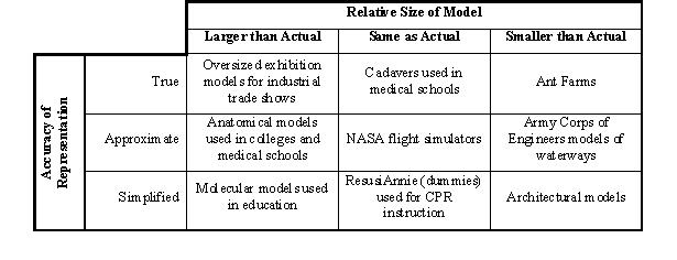
Models can be true representations, approximate (or at least as good as practicable), or simplified, even cartoonish compared to what they represent. They can be about the same size, bigger, or most typically, smaller, whatever makes them easiest to handle. They usually represent physical objects but can also represent a variety of phenomena, including conditions such as weather patterns, behaviors such as customer satisfaction, and processes such as widget manufacturing. The models themselves do not have to be physical objects either. They can be written, drawn, or consist of mathematical equations or computer programming. In fact, using equations and computer code can be much more flexible and less expensive than building a physical model.

Customarily, models are used either to:

  • Display what they represent (e.g., model airplanes) or are associated with (e.g., fashions)
  • Substitute for incomplete real world data, such as using the Normal distribution as a surrogate for a sample distribution.
  • Manipulate their components to learn more about the things they represent (e.g., scientific models for planetary motion).

Whether you know it or not, you deal with models every day. Your weather forecast comes from a meteorological model, maybe several. Mannequins are used to display how fashions may look on you. Blueprints are drawn models of objects or structures to be built. Examples are plentiful.

Examples of Physical Models

Humans, in particular, are modeled all the time because of our complexity. Children play with dolls as models of playmates. Mannequins are simplified models of fashion models, who in turn, are models of people who might wear a fashion designer’s wares. Posing models provide reference points for artists. Crash test dummies reveal how the human body might react in an automobile accident. Medical researchers use laboratory animals in place of humans for basic research. Medical schools use donated cadavers as models, very good ones as it turns out, of the human anatomy. So, there should be nothing unfamiliar or intimidating about models.

Whether it is a physical scale-model of a hydroelectric dam or a mathematical model of weather patterns, a model is nothing more than a tool used to stimulate the imagination by simulating an object or phenomenon. The model airplane takes its young pilot looping through the blue skies of a summer day. Globes teach geography and orreries teach planetary motion. The mannequin shows the bride-to-be how beautiful she’ll look in the gown at her wedding. The concept car unveiled today gives consumers an idea of what they may be driving in a few years. The National Hurricane Center uses over a dozen mathematical models to forecast the intensities and paths of tropical storms and to help understand the complex dynamics of hurricanes.

It should come as no surprise, then, that scientists, engineers, and mathematicians use models, especially virtual models, all the time. It may be surprising, though, that virtual models are also used extensively in business, economics, politics, and many other fields. Nevertheless, there is a mystique associated with modeling, especially the mathematical variety. Some believe that models are infallible and unchanging. Some believe that models are impossibly complex and necessarily unfathomable. Some believe that models are sophisticated delusions for obfuscating real data. In reality, none of these opinions is correct, at least entirely.

A Medley of Numbers

Mathematical models can be either theoretical (i.e., derived mathematically from scientific principles) or empirical
(i.e., based on experimental observations). For example, celestial movements and radioactive decay are phenomena that can be evaluated using theory-based models. To calibrate a theoretical model, the form of the model (i.e., the equation) is fixed and the inputs are adjusted so that the calculated results adequately represent actual observations.

Empirical models differ from theoretical models in that the model is not necessarily fixed for all instances of its use. Rather, empirical models are developed for specific situations from measured data. Model formulation and calibration are simultaneous. However, the selection of the form of the equation and the inputs used in an empirical model are usually based on related theories. Models developed using statistical techniques are examples of empirical models.

Empirical models can also be deterministic, stochastic, or sometimes a hybrid of the two. Deterministic empirical models presume that a specific mathematical relationship exists between two or more measurable phenomena (as do theoretical models) that will allow the phenomena to be modeled without uncertainty under a given set of conditions (i.e., the model’s inputs and assumptions). Biological growth models are examples of deterministic empirical models.

Both theoretical models and deterministic empirical models provide solutions that presume that there is no uncertainty. These solutions are termed “exact” (which does not necessarily imply “correct”). Conversely, stochastic empirical models presume that changes in a phenomenon have a random component. The random component allows stochastic empirical models to provide solutions that incorporate uncertainty into the analysis.

Statistical models are examples of stochastic empirical models in which the model equation is generated by quantifying and minimizing errors (i.e., uncertainty). Statistical models place great emphasis on examining and quantifying uncertainty, whereas theoretical models generally do not.

OK, that’s way more than you need to know. Let me simplify. Mathematical models are based on theories or observations or both. They can produce a single (exact) answer for a set of inputs by assuming there is no variability or a range of (inexact) answers by incorporating the variability into the model.

For example, distribution models are equations that produce exact solutions for the equation curve. The model describes what your data frequency would look like if your sampling were a perfect representation of the population. So if your data follow a particular distribution model, you can use the model instead of your data to estimate the probability of a data value occurring. This is the basis of parametric statistics; you evaluate your data as if they came from a population described by the model. (In contrast, nonparametric statistics use your data instead of an exact model to estimate the probability of a data value occurring.) It’s like building a sand castle. A distribution model is like a bucket you can fill with sand (data) to create the castle (the result) with great efficiency. Without the model serving as a substitute, it takes more effort (data) to completely shape the castle.

Statistical analyses involving descriptive statistics and testing rely on exact mathematical models like the Normal distribution to represent data frequencies and error rates. Just as importantly, though, statistical techniques are used to build models from data. Such statistical models include an error term to incorporate the effects of variation, and thus, are inexact because they produce a solution that is a range of possible values. Statistical analyses involving detecting differences, prediction, or exploration involve using statistics to estimate the mathematical coefficients, the parameters, of a model.

So, models and statistics are closely intertwined. Statistical analyses begin and end with models. Models serve as both inputs and outputs of statistical analyses. You can’t do without them, so you might as well understand what they are.

Read more about using statistics at the Stats with Cats blog. Join other fans at the Stats with Cats Facebook group and the Stats with Cats Facebook page. Order Stats with Cats: The Domesticated Guide to Statistics, Models, Graphs, and Other Breeds of Data Analysis at Wheatmark, amazon.combarnesandnoble.com, or other online booksellers.

Posted in Uncategorized | Tagged , , , , , , , , , , , , , , | 16 Comments

There’s Something About Variance

Imagine practicing hitting a target using darts, bow and arrow, pistol, cannon, missile launcher, or whatever. You aim for the center of the target. If your shots land where you aimed, you are considered to be accurate. If all your shots land near each other, you are considered to be precise. The two properties are not linked. You can be accurate but not precise, precise but not accurate, neither accurate nor precise, or both accurate and precise.

Accuracy and precision also apply to statistics calculated from data. If you’re trying to determine some characteristic of a population (i.e., a population parameter), you want your statistical estimates of the characteristic to be both accurate and precise.

The same also applies to the data themselves. When you start measuring data for an analysis, you’ll notice that even under similar conditions, you can get dissimilar results. That lack of precision
is called variability. Variability is everywhere; it’s a normal part of life. In fact, it is the spice in the soup. Without variability, all wines would taste the same. Every race would end in a tie. Even statistics might lose its charm. Your doctor wouldn’t tell you that you have about a year to live, he’d say don’t make any plans for January 11 after 6:13 pm EST. So a bit of variability isn’t such a bad thing. The important question, though, is what kind of variability?

The Inevitability of Variability

Before going further, let me clarify something. Statisticians discuss variability using a variety of terms, including errors, uncertainty, deviations, distortions, residuals, noise, inexactness, dispersion, scatter, spread, perturbations, fuzziness, and differences. To nonprofessionals, many of these terms hold pejorative connotations. But variability isn’t bad … it’s just misunderstood.

Suppose you’re sitting in your living room one cold winter night contemplating the high cost of heating oil. The thermostat reads 68 degreesF, but you’re still shivering. Maybe the thermostat is broken. Maybe the heater is malfunctioning or you need more insulation. You need a warmer place to sit while you read An Inconvenient Truth, so you grab a thermometer from the medicine cabinet and start measuring temperatures around the room. It’s 115 degrees at the radiator, 68 degrees at your chair, 59 degrees at the window, and 69 degrees at the stairs. You keep measuring. It’s 73 degrees at the fish tank, 67 degrees at the couch and bookcase, 82 degrees at the TV, and 60 degrees at the door. That’s a lot of variation!

Think of those temperature readings as the summation of five components:

  • Characteristic of Population—the portion of a data value that is the same between a sample and the population. This part of a data value forms the patterns in the population that you want to uncover. If you think of the living room space as the population you’re measuring, the characteristic temperature would be the 68 degrees at your chair where you want to read.
  • Natural Variability—the inherent differences between a sample and the population. This part of a data value is the uncertainty or variability in population patterns. In a completely deterministic world, there would be no natural variability. You would read the same value at every point where you took a measurement. But in the real world, if you made the same measurement again and again, you probably would get different values. If all other types of variation were controlled, these differences would be the natural or inherent variability.
  • Sampling Variability—differences between a sample and the population attributable to how uncharacteristic (non-representative) the sample is of the population. Minimizing sampling error requires that you understand the population you are trying to evaluate. The sampling variability in the living room would be attributable to where you took the temperature readings. For example, the radiator and TV are heat sources. The door and window are heat sinks. Furthermore, if all the readings were taken at eye level, the areas near the ceiling and floor would not have been adequately represented. The floor may be a few degrees cooler because the more dense cold air sinks displacing the warmer air upward, which is why the air at the ceiling is warmer.
  • Measurement Variability—differences between a sample and the population attributable to how data were measured or otherwise generated. Minimizing measurement error requires that you understand measurement scales and the actual process and instrument you use to generate data. Using an oral thermometer for the living room measurements may have been expedient but not entirely appropriate. The temperatures you wanted to measure are at the low end of the thermometer’s range and may be less accurate than around 98 degrees. Also, the thermometer is slow to reach equilibrium and can’t be read with more than one decimal place of precision. Use a digital infrared laser-point thermometer next time. More accurate. More precise. More fun.
  • Environmental Variability—differences between a sample and the population attributable to extraneous factors. Minimizing environmental variance is difficult because there are so many causes and because the causes are often impossible to anticipate or control. For example, the heating system may go on and off unexpectedly. Your own body heat adds to the room temperature and walking around the living room taking measurements mixes the ceiling and floor air which adds variability to the temperatures.

When you analyze data, you usually want to evaluate characteristics of some population and the natural variability associated with the population. Ideally, you don’t want to be mislead by any extraneous variability that might be introduced by the way you select your samples (or patients, items, or other entities), measure (generate or collect) the data, or experience uncontrolled transient events or conditions. That’s why it’s so important to understand the ways of variability.

Variability versus Bias

Remember target practice? If there is little variation in your aim, the deviations from the center of the target would be random in distance and direction. Your aim would be accurate and precise. But what if the sight on your weapon were misaligned? Your shots would not be centered on the center of the target. Instead there would be a systematic deviation caused by the misaligned sight. Your shots would all be inaccurate, by roughly the same distance and direction from the center. That systematic deviation is called bias. You may not even have known there was a problem with the sight before shooting, although you would probably suspect something after all the misses.

Bias usually carries the connotation of being a bad thing. It usually is. It may be why 19th Century British Prime Minister Benjamin Disraeli mistakenly associated statistics with lies and damn lies. But if the systematic deviation is a good thing because it fixes another bias, it’s called a correction. For example, you could add a correction, an intentional bias in the direction opposite the bias introduced by the weapon sight, to compensate for the inaccuracy. So bias can be good (in a way) or bad, intentional or not, but it’s always systematic. On the other hand, a bias applied to only selected data is a form of exploitation, and is nearly always intentional and a very bad thing.

So the relationships to remember are:

Variance ↔ Imprecision

Bias ↔ Inaccuracy

Most statistical techniques are unbiased themselves, as long as you meet their assumptions. If something goes wrong, you can’t blame the statistics. You may have to look in the mirror, though. During the course of any statistical analysis, there are many decisions that have to be made, primarily involving data. Whatever the decisions are, such as deleting or keeping an outlier, there will be some impact on precision and perhaps even accuracy. In an ideal world, the sum of the decisions wouldn’t add appreciably to the variability. Often, though, data analysts want to be conservative, so they make decisions they believe are counter to their expectations. But when they don’t get the results they expected, they go back and try to tweak the analysis. At that point they have lost all chance of doing an objective analysis and are little better than analysts with vested interests who apply their biases from the start. Avoiding such analysis bias requires no more than to make decisions based solely on statistical principles. This sounds simple but it isn’t always so.

Sometimes bias isn’t the fault of the data analyst, as in the case of reporting bias. In professional circles the most common form of reporting bias is probably not reporting non-significant results. Some investigators will repeat a study again and again, continually fine-tuning the study design until they reach their nirvana of statistical significance. Seriously, is there any real difference between probabilities of significance of 0.051 versus 0.049? But you can’t fault the investigators alone. Some professional journals won’t publish negative results, and professionals who don’t publish perish. Can you imagine the pressure on an investigator looking for a significant result for some new business venture, like a pharmaceutical? He might take subtle actions to help his cause then not report everything he did. That’s a form of reporting bias.

Perhaps the most common form of reporting bias in nonprofessional circles is cherry picking, the practice of reporting just those findings that are favorable to the reporter’s position. Cherry picking is very common in studies of controversial topics such as climate change, marijuana, and alternative medicine. Virtually all political discussions use information that was cherry picked.

Given that someone else’s reporting bias is after-the-analysis, why is it important to your analysis? The answer is that it’s how you can be misled in planning your statistical study. Never trust a secondary source if you can avoid it. Never trust a source of statistics or a statistical analysis that doesn’t report variance and sample size along with the results. And always remember: statistics don’t lie; people do.

Read more about using statistics at the Stats with Cats blog. Join other fans at the Stats with Cats Facebook group and the Stats with Cats Facebook page. Order Stats with Cats: The Domesticated Guide to Statistics, Models, Graphs, and Other Breeds of Data Analysis at Wheatmark, amazon.combarnesandnoble.com, or other online booksellers.

Posted in Uncategorized | Tagged , , , , , , , , , , , , , , | 19 Comments

Samples and Potato Chips

Samples are like potato chips. You’re never satisfied with just one. Every one you take makes you want more. And you’re never sure you’ve had enough until you’ve had way too many.


Betcha Can’t Take Just One

One observation. One test sample. One subject. One measurement. One of anything isn’t that satisfying. You’ll always want more to replicate the experience, to find out if there is consistency. Maybe you take just a few. If you sense a pattern, you can build your observations into an anecdote, a story. Many statistical analyses, in fact, grow out of anecdotal evidence. You just can’t stop at the story telling stage. Statistics are antidotes to those anecdotes.

Chips all gone. Want more!

Politicians, preachers, and parents can get away with telling tales to illustrate points they want to make. Their followers trust them and want to believe them whether they are telling the truth or not. Other professionals, though, can’t rely on their audience having such unquestioning faith. Scientists rely on hard data to test their hypotheses. Educators need test scores so they can grade on a curve. Businessmen want to see the numbers before they spend their money (your money, not so much). So you can pretty much expect that once you start collecting data, you’ll going to want more.

Want More

You know you want more data, so first you estimate how many more samples you’ll need to get that Purrfect Resolution. Say you’ve estimated that you need 1,000 samples to do a statistical analysis. You package your sampling and analysis plan into a proposal and give it to your client. One thing you can bet on is that your client won’t want to spend the money to collect that many samples. So what can you do? Here are a few suggestions:

Change the Study—Lower your confidence (1 minus the false positive error rate you’ll allow) and power (1 minus the false negative error rate you’ll allow). If you do this, look out for those misleading test results. You can look for bigger effects (e.g., differences between means, size of targets, and so on). You won’t get the resolution you wanted but it could be a good start. Also consider limiting the study area, level of detail, or analysis scope. Sometimes you can trade other project costs, like meetings and deliverables, for a few more samples.

Take Smaller Bites—Take as many samples as you can and use the information to decide what to do next. This is sometimes the aim of a pilot study. You can use the samples collected during a pilot study to estimate more precisely how many more samples you’ll need to get the statistical resolution you want. You might also be able to collect samples in phases or change the implementation schedule to accommodate your client’s budget cycle.

Use Supporting Data—There may be historical data available that you can use to reassess the number of samples you’ll need and even augment the samples you plan to collect (i.e., provided the quality of the historical data is appropriate). You can also consider surrogate sampling, in which you correlate the results of many inexpensive observations or measurements to the few expensive samples your client can afford.

Control Variance—If you think about it, the reason you need more samples in the first place is because you need to improve precision (not accuracy). So think harder about how you can reduce any extraneous variability in the data generation process. Standardized procedures and training of the data collectors might mitigate the need for quite a few samples.

Too Many

Can you eat too many potato chips? Of course you can. It’s happened to many of us. Likewise, you can have too many samples, which presents its own set of challenges. Here are five:

Information Overload — Statistical software tends to be very efficient, but when you have tens of thousands of samples, you start to see performance slow a bit. What’s more important, though, is the inefficiency you run into when you scrub your dataset, especially if you use a lot of spreadsheet array formulas. Be patient. You can use the waiting time to read a good book.

Chasing Tails — In any data set, you may have 5% influential observations not to mention the outliers and errors that you’ll have to check to determine if they should be corrected, removed from the dataset, or left alone. This is a very time consuming process. With a small dataset, you may have to investigate just a few samples. With a 1,000-record dataset, you may have to investigate 50 samples. This is part of why data scrubbing can represent most of the work in a data analysis project.

Data Intimacy — When you’re working with only a few dozen samples, you get to know each data point. You can look at plots and tables and see how individual details fit into a bigger picture. You can’t do that with a thousand data points. Sometimes you can get around this problem by dividing the data into groups and working with the groups, or analyzing a higher level of hierarchical data.

Graphic Mud — It’s tough to see patterns with only a few samples but plotting thousands of samples can be just as perplexing. You won’t be able to use any small plots like matrix plots. Even with full-scale plots, it will be difficult to see subtle differences in data point markers, like size, shape, and even color. Points will overwrite each other so you won’t be able to tell it there is one point at a graph location or a hundred points stacked on top of each other. And even the best statistical software will choke when trying to print graphs with thousands of data points. Solving this problem usually involves plotting group means or only randomly selected records from the data matrix.

Meaningless Differences — Sometimes you can have too much resolution in a statistical test. If the test can detect a difference smaller than would be of interest in the real world, it’s probably because you used too many samples. Conduct a power analysis after statistical testing to determine what your effect size and error rates were for the test.

And that’s why it’s important to have about the right number of samples; enough to at least make progress towards your goal but not so many that the progress doesn’t justify the effort.

Read more about using statistics at the Stats with Cats blog. Join other fans at the Stats with Cats Facebook group and the Stats with Cats Facebook page. Order Stats with Cats: The Domesticated Guide to Statistics, Models, Graphs, and Other Breeds of Data Analysis at Wheatmark, amazon.combarnesandnoble.com, or other online booksellers.

Posted in Uncategorized | Tagged , , , , , , , , , , , , , | 9 Comments