Purrfect Resolution

No matter what their area of expertise, statisticians are asked certain questions with such predictability that it borders on the deterministic. No question is asked more often than:

How many samples do I need?

Most statisticians wish they could answer the sample size question definitively instead of mumbling about effect sizes and whatnot. It’s just not that simple.

One way to look at how many individual samples (i.e., observations, cases, records, subjects, survey respondents, organisms, or any other object or entity on which you collect information) you need for an analysis is in terms of how much resolution you want. Think of the resolving power of a telescope or a microscope, or the number of pixels in a computer image. The greater the resolution, the more detail you’ll see.

Consider this picture. You couldn’t make out the image with a resolution of 9 pixels per inch and maybe not even with a resolution of 18 pixels per inch. At 36 pixels per inch, you can tell it’s an image of a kitten, even if it’s a bit fuzzy. At 72 pixels per inch, the image is sharp and you can tell that the kitten is Kerpow. Doubling the resolution again adds little to your perception of the image; it’s a waste of the additional information. Likewise with statistics, the greater the number of samples, the more precise your results will be. But beyond a certain point, adding samples adds little to your understanding. In fact too many samples can have negative consequences. So, the trick is to collect the fewest samples that will achieve your objective.

Deciding how many samples you’ll need starts with deciding how certain your answer needs to be given your objective. Now here’s the bad news. There’s no way to know exactly how many samples you’ll need before you conduct your study. There are, however, formulas for estimating what an appropriate number of samples might be. In the situations in which the formulas don’t apply, there are rules-of-thumb or other ways to come up with a number. Unfortunately, it seems that no matter how many samples you estimate you’ll need, the number is always a lot more than your client wants to collect. After all, they are the ones who have to pay for collecting and analyzing the samples. So, any estimate of the number of samples that you tell your client ends up being a subject of negotiations. But here are a few places to start.

How Many Samples for Describing Data?

Say all you want to do is to collect enough samples to calculate some descriptive statistics. Maybe you want to characterize some condition, like the average weight of a litter of kittens or the average age of your favorite professional sports team. How many samples do you need? Well if your population is small enough, like five kittens or 25 baseball players, you simply use all the members of the population, a census.

But what if you want to calculate descriptive statistics to characterize a large population? The number of samples you’ll need to describe it will depend on the precision you want, not the accuracy. The greater the number of samples, the more precise your estimate will be. More specifically, the precision will be proportional to the variance divided by the square root of the number of samples. So maximize the number of samples if you can (by a lot, remember, precision is proportional to the square root of the number of samples), but if you can’t, try to control the variance.

How Many Samples for Detecting Differences?

Often, the point of calculating statistics is to make an inference from a sample to a population. You can estimate how many samples you might need to conduct a statistical test of one or more populations by rearranging the equation for the test you plan to use and solve for the number of samples. To take this approach, there are usually two other things you need to know—the difference you want to detect and the population variance.

You should have some idea of the size of the difference you want to detect, called a meaningful difference. Say you want to compare how long it takes you to commute to work via two different routes. Differences of a few seconds probably aren’t meaningful but differences of a few minutes probably are. If you work as a NASCAR driver, go with seconds. The smaller the difference you want to detect the more samples you’ll need.

Knowing the population variance is the Catch-22 of statistics. You can’t calculate the number of samples you’ll need without knowing the population variance and you can’t estimate the population variance without already having samples from the population. Now, there are maybe a half dozen ways to try to get around this problem but they all require you to know or guess at some aspect of the population. The approach is often used after a preliminary study (called a pilot study) is done in part to estimate the population variance.

How Many Samples for Opinion Surveys

If you’re going to survey a small population, like your colleagues at work, send surveys to everybody and hope you get a representative sample from the people who do respond. If the size of your population is large compared to the number of surveys you might take, a quick way to estimate the sample size is:

sample size = 1 / (approximate percent error you want)2

So if you want a ±5% error with 95% confidence, you would need about 400 surveys to be completed (i.e., 1/0.052). With 1,000 surveys, the error drops to about 3%, but to get to 2% error, you would have to collect 2,500 surveys. It’s more complicated than this of course. If your sample will be a sizable proportion of your population or if the opinions aren’t evenly divided, the short-cut formula will overestimate how many surveys you might need. If you plan to subdivide the population to look at demographics, you’ll need more surveys to get to your desired error rates.

How Many Samples for Evaluating Trends?

Say you plan to do a regression analysis to evaluate the relationship between two sets of measurements. How many samples do you need? There are two ways to answer this question, a difficult way and an easy way. The difficult way is to calculate it the same way as you would if you were looking to detect differences. This approach requires a sophisticated understanding of statistical tests and the populations being tested. It is most often used in experimental situations.

The simpler approach is to base the number of samples on a rule-of-thumb based on the number of independent variables. The more independent variables (i.e., predictor variables) there are, the more samples are needed to define their relationship to a dependent variable. The guidelines are not hard and fast but they boil down to these:

  • 10 samples per predictor variable—the bias may be large but there are often enough samples to estimate simple linear relationships with adequate precision.
  • 50 samples per predictor variable—the bias is relatively small, linear relationships can be estimated with good precision, and there are usually enough samples to determine the form of more complex relationships.
  • 100 samples per predictor variable—the bias is insignificant, linear relationships are estimated precisely, and complex nonlinear relationships can be estimated adequately.
  • 250+ samples per predictor variable—the bias is insignificant and most complex relationships can be estimated precisely.

How Many Samples for Forecasting Time Series?

Deciding how many samples to use for analyzing a time series can be a challenge. Here are two popular rules-of-thumb:

  • Collect samples at regular intervals from at least three or four consecutive cycles or units of any pattern in which you might be interested. For example, if you are interested in seasonal patterns (i.e., a pattern lasting a year) collect data for at least three or four years.
  • Collect samples at time units smaller than the duration of the pattern in which you might be interested. For example, if you are interested in seasonal patterns, collect data weekly, biweekly, or at least, monthly.

How Many Samples for Identifying Targets?

Sometimes the goal of sampling is to find one or more targets. For example, in World War II, destroyer captains needed to know how many depth charges to drop to be reasonably certain of destroying an enemy submarine. Likewise, adventurers looking for sunken ships, like the Monitor and the Titanic, use statistical sampling to find their targets. In the environmental field, sampling is often done to look for “hot spots” of contamination in soil. There are two ways this type of problem is typically handled—judgment sampling and search sampling.

The strategy behind judgment sampling is that an expert picks locations for sampling that he or she believes are most likely to reveal a target. With this approach, it is assumed that the expert has some preternatural ability to find the targets. Judgment sampling (a.k.a. judgmental sampling, biased sampling, haphazard sampling, directed sampling, professional judgment) has the advantage of involving far fewer samples than search sampling. The disadvantage is that there is no way to quantify the uncertainty of the result.

Search sampling involves sampling on a regular grid so that it is possible to estimate the probability of finding randomly located targets. In essence, the probability of finding a target depends on the size and shape of the target and the size and shape of the cells of the sampling grid. The downside of this sampling approach is that it usually involves many more samples than the judgment sampling approach and the results do not always sound very reassuring. For example, you would need over 10,000 samples taken on a 100-foot square grid in a 1,000,000 square-foot search area to have an 80% probability of finding a circular hotspot 100 feet in diameter. In search sampling, a large number of samples is the price you pay for being able to quantify uncertainty. But if you understand the uncertainty, you are one giant step closer to controlling adverse risks. That’s the resolving power of statistics.

Read more about using statistics at the Stats with Cats blog. Join other fans at the Stats with Cats Facebook group and the Stats with Cats Facebook page. Order Stats with Cats: The Domesticated Guide to Statistics, Models, Graphs, and Other Breeds of Data Analysis at Wheatmark, amazon.combarnesandnoble.com, or other online booksellers.

Posted in Uncategorized | Tagged , , , , , , , , , , , | 14 Comments

30 Samples. Standard, Suggestion, or Superstition?

If you’ve ever taken any applied statistics courses in college, you may have been exposed to the mystique of 30 samples. Too many times I’ve heard statistician do-it-yourselfers tell me that “you need 30 samples for statistical significance.” Maybe that’s what they were taught; maybe that’s how they remember what they were taught. In either case, the statement merits more than a little clarification, starting with the 30-samples part. Suffice it to say that if there were any way to answer the how-many-samples-do-I-need question that simply, you would find it in every textbook on statistics, not to mention TV quiz shows and fortune cookies. Still, if you do an Internet search for “30 samples” you’ll get millions of hits.

Like many legends, there is some truth behind the myth. The 30-sample rule-of-thumb may have originated with William Gosset, a statistician and Head Brewer for Guinness. In a 1908 article published under the pseudonym Student (Student. 1908. Probable error of a correlation coefficient. Biometrika 6, 2-3, 302–310.), he compared the variation associated with 750 correlation coefficients calculated from sets of 4 and 8 data pairs, and 100 correlation coefficients calculated from sets of 30 data pairs, all drawn from a dataset of 3,000 data pairs. Why did he pick 30 samples? He never said but he concluded, “with samples of 30 … the mean value [of the correlation coefficient] approaches the real value [of the population] comparatively rapidly,” (page 309). That seems to have been enough to get the notion brewing.

Since then, there have been two primary arguments put forward to support the belief that you need 30 samples for a statistical analysis. The first argument is that the t-distribution becomes a close fit for the Normal distribution when the number of samples reaches 30. (The t-distribution, sometimes referred to as Student’s distribution, is also attributable to W. S. Gosset. The t-distribution is used to represent a normally distributed population when there are only a limited number of samples from the population.) That’s a matter of perspective.

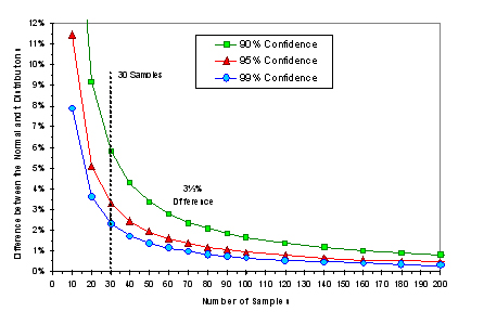
This figure shows the difference between the Normal distribution and the t-distribution for 10 to 200 samples. The differences between the distributions are quite large for 10 samples but decrease rapidly as the number of samples increases. The rate of the decrease, however, also diminishes as the number of samples increases. At 30 samples, the difference between the Normal distribution and the t-distribution (at 95% of the upper tail) is about 3½%. At 60 samples, the difference is about 1½%. At 120 samples, the difference is less than 1%. So from this perspective, using 30 samples is better than 20 samples but not as good as 40 samples. Clearly, there is no one magic number of samples that you should use based on this argument.

The second argument is based on the Law of Large Numbers, which in essence says that the more samples you use the closer your estimates will be to the true population values. This sounds a bit like what Gosset said in 1908, and in fact, the Law of Large numbers was 200 years old by that time.

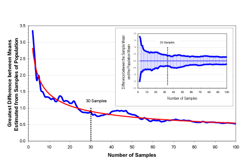
This figure shows how differences between means estimated from different numbers of samples compare to the population mean. (These data were generated by creating a normally distributed population of 10,000 values, then drawing at random 100 sets of values for each number of samples from 2 to 100 (i.e., 100 datasets containing 2 samples, 100 datasets containing 3 samples, and so on up to 100 datasets containing 100 samples. Then, the mean of the datasets was calculated for each number of samples. Unlike Gosset, I got to use a computer and some expensive statistical software.) The small inset graph shows the largest and smallest means calculated for datasets of each sample size. The large graph shows the difference between the largest mean and the smallest mean calculated for each sample size. These graphs show that estimates of the mean from a sampled population will become more precise as the sample size increases (i.e., the Law of Large Numbers). The important thing to note is that the precision of the estimated means increases very rapidly up to about ten samples then continues to increase, albeit at a decreasing rate. Even with more than 70 or 80 samples, the spread of the estimates continues to decrease. So again, there’s nothing extraordinary about using 30 samples.

So while Gosset may have inadvertently started the 30-samples tale, you have to give him a lot of credit for doing all those calculations with pencil and paper. To William Gosset, I raise a pint of Guinness.

Now we still have to deal with that how-many-samples-do-I-need question. As it turns out, the number of samples you’ll need for a statistical analysis really all comes down to resolution. Needless to say, that’s a very unsatisfying answer compared to … 30 samples.

Read more about using statistics at the Stats with Cats blog. Join other fans at the Stats with Cats Facebook group and the Stats with Cats Facebook page. Order Stats with Cats: The Domesticated Guide to Statistics, Models, Graphs, and Other Breeds of Data Analysis at Wheatmark, amazon.combarnesandnoble.com, or other online booksellers.
Posted in Uncategorized | Tagged , , , , , , , , , , , , , , , | 13 Comments

It’s All Greek

When Humpty Dumpty uses a word, it means just what he chooses it to mean, neither more nor less. To people not conversant in a technical specialty, it seems that all the experts are Humpty Dumptys. Statistics is no exception.

It doesn’t look like a mouse to me.

If you’re a beginner at data analysis, it will seem like there is a superabundance of esoteric statistical slang. You’ll hear it even from friendly statisticians. It gets worse when you start reading websites, books, and worst of all, journal articles. If you want to see what I mean, read some of the article titles in the Journal of the American Statistical Association (at http://pubs.amstat.org/loi/jasa). The statisticians who write those obfuscatory tracts believe they are writing to people who know as much as they do. This seems odd given that those authors are supposed to be the experts in what they are writing about.  Even other statisticians can’t decipher some of those articles without spending time with the reference books. So don’t feel like you’re alone in a foreign country. We stand befuddled together.

To simplify statistical jargon, think of three distinctions—statistical concepts named after someone, special words created to convey a special meaning, and common words and phrases with alternative meanings. We’ll leave the acronyms out of it for now.

Named Things

Statistical procedures, especially statistical tests, are often modified to accommodate some special circumstance or to have some desirable property. When this occurs, the new procedure is commonly named after the originators. Thus, there are statistical tests named after Dixon, Tukey, Wilcoxon, Scheffe, Kolmogorov, Fisher, Levene, Hotelling, Dunnett, and Bonferroni. And those are just some well-known ones. Dig into the literature, and you’ll find scores more.

It’s not just tests that get named. Bayesian statistics is a branch of statistics based on Bayes Theorem formulated in the 1700s by Reverend Thomas Bayes. Kriging, the interpolation algorithm of geostatistics was named after Daniel Krige, a South African mining engineer, who pioneered the field in the 1950s. The Normal distribution is also called the Gaussian distribution after Carl Friedrich Gauss, who introduced it in 1809, and the Laplacian distribution after Pierre-Simon Laplace who showed that the distribution was the basis for the central limit theorem in 1810. There are also theoretical frequency distributions named after Benford, Weibull, Rayleigh, Cauchy, Poisson, and Bernoulli.

If someone mentions a named distribution , test, or other statistical procedure, don’t panic. Nobody knows everything. Just ask what the distribution or procedure is supposed to do. If you took an introductory course in statistics and know about probability, the Normal distribution, and hypothesis testing, you’re in great shape for understanding most of the named stat terms you might run into. This type of statistical jargon could be much worse. When biologists name something after someone, they do it in Latin.

Created Words

Some statistical jargon might just as well be a foreign language because the words have no common meaning in the English language outside of statistics (or math). Examples of such words include: kurtosis, leptokurtic, platykurtic, skewness, covariance, autoregressive, variogram, logit, probit, eigenvalue, median, outlier, stationarity, winsorizing, communality, multicollinearity, and my personal favorite, homoscedasticity. If you’re at a bar and you hear any of these words being bandied around, slip quietly out the door and run for your life. Any statistician who uses these words with innocent civilians without explanation either doesn’t understand his or her audience or is a sadist. Dealing  with created statistical terms is straightforward; just ask the statistician using them what they mean. Preferably ask in a foreign language just to prove the point.

Alternative Meanings

The most confusing statistical jargon just might be words in most people’s everyday vocabulary that have a very different statistical meaning. For example, when you hear the word mean, your mind has to sort out the word’s connotation. It can signify to intend, as in say what you mean. It can be used to associate, as in spring means flowers. It can refer to resources or methods, as in by any means. It can indicate character, as in she has a mean streak. It can imply exceptional skill, as in he has a mean fastball. And of course, in statistics, mean means average.” If you don’t realize that some words in English have different meanings in statistics, you can get confused very quickly. I’ve had well-meaning report editors change median to medium and nonsignificant to insignificant.

Here are a few more examples:

Word

Meaning to a Statistician

Meaning to a Nonstatistician

bagging A method for combining predictions from many data mining models What the cashier does with your groceries when you’re done paying
blocking A technique for controlling variation in ANOVA What the offensive line does during football season
brushing Interactively selecting data points on an on-screen graph to access other information associated with the point What you do with your toothpaste and toothbrush
breakdown Splitting data into groups to calculate descriptive statistics and correlations What happens to your car when you’re in a hurry to get somewhere
censoring Data with a real but undetermined value, usually less than or greater than all other values in a dataset. Restricting free speech; removing material considered to be offensive from books or other media
confidence Absence of type I errors Ego stability
discriminate Classify observations by a statistical model; a good thing. To make distinctions based on race, creed, ethnicity, age or other category without regard to individual merit; a bad thing
errors Differences between observed values and values predicted from a statistical model; residuals Mistakes
mode The most frequently appearing number in a set of numbers A manner of acting, such as being in “relaxation mode.”
Monte Carlo A simulation procedure for evaluating the properties or performance of a statistic The quarter of Monaco known for its resorts and casinos; a hotel in Las Vegas
Normal Follows a Gaussian (bell-shaped) distribution Typical, routine, sane
residuals Differences between observed values and values predicted from a statistical model; errors Money made by musicians and actors when their works are replayed.
sample An individual observation or multiple observations that are part of a population A piece, a bit, a taste.

Don’t feel that you’re alone in the quagmire of statistical jargon. Like dialects of the English language, different statistical specialties have their own jargon and ways of expressing ideas. Data mining, time-series forecasting, quality control, nonlinear modeling, biometrics, econometrics, and geostatistics are all examples of statistical specialties that use terms not used in the other specialties. Imagine a Louisiana Cajun talking to a Pennsylvania Dutch. They both speak dialects of English, but it might as well be Greek.

Read more about using statistics at the Stats with Cats blog. Join other fans at the Stats with Cats Facebook group and the Stats with Cats Facebook page. Order Stats with Cats: The Domesticated Guide to Statistics, Models, Graphs, and Other Breeds of Data Analysis at Wheatmark, amazon.combarnesandnoble.com, or other online booksellers.
Posted in Uncategorized | Tagged , , , , , , , , , , , , , | 10 Comments

Weapons of Math Production

In theory, if you have the free time, you can calculate any statistic you might need using nothing more than a pencil and paper. After all, it’s just matrix mathematics. With a lot of data or a complicated procedure, though, you might need a lot of free time. A generation ago, that’s how most statistics were calculated. Most people didn’t have computers, or calculators for that matter. Slide rules … maybe. Now, there is an abundance of hardware and software to ease the tedium. Having a statistician’s version of Norm Abram’s workshop to use actually makes analyzing data a lot of fun.

Whether you’re planning a career in statistics or just looking to analyze your current dataset, you’re going to need software to do the calculations. Yes, there are some people who still calculate descriptive statistics manually, but this practice is so prone to errors that it’s only applied to very small datasets. And yes, there are some people who develop their own statistical routines, usually with R, a programming language for statistics available for free under a General Public License, or matrix manipulation software like matlab, maple and mathematica. Unless you’re a mathematical statistician developing a new statistical technique, though, you won’t need to take this approach if you don’t want to. There’s plenty of software available. All you need to know is the kind of statistical analyses you’re likely to use and your price range.

Software for General Statistics

With a few exceptions, almost all of the statistical software you’ll find is geared to the most common types of statistical analysis, including descriptive statistics, hypothesis testing, correlation and regression, and analysis of variance. Software used for statistical analysis can be grouped into five categories:

  • Web-based Calculators—Web sites that perform simple statistical calculations can be found at statpages.org/. This is the low end of cost, but also usability. You usually have to enter your data and edit it manually, so it’s not really suitable for production work.
  • Spreadsheets—You probably already have a copy of Microsoft Excel or some other spreadsheet software on your computer. If you are a beginner at data analysis, you’ll find that you can accomplish most of what you want to do using spreadsheet software. Advanced data analysis may be more of an issue, though. Some statisticians advise against using spreadsheet software, particularly Excel, citing three reasons. First, Excel doesn’t do some calculations and graphs that statistical packages do. Well, of course it doesn’t. It’s a spreadsheet program that sells for less than $200 (by itself, not part of Office) compared to statistical packages that cost ten times as much. Big deal. Second, Excel’s calculated probabilities are incorrect, reportedly in the third decimal place. OK, but if you would base a decision solely on whether a probability is 0.051 instead of 0.049, you really don’t understand the nature of statistical testing (more on this in another blog). And third, Excel’s random number generators are not of research quality. Yup, so if you’re planning to do Monte Carlo simulations with Excel … well, don’t (not necessarily because your answer will be wrong as much as because some people will think it is wrong).
  • Basic Statistical Software—This category includes software that is used mainly for less sophisticated types of statistical analysis. Most can be purchased for less than about $500. Key examples include StatsDirect, In Stat, Analyze It, and Assistat.
  • Intermediate Statistical Software—This category includes software that can be used for many types of statistical analysis except some of the more sophisticated techniques like multivariate analysis. Most but not all are a single module and cost less than about $1,000. Examples include NCSS, Statistix, Costat, Origin, Prostat, Soritec, MVSP, and Simstat.
  • Major Statistical Packages—This category includes software that can be used for a variety of purposes. Most have a base module and a variety of optional add-on modules. They are usually purchased through annual licenses specifying a number of users, and cost more than about $1,000 (in some cases, way over). Some of the major packages like SAS and SPSS have been around since the mainframe days of the 1960s. Others like Statistica are products of the 1980s development of personal computers. Other examples include S-Plus, Stata, Systat, Minitab, and Statgraphics.

Data analysis programs typically have spreadsheet screens for data because statistical calculations use matrices, and after all, a spreadsheet is really just a matrix. They also have utilities for both data management and graphing, which are essential for any type of data analysis. Most all statistical software has graphical user interfaces (GUIs) and many also allow you to write your own code for specialized applications. Almost all have downloadable demos, usually fully functional (at least for basic statistics) for 30 days.

To conduct an analysis with statistical software, you enter or upload your data, scrub it (a whole other discussion), then pick from the program’s menus the graphing or analysis procedure you want to run. Submenus will pop up with all the specifications and options for the procedure. So, it’s quite easy to do a lot of statistical analyses with just a few mouse clicks but you really have to understand what all those specifications and options are about.

All of the software packages have their fans, especially the major packages. SPSS was created in the 1960s by graduates of Stanford who continued development at the University of Chicago. It used to be called Statistical Package for the Social Sciences, which is why it’s still very popular in the social sciences. SPSS was bought by IBM in 2009. SAS, formerly called the Statistical Analysis System, was developed in the early 1970s by professors at North Carolina State University. S-Plus started out as a programming language developed by Bell Laboratories in the 1980s. Minitab was created by professors at the Pennsylvania University in the 1970s from statistical spreadsheet software developed at the National Institute of Standards and Technology (NIST). It’s now focusing on Six Sigma statistics procedures for managing quality.

There is no real best statistical software. They’re all pretty good, dollar-for-dollar. A lot of what determines a user’s preference is what software is (was) available at their college or the place they work. For example, if you go (went) to Penn State, you probably think Minitab is the best. If you work at a pharmaceutical company, you probably use SAS because that’s what the entire pharmaceutical industry uses. Social scientists like to use SPSS. If you like programming your own procedures you’re probably a proponent of the R programming language for statistics.

Assuming you don’t have access to software through your school or work, you can evaluate your software needs by answering three questions:

  • How sophisticated are the statistical techniques you need to use?
  • How often would you likely need to use the software?
  • How much do you have to spend for the software?

If you are planning on doing only one analysis, see if you can use what you have. You may be able to do all your calculations in a spreadsheet program or use free software or web-based software. If you are going to do full-time statistical consulting and you can’t afford a license for a major package, bite the bullet and learn R. Another option would be to buy a basic or an intermediate package and move up as you can afford to. If you’re only going to be an occasional user, any of the statistical packages will be better than using a spreadsheet (except perhaps for dataset scrubbing), so purchase whatever you can afford.

If you aren’t acquainted with statistical software, conduct a web search or start at en.wikipedia.org/wiki/List_of_statistical_packages. Explore the web sites you find to be sure that the software has the statistical procedures you think you will be using. Almost all of the sites have free downloads, such as brochures, white papers and demonstration software. Don’t download the demo software until you’re ready to make a decision. Most demos are good for only 30 days after which the software won’t work even if you download a new copy.

Software for Specialized Applications

There are a few kinds of analysis you might run into that will require specialized software. For example, have you ever seen an icon plot using sparklines or Chernoff faces? How about a ternary diagram or a piper plot? Some day you may have to produce one of these specialized graphics. Software you could look into would include: Sigmaplot, Origin, AquaChem, GraphPad, EasyPlot, Delta Graph, and Grapher.

If you ever have to do time-series analysis, you could start with some of the high-end statistical packages. Or, you could look into specialized software including Autobox, Eviews, ForecastX, and RATS. If you have to produce maps, find a GIS expert to help you. If you’re committed to doing it yourself, try Surfer. If you’re not into meteorology or geology, you probably don’t run into orientation data very often, but if you ever do, get Oriana. For critical-path scheduling, try Microsoft Project or P5, an update to Primavera Project Planner, now a product of Oracle. There’s also software for resampling statistics, control charts, ANOVA, neural networks, nonparametric statistics, power analysis, Bayesian statistics, data mining and many other specialties.

The software market changes rapidly. The big packages keep getting bigger, spawning optional modules from procedures that used to be part of the basic package. At the same time, new statistical software appears, usually for specialized application. Spreadsheet software is also becoming more sophisticated. Introductory statistics classes are now taught with spreadsheet software; even calculators are a thing of the past. So do some research and get the software that’s best for your situation.

Read more about using statistics at the Stats with Cats blog. Join other fans at the Stats with Cats Facebook group and the Stats with Cats Facebook page. Order Stats with Cats: The Domesticated Guide to Statistics, Models, Graphs, and Other Breeds of Data Analysis at Wheatmark, amazon.combarnesandnoble.com, or other online booksellers.
Posted in Uncategorized | Tagged , , , , , , , , , , | 17 Comments

Try This At Home

We are all awash in statistics. Every day, we see the probability of precipitation, the results of opinion polls, changes in the stock market, your grades in school, or the batting average of the baseball team you follow. It’s surprising, then, that many people believe that data analysis is something you do only in school or at work. The evolution of computer hardware and software that has fed the growth of statistics didn’t stop at the door to your office or school. Why should your use of statistics stop there?

No skill improves without practice. You can practice your data analysis skills at home without making it feel like homework. Start with something you love to do, like your favorite hobby or interest. Design a study to answer some question that is interesting to you. Collect the data and then do your analysis and see what happens. Here are eight ideas for how to do that.

Personal Behaviors

Ever wonder where the time goes? Time is a major component of many data analyses, so what better place to start than an analysis of your own time. Keep a timesheet of what you do each day for at least a month. For example, categorize how you spend your day into work/school, commuting, chores, errands, sleep, and personal time. Before you start, write down how you think you allot your time to each category. Then calculate the percentages from your data. How close are your predictions to the actual percentages? Do the percentages change much from day to day? Do they vary by day of the week?

There may also be some specific activities you might want to collect data on, like how much you smoke, drink, do drugs, look at porn, gamble, curse, and watch reality TV. Keep this data in a hidden directory on your computer.

Don’t make me hungry. You wouldn’t like me when I’m hungry.

Consumption

Have you ever been on a diet and kept a food diary? You can expand this concept to create a dataset. Convert the types and amounts of foods you eat in a day into estimates of calories. Get a pedometer to estimate your exercise. Record your weight. Then see if you can see any correlations between your weights, the foods and calories you eat, your exercise, the season, and anything else you record. You might find the information quite valuable.

You may already be keeping track of your car’s mileage and fuel costs. It’s a good way to see the effects of driving styles, seasons, maintenance, and other factors on your miles per gallon. If you keep your household financial data on software, like Quicken, you can do many analyses and graphs of your spending patterns. For example, do you spend more on lattes than laundry?

If you have a cell phone, put your usage records in a spreadsheet. Figure out the minimum, maximum, and average amount of time you spend on the phone in a day. Who do you talk to the most often and for the longest duration? What is your most connected time of day and day of the week? Save these records so your family can sue Nokia in thirty years after you die from brain cancer.

Other good sources of data you can analyze are your utility bills. Some utility companies will report your past year of electricity, gas, oil, and water consumption, as well as some supporting information such as average temperature. In fact, they may have many years of your energy usage data that they can retrieve for you. You can use the data to test the effects of seasons, vacations, holidays, energy conservation measures, and more significant lifestyle changes, like the kids finally moving out.

Screen Time

Do you relax by watching TV, surfing the Internet, playing video games, or all three? Keep a log of how much time you spend in front of a view screen. You might record date, day of the week, the weather, hours watching TV, hours surfing the Internet, hours playing video games, hours sleeping, and so on, every day for a month. What is the average proportion of your day that you spend looking at a view screen? Does it vary by day of the week or by weather? At the end of a month, revise your data collection to look at other ways you spend your time? Does the act of collecting the data influence how you spend your free time?

Hobbies

Everybody has hobbies and interests that they enjoy, so why not use your favorite pastimes as opportunities to design statistical studies and collect data you can practice analyzing. Here are a few ideas for what you might do.

  • Hunting and Fishing – Record where you hunt or fish, what bait or other aids you use, the time, the weather, and what results you had. Likewise with treasure hunting, record where you search, what detector settings you use, the time, the weather, and what results you had. Are there any notable patterns?
  • Gardening—Keep a diary (or better, a spreadsheet) of how much time you spend in your garden, what you do, and the weather. What proportions of you time do you spend planting, weeding, maintaining, and harvesting? How do the percentages change with the date and the weather? If you plant seeds, do you get similar germination rates for the same plant from different suppliers?
  • Reading—Keep a log of what you read and when you read it. How much of your reading is for enjoyment versus work? What are your reading preferences? Format (books, ebooks, magazines)? Genre (e.g., nonfiction, science fiction, religion, mystery, romance)? Are there differences in how fast you read different genre or formats?
  • Music—Build a database of music; music you like and music you don’t like. Include variables like genre, length, artist, year released, theme of lyrics, instruments, time, key, and so on. Set up a rating scale for each song as the dependent variables and see if you can find patterns that explain why you like or dislike the music that you do. Extend your findings to artists you haven’t listened to before. You may even find something unexpected, like Prisencolinensinainciusol.

Kids and Other Pets

If you have a youngster in the family, start early recording height (length) and weight. Don’t just make marks on a doorframe; set up a spreadsheet to organize your data. Do this daily for a few months. How much variation in height and weight occurs from day to day? Is the variation natural or attributable to how you measure the variables? Graph the data over time. Are there changes in growth rates? How do the height and weight compare to standards for the age and species? How much can you change the frequency of data collection without losing the resolution you need to see changes?

Medical Conditions

If you have any chronic medical condition, start collecting relevant data using equipment you can find at most drug stores. For example, you might record your weight, heart rate, blood glucose, blood pressure, and temperature. Be sure to note the date and time of each measurement. You can also record qualitative variables like what and when you ate, how you feel, what exercise you did, and so on. Put the data in a graph and show your Doctor on your next visit. She or he may be impressed enough to prescribe you some medical marijuana.

Sports

No matter how you like sports—professional, amateur, personal, or fantasy—you’ll always be served a side dish of statistics. Relish the experience by analyzing data in ways no one else has. Google sabermetrics to see what I mean. Figure out what baseball player is paid the most per hit. What basketball player scores the most points per minute played? Is there a relationship between height and the number of catches a receiver makes? You can find data for almost every sport imaginable on the Internet, no vuvuzela needed.

Politics

Don’t get me going on politics. Suffice it to say that you could spend a lifetime and not analyze all the data that is currently available for free from government web sites. If you come up with anything good, write a blog about it. Most political blogs are fanatical fluff made of anti-data. Annihilate them with a real analysis.

Read more about using statistics at the Stats with Cats blog. Join other fans at the Stats with Cats Facebook group and the Stats with Cats Facebook page. Order Stats with Cats: The Domesticated Guide to Statistics, Models, Graphs, and Other Breeds of Data Analysis at Wheatmark, amazon.combarnesandnoble.com, or other online booksellers.
Posted in Uncategorized | Tagged , , , , , , , , , , , , | 4 Comments

Reality Statistics

During the 1970s, statistical analyses were done on mainframe computers that were as big as elephants. They were sequestered in their own climate-controlled quarters, waited on command and reboot by a priesthood of system operators.

Conducting a 1970s era statistical analysis was an involved process. To analyze a dataset, statisticians first had to write their own programs. Some used standalone programming languages, like FORTRAN or COBOL, or the language of one of the few commercially available statistical software packages, like SAS or SPSS. There were no GUIs (Graphical User Interfaces) or code writing applications. The statistical packages were easier to use than the programming languages but they were complicated and expensive mainframe programs. Only the government, universities, and major corporations could afford their annual licenses, the mainframes to run them, and the priesthoods to care for them.

Once you had coded the data analysis program, you had to wait in line for an available keypunch machine so you could transfer your program code and all your data onto 3¼ by 7⅜ inch computer punch cards. After that, you waited so you could feed the cards through the mechanical card reader. Finally, you waited for the mainframe to run your program and the printer to output your results. When you picked up your output from the priesthood who tended the sacred processing units, sometimes all you got was a page of error codes. You had to decide what to do next and start the process all over again. Life wasn’t slower back then, it just required more waiting.

A computer and a cat are somewhat alike - they both purr, and like to be stroked, and spend a lot of the day motionless. They also have secrets they don't necessarily share.  --John Updike

A computer and a cat are somewhat alike – they both purr, and like to be stroked, and spend a lot of the day motionless. They also have secrets they don’t necessarily share. –John Updike

In the 1970s, personal computers, or what would eventually evolve into what we now know as PCs, were like mammals during the Jurassic period, hiding in protected niches while the mainframe dinosaurs ruled. Before 1974, most PCs were built by hobbyists from kits. The MITS Altair is generally acknowledged as the first personal computer, although there are more than a few other claimants.

As with biological species, it’s sometimes difficult to say when a new technological species originated. What differentiates a calculator from a microcomputer from a personal computer? Digital electronics were developed in the 1930s and 1940s. By the 1950s, plans and kits for microcomputers, some analog some digital, were available from several companies. The MIT Altair was probably the first complete non-kit PC to be produced in quantity. In 1975, MITS sold about 6,000 Altairs. This model of the Altair used a new version of BASIC from a small, unknown, startup company, Micro-Soft.

By 1980, PC sales had reached almost a million per year. Then in 1981, IBM introduced their 8088 PC. Over the next two decades, the number of IBM-compatible PCs sold annually increased to almost 200 million. From the early 1990s, sales of PCs have been fueled by Pentium-speed, GUIs, the Internet, and affordable, user-friendly software, including spreadsheets with statistical functions. MITS and the Altair are long gone, now seen only in museums, but Microsoft has survived, evolved, and dominated the top of the code chain.

Statistical analysis has changed a lot in a generation. Punch cards and their supporting machinery are extinct. Mainframes are an endangered species, having been exiled to specialty niches by PCs that fit in backpacks. Inexpensive statistical packages that run on PCs, on the other hand, have multiplied like rabbits. All of these packages have GUIs. Even the venerable ancients, SAS and SPSS, have evolved point-and-click faces (although you can still write code if you want). Now you can run even the most complex statistical analysis in less time than it takes to drink a cup of coffee.

The maturation of the Internet also created many new opportunities. You no longer need to have access to a huge library of books to do a statistical analysis. There are thousands of websites with reference materials for statistics. Instead of purchasing one expensive reference, you can now consult a dozen different discussions on the same topic, free. If you find a book you want to keep as a handy reference, you can buy electronic access to it. No dead trees need clutter your office. If you can’t find a reference book with what you want, there are discussion groups where you can post your questions. Perhaps most importantly, though, data that would have been difficult or impossible to obtain a decade ago are now just a few mouse clicks away. It’s almost as if some great intelligence designed things to happen this way. Uh huh.

So, with computer sales skyrocketing and the Internet becoming as addictive as crack, it’s not surprising that the use of statistics might also be on the increase. Consider the trends shown in this figure. The red squares represent the number of computers sold from 1981 to 2005. The blue diamonds, which follow a trend similar to computer sales, represent revenues for SPSS, Inc., the makers of the software formerly known as Statistical Package for the Social Sciences. So, sales of at least one of the major pieces of statistical software have also grown substantially over the past decade. They probably all have.

Personal Computers, SPSS Revenues, and Presidential Polls.With the availability of more computers and more statistical software, you might expect that there may be more statistical analyses being done. That’s a tough trend to quantify, but consider the increases in the numbers of political polls and pollsters since the 1990s.

Before 1988, there were on average only one or two presidential approval polls conducted per month. Within a decade, that number had increased to more than a dozen. In the figure, the green circles represent the number of polls conducted on presidential approval. This trend is quite similar to the trends for computer sales and SPSS revenues. Correlation doesn’t imply causation but sometimes it sure makes a lot of sense.

Perhaps even more revealing is the increase in the number of pollsters. Before 1990, the Gallup Organization was pretty much the only organization conducting presidential approval polls. Now, there are several dozen. These pollsters don’t just ask about Presidential approval, either. There are a plethora of polls for every issue of real importance and most of the issues of contrived importance. Many of these polls are repeated to look for changes in opinions over time, between locations, and for different demographics. And that’s just political polls. There has been an even faster increase in polling for marketing, product development, and other business applications. Even without including non-professional polls conducted on the Internet, the growth of polling has been exponential. So, there should be no doubt that there are many more statistical analyses being done today than even a decade ago.

Times change. There are no more elevator operators because untrained riders can just press a button and the doors close automatically. Gas station attendants, store cashiers, and bank tellers are being replaced by self-service mechanisms. Entertainers—actors, dancers, singers, and writers—compete for work with wannabes on reality TV shows like American Idol. Statistics too has changed. Data analysis is no longer the exclusive domain of professionals. Bosses who can’t program the clock on their microwave think nothing of expecting their subordinates to do all kinds of data analyses. So if there can be reality TV, why not reality statistics too? Are you ready for the challenge?

Read more about using statistics at the Stats with Cats blog. Join other fans at the Stats with Cats Facebook group and the Stats with Cats Facebook page. Order Stats with Cats: The Domesticated Guide to Statistics, Models, Graphs, and Other Breeds of Data Analysis at Wheatmark, amazon.combarnesandnoble.com, or other online booksellers.
Posted in Uncategorized | Tagged , , , , , , , , , | 7 Comments

Why Do I Have To Take Statistics?

When you were in school, you probably asked the question, why do I have to take statistics?” Your adviser told you: “because it’s required for the degree.” “But why,” you said “why would I ever need to use statistics?”

Everybody who has completed high school has learned some statistics. There are good reasons for that. Your class grades were averages of scores you received for tests and other efforts. Most of your classes were graded on a curve, requiring the concepts of the Normal distribution, standard deviations, and confidence limits. Your scores on standardized tests, like the SAT, were presented in percentiles. You learned about pie and bar charts, scatter plots, and maybe other ways to display data. You might even have learned about equations for lines and some elementary curves. So by the time you got to the prom, you were exposed to at least enough statistics to read USA Today. In college, you’ll find that most majors require some statistics. Why? Consider the following.

Statistics is an integral part of everyday life in America. Without statistics, there would be no U.S. Census, IRS audits, Nielsen ratings of TV shows, political polls, and consumer preference surveys. Our society couldn’t function without being able to figure out tax brackets, insurance rates, stock prices, and online matchmaking. We couldn’t predict the outcome of elections before the polls close. There would be no standardized tests, no ACT, GRE, TOEFL, MBTI, or CATs (MCAT, LCAT, PCAT, and VCAT). Amazon.com couldn’t tell us what we want to buy. Baseball announcers would have nothing to talk about between pitches. It would be anarchy.

If you’re still not convinced that you need to learn statistics, keep reading.

The use of statistics is common to almost all fields of inquiry—social and natural sciences, sports, business, education, library and information science, and even music and art. Its popularity is attributable at least in part to its applicability to any type of data. Statistical methods can be used for analyzing data based on natural laws, theories, or nothing in particular. If you can measure it, you can analyze it with statistics. If you’re creative enough, you can even analyze things you can’t measure very well.

So why do your advisors want you to take statistics? Here are a few of the reasons.

  • Statistics provide a starting point and a course of action—If you’re in the natural sciences, you’ll probably have some basic principles, laws, or at least theories to start with in analyzing data. Even some of those were discovered or verified by statistical observation. If you’re in the social sciences, business, economics, or most other fields, though, you’re got little to go on besides statistics. Anecdotes aren’t worth much. Statistics gives you a place to start by having you focus on the population, so you know what to sample, and the phenomenon, so you know what to measure and how to measure it. Once you have laid this groundwork, statistics has you define alternative hypotheses to weigh and provide a variety of methods to analyze the data.
  • Statistics give you more ways to analyze data— Statistics is a colossal workshop with more tools than you could ever use in a career. Statistics allows you to describe, correlate, detect differences, group, separate, reorganize, identify, predict, smooth, and model. And it’s not just the variety of tools for doing different things, there are also many tools for doing the same thing in different ways. Want to find the center of a data distribution? You can use the arithmetic mean, the geometric mean, the harmonic mean, trimmed and winsorized means, weighted means, the median, the trimean, or the mode. Each has its own special use, like the variety of types of screwdrivers used by a mechanic. With a statistician’s toolbox, you can gain far more insight from your data than you might from any other type of analysis.
  • Statistics examine both accuracy and precision—Any marksman will tell you that it’s not enough to be able to hit a target. You have to be able to hit it where you aim and do it consistency. That’s accuracy and precision. Many analytical techniques focus on accuracy and forget all about precision. But variability, uncertainty, and risk don’t go away by just ignoring them. Statistics is all about understanding variability.
  • Statistics examine both trends and anomalies—Most forms of analysis focus on finding similarities and patterns in data. Statistics, in particular, can be used to find linear and nonlinear trends, cycles, steps, shocks, clusters, and many other types of groupings. What’s more, statistics can be used to identify and explore divergent or anomalous cases, which don’t fit general patterns. Sometimes it is these outliers rather than the trends that reveal the information most crucial in an analysis.
  • Statistics tells you how much information you need—In data analysis, more is not always better. It’s not unusual to have too much data to make sense of using only graphs and tables. Statistics provides a variety of ways to help you decide about how many samples you need to achieve a certain objective. Statistics provides ways to judge the quality of the data and compensate for misleading variability. Statistics can also tell you if your data are redundant, and if so, provide ways to reassemble the data more efficiently.
  • Statistics provide standardization— You can usually convince people who are reviewing your work that your data analysis is legitimate because it uses well-known, professionally accepted, statistical procedures. Likewise, it’s easier to use statistics as the basis for any standardized procedures you specify that others use because most people know some statistics. For example, Government regulations frequently require the use of statistics to report and analyze data sets, such as crime rates, pharmaceutical effectiveness, environmental impact, occupational safety, public health, and educational testing.

So you see, statistics has a lot to offer you, whether there is a strong theoretical basis to your field of practice or not. That’s why your advisers want you to learn about it.

Read more about using statistics at the Stats with Cats blog. Join other fans at the Stats with Cats Facebook group and the Stats with Cats Facebook page. Order Stats with Cats: The Domesticated Guide to Statistics, Models, Graphs, and Other Breeds of Data Analysis at Wheatmark, amazon.combarnesandnoble.com, or other online booksellers.
Posted in Uncategorized | Tagged , , , , , , , | 19 Comments

Stats With Cats: What’s inside

Stats With Cats is a great companion to any introductory textbook in statistics. You won’t find a lot of equations or descriptions of the central limit theorem, probability, and hypothesis testing. You can find that information in traditional statistical texts. What you will find are topics like data scrubbing, minimizing variance, model building, and critiquing statistical reports. You’ll need these skills to complete your own statistical analyses. Think of Stats with Cats as a textbook for Statistics 101.5.

Following the words of Samuel Johnson, Stats With Cats tries “to make new things familiar and familiar things new” by using graphics, examples, stories, quotes, songs, obscure cultural references, way too many analogies, and a little bit of humor. Hopefully, you’ll recognize which is which.

Stats With Cats will be available mid-January, 2011. Here are some of the other things you’ll find inside.

PART I. The Lost Treasures of Statistics 101
Chapter 1. Reality Statistics
Chapter 2. Data Speak
Chapter 3. Designer Datasets
Chapter 4. Hellbent on Measurement
Chapter 5. Catch an Error by the Tail
Chapter 6. The Zen of Modeling
Chapter 7. Assuming the Worst
Chapter 8. Perspectives on Objectives

PART II. Frisky Business
Chapter 9. The Statistical Do-It-Yourselfer
Chapter 10. Manage to Get It Right
Chapter 11. Weapons of Math Production
Chapter 12. Tales of the Unprojected

PART III. Is that a Dataset in your Pocket?
Chapter 13. In Search of … Variables
Chapter 14. Not-So-Simple Samples
Chapter 15. The Heart and Soul of Variance Control
Chapter 16. Functional File Formats

PART IV. Statistical Foreplay
Chapter 17. Getting the Numbers Right
Chapter 18. Getting the Right Numbers
Chapter 19. Kicking the Data Tires
Chapter 20. Teaching Old Data New Tricks

PART V. A Model for Modeling
Chapter 21. Modelus Operandi
Chapter 22. The Land Beyond Statistics 101
Chapter 23. Models and Sausages

PART VI. Saving the World One Analysis at a Time
Chapter 24. Grasping at Flaws
Chapter 25. The TerraByte Zone

Read more about using statistics at the Stats with Cats blog. Join other fans at the Stats with Cats Facebook group and the Stats with Cats Facebook page. Order Stats with Cats: The Domesticated Guide to Statistics, Models, Graphs, and Other Breeds of Data Analysis at Wheatmark, amazon.combarnesandnoble.com, or other online booksellers.

Posted in Uncategorized | Tagged , , , , , , , , , , , , , , , , , | 1 Comment