Dealing with Dilemmas

Suddenly, Mika screeched and the printer stopped ..

A decade or so ago, I always feared and was the frequent victim of hardware and software problems. It was a logical consequence of a craftsman routinely pushing his tools way beyond the limits of their capabilities. But the software is far better now, and the hardware is cheap enough to allow extraordinary redundancy. It isn’t often that a problem goes away so completely with so little fanfare. But that doesn’t say there are no technical problems that can cause major difficulties in a data analysis project. Here are three of the most common.

Inadequate Data

This problem seems to occur on every project in which the client is responsible for providing previously collected data. Data delivery might be late, incomplete, or in the wrong format. More times than I can count, clients have given me spreadsheets they used as a data table in a report—with footnotes, blank rows and columns, and all kinds of extraneous formatting—all the time thinking that the table was ready for statistical analysis. Those things happen, and in fact, should be anticipated and built into the project budget.
I’m done with the analysis and NOW you want to change the data?

The real problem is when the client provides data sets after you’ve started your analysis. Statistical analysis projects are pretty much once-and-done endeavors. They might be repeated yearly or at some other provocation, they may use some of the same data and be done by the same analysts, but each analysis is expected to have at least some new data and new results, and most importantly, a new budget and schedule. This point is lost on many clients.

Updated data sets usually just include new data the client generated since they gave you the original data set. If the new data can be merged into your working data set, that’s less of a problem and more of an annoyance if you only have to scrub the new data (https://statswithcats.wordpress.com/2010/10/17/the-data-scrub-3/). Usually, you have to at least look at the original data in light of the new data. It’s a real problem, though, when the updated data set includes or excludes subjects the client thought they weren’t going to use, or involves a modified database query, or provides recalibrated measurements, or worst of all, corrects a few random errors they noticed. Too many times I’ve asked about possible errors in a database only to get a corrected and updated, totally new data file. It’s back to square one for Sisyphus the statistician. Whose fault is that?

Updating incorrect data is a two-edged sword. It will improve your analysis, sometimes substantially, but you lose any analysis work you’ve already done. If a client corrects one error, how can you be sure there won’t be more corrections? I had one client who agreed to deliver a complete, error-free data set that I would then analyze within sixteen weeks. They delivered a table, which I reformatted and scrubbed, and identified errors. They sent an updated table with corrected data. I reformatted and scrubbed the new data set, only to be told they had new data they wanted included. So we had a meeting to redefine what data would be included in the analysis, which they promised to deliver the following week. Two weeks later, more data arrived, but not all the data we agreed to. More data were delivered a few weeks later. This continued for weeks until the final pieces were delivered just three days before the original project deadline. You can probably guess what happened. The client was outraged when I hadn’t completed the sixteen week analysis in the three days I had the complete data set.

Perhaps the worst problem with inadequate data is when data errors aren’t noticed until after you’ve pretty much completed the analysis. Your dilemma is telling your client, in a nice way, that they screwed up and there are consequences. If the analysis is small and you want to keep the client, grit your teeth, get the correct data, redo the analysis, and take the loss. But if the analysis is more complex and you’ve passed the point of easy return, you have to explain to the client that they have two options—let you finish the analysis with the data you have or pay for you to redo the analysis. Changing only a couple of numbers might not change their decision based on the results but it will change all the numbers presented in the report. So, if the client plans to release the results to adversarial reviewers, they need to understand their alternatives.

Unwelcome Results

Most of the time, your analysis will confirm what you and your client already suspect. No problem. Occasionally, you’ll reach some unexpected finding. Most clients don’t even mind this. They feel they got something new for their money. But there are two other kinds of findings that are problematical—complex and inconclusive results.
I’m sorry it didn’t work out like you wanted.

Exceedingly complex findings are difficult to communicate, especially to a non-technical audience. There’s only so much you can show in pie charts and bad graphs, even if you use cutesy icons of money bags and people. If the client doesn’t understand your findings, and especially, the value of your findings, your work will never see the light of day. Likewise if they don’t believe your results they’ll never be acted upon (https://statswithcats.wordpress.com/2011/01/16/ockham%E2%80%99s-spatula/). Even more troubling are inconclusive results. It’s difficult explaining to a client that you finished the work, spent all the money, but didn’t reach any conclusive findings. Imagine how you might feel if your mechanic were to tell you he couldn’t find or fix the problem with your car, but then charge you $500.

Unavailability of Key Staff

This happens on all projects not just statistical projects. Sometimes people get sick or resign and take new jobs. Sometimes, management reassigns your staff during lulls in the work, never to return to your project. There’s not much you can do to prevent these dilemmas. You just have to react quickly when the problem arises.

Faster, Better, Cheaper. Pick two. Get one.

Consultants always want to do a better job than their competitors, complete the job sooner, and charge less for their work. It never happens that way though. Some consultants always do superior work, but they may take longer to achieve their vision of perfection. Some consultants pride themselves in being the lowest cost, but their work is often mediocre. Other consultants specialize in quick response, no matter what it takes.

It’s like college. Most students have to do “academic triage”—pick the courses they will excel in and coast through the rest. Nobody is good at everything but that’s what clients want and expect. Besides, you probably said in your proposal that you were faster, better, and cheaper. Now it’s time to deliver.

So is it best to be faster? Should you try to be better? Is being cheaper what clients want most? Consider this analogy. Say you hire a painter to paint the outside of your house. You tell him what you want done and agree to a price and a schedule. Then something goes wrong. Maybe you have to leave town, or the painter can’t get the paint you want, or it rains for two weeks straight. Suddenly the whole agreement is in upheaval. Now, fast-forward a few years. Do you remember that the job took a month longer because of the rain or cost more because the paint had to be special ordered? Maybe, but chances are you don’t think about it nearly as often as you think about the appearance of the chipping, bubbling paint caused by the poor application.

In general, the memory of poor quality lasts far longer than memories of missed schedules or overrun budgets. Quality, however, is a matter of opinion. It’s easy to tell when budgets and schedules are missed. So you have to try to balance all three. But if you find that you can’t be faster, better, and cheaper, you’ll have to do “management triage.” If there’s no money left in the budget, you may have to put in some free time even if it results in a delay. If you have an immovable deadline, get help even if you have to eat some costs. If you have no budget or schedule flexibility, stop where you are and package the deliverable with recommendations for the work you wanted to do but couldn’t finish. Maybe you’ll get lucky.

Picking between faster, better, and cheaper is both a technical and a business decision that is never pleasant. If you decide not to pick quality, beware of the long-term consequences. Whatever you decide to do, don’t wait to inform the client. Clients hate surprises. Confirmed bad news delivered late in a project is much worse than potential bad news delivered early in the project.

Read more about using statistics at the Stats with Cats blog. Join other fans at the Stats with Cats Facebook group and the Stats with Cats Facebook page. Order Stats with Cats: The Domesticated Guide to Statistics, Models, Graphs, and Other Breeds of Data Analysis at Wheatmark, amazon.combarnesandnoble.com, or other online booksellers.
Posted in Uncategorized | Tagged , , , , , , , , | 4 Comments

Limits of Confusion

Cat whiskers are like confidence intervals. They let the cat know how big it’s spread is.

A confidence interval is the numerical interval around the mean of a sample from a population that has a certain confidence of including the mean of the entire population. “Say what?” OK, let’s take it one point at a time.

Say you collect 30 water samples from a lake. Oh wait. That use of the word sample will be confusing to some people. A sample is a portion of a population, but the word can refer to an individual piece of a population or a collection of pieces of the population (https://statswithcats.wordpress.com/2010/07/03/it’s-all-greek/). It’s like the word fish—one fish, two fish, school of fish, and so on.

Anyway, say you collect 30 aliquots (i.e., samples) of water from the lake and analyze the aliquots for iron content. Then, you sum the 30 iron concentrations and divide by 30 to get the mean iron concentration of your collection of aliquots (i.e., sample). But you don’t really care about the mean iron concentration of your sample of 30 samples collection of 30 aliquots. What you want to know is the average iron concentration of all the water in the lake. No problem. You can use the mean iron concentration of the 30 aliquots as an approximation of the mean iron concentration of the lake (population).

Now, that would be fine for most people except for neurotic individuals who don’t understand the Central Limit Theorem. These persons have a couple of options. They can go back to the lake and collect 30 more aliquots of water (this is sometimes referred to as a working vacation if the collection of fish samples is also involved), then recalculate the mean, and see what they get. They can do the same thing again, and again, and again (referred to as a vacation if the consumption of beer and potato chips is involved, https://statswithcats.wordpress.com/2010/07/26/samples-and-potato-chips/) until they have enough means to say how variable the lake’s mean iron concentration might be. (Note: If the neurotic individuals can get someone else to pay for everything, they are called consultants. If the neurotic individuals can get everyone else to pay for everything, they are called politicians.)

For people who can’t afford to collect more samples of samples, there’s an alternative approach called resampling. It’s the computer equivalent of a cushy government contract for data collection. In a resampling approach, you would collect the 30 aliquots of lake water, analyze them for iron content, and calculate the mean of your sample. Then you would have specialized software randomly select a certain number of the original 30 samples (the process is called bootstrapping or jackknifing depending on how it’s done; feel free to google away) to create a new dataset, from which you could calculate a new mean iron concentration. Then do that again, and again, and again until you have enough means to say how variable the mean iron concentration is.

A third alternative, which involves no fishing, less computer time, and as much beer as you need, is to calculate a confidence interval. First, calculate the mean and standard deviation of the 30 iron concentrations. Then calculate a confidence interval around the sample mean using the formula

Sample Mean ± Sample Standard deviation divided by square root of the Number of Samples times a t-value

In the lake example, the mean, standard deviation and number of samples would be calculated from the iron concentrations determined in the aliquots of lake water. The t-value would be calculated using software or selected from a table of values of the t-distribution on the basis of:

Degrees-of-freedom. The number of samples minus one. In this case, 30 water aliquots minus 1 equals 29.

Alpha. One minus the confidence that you won’t find any estimates of the mean outside the interval you calculate divided by the number of limits you will calculate, in this case, two because you want upper and lower limits.

The boundaries of a confidence interval are called the upper confidence limit and the lower confidence limit.

For example, if:

  • Mean iron concentration were 50
  • Standard deviation of iron concentration were 10
  • t-value for 29 degrees-of-freedom (based on 30 iron concentrations) and alpha of .005 (based on 99% confidence for a two-sided limit) were 3.04

the 99% lower confidence limit would be 44.45 (i.e., 50 – (3.04 * (10/30)) and the 95% upper confidence limit would be 55.55 (i.e., 50 + (3.04 * (10/30))

You would have about 99% confidence that this interval would include the mean iron concentration of the lake.

But what if you think 44 to 56 is too wide a range for the lake’s mean iron concentration. What can you do? You could go back to the lake and collect another 30 samples and try again. Better yet, you could go back to the lake and take 120 or even more samples https://statswithcats.wordpress.com/2010/07/11/30-samples-standard-suggestion-or-superstition/), but that’s a lot of expensive work vacation.

Look back at the formula for the confidence limits. The limits are calculated from the mean, the standard deviation, the number of samples, and the t-value. If you’re not going back to the lake, you can’t change the mean, the standard deviation, or the number of samples. That leaves the t-value. The t-value would be based on the degrees-of-freedom and the confidence. The degrees-of-freedom are determined from the number of samples, so that’s still no help. BUT, the choice of the confidence is yours.

Consider this. If you choose the confidence level to be:

99%, the confidence limit would be 44.45 to 55.55
95%, the confidence limit would be 45.68 to 54.32
90%, the confidence limit would be 46.27 to 54.32

Or for that matter,

50%, the confidence limit would be 47.86 to 52.14

although it wouldn’t be very useful if your interval only had a 50% chance of including the real mean iron concentration of the lake.

Consider the analogy of a nearsighted man playing a ring-toss game at a carnival. The location of the peg he will toss his ring at is like the mean of a population of possible measurements. The diameter of the peg is like the inherent variability of the population of measurements. The fuzziness with which he sees the peg because of his near sightedness is like the additional variation associated with sampling, measurement, and environmental variability (https://statswithcats.wordpress.com/2010/08/01/there%E2%80%99s-something-about-variance/). The size of the ring he tosses is like the size of the confidence interval. If he wanted to be very confident that he could toss a ring over the peg, he would use a large ring to give him that confidence (i.e., the higher the confidence the larger the confidence interval).

The man cannot change the location and diameter of the peg (i.e., the population values are fixed). However, he would have a greater chance of success if he could see better (i.e., extraneous variation in the samples is controlled, https://statswithcats.wordpress.com/2010/09/05/the-heart-and-soul-of-variance-control/; https://statswithcats.wordpress.com/2010/09/19/it%E2%80%99s-all-in-the-technique/) or if he could use a very large ring (i.e., a relatively wide confidence interval). If the ring (the confidence interval) becomes too large, though, the game becomes meaningless. Thus, there must be some limits on how large the ring should be.

Obsidian in a 90% confidence drawer.

By convention, most statistical inferences, including confidence intervals, use a 95% confidence level. Sometimes either a 90% level (resulting in a smaller confidence interval) or a 99% level (resulting in a larger interval) is used. A 90% level would be more appropriate when the consequences of not including the true population value in the interval are relatively minor. Confirmatory inferences, on the other hand, often use a 99% confidence level. When in doubt, use 95%.

Some people dislike putting confidence limits around means they calculate. Limits show how imprecise data, and statistics calculated from them, actually are. But if you are going to make an informed decision, you have to know not just the evidence, but the reliability of the evidence as well. Maybe that’s why lawyers hate to have statisticians sitting in the jury pool.

Read more about using statistics at the Stats with Cats blog. Join other fans at the Stats with Cats Facebook group and the Stats with Cats Facebook page. Order Stats with Cats: The Domesticated Guide to Statistics, Models, Graphs, and Other Breeds of Data Analysis at Wheatmark, amazon.combarnesandnoble.com, or other online booksellers.
Posted in Uncategorized | Tagged , , , , , , , , , | 8 Comments

A Picture Worth 140,000 Words

This data analysis stuff is hard.

Even if it’s been a while since your last statistics class, when you read Stats with Cats: The Domesticated Guide to Statistics, Models, Graphs, and Other Breeds of Data Analysis you’ll figure out that there’s much more to data analysis than just calculating a few averages and creating bar charts. Data analysis is definitely not easy. Even so, there are more political pollsters than ever and baseball announcers still talk endlessly about statistics between pitches.

Most of the things you’ll read about in Stats with Cats were never mentioned in your Statistics 101 class. You’ll have to know about these things, though, if you want to analyze your own data at home and at work. It may look formidable at first, at second, and at third. But like baseball, if data analysis wasn’t hard everybody would do it because it’s a lot of fun.

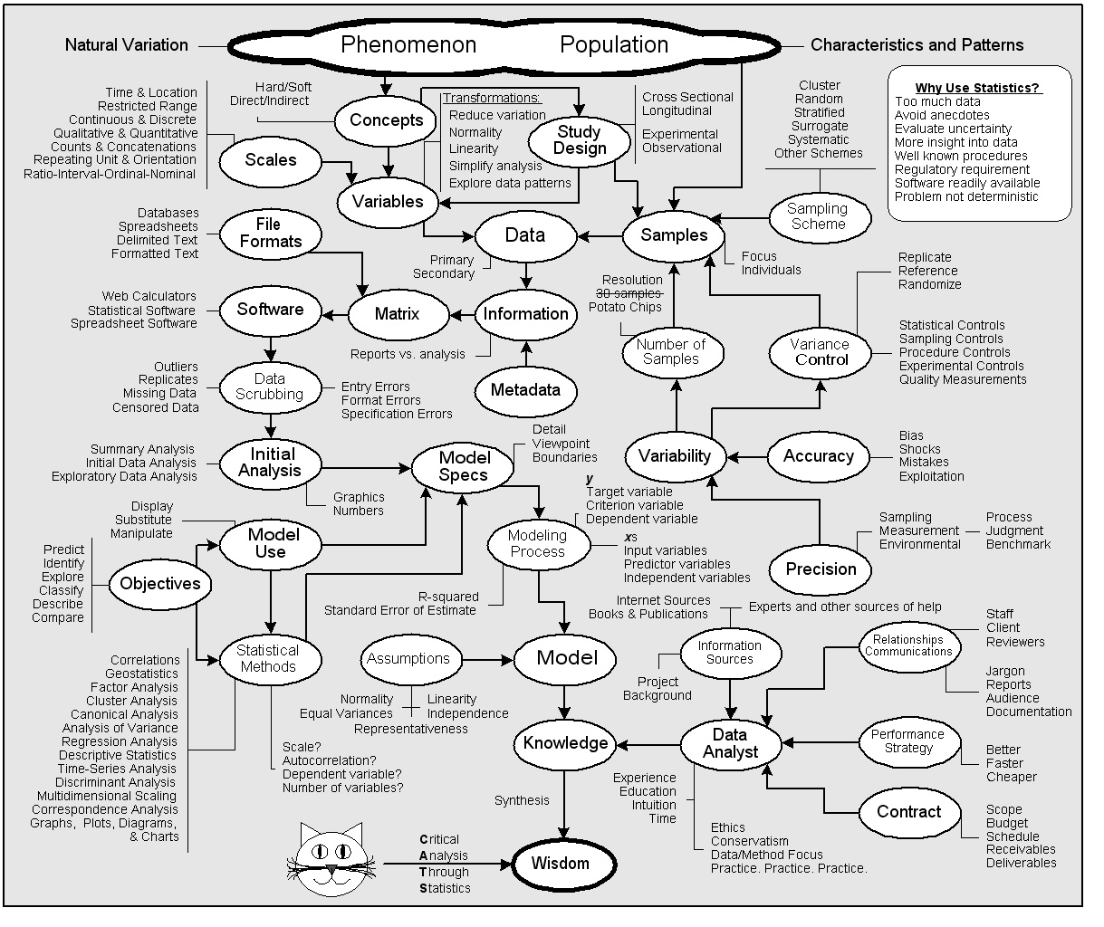
Stats with Cats has 140,000 words on 376, 7×10-inch pages divided into 25 chapters in 6 parts with 47 figures, 24 tables, 107 quotes, and 99 photos of cats. If all that information could be distilled into one picture, this is what it would look like:

You use statistics because you can; you have the knowledge and software is readily available. You use statistics because you need to, to analyze uncertainty, especially when there are too many data to just make a graph. You use statistics when you have to, such as when the problem can’t be solved any other way or when regulations mandate their use.

As a data analyst, you have to know many things, not just about statistics and the project background, but also about the project’s contract, scope, schedule, budget, and deliverables. You have to communicate effectively, both in speech and in writing, and establish good working relationships with project stakeholders. You have to decide on a performance strategy, ensure you get paid, and never compromise your ethics. Finally, you have to have the expertise and time to do the work, and above all, you have to practice, practice, practice.

Data analysis begins when you want to investigate some phenomenon that occurs in a definable population. You collect samples of the population using an appropriate sampling scheme and other measures to control variance and avoid biases so that you will meet your targets for precision and accuracy. You may need to collect more (or less) than thirty samples to meet the resolution you need for the analysis. You measure variables relevant to the phenomenon on appropriate scales. These measurements are the data, which along with the metadata, form the information you structure in a file format your software can recognize as a matrix. Your objectives and aims for model use, together with the scales and natures of your variables, enable you to select appropriate statistical methods. You scrub the information and do an initial analysis, which together with the objectives and methods, lead to your model specifications. Using the specs, you go through the steps of the modeling process to develop and calibrate a model, and evaluate possible violations of assumptions. From the model, you build on your knowledge of the phenomenon. Eventually, from critical analysis through statistics, you can synthesize the wisdom you need to make informed decisions.

The book needs more pictures of MEEEE!

The last three paragraphs describe the contents of Stats with Cats in about 350 words, without the cats of course. See what a big difference they make?

Over time, as you analyze different datasets, you’ll become more comfortable with the process. You’ll learn shortcuts to doing things. You’ll develop an instinct for things that will work and things that won’t. You’ll even be able to impress your friends and co-workers with all the new jargon you’ve learned. You might also learn a bit about yourself. Are you more of a right-brained, intuitive, visual, big-picture, inductive thinker or are you more of a left-brained analytical, verbal, detail-oriented, deductive thinker. Understanding your own preferred thought processes will help you find your best paths in life as well as data analysis.

Being able to analyze data is the asset that sets the knowledge-wielding experts apart from the arm-waving storytellers. Don’t wait for your boss or teacher to send you out into the many unmarked routes of the databahn. Journey to the land of data analysis at your own speed along paths you’re comfortable with. Don’t just endure a data analysis project. Make the journey as fulfilling as the arrival. Make data analysis your passion.

Read more about using statistics at the Stats with Cats blog. Join other fans at the Stats with Cats Facebook group and the Stats with Cats Facebook page. Order Stats with Cats: The Domesticated Guide to Statistics, Models, Graphs, and Other Breeds of Data Analysis at Wheatmark, amazon.combarnesandnoble.com, or other online booksellers.

Posted in Uncategorized | Tagged , , , , , , , , , , , , , , , | 4 Comments

Ockham’s Spatula

OK, now how do I get down from here?

Model building is like climbing a mountain. It’s what you spend so much time planning for. It’s what everybody wants to talk about. It’s what gives you that euphoric feeling of accomplishment when you’re finished. But just as mountain climbers have to descend, model builders have to deploy. You have to put your model in a form that will be palatable to users.

I had a client, a very skilled engineer, who wanted a model to predict how many workers he would need to hire during the year. His company produced three lines of products, most of which were customized for individual customers. A few years earlier, he had gone to great effort and expense to develop a model to predict his man-power needs. He collected data on how many of each type of product he had produced over the past five years and from that data had his managers estimate how long it took to make each product and complete the most common customizations. Then he had his sales force estimate the number of orders they expected the following year. He reasoned that adding up the time it took to produce a product multiplied by the number of expected orders would give him the number of man hours he would need. It was a classic bottom-up modeling approach.

The model had a problem, though. It didn’t work. Even after tinkering with the manufacturing times and correcting for employee leave, administrative functions, and inefficiency, the model still wasn’t very accurate. Moreover, it took his administrative assistant several weeks each year to collect the projected sales data to input into the model. Some of the sales force estimated more sales than they expected to try to impress the boss. Others estimated fewer sales so that they would have a better chance of making whatever goal might be given to them. A few avoided giving the administrative assistant any forecasts at all, so she just used numbers from the previous year.

Using a statistical modeling approach, I found that his historical staffing was highly correlated to just one factor, the number of units of one of the products he produced in the prior year. It made sense to me. His historical staffing levels were appropriate because he had hired staff as he needed them, albeit somewhat after his backlog reached a crisis. His business had also been growing at a fairly steady rate. So long as conditions in his market did not change, predicting future staffing needs was straightforward. He didn’t need to rely on projections from his psychologically fragile sales force.

Simple is best.

But my model proved to be quite unsettling to many. The manager of the product line that was used as the basis of the model claimed the model proved his division merited a greater share of corporate resources, and bigger bonuses for him and his staff. Managers of the two product lines that were not included in the model claimed the model was too simplistic because it ignored their contributions.

At that point, the client had a complex model that he liked but didn’t work and a simple model that worked but nobody liked. He probably would have continued to use the complex model if it didn’t take so much work to gather the input data. Valid or not, the simple model had no credibility with his managers. He could calculate a forecast with the model but was reluctant to favor the model over the intuitions of the managers. So given his two flawed alternatives, the client decided to move manpower forecasting to the back burner until the next crisis would again bring it to a boil.

I wish I could say that this was an isolated case, but it’s more of a rule than an exception especially with technically oriented clients who are most comfortable working from the bottom details up to the prediction.

A model may look good but not be adequate representation of a phenomenon.

I once developed a model for a client to predict the relative risks associated with real estate they managed. The managers wanted a quick-and-dirty way to set priorities for conducting more thorough risk evaluations of the properties. I based my model on information that would be readily available to the client. They could evaluate a property for a few hundred dollars and decide in a day or two whether further evaluation was needed immediately or whether it could be deferred. When the model-development project was done, the model was turned over to the operations group for implementation. The first thing the operations manager did was invite “experts” he worked with to refine the model. Very quickly, the refinements became expansions. The model went from quick and dirty to comprehensive and protracted. It took the operations group on average $50,000 over six-months to evaluate each property. The priorities set by the refined model were virtually identical to the priorities set by the quick-and-dirty model.

Was one of these models good and the other bad? Not exactly, there’s an important distinction to be made. Statisticians, and for that matter, scientists and engineers and many other professionals, are taught that, all else being equal, simple is best. It’s Ockham’s razor. A simple model that predicts the same answers as a more complicated model should be considered to be better. It’s more efficient. But sometimes you, as the statistician, have to be more flexible.

Statisticians, like cats, have to be flexible.

The operations manager wasn’t comfortable with a simple model. He needed to be confident in the results, which, for him, required adding every theoretical possibility his experts could think of. He didn’t want to ignore any sources of risk, even if they were rare or unlikely. That made for a very inefficient model, but if you don’t have confidence in a model and don’t use it, it’s not the tool you need.

These cases illustrate how there’s more to modeling than just the technical details. There are also artistic and psychological aspects to be mastered. Textbooks describe statistical methods to find the best model components but not necessarily the ones that will work for the model’s users. Sometimes you have to be flexible. Think of Ockham razor as more of a spatula than a cleaver.

A model is only as successful as the use to which it is put.

Like sausages, models need to look good on the outside especially if there are things on the inside that might make most users choke. You have to package the model. First, it can’t look so intimidating that users break out in a sweat when they see it. Leave the equations to the technical reviewers; hide them from the naive users. USDA inspectors have to look inside sausages, but you don’t. Second, put the model in a form that can be used easily. That inch-thick report may be great documentation, but it’ll garner more dust than users. If your users are familiar with Excel, program the model as a spreadsheet. If you know a computer language, put the model in a standalone application. A model is only as successful as the use to which it is put.

Read more about using statistics at the Stats with Cats blog. Join other fans at the Stats with Cats Facebook group and the Stats with Cats Facebook page. Order Stats with Cats: The Domesticated Guide to Statistics, Models, Graphs, and Other Breeds of Data Analysis at Wheatmark, amazon.combarnesandnoble.com, or other online booksellers.
Posted in Uncategorized | Tagged , , , , , , , , , | 5 Comments

Grasping at Flaws

Even if you’re not a statistician, you may one day find yourself in the position of reviewing a statistical analysis that was done by someone else. It may be an associate, someone who works for you, or even a competitor. Don’t panic. Critiquing someone else’s work has got to be one of the easiest jobs in the world. After all, your boss does it all the time (https://statswithcats.wordpress.com/2010/11/14/you-can-lead-a-boss-to-data-but-you-can%e2%80%99t-make-him-think/). Doing it in a constructive manner is another story.

Don’t expect to find a major flaw in a multivariate analysis of variance, or a neural network, or a factor analysis. Look for the simple and fundamental errors of logic and performance. It’s probably what you are best suited for and will be most useful to the report writer who can no longer see the statistical forest through the numerical trees.

I feel like I’m being watched.


So here’s the deal. I’ll give you some bulletproof leads on what criticisms to level on that statistical report you’re reading. In exchange, you must promise tobe gracious, forgiving, understanding, and, above all, constructive in your remarks. If you don’t, you will be forever cursed to receive the same manner of comments that you dish out.

With that said, here are some things to look for.

The Red-Face Test

Start with an overall look at the calculations and findings. Not infrequently, there is a glaring error that is invisible to all the poor folks who have been living with the analysis 24/7 for the last several months. The error is usually simple, obvious once detected, very embarrassing, and enough to send them back to their computers. Look for:

  • Wrong number of samples. Either samples were unintentionally omitted or replicates were included when they shouldn’t have been.
  • Unreasonable means. Calculated means look too high or low, sometimes by a lot. The cause may be a mistaken data entry, an incorrect calculation, or an untreated outlier.
  • Nonsensical conclusions. A stated conclusion seems counterintuitive or unlikely given known conditions. This may be caused by a lost sign on a correlation or regression coefficient, a misinterpreted test probability, or an inappropriate statistical design or analysis.

Nobody Expects the Sample Inquisition

Start with the samples. If you can cast doubt on the representativeness of the samples, everything else done after that doesn’t matter. If you are reviewing a product from a mathematically trained statistician, probably the only place to look for difficulties is in the samples. There are a few reasons for this. First, a statistician may not be familiar with some of the technical complexities of sampling the medium or population being investigated. Second, he or she may have been handed the dataset with little or no explanation of the methods used to generate the data. Third, he or she will probably get everything else right. Focus on what the data analyst knows the least about.


Data Alone Do Not an Analysis Make

Calculations

Unless you see the report writer counting on his or her fingers, don’t worry about the calculations being correct. There’s so much good statistical software available that getting the calculations right shouldn’t be a problem (https://statswithcats.wordpress.com/2010/06/27/weapons-of-math-production/). It should be sufficient to simply verify that he or she used tested statistical software. Likewise, don’t bother asking for the data unless you plan to redo the analysis. You won’t be able to get much out of a quick look at a database, especially if it is large. Even if you redo the analysis, you may not make the same decisions about outliers and other data issues that will lead to slightly different results (https://statswithcats.wordpress.com/2010/10/17/the-data-scrub-3/). Waste your time on other things.

Descriptive Statistics

Descriptive statistics are usually the first place you might notice something amiss in a dataset. Be sure the report provides means, variances, minimums, and maximums, and numbers of samples. Anything else is gravy. Look for obvious data problems like a minimum that’s way too low or a maximum that’s way too high. Be sure the sample sizes are correct. Watch out for the analysis that claims to have a large number of samples but also a large number of grouping factors. The total number of samples might be sufficient, but the number in each group may be too small to be analyzed reliably.

Correlations

You might be provided a matrix with dozens of correlation coefficients (https://statswithcats.wordpress.com/2010/11/28/secrets-of-good-correlations/). For any correlation that is important to the analysis in the report, be sure you get a t-test to determine whether the correlation coefficient is different from zero, and a plot of the two correlated variables to verify that the relationship between the two variables is linear and there are no outliers.

Regression

Regression models are one of the most popular types of statistical analyses conducted by non-statisticians. Needless to say, there are usually quite a few areas that can be critiqued. Here are probably the most common errors.

Statistical Tests

Statistical tests are often done by report writers with no notion of what they mean. Look for some description of the null hypothesis (the assumption the test is trying to disprove) for the test. It doesn’t matter if it is in words or mathematical shorthand. Does it make sense? For example, if the analysis is trying to prove that a pharmaceutical is effective, the null hypothesis should be that the pharmaceutical is not effective. After that, look for the test statistics and probabilities. If you don’t understand what they mean, just be sure they were reported. If you want to take it to the next step, look for violations of statistical assumptions (https://statswithcats.wordpress.com/2010/10/03/assuming-the-worst/).

Analysis of Variance

An ANOVA is like a testosterone-induced, steroid-driven, rampaging horde of statistical tests. There are many many ways the analysis can be misspecified, miscalculated, misinterpreted, and misapplied. You’ll probably never find most kinds of ANOVA flaws unless you’re a professional statistician, so stick with the simple stuff.

A good ANOVA will include the traditional ANOVA summary table, an analysis of deviations from assumptions, and a power analysis. You hardly ever get the last two items. Not getting the ANOVA table in one form or another is cause for suspicion. It might be that there was something in the analysis, or the data analyst didn’t know it should be included.

If the ANOVA design doesn’t have the same number of samples in each cell, the design is termed unbalanced. That’s not a fatal flaw but violations of assumptions are more serious for unbalanced designs.

If the sample sizes are very small, only large difference can be detected in the means of the parameter being investigated. In this case, be suspicious of finding no significant differences when there should be some.

Assumptions Giveth and Assumptions Taketh Away

Statistical models usually make at least four assumptions: the model is linear; the errors (residuals) from the model are independent; Normally-distributed; and have the same variance for all groups. A first-class analysis will include some mention of violations of assumptions. Violating an assumption does not necessarily invalidate a model but may require that some caveats be placed on the results.

The independence assumption is the most critical. This is usually addressed by using some form of randomization to select samples. If you’re dealing with spatial or temporal data, you probably have a problem unless some additional steps were taken to compensate for autocorrelation.

Equality of variances is a bit more tricky. There are tests to evaluate this assumption, but they may not have been cited by the report writer. Here’s a rule of thumb. If the largest variance in an ANOVA group or regression level is twice as big as the smallest variance, you might have a problem. If the difference is a factor of five or more, you definitely have a problem.

The Normality of the residuals may be important although it is sometimes afforded too much attention. The most serious problems are associated with sample distributions that are truncated on one side. If the analysis used a one-sided statistical test on the same side as the truncated end of the distribution, you have a problem. Distributions that are too peaked or flat can result in slightly higher rates of false negative or false positive tests but it would be hard to tell without a closer look than just a review.

Look at a few scatter plots of correlations with the dependent variable, then forget the linearity assumption. It’s most likely not an issue. If the report goes into nonlinear models, you’re probably in over your head.

We’re Gonna Need a Bigger Report

Statistical Graphics

There are scores of ways that data analysts mislead their readers and themselves with graphs (https://statswithcats.wordpress.com/2010/09/26/it-was-professor-plot-in-the-diagram-with-a-graph/). Here’s the first hint. If most of the results appear as pie charts or bar graphs, you’re probably dealing with a statistical novice. These charts are simple and used commonly, but they are notorious for distorting reality. Also, be sure to check the scales of the axes to be sure they’re reasonable for displaying the data across the graphic. If comparisons are being made between graphics, the scales of the graphics should be the same. Make sure everything is labeled appropriately.

Maps

As with graphs, there are so many things that can make a map invalid that critiquing them is almost no challenge at all. Start by making sure the basics—north arrow, coordinates, scale, contours, and legend—are correct and appropriate for the information being depicted. Compare extreme data points with their depiction. Most interpolation algorithms smooth the data, so the contours won’t necessarily honor individual points. But if the contour and a nearby datum are too different, some correction may be needed. Check the actual locations of data points to ensure that contours don’t extend (too far) into areas with no samples. Be sure the northing and easting scales are identical, easily done if there is an overlay of some physical features. Finally, step back and look for contour artifacts. These generally appear as sharp bends or long parallel lines, but they may take other forms.

Documentation

I’m sorry. I ate your documentation.

It’s always handy in a review to say that all the documentation was not included. But let’s be realistic. Even an average statistical analysis can generate a couple of inches of paper. A good statistician will provide what’s relevant to the final results. If you’re not going to look at it probably no one else will either. Again, waste your time on other things. On the other hand, if you really need some information that was omitted, you can’t be faulted for making the comment.

You’ve Got Nothing

If, after reading the report cover-to-cover, you can’t find anything to comment on, you can sit back and relax. Just make sure you haven’t also missed a fatal flaw (https://statswithcats.wordpress.com/2010/11/07/ten-fatal-flaws-in-data-analysis/).

If you’re the suspicious sort, though, there is another thing you can try. This ploy requires some acting skills. Tell the data analyst/report writer that you are concerned that the samples may not fairly represent the population being analyzed.

Expressing concern over the representativeness of a sample is like questioning whether a nuclear power plant is safe. No matter how much you try, there is no absolute certainty. Even experienced statisticians will gasp at the implications of a comment concerning the sample not being representative of the population. That one problem could undermine everything they’ve done.

Here’s what to look for in a response. If the statistician explains the measures that were used to ensure representativeness, prevent bias, and minimize extraneous variation, the sample is probably all right. If the statistician mumbles about not being able to tell if the sample is representative and talks only about the numbers and not about the population, there may be a problem. If the statistician ignores the comment or tries to dismiss it with a stream of meaningless generalities and unintelligible jargon (https://statswithcats.wordpress.com/2010/07/03/it%e2%80%99s-all-greek/), there is a problem and the statistician probably knows it. If he or she won’t look you in the eyes, you’ve definitely got something. If you get an open-mouth, big-eye vacant stare, he or she knows less about statistics than you do. Be gentle!

Now It’s Up to You

So that’s my quick-and-dirty guide to critiquing statistical analyses. Sure there’s a lot more to it, but you should be able to find something in these tips that you could apply to almost any statistical report you have to review. At a minimum, you should be able to provide at least some constructive feedback that will benefit both the writer and the report. Maybe you’ll even be able to prevent a catastrophe. If nothing else, you’ll have earned your day’s pay, and if you critique constructively, the respect of the report writer as well.

Read more about using statistics at the Stats with Cats blog. Join other fans at the Stats with Cats Facebook group and the Stats with Cats Facebook page. Order Stats with Cats: The Domesticated Guide to Statistics, Models, Graphs, and Other Breeds of Data Analysis at Wheatmark, amazon.combarnesandnoble.com, or other online booksellers.

Posted in Uncategorized | Tagged , , , , , , , , , , , , , , , , , , , , , , | 8 Comments

Stats With Cats Blog: 2010 in review

The stats helper monkeys at WordPress.com mulled over how this blog did in 2010, and here’s a high level summary of its overall blog health:

Healthy blog!

The Blog-Health-o-Meter™ reads Wow.

Crunchy numbers

Featured image

The average container ship can carry about 4,500 containers. This blog was viewed about 19,000 times in 2010. If each view were a shipping container, your blog would have filled about 4 fully loaded ships.

In 2010, there were 31 new posts, not bad for the first year! There were 98 pictures uploaded, taking up a total of 36mb. That’s about 2 pictures per week.

The busiest day of the year was November 8th with 4,691 views. The most popular post that day was Ten Fatal Flaws in Data Analysis.

Where did they come from?

The top referring sites in 2010 were reddit.com, mail.live.com, mail.yahoo.com, facebook.com, and Google Reader.

Some visitors came searching, mostly for stats with cats, cats, why take statistics, statswithcats, and stats and cats.

Attractions in 2010

These are the posts and pages that got the most views in 2010.

1

Ten Fatal Flaws in Data Analysis November 2010
9 comments and 2 Likes on WordPress.com

2

Try This At Home June 2010
1 comment

3

30 Samples. Standard, Suggestion, or Superstition? July 2010
4 comments

4

The Right Tool for the Job August 2010
1 comment

5

The Five Pursuits You Meet in Statistics August 2010
3 comments

Posted in Uncategorized | Leave a comment

Live Long and Publish

How I Finished My Book in Only a Decade

If you want to write a book, you just need to get a round tuit.

Do you have a half written book in your desk drawer at home? How about a file bulging with outlines and ideas you’re storing until you have the time? I’ve had those for decades, still do. In a few weeks, though, I’ll have published my book. Stats with Cats: The Domesticated Guide to Statistics, Models, Graphs, and Other Breeds of Data Analysis (http://www.wheatmark.com/merchant2/merchant.mvc?Screen=PROD&Store_Code=BS&Product_Code=9781604944723). Stats with Cats is an attempt to help people who have some training in statistics to apply their skills outside of the classroom. Maybe in time, I’ll be able to refer to it as my first book.

Writing

I started writing what would become Stats with Cats in the conventional way. I identified who I thought my audience would be. I created detailed objectives and outlines. And, I collected the scores of articles on statistical topics I had written over the years that I thought I could use as seeds for the book. At that time, the book was about using statistics to solve environmental problems.

No. No. No. This all has to be rewritten.

By the time I was through, I had restructured the book twice, thrown out most of what I had written in the past, rewritten every chapter at least three or four times, and edited sections more times than I wanted to count. I must have revised the first fifty pages twenty times. I had done everything I could do to it but finish.

When I look back at the book I planned to write at the beginning, I’m glad I took the time to let my writing mature and transform (https://statswithcats.wordpress.com/2010/05/29/stats-with-cats-whats-inside/).

Publishing

Back in the 1980s when I started thinking seriously about writing a book, I followed the traditional advice. I took classes. I talked to agents. I wrote cover letters and book proposals, but I never made a sale. Then technology changed the rules of the game. Advances in tools for book design and printing gave rise to Print On Demand (POD) publishing. POD allows publishers to order small runs of a book, thus eliminating the need for warehousing. This, in turn, opened the market to small publishing ventures and brought the cost of book publishing within the reach of aspiring authors.

Like any business, book publishing involves controlling risks. In the traditional business model, the big publishing houses take most of the business risks. They select the authors and the books that are published. They fund the book editing and design, printing, warehousing, marketing, and fulfillment (i.e., providing the books and managing the money). Sometimes they even advance money to authors to write the book. The publisher controls all aspects of an author’s book—its size, its price, the publishing schedule, and sometimes even the title and contents. They reap the bulk of any profits, leaving the author with only a few percent of the revenues. But, the author assumes almost no risk. If not a single book is sold, authors lose nothing other than their investment of their own time.

POD has liberated aspiring authors from the tyranny of the big publishing houses. Authors can take all or some of the risks and retain more of the control and rewards by self-publishing. Typically, a self-publishing author will pay a POD publisher to edit and design the book, obtain copyrights and registrations, arrange for printing and fulfillment, and handle all the money. Self-publishing authors usually retain the copyrights, receive more than 10% royalties on books sold, and can influence if not dictate most anything, right down to fonts and the price of the book. Last year, close to 200,000 books were published in the U.S., 80% of which were self-published. That number is expected to increase in the future (Don Harold, BookWhirl.com).

Aren’t you done yet?

For my book I searched the internet and in just a few minutes identified a score of POD publishers, including Trafford, Xlibris, iUniverse, Lulu, Dog Ear, Wheatmark, and quite a few others. I filled in an online form and later emailed the part of the book I had completed so they could send me a book proposal. I selected Wheatmark, signed the contract, and paid the fee in only a few days.

My book was expensive, several thousand dollars. That’s because it is 140,000 words on 374, 7×10-inch pages with 47 figures, 24 tables, and 99 photos of cats. I figure it cost me about $25 per graphic. So here’s a hint—publishing your book will cost hundreds instead of thousands of dollars if you don’t include graphics. But what’s non-fiction without pictures? I had to do it. Don’t even think about interior color, though, unless you’re going to publish a fifteen page children’s book. It’s absurdly expensive.

Marketing

Publishing is just the middle step in completing a book. You have to market it so people will know it’s there. Most aspiring authors probably don’t think much about marketing their book. Most successful self publishers think about marketing a LOT.

My marketing plan includes:

  • A description of the book along with some promotional text, taglines, and pictures I use in advertising, and a list of features and benefits of the book that show how the book is valuable and unique.
  • A description of the book’s audiences, their relative size, how they might find out about the book, where they might purchase the book, and the probability they might purchase the book. From this I selected target groups that I would focus on marketing.
  • A list of companion and competitor books including year of publication, price, size and number of pages, publisher, and Amazon sales ranking. This information helped me set the price for Stats with Cats that was well below the cost of books used in introductory statistics classes.
  • A list of websites where I plan to post announcements of the book’s availability, such as alumni groups and social networking sites, and possible venues for press releases and paid advertisements.

My first marketing effort was a blog, which I started in June, eight months before Stats with Cats will be published. My blog is at https://statswithcats.wordpress.com/and is linked to my accounts on Facebook and Linkedin. I also have a Facebook group for Stats with Cats. Every Sunday I post an excerpt from the book, which I also then post to reddit.com (i.e., the /statistics, /matheducation, and /learnmath subreddits), scribd.com, digg.com, and stumbleupon.com. Since November, I’ve been averaging about 100 views per day. Hopefully, this trend will increase substantially once the book begins shipping.

Lessons Learned

If I get to publish another book, I know a few things I would do differently. This is the advice I would offer to aspiring authors:

  1. Be sure you understand why you want to publish a book—Decide what’s important. Are you looking to stimulate your career or business? Keep the price low, even give the book away. The book is a means to the end. Are you looking to make money? Be sure you have a good marketing plan. In any case, have a measurable goal whether it is books sold, blog followers, or new business attributable to the book.
  2. Define your audience in terms of marketing—Statisticians talk about populations all the time. It’s fundamental to what we do. But there’s a concept called phantom populations, a group of subjects that have no practical commonalities. For example, it would make no sense to say the audience for your book is people who wear red shirts. Define your audience in terms of how you will get the attention of potential buyers. In statistics, this is called a frame. If you are writing a children’s book, for instance, your audience is not five-year-olds. What do they know, thay can’t even read? Your real audience is parents and relatives who will buy the book for their five-year-old. Eighty percent of books purchases are given as gifts.
  3. Let your book evolve if it needs to—Don’t get too enamored with titles and outlines. Your perspective may change while you are writing the book. Be adaptable. Don’t be afraid to throw stuff away. Defer rewriting until you’ve had a chance to forget what you wrote (this turns out to be quite easy in people my age). Look at your writing with fresh eyes. And don’t just review your writing once. Keep rewriting so that each time you make fewer and more minor changes. Eventually, you won’t be able to change anything to make it better, only different. It’ll be like Fonzi combing his hair in the restroom mirror. Finally, know when to stop making changes. If you’re not sure when that may be, your publisher will tell you. It’s when they charge you extra for any changes you make.

Don’t be afraid of failure, the experience alone is worth the effort. Anything you complete will empower you to more and greater successes. All you have to do is start the journey and take a small step forward from time to time until you arrive at your goal. Good luck!

Any questions?

You can read a longer version of this blog at
http://www.scribd.com/doc/45815415/Live-Long-and-Publish.

Read more about using statistics at the Stats with Cats blog. Join other fans at the Stats with Cats Facebook group and the Stats with Cats Facebook page. Order Stats with Cats: The Domesticated Guide to Statistics, Models, Graphs, and Other Breeds of Data Analysis at Wheatmark, amazon.combarnesandnoble.com, or other online booksellers.

Posted in Uncategorized | Tagged , , , , , | 4 Comments

The Santa Claus Strategy

I’ve been very good this year. I don’t know why the humans call me Mischief.

I’m working all out
Deadline is near
Model’s in doubt
Dooming my career.
Sta-tis-tics will chill my meltdown.

I’m adding new vars
Testing them twice
Trying to find out which ones’ll suffice
Sta-tis-tics will give the lowdown.

I see the best predictors.
I know what steps come next
I clean up my dataset and
Regress my y on my x.

Ohhhhh!
My work is all through
My deadline was met
My client paid up
Now I’m out of debt.
Sta-tis-tics helped thwart my shutdown.

Sing to the tune of “Santa Claus Is Coming to Town”

Make a list. Check it twice. That’s sage advice from an old fat guy with a beard. Here’s what that means if you’re analyzing data.

What a Phenomenal Concept

The first step in assembling a set of variables for your analysis is to identify the concepts or aspects of the phenomenon you want to investigate. By concepts, I mean to include hypotheses and theories as well as ideas, suppositions, beliefs, assertions, and premises, which may be less definitive or accepted. These concepts will come from the relationships known and supposed about the phenomenon. The reasons for doing this are that concepts can be multifaceted and linked to other concepts creating a framework of relationships underlying the phenomena. In traditional research, this is what a literature search is for. Literature searches, though, are considered by some to be an academic activity not applicable to analyses done on the job. Not true. The process of thinking through what you want to measure is necessary.

Once you have specific ideas you want to explore, identify ways they could be measured. Start with conventional measures, the ones everyone would recognize and know what you did to determine. Then consider whether there are any other ways to measure the concept directly. From there, establish whether there are any indirect measures or surrogates that could be used in lieu of a direct measurement. Finally, if there are no other options, explore whether it would be feasible to develop a new measure based on theory. Keep in mind that developing a new measure or a new scale of measurement is more difficult for the experimenter and less understandable for reviewers than using an established measure.

On a Scale of ½ to VIII

Of the possible measures you identify, select scales of measurement and consider how difficult it would be to generate the data. For example:

  • Qualities are usually more difficult to measure accurately and consistently than quantities because there is more complex judgments involved.
  • Counts are straightforward when they involve simple judgments as to what to count. Some judgments, such as species counts, can be relatively complex because you have to be able to identify the species before you can count it. Counts have no decimals and no negative numbers.
  • Amounts are usually more difficult to measure than counts because the judgment process is more complex. Amounts have decimals but no negative numbers unless losses are admissible.
  • Ratio measures, such as concentrations, rates, and percentages, are usually more difficult to measure than amounts because they involve two or more amounts. Ratio measures have both decimals and negative numbers.

Once you know what you might measure, evaluate the sources of measurement variability (benchmark, process, and judgment described in https://statswithcats.wordpress.com/2010/09/12/the-measure-of-a-measure/) in each measure.

Finally, take into account your objective and the ultimate use of your statistics (https://statswithcats.wordpress.com/2010/08/22/the-five-pursuits-you-meet-in-statistics/). For example, if you want to predict some dependent variable, quantitative independent variables would usually be preferable to qualitative variables because they would provide more scale resolution. Furthermore, you could dumb down a quantitative variable you measured to a less finely divided scale or even a qualitative scale. You usually can’t go in the other direction. If you want your prediction model to be simple and inexpensive to use, don’t select predictors that are expensive and time-consuming to measure.

Consider building some redundancy into your variables if there is more than one way to measure a concept. Sometimes one variable will display a higher correlation with your model’s dependant variable or help explain analogous measurements in a related measure. For example, redundant measures are often included in opinion surveys by using differently worded questions to solicit the same information. One question might ask “Did you like [something]?” and then a later question ask “Would you recommend [something] to your friends?” or “Would you use [something] again in the future?” to assess consistency in a respondent’s opinion about a product. Redundant variables can be a good check on data quality (https://statswithcats.wordpress.com/2010/09/19/it%E2%80%99s-all-in-the-technique/).

The Santa Claus Strategy

So make a list and check it twice.

Here’s a checklist you can use to help you think about your variables. Complete a checklist for each variable you plan to record. This may seem like a formidable amount of work, but it’s worth the effort. The checklist will help you think about your measurements, visualize how they will be generated, and ultimately produce results with less bias and variability. The checklists also provide concise documentation that can be added to a report appendix or project file. Furthermore, if you work with the same data often, you’ll find that completing such a checklist becomes much easier once you have thought through the process the first time. If this checklist doesn’t meet your needs, use it as a starting point to create your own. The important point is to think about what you plan to do.


Also, remember that this isn’t a once-and-done process. Be sure to revisit your thought process periodically throughout your analysis. It’ll help keep you on track.

Read more about using statistics at the Stats with Cats blog. Join other fans at the Stats with Cats Facebook group and the Stats with Cats Facebook page. Order Stats with Cats: The Domesticated Guide to Statistics, Models, Graphs, and Other Breeds of Data Analysis at Wheatmark, amazon.combarnesandnoble.com, or other online booksellers.

Posted in Uncategorized | Tagged , , , , , , , , | 4 Comments

You’re Off to Be a Wizard

It’s naptime. Nobody gets to see the Wizard. Not nobody, not nohow!

The process of developing a statistical model (https://statswithcats.wordpress.com/2010/12/04/many-paths-lead-to-models/) involves finding the mathematical equation of a line, curve, or other pattern that faithfully represents the data with the least amount of error (i.e., variability). Variability and pattern are the yin and yang of models. They are opposites yet they are intertwined. Improve the fit of the model’s pattern to the pattern of the data, and you’ll reduce the variability in the model and vice versa. It’s wizardry.

Follow the Modeling Code

Say you have a conceptual model (https://statswithcats.wordpress.com/2010/12/12/the-seeds-of-a-model/) with a dependent variable (y) and one or more independent variables (x1
through xn) in the fear-provoking-yet-oh-so-convenient mathematical shorthand:

y = a0 + a1x1 + a2x2 + a3x3anxn + e

Estimating values for the model’s parameters (i.e., a0
through an) and the model’s uncertainty (i.e., the e) so that the model is the best fit for the data with the least imprecision is a process called calibrating or fitting a model. Every statistical method has criteria that the procedure uses to calculate the parameters of the best model given the variables, data, and statistical options you specify. Your job is to specify those variables, data, and statistical options.

This is how it works:

  1. You collect data that represent the y and the xs for each of the samples.
  2. You make sure the data are correct and appropriate for the phenomenon and put the values in a dataset.
  3. Using the software for the statistical procedure you selected, you specify the dependent variable, the independent variables, and any statistical option you want to use. Every statistical procedure has a variety of options that can be specified. If you’re doing a factor analysis, for instance, you can try different extraction techniques, different communalities, different numbers of factors, and so on. If you’re a statistician, you know what I mean. If you’re not a statistician, don’t worry about this.
  4. Magic happens. This is what you learn about if you major in statistics.
  5. You evaluate the output from the software and, if all is well, you record the parameters and the error, and you have a calibrated statistical model. If the model fit isn’t what you would like, which is what usually happens, you make changes and try again.

Consider your choices wisely.

What changes could you make? Here are a few hints. If you are well acquainted with statistics, you can try making adjustments to the variables and the statistical options, and perhaps even the data, to see how the different combinations affect the model. For example, you can try including or excluding influential observations, filling in missing data, changing the variables in the model, or breaking down the analysis by some grouping factor (https://statswithcats.wordpress.com/2010/11/21/fifty-ways-to-fix-your-data/). If you are well acquainted with the data but not statistics, you might rely more on your intuition than your computations. Look for differences between the different models as well as between the results and your own expectations based on established theory.

Models and Variables and Samples, Oh My

If you specify only one way that you want to combine the variables, data, and statistical options, the statistical method will give you the best model. However, if you specify more than one combination of independent variables, you have to have some criteria for selecting which of the models to use as your final model and then decide how good the model is. The three most commonly used criteria are the coefficient of determination, the standard error of estimate, and the F-test.

  • Coefficient of Determination—also called R2 or R-square, is the square of the correlation of the independent variables with the dependent variable. R-squared ranges from 0 to 1. It is thought of as the proportion of the variation in the dependent variable that is accounted for by the independent variables, or similarly, the proportion of the total variation in the relationship that the model accounts for. It is a measure of how well the pattern of the model fits the pattern of the data, and hence, is a measure of accuracy. Some statisticians believe that R-square is overused and flawed because it always increases as terms are added to a model. Whine. Whine. Whine.
  • Standard Error of Estimate—also called sxy or SEE, is the standard deviation of the residuals. The residuals are the differences (i.e., errors) between the observed values of the dependent variable and the values calculated by the model. The SEE takes into account the number of samples (more is better) and the number of variables (fewer is better) in the model, and is in the same units as the dependent variable. It is a measure of how much scatter there is between the model and the data, and hence, is a measure of precision. For a set of models you are considering, the largest coefficient of determination usually will correspond to the smallest standard error of estimate. Consequently, many people look only at the coefficient of determination because it is easier to understand that statistic given its bounded scale. It’s essential to look at the standard error of estimate as well, though, because it will allow you to evaluate the uncertainty in the model’s predictions. In other words, R-square might tell you which of several models may be best while SEE will tell you if that best is good enough for what you need to do with the model.
  • F-test and probability—A test of whether the R-square value is different from zero. The F-value will vary with the numbers of samples and terms in the model. The probability is customarily required to be less than 0.05. Many statisticians start by looking at the results of the F-test, using the probability as a threshold, and then look at the R-square and SEE.

Evaluating models doesn’t end with R-square, SEE, and F-test. There are many other diagnostic tools for evaluating the overall quality of statistical models, including:

  • AIC and BIC—The Akaike’s Information Criterion and the Bayesian Information Criterion are statistics for comparing alternative models. For any collection of models, the one with the lowest values of AIC and BIC is the preferred model.
  • Mallows’ Cp Criterion—A relative measure of inaccuracy in the model given the number of terms. Cp should be small and close to the number of terms in the model. Large values of Cp may indicate that the model is overfit.
  • Plot of Observed vs. Predicted—On a graph with observed values on the y-axis and predicted values on the x-axis, data points should plot close to a straight 45-degree line passing through the origin of the axes. Systematic deviations from the line indicate a lack-of-fit of the model to the data. Individual data points that deviate substantially from the line may be considered outliers.
  • Plot of Observed vs. Residuals—On a graph with observed values on the y-axis and residuals (predicted values minus observed values) on the x-axis, data points should plot randomly around the origin of the axes.
  • Histogram of Residuals—If the frequency distribution of the model’s residuals does not approximate a Normal distribution, the probabilities calculated for the F-test may be in error.

There are a lot of things you’ll want to look at.

Usually, all of these statistics should be considered when building a model. Once a small number of alternative models is selected, statistical diagnostics are used to evaluate the components of a statistical model, the variables, including:

  • Regression Coefficients—If you use statistical software, you’ll see two types of regression coefficients. The unstandardized regression coefficients are the a0 through an terms in the model. They are also referred to as B or b. These are the values you use if you want to calculate a prediction of the y variable from the values of the x variables. The standardized regression coefficients are equal to the unstandardized regression coefficients divided by the standard errors of the coefficients. Standardized regression coefficients, also called Beta coefficients, are used to compare the relative importance of the independent variables. If you forget which is which, remember that there is no standardized coefficient for the constant intercept term in the model. The column with a number for the model intercept contains the unstandardized coefficients you use for calculating predictions.
  • t-tests and probabilities—Tests of whether the regression coefficients are different from zero. The t-values may change significantly depending on what other terms are in the model. The probability for the tests are commonly used to include or discard independent variables.
  • Variance Inflation Factor—VIFs are measures of how much the model’s coefficients change because of correlations between the independent variables. The VIF for a variable should be less than 10 and ideally near 1 or multicollinearity may be a concern. The reciprocal of the VIF is called the tolerance.
  • Partial Regression Leverage Plots—Leverage plots are graphs of the dependent variable (y-axis) versus an independent variable from which the effects of the other independent variables in the model have been removed (x-axis). The slope of a line fit to the leverage plot is the regression coefficient for that independent variable. These plots are useful for identifying outliers and other concerns in the relationship between the independent variable and the dependent variable.

These statistics are calculated for each independent variable in a model.

Finally, the observations used to create the statistical model are evaluated using diagnostic statistics, including:

  • Residuals—Residuals are the differences between the observed values and the model’s predictions. The residuals should all be small and Normally distributed.
  • DFBETAs—The changes in the regression coefficients that would result from deleting the observation. DFBETAs should all be small and relatively consistent for all the observations.
  • Studentized Deleted Residual—A measure of whether an observation of the dependent variable might be overly influential. The studentized deleted residual is like a t-statistic; it should be small, preferably less than 2, if the observation is not overly influential.
  • Leverage— A measure of whether an observation for an independent variable might be overly influential. The leverage for an observation should be less than two times the number of terms in the model divided by the sample size.
  • Cook’s Distance— A measure of the overall impact of an observation on the coefficients of the model. If the CD for an observation is less than 0.2, the observation has little impact on the model. A CD value over 0.5 indicates a very influential observation.

These statistics are calculated for each sample used to create the model.

You won’t necessarily use all of these diagnostics every time you build a model. Then again, you may also have to use some of the many other diagnostic statistics. You have to have the brains to know what statistics to use, the heart to follow through all the calculations and plots, and the courage to decide what diagnostics to ignore and what parts of the model you should change.

No Place for a Tome

In step 5 of the modeling process, “If all is well” means that all the statistical tests and graphics that your software provides indicate that the model will be satisfactory for your needs. This, of course, is the crux of statistical modeling that statisticians write all those books about. You’ll want to get at least one reference for the type of analysis you want to do and maybe another one for the software you plan to use. Then you actually have to read them. Good luck with that.

Let’s not have any big surprises. OK?

The best results you can hope for, in a way, are the mundane conclusions that confirm what you expect, especially if they add a bit of illumination to the dark places on the horizon of your current knowledge. Expect that there will be some minor differences between simulations. They’ll probably be inconsequential. But be cautious if the results are a big surprise. Be skeptical of anything that might make you want to call a press conference. It’s OK to get surprising results, just be sure you aren’t the one surprised later to find an error or misinterpretation.

After you’re done with model calibration, you’re ready to implement the model in a process called deployment or rollout. You’ll find a lot of information about deployment on the Internet, particularly in regards to software. Most data analyses give birth to reports, mostly shelf debris. Statistical models that perform a function, though, usually involve software. These models can be programmed into a standalone application or integrated into available software like Access or Excel. Consider your audience. Perhaps the best advice is to keep a deployed model as simple as possible. Most users won’t have to know the details of the model, only how to use it. Be sure you provide enough documentation, though, so that any number crunchers in the group can marvel at your accomplishment.

Read more about using statistics at the Stats with Cats blog. Join other fans at the Stats with Cats Facebook group and the Stats with Cats Facebook page. Order Stats with Cats: The Domesticated Guide to Statistics, Models, Graphs, and Other Breeds of Data Analysis at Wheatmark, amazon.combarnesandnoble.com, or other online booksellers.
Posted in Uncategorized | Tagged , , , , , , , , , , , , , , , , , , , , , , , , , | 8 Comments

The Seeds of a Model

Always start with good seeds.

Perhaps the most complicated and time-consuming aspect of model building is selecting the components of your model—the variables, the samples, and the data (https://statswithcats.wordpress.com/2010/12/04/many-paths-lead-to-models/). Here are a few tips for collecting the seeds of your model.

Models Revisited

Here’s a quick review of the components of a statistical model. The key variable that characterizes the phenomenon to be modeled is called the criterion variable, or more commonly, the dependent variable. Variables (usually, but not necessarily, more than one) that will be used to test, predict, or explain the dependent variable in the model are called grouping variables, predictor variables, explanatory variables, or most commonly, independent variables. A prototype model is represented as:

Dependent variable that
characterizes the phenomenon

=

Independent variable(s) that test, predict, or explain the dependent variable

By convention, the criterion or dependent variable is always placed to the left of the equals sign, and the independent variables are placed to the right. This representation says that the information in the dependent variable can be obtained from the information in the independent variable(s). Usually, though, the independent variables in a model won’t all be equally important for describing a dependent variable. Each independent variable has to be weighted by multiplying it by an adjustment factor to account for the differences. The adjustment factors also correct for the independent variables being measured in different units, or even scales of measurement. So a more detailed representation of a model would be:

Dependent variable

=

Variable 1 Adjustment Factor * Independent variable 1 +
Variable 2 Adjustment Factor * Independent variable 2 +
… and so on … +
Model Adjustment Factor

This says that the information in your dependent variable can be expressed as the sum of your independent variables, which have been adjusted to account for their scales of measurement and for their contributions to the model, plus an adjustment factor for the entire model not related to a specific independent variable. If all of the adjustment factors are constants in a given model, which they usually are, you have a linear model. The values for the adjustment factors are determined by the technique you’re using to calibrate the model. If the value of a dependent variable is always equal to the sum of the adjustment factors times the values of the independent variables, plus the model constant, the model is called exact or deterministic (https://statswithcats.wordpress.com/2010/08/08/the-zen-of-modeling/).

Even with all those adjustment factors, though, sometimes the independent variables can’t quite reproduce the values of the dependent variable, so there are errors. Add an error term to the model and you have a statistical model:

Dependent variable

=

Variable 1 Adjustment Factor * Independent variable 1 +
Variable 2 Adjustment Factor * Independent variable 2 +
… and so on … +
Model Adjustment Factor +
Error

To be more concise, the terms in the model can be represented by letters and rewritten as:

y = a0 + a1x1 + a2x2 +anxn + e

where:

y is the dependent variable that characterizes the phenomenon.

x1 through xn are the independent variables that test, predict, or explain the dependent variable.

a0 is the Model Adjustment Factor.

a1 through an are the Variable Adjustment Factors. a1 through an are constants called coefficients or parameters of the model. If a1 through an
aren’t constants, you have a nonlinear model.

e is the Error term, which allows you to characterize the uncertainty in the model.

The y and the xs are the variables you create and measure on your samples. The as and the e are the constants the statistical procedure estimates. That’s a statistical model. To add a little more perspective, if you have only one dependent variable, only one independent variable, and no error, the model reduces to:

y = a + bx

Now that’s a different way to look at things.

which you may remember from high school algebra is the equation of a straight line where a is the y-intercept and b is the slope of the line. So mathematical models really aren’t so mysterious and shouldn’t induce the terror of, say, getting sucked down the toilet in the restroom of a Boeing 747 and falling 35,000 feet into a fetid swamp full of vampire bats, ticks, leeches, and IRS agents, then having to give an hour-long presentation on your experience au naturel at the next Christian Nudist Convocation. Try both, you’ll see.

Dependent Variables

To build your model, select as many dependent variables as you feel you’ll need to characterize the phenomenon. Usually, statistical models have only one dependent variable. These are called univariate statistical models. If you think you’ll need only one dependent variable, that’s great. It will make for a fairly straightforward analysis.

If more than one dependent variable is needed to describe a phenomenon, the model is called a multivariate statistical model. (Some statistical textbooks, particularly in the social sciences, refer to statistical procedures that analyze more than one kind of variable, either dependent or independent, as multivariate. But the complexity of the analysis is far greater if there are multiple dependent variables then if there are multiple independent variables.)

If you need more than one dependent variable, try to limit the number. If you have more than a few dependent variables, here are a few things you can do to reduce the number of candidate dependent variables.

  • Focus on Aspects of the Phenomenon—Some phenomena are very complex or at least multifaceted. You may be able to reduce the number of dependent variables you are considering by focusing on just one aspect of the phenomenon.
  • Narrow the Objective—If you are trying to do too much in one study, you might try to reduce your aims, or break up the project into parts and conduct the subprojects sequentially.
  • Focus on Hard Information—Hard information involves measurements of tangible, observable demonstrations as opposed to measurements of intangible beliefs or opinions. Focus on dependent variables that involve hard information.
  • Focus on Direct Information—Direct information involves measurements specifically of the phenomenon being investigated, as opposed to measurements of factors associated with the phenomenon. Focus on dependent variables that directly measure the phenomenon.
  • Eliminate Correlated Variables—If several candidate dependent variables are highly intercorrelated, pick the best and eliminate the rest.
  • Create Multiple Models—If you have to have more than one dependent variable, create a different model for each one. This is like subdividing the objectives—not optimal but sometimes a necessary evil.
  • Conduct a Factor Analysis—You might be able to reduce the number of dependent variables using factor analysis to combine the multiple variables into one.

If you can’t do any of these things, you’re probably headed for a multivariate analysis. Consider looking for help.

Independent Variables

Your selection of independent variables will hinge on what you plan to use the model for. Here are a few tips for identifying candidate measures and scales:

  • Variables for Characterizing, Classifying, Identifying, and Explaining—Select enough variables to address all the theoretical aspects of the phenomenon, even to the point of having some redundancy. Sometimes two differently measured or differently scaled variables that address the same theoretical concept will make dissimilar contributions to the model. When you calibrate the model, the extra variables will drop out.
  • Variables for Comparing—Test what you want to know, not everything under the sun. Keep the number of variables to an absolute minimum or your analysis will become intractable. Try to use conventionally recognized variables and scales rather than creating new ones if you can. This will facilitate replication studies.
  • Variables for Predicting—Be sure that the variables and scales you select are relatively inexpensive and easy to create or obtain. A prediction model won’t be very useful if the prediction variables cost more to generate than the prediction is worth. For example, if you plan to use the model repeatedly, say to make monthly forecasts, you’ll want the model inputs to be simple enough that you could generate all the data you would need in a couple of weeks at most. If the inputs were so complex that they take months to generate, you wouldn’t be able to use the model as you wanted. Stress precision in selecting variables. Accuracy tends to come easy while precision is elusive. Prediction models usually keep only the variables that work best in making a prediction, so the number of variables you select initially isn’t that important. Recognize, though, that the more variables you have in your conceptual model, the more work it will be to winnow out the ones you don’t need.

Some of the variables may have several possible scales (https://statswithcats.wordpress.com/2010/09/12/the-measure-of-a-measure/). If these extra scales are related to each other by a linear algebraic relationship, keep only one. This is because the variables will be perfectly correlated, and thus, will add no new information to the model. For example, if you measure temperature in degrees Fahrenheit, you don’t need to also include temperature in degrees Celsius because °C = 5/9(°F − 32). Pick the scale that will give you the best resolution. In the example of temperature, Fahrenheit-scaled thermometers can be read with greater precision than Celsius-scaled thermometers because they have smaller divisions. Better yet, get a digital thermometer that displays several decimal places.

If two measures have unrelated scales or can be measured differently, keep them all at this point. You will sort out the best measures when you calibrate the model. For example, you could measure pH using pH paper, a field meter, or a lab titration. If a concept that you want to evaluate with your model were a person’s size, you could use a height scale and a weight scale. However, you wouldn’t need to include weight in both pounds and kilograms because the two scales are linearly related (1 kg = 2.2 lbs). You could include weight measured by a balance beam, a strain gage, a spring scale, or even a circus weight-guesser because they use different techniques to measure weight (although they would probably be highly correlated).

Samples and Data

The samples you select must represent the population you want to analyze. A lot of thought must go into defining the population and finding samples that will fairly represent that population. Then all those mental maneuvers go into fitting considerations, like the sample hierarchy, resolution and the number of samples (https://statswithcats.wordpress.com/2010/07/17/purrfect-resolution/), and the sampling scheme, into a comprehensive sampling plan. So the last thing you want to have happen is to have the sampler, the person who will generate the data, stray from the carefully thought-out plan. You don’t want field technicians moving sampling locations so that they don’t have to walk so far from their truck. You don’t want doctors reassigning their friends to experimental groups that will get preferential treatment. You don’t want your survey takers concentrating on attractive members of the opposite sex. You get the idea.

I think I’ll take a sample here

When it comes to samples, samplers should have little or no discretion to stray from the plan. Follow the map that will find the population you’re looking for. Then there’s the process of generating the data. As much as you plan to minimize variance with reference, replication, and randomization (https://statswithcats.wordpress.com/2010/09/05/the-heart-and-soul-of-variance-control/), there will always be opportunities at the point of data collection to improve the process. A dropped meter may require recalibration that’s not called for in the sampling plan. A survey taker might ask a clarifying question, check spelling, or point out a math error before a respondent forever disappears. A surveyor can correct a map with an incorrectly located sampling point. An accountant can adjust misclassified debits in financial records. As the data analyst, you are mostly powerless to make such corrections and clarifications until it’s too late, and you have to puzzle over the cause of an outlier. You need to rely on the knowledge and experience of the people collecting the data. So when it comes to data, samplers should have considerable discretion to use their initiative to ensure the quality of the data, minimize variance, and achieve the intent, if not the letter, of the sampling plan.

Once you know what you want your model to do and you know what you need to measure, you can consider the statistical techniques you might use (https://statswithcats.wordpress.com/2010/08/27/the-right-tool-for-the-job/).

Read more about using statistics at the Stats with Cats blog. Join other fans at the Stats with Cats Facebook group and the Stats with Cats Facebook page. Order Stats with Cats: The Domesticated Guide to Statistics, Models, Graphs, and Other Breeds of Data Analysis at Wheatmark, amazon.combarnesandnoble.com, or other online booksellers.
Posted in Uncategorized | Tagged , , , , , , , , , , , , , , , | 7 Comments