Regression Fantasies: Part I

Five Common Reasons for Doubting a Regression Model

Finding a model that fits a set of data is one of the most common goals in data analysis. Least squares regression is the most commonly used tool for achieving this goal. It’s a relatively simple concept, it’s easy to do, and there’s a lot of readily available software to do the calculations. It’s even taught in many Statistics 101 courses. Everybody uses it … and therein lies the problem. Even if there is no intention to mislead anyone, it does happen.

Here are five of the most common reasons to doubt a regression model.

Not Enough Samples

Accuracy is a critical component for evaluating a model. The coefficient of determination, also known as R-squared or R2, is the most often cited measure of accuracy. Now obviously, the more accurate a model is the better, so data analysts look large values for R-squared.

R-squared is designed to estimate the maximum relationship between the dependent and independent variables based on a set of samples (cases, observations, records, or whatever). If there aren’t enough samples compared to the number of independent variables in the model, the estimate of R-squared will be especially unstable. The effect is greatest when the R-squared value is small, the number of samples is small, and the number of independent variables is large, as shown in this figure.
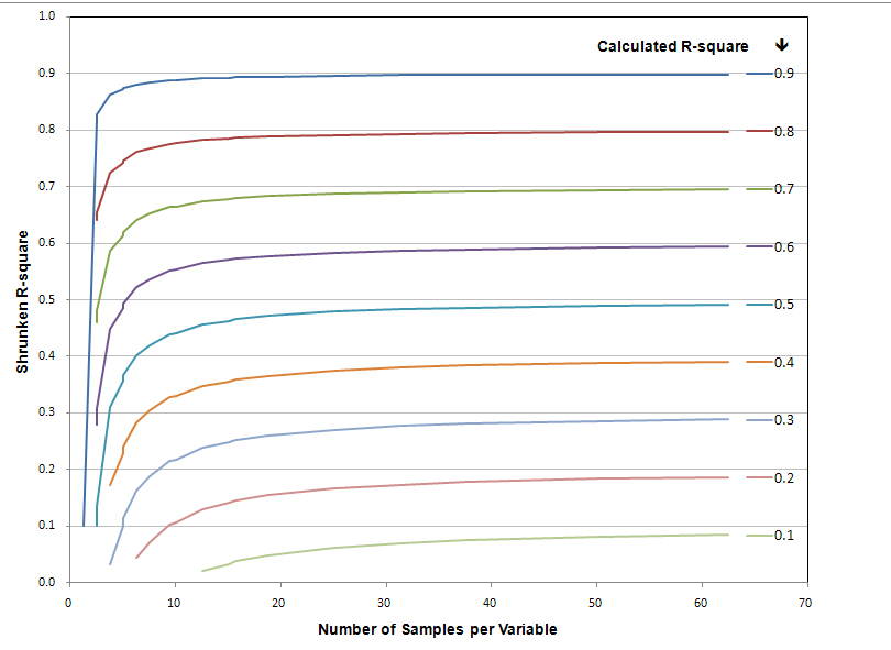
The inflation in the value of R-squared can be assesses by calculating the shrunken R-square. The figure shows that for an R-squared value above 0.8 with 30 cases per variable, there isn’t much shrinkage. Lower estimates of R-square, however, experience considerable shrinkage.

You can’t control the magnitude of the relationship between a dependent variable and a set of independent variables, and often, you won’t have total control over the number of samples and variables either. So, you have to be aware that R-squared will be overestimated and treat your regression models with some skepticism.

No Intercept

Almost all software that performs regression analysis provides an option to not include an intercept term in the model. This sounds convenient, especially for relationships that presume a one-to-one relationship between the dependent and independent variables. But when an intercept is excluded from the model, it’s not omitted from the analysis; it is set to zero. Look at any regression model with “no intercept” and you’ll see that the regression line goes through the origin of the axes.

With the regression line nailed down on one end at the origin, you might expect that the value of R-squared would be diminished because the line wouldn’t necessarily travel through the data in a way that minimizes the differences between the data points and the regression line, called the errors or residuals. Instead, R-squared is artificially inflated because when the correction provided by the intercept is removed, the total variation in the model increases. But, the ratio of the variability attributable to the model compared to the total variability also increases, hence the increase in R-squared.

The solution is simple. Always have an intercept term in the model unless there is a compelling theoretical reason not to include it. In that case, don’t put all your trust in R-square (or the F-tests).

Stepwise Regression

Stepwise regression is a data analyst’s dream. Throw all the variables into a hopper, grab a cup of coffee, and the silicon chips will tell you which variables yield the best model. That irritates hard-core statisticians who don’t like amateurs messing around with their numbers. You can bet, though, that at least some of them go home at night, throw all the food in their cupboard into a crock pot, and expect to get a meal out of it.

The cause of some statistician’s consternation is that stepwise regression will select the variables that are best for the dataset, but not necessarily the population. Model test probabilities are optimistic because they don’t account for the stepwise procedure’s ability to capitalize on chance. Moreover, adding new variables will always increase R-squared, so you have to have some good ways to decide how many variables is too many. There are ways to do this. So using stepwise regression alone isn’t a fatal flow. Like with guns, drugs, and fast food, you have to be careful how you use it.

If you use stepwise regression, be sure to look at the diagnostic statistics for the model. Also, verify your results using a different data set by splitting the data set before you do any analysis, by randomly extracting observations from the original data set to create new data sets, or by collecting new samples.

Outliers

Outliers are a special irritant for data analysts. They’re not really that tough to identify but they cause a variety of problems that data analysts have to deal with. The first problem is convincing reviewers not familiar with the data that the outliers are in fact outliers. Second, the data analysts have to convince all reviewers that what they want to do with them, delete or include or whatever, is the appropriate thing to do. One way or another, though, outliers will wreak havoc with R-squared.

Consider this figure, which comes from an analysis of slug tests to estimate the hydraulic conductivity of an aquifer. The red circles show the relationship between rising-head and falling-head slug tests performed on groundwater monitoring wells. The model for this relationship has an R-square of 0.90. The blue diamond is an outlier along the trend (same regression equation) about 60% greater than the next highest value. The R-squared of this equation is 0.95. The green square is an outlier perpendicular to the trend. The R-squared of this equation is 0.42. Those are fairly sizable differences to have been caused by a single data point.

How should you deal with outliers? I usually delete them because I’m usually looking to model trends and other patterns. But outliers are great thought provokers. Sometimes they tell you things the patterns don’t. If you’re not comfortable deciding what to do with an outlier, run the analysis both with and without outliers, a time consuming and expensive approach. The other approach would be to get the reviewer, an interested stakeholder, or an independent expert involved in the decision. That approach is time consuming and expensive too. Pick your poison.

Non-linear relationships

Linear regression assumes that the relationship between a dependent variable and a set of independent variables are additive, or linear. If the relationship is actually nonlinear, the R-squared for the linear model will be lower than it would be for a better fitting nonlinear model.

This figure shows the relationship between the number of employed individuals and the number of individuals not in the U.S. work force between 1980 and 2009. The linear model has a respectable R-squared value of 0.84, but the polynomial model fits the data much better with an R-squared value of 0.95.

Non-linear relationships are a relatively simple problem to fix, or at least acknowledge, once you know what to look for. Graph your data and go from there.

No Doubts

So there are five of the most common reasons for doubting a regression model. If you’re grasping for flaws in a regression model, these are the best places to start looking. They occur commonly and are simple to identify. But, there are plenty more reasons to question a regression model, such as multicollinearity, weighting, overfitting, and misspecification. But those are topics for another time.


Read more about using statistics at the Stats with Cats blog. Join other fans at the Stats with Cats Facebook group and the Stats with Cats Facebook page. Order Stats with Cats: The Domesticated Guide to Statistics, Models, Graphs, and Other Breeds of Data Analysis at Wheatmark, amazon.combarnesandnoble.com, or other online booksellers.


Posted in Uncategorized | Tagged , , , , , , , , , , , , , , | 4 Comments

Aphorisms for Data Analysts

An aphorism is a pithy saying that reveals some astute observation or popular notion, whether true or fictitious. “Lies, damn lies, and statistics” you’ve undoubtedly heard. If you’ve taken Stats 101, you probably know that “correlation doesn’t imply causation.” Here are a few more for your consideration.

I’m being an afurism.

  1. No data analyst is an island. Be sure you have the resources you need to complete an analysis. Get help if you need it, but never pass up the opportunity to learn new things.
  2. Quality begins with staffing. Support those who generate your data. Pick good people. Give them clear, well written procedures. Train them. Provide positive feedback. And thank them when they’re done.
  3. Start at the beginning. Plan your work. Work your plan. Expect the unexpected. Ask the right questions. Beware of preconceived notions. Fairly consider alternatives. Sometimes you get lucky, just don’t count on it.
  4. Applied statistics is about compromise. The way an analysis gets done often depends as much on the administrative details as the technical details. “Stay within budget.” “Finish on time.” “Don’t collect any more samples.” “Don’t tell anyone what you’re doing.” Most mind-bending, though, is that every stakeholder will have different agendas but you won’t always be able to tell what they are. Be patient and don’t lose sight of your goal.
  5. Statistics need a good foundation. You’ll never find the answer if you don’t measure the right things on the right subjects.
  6. Precision trumps accuracy. You can’t understand the data without controlling variance. You can’t control variance without understanding the data. Variance doesn’t go away just because you ignore it.
  7. Know your data. The more you know about your data the better your analysis will be. Understanding the big picture leads to better answers but failure lurks in the details.
  8. Samples are like potato chips. You can never have just one. You always want more than you have. And by the time you think you’ve had enough, you’ve had way too many.
  9. More data are better but better data are best. Garbage in; garbage out. Get the right data and get the data right before you start the analysis. Conducting a sophisticated analysis of poor data is like painting rotted wood. It won’t hold up to even a cursory inspection.
  10. Statistics don’t replace common sense. Don’t sacrifice good sense for convenience. You can’t turn off your meat computer just because you have a few silicon chips at your disposal.
  11. Have many tools; use the best one. There is usually more than one way to analyze a dataset. Use the best tool you have or get a new one that’s appropriate. A mechanic who only uses a wrench isn’t a very good mechanic.
  12. Know when to fish and when to cut bait. If at first you don’t succeed, try and try again, just don’t be compulsive about it. Knowing when to quit is usually spelled out in your budget and schedule. It’s OK if the analysis raises more questions than it answers. That’s part of knowledge discovery.
  13. There’s a reason analysis begins with anal. Always evaluate the validity of your assumptions, your data scrubbing, and your interpretations. If you don’t, someone else will.
  14. Statistics are rarely black-and-white. Correlation doesn’t necessarily imply causation. Statistical significance doesn’t necessarily imply meaningfulness. Accuracy doesn’t necessarily imply precision. Be sure you understand what the numbers are really saying.
  15. No result is better than the way it is presented. Even the right answer doesn’t stand alone. An analysis is only as successful as the use to which it is put.
  16. You can’t always get what you want. When you don’t get the answers you and your client want, remember that there are more things to consider than just the numbers. Even a flawed study can yield valuable results.
  17. Archive your work. You never understand the important of an analysis you conduct until much later. It may be a method you used, problems you overcame, results you found, or text you wrote. Save your work in more than one way. Storage formats come and go.

You can find more aphorisms at Aphorisms Galore.

Read more about using statistics at the Stats with Cats blog. Join other fans at the Stats with Cats Facebook group and the Stats with Cats Facebook page. Order Stats with Cats: The Domesticated Guide to Statistics, Models, Graphs, and Other Breeds of Data Analysis at Wheatmark, amazon.combarnesandnoble.com, or other online booksellers.



Posted in Uncategorized | Tagged , , , , , , , , , , , , , | 1 Comment

Getting the Right Answer

There’s more to it than you might think.

The academic world of statistics stresses understanding theory, types of analyses, calculations and interpretations. In the world of profit-driven business and government regulations, though, there’s even more to consider, especially if you are conducting the analysis for a boss or other client. How you propose to do the work, how you support the data generation, how you interact with others, how you package the results, and what you recommend your client should do are all part of the big picture. Here is an opportunity to practice skills that a statistician needs to have in addition to the number crunching.

Jamais Vu?

If you’ve completed Stats 101, it’s not unlikely that, one day, your boss will ask you to analyze some data. You may be assigned that job because you are the only person in the office who has the training. You may be assigned the job because you are smart, curious, and have the ability to quickly learn new skills on your own. You may be assigned the job because you are a rising star who the boss wants to give an opportunity to shine. Or, you may just be the most junior staff member in the office, and so, are the dumping grounds for all the crap assignments.

Here are six hypothetical situations for you to practice on. These scenarios are brief descriptions, devoid of many essential facts yet chocked with superfluous distractions. Feel free to customize the scenarios to stimulate your own thinking and any discussions you may have with other data analysts.

There are no unique correct answers. A student will answer differently from a seasoned professional. A data analyst trained in mathematics will answer differently from an individual trained in economics or engineering. What’s important is that you visualize how you might go about approaching these scenarios. And so …

  1. You are Chris, a new hire at a small nonprofit organization dedicated to consumer-protection. The city’s public transit system is in the process of requesting funding from the State for the purchase of new busses and train cars to replace obsolete equipment. The new equipment is needed desperately because many of the vehicles are well past their design life and can be repaired only by hand fabricating replacement parts. The system is touting improvements in its traditionally poor on-time performance and customer satisfaction since the new CEO, Fred, took over two years ago. They cite this as evidence that the system merits an infusion of cash to continue its equipment replacement program. There have been dozens of rallies held to support the system, including a sit-in in the mayor’s office, which was covered by the local TV news consumer reporter, Ned. One counter-protest was also held to oppose a rumored expansion of the maintenance yard in a minority community, but this did not make the news. The District’s Representative to the State Legislature, Ted, has championed the transit system’s cause by writing the funding legislation. Ted also promised to lobby Jed, one of the State’s two U.S. Senators, for a Federal grant to expand the system. A political opponent of Jed’s accused him of taking kickbacks, but no charges were ever filed. Fred and Ted are fraternal twins. Fred is a redhead like his mother, Ingrid. Ted is bald like his father, Jed. Your organization has obtained public records for the past five years on the system’s riders, customer satisfaction, and on-time performance. The information includes for each route the number of riders on each conveyance (bus or train), the number of seats available on the conveyance, the actual and scheduled times for the run, and any comments on equipment malfunctions or EMT/police calls for assistance. There are five train routes run twenty times per day and one hundred bus routes run fifty times a day. Because you took Stats 101, your boss, Ingrid, has asked you to analyze the data to see if the transit system’s claims are valid. You’re anxious to impress everyone on your first assignment. What would you do?
  2. You are Dawn. You made a bet with your friend Bob that your favorite weather forecaster, Ororo Munroe, is more accurate than his favorite forecaster, David Drake. You want to design a study that you and Bob can carry out to determine who the better weather person is. What would you do?
  3. You are Darren, a college student in a Quantitative Methods class. Your semester assignment is to conduct a survey of students involving some aspect of campus life. You plan to major in psychology so you need to make sure the survey project is done well. Because you arrived late for class, you ended up in the last group consisting of a jock, a nerd, a miscreant, a snob, and a stoner. You volunteer to be leader of the group. The group decides to study preferences in coffee consumption by comparing the preferences of students for different sizes and types of coffee drinks from two local coffee shops. You also want to analyze characteristics of the students, perhaps attributes like sex, age, race, class year, and height/weight. The nerd also wants to analyze the chemistry of the coffee drinks using variables such as water hardness and iron content, coffee bean type, sugar content, and temperature. The jock wants to conduct the survey in the fraternities and sororities on campus because he has contacts in all the houses who will facilitate the study. The snob, on the other hand, wants to conduct the survey anonymously over the web instead of in person because it will be less work. The miscreant wants to get free food and drinks from the coffee shops and later, sell them the data and results. The stoner also wants to gather data on drug usage and frequency and type of sexual activity to compare to the coffee preferences. You have ten weeks to complete the project. What would you do?
  4. You are Lois, an average resident of an average middle-class community in an average city of about 50,000. Over the past two years, you’ve heard from at least a dozen neighbors about someone in their families being diagnosed with a rare form of brain cancer. You asked State health officials to investigate the occurrences but they dismissed your concerns as coincidental. What would you do?
  5. You are Sid, a math teacher in a large urban high school of about 2,500 students. As a fifth-year teacher, you will receive tenure at the end of the year if you receive another year of satisfactory ratings. Your last review contained a recommendation that you become more involved in supporting the school’s administration. Principal Onyx, your boss, is especially concerned about security because of the growing number of incidences of in-school violence occurring across the country. He has compiled hundreds of reports on current and former students who have had illegal and otherwise prohibited items confiscated, ranging from weapons and drugs to cell phones and gum. Each report has information on the student’s background, including grades, family address and contact information, medical information, and a log of disciplinary actions. Onyx indicated that he will also provide similar files on students who have had no disciplinary actions, which can be used for comparison. If needed, he said he has a contact in the Sheriff’s office who can obtain information on student vehicles and traffic violations. The Principal wants you to develop a model to predict which students would be most likely to have contraband or be involved in some infraction of school rules. What would you do?
  6. You are Liz. For the past four years you have sold your artwork through an Internet web site a friend built for you. Now, you’re thinking of quitting your day job and selling your art full time. It’s a big decision with a lot of uncertainty and risk, so you decide to look at the data accumulated by the website database. The data includes: number of visitors, their Internet location, the pages viewed on your site, and the sites they visited before and after your site. For customers who purchased artwork, you also have data on: type of art, product price, tax, shipping, customer delivery address, credit card information, and gift wrap options. You looking for the data to give you profiles of your website visitors and customers, and from that, tell you how to improve your sales. If you can generate enough sales, you can fulfill your life’s dream of making a living from your artwork. What would do you do?

Did You Consider …

Here are some things to think about as you go through the hypothetical situations:

  • What is the problem or question that needs to be addressed by the analysis? How important would the analysis be? Should the work even be done? Is there a better way to answer the question or solve the problem than statistics?
  • Who would do the work, you or some hired help? If you would hire a data analyst to do the work, how would you identify, contract, manage, and compensate him or her? If you plan to do the work yourself, how can you leverage your primary area of expertise to the problem? What help, (e.g., people, information, tools) might you need to obtain?
  • Are there valid data available or would they have to be generated? If you need to generate data, how will you control bias and variability? Could publicly available information be used to augment the data?
  • What data analysis techniques would need to be used? What software and special expertise would you need? Are there technical assumptions or caveats that should be considered?
  • Could the analysis be kept small (e.g., relatively unsophisticated descriptive statistics and graphs), completed in steps (e.g., initially at a small scale like a pilot study), or would the study need to be thorough and technically defensible?
  • How long do you think it will take to scrub and analyze the data? Where might the schedule for getting the work done be problematical? Would funding be needed, and if so, where might it come from? Might the source of funding introduce any unintentional bias or apparent conflict-of-interest?
  • Is there likely to be media attention or legal proceedings associated with the results? Are there any potential ethical dilemmas or political complications? Are you competing with someone else for the work? Might the results produce some undesirable outcome? What other risks to you, your client, and other stakeholders might there be in the work?

Oh, and don’t forget all the statistical specifications and decisions you have to address.

Different stats for different cats.

Getting the Answer that’s Right for You

In life, the correct answers aren’t in the back of the book. Sometimes, there are more than one, even many acceptable answers. Sometimes there are none. Analyzing data is like taking a long road trip. Most of the trip has nothing to do with your destination but you have to go through it to get there. If you’re not proficient in data analysis, it can be like the last bridge, tunnel, or traffic jam you have to get by, white-knuckled and sweating, before you reach your destination. If you are a statistician, it’s more like the last rest stop where you can relieve your pent up anxiety before you cruise home. Whether your analysis will be an aggravating traffic jam or a tranquil rest stop will depend on your confidence. Confidence comes from practice. Go for it!

Read more about using statistics at the Stats with Cats blog. Join other fans at the Stats with Cats Facebook group and the Stats with Cats Facebook page. Order Stats with Cats: The Domesticated Guide to Statistics, Models, Graphs, and Other Breeds of Data Analysis at Wheatmark, amazon.combarnesandnoble.com, or other online booksellers.

Posted in Uncategorized | Tagged , , , , , , | 1 Comment

Ten Tactics used in the War on Error

Scientists and other theory-driven data analysts focus on eliminating bias and maximizing accuracy so they can find trends and patterns in their data. That’s necessary for any type of data analysis. For statisticians, though, the real enemy in the battle to discover knowledge isn’t so much accuracy as it is precision. Call it lack of precision, variability, uncertainty, dispersion, scatter, spread, noise, or error, it’s all the same adversary.

A lone sentry sits on watch in the night.

One caution before advancing further. There’s a subtle difference between data mining and data dredging. Data mining is the process of fining patterns in large data sets using computer algorithms, statistics, and just about anything else you can think of short of voodoo. Data dredging involves substantial voodoo, usually involving overfitting models to small data sets that aren’t really as representative of a population as you might think. Overfitting doesn’t occur in a blitzkrieg; it’s more of a siege process. It takes a lot of work. Even so, it’s easy to lose track of where you are and what you’re doing when you’re focused exclusively on a goal. The upshot of all this is that you may be creating false intelligence. Take the high ground. Don’t interpret statistical tests and probabilities too rigidly. Don’t trust diagnostic statistics with your professional life. Any statistician with a blood alcohol level under 0.2 will make you look silly.

Here are ten tactics you can use to try to control and reduce variability in a statistical analysis.

Know Your Enemy

There’s an old saying, six months collecting data will save you a week in the library. Be smart about your data. Figure out where the variability might be hiding before you launch an attack. Focus at first on three types of variability—sampling, measurement, and environmental.

Sampling variability consists of the differences between a sample and the population that are attributable to how uncharacteristic (non-representative) the sample is of the population. Measurement variability consists of the differences between a sample and the population that are attributable to how data were measured or otherwise generated. Environmental Variability consists of the differences between a sample and the population that is attributable to extraneous factors. So there are three places to hunt for errors—how you select the samples, how you measure their attributes, and everything else you do. OK, I didn’t say it was going to be easy.

Start with Diplomacy

Start by figuring out what you can do to tame the error before things get messy. Consider how you can use the concepts of reference, replication, and randomization. The concept behind using a reference in data generation is that there is some ideal, background, baseline, norm, benchmark, or at least, generally accepted standard that can be compared to all similar data operations or results. If you can’t take advantage of a reference point to help control variability, try repeating some aspects of the study as a form of internal reference. When all else fails, randomize.

Five maneuvers you can try in order to control, minimize, or at least be able to assess the effects of extraneous variability,are :

  • Procedural Controls—like standard instructions, training, and checklists.
  • Quality Samples and Measurements—like replicate measurements, placebos, and blanks.
  • Sampling Controls—like random, stratified, and systematic sampling patterns.
  • Experimental Controls—randomly assigning individuals or objects to groups for testing, control groups, and blinding.
  • Statistical Controls—Special statistics and procedures like partial correlations and covariates.

Even if none of these things work, at least everybody will know you tried.

Prepare, Provision, and Deploy

Before entering the fray, you’ll want to know that your troops data are ready to go. You have to ask yourself two questions—do you have the right data and do you have the data right? Getting the right data involves deciding what to do about replicates, missing data, censored data, and outliers. Getting the data right involves making sure all the values were generated appropriately and the values in the dataset are identical to the values that were originally generated. Sorting, reformatting, writing test formulas, calculating descriptive statistics, and graphing are some of the data scrubbing maneuvers that will help to eliminate extraneous errors. Once you’ve done all that, the only thing left to do is lock and load.

Perform Reconnaissance

Reconnaissance requires stealth and camouflage.

While analyzing your data, be sure to look at errors in every way you can. Is it relatively small? Is it constant for all values of the dependent variable? Infiltrate the front line of diagnostic statistics. Look beyond r-squares and test probabilities to the standard error of estimate, DFBETAs, deleted residuals, leverage, and other measures of data influence. What you learn from these diagnostics will lead you through the next actions.

Divide and Conquer

Perhaps the best, or at least the most common, way to isolate errors is to divide the data into more homogeneous groups. There are at least three ways you can do this. First, and easiest, is to use any natural grouping data you might have in your dataset, like species or sex. There may also be information you can use to group the data in the metadata. Second is the more problematical visual classification. You may be able to classify your data manually by sorting, filtering, and most of all, plotting. For example, by plotting histograms you may be able to identify thresholds for categorizing continuous-scale data into groups, like converting weight into weight classes. Then you can analyze each more homogeneous class separately. Sometimes it helps and sometimes it’s just a lot of work for little result. The other potential problems with visual classification are that it takes a bit of practice to know what to do and what to look for, and more importantly, you have to be careful that your grouping isn’t just coincidental.

The third method of classifying data is the best or the worst, depending on your perspective. Cluster analysis is unarguably the best way to find the optimal groupings in data. The downside is that the technique requires even more skill and experience than visual classification, and furthermore, the right software.

Call in Reinforcements

If you find that you need more than just groupings to minimize extraneous error, bring in some transformations. You can use transformations to rescale, smooth, shift, standardize, combine, and linearize data, and in the process, minimize unaccounted for errors. There’s no shame in asking for help—not physical, not mental, and not mathematical.

Shock and Awe

If all else fails, you can call in the big guns. In a sense, this tactic involves rewriting the rules of engagement. Rather than attacking the subjects, you aim at reducing the chaos in the variables. The main technique to try is factor analysis. Factor analysis involves rearranging the information in the variables so that you have a smaller number of new variables (called factors, components or dimensions, depending on the type of analysis) that represent about the same amount of information. These new factors may be able to account for errors more efficiently than the original variables. The downside is that the factors often represent latent, unmeasurable characteristics of the samples, making them hard to interpret. You also have to be sure you have appropriate weapons of math production (i.e., software) if you’re going to try this tactic.

Set Terms of Surrender

Questioning a suspected errorist.

If you’re been pretty aggressive in torturing your data, make sure the error enemy is subdued before declaring victory. Errors are like zombies. Just when you think you have everything under control they come back to bite you. Rule 2: Always double tap. In statistics, this means that you have to verify your results using a different data set. It’s called cross validation and there are many approaches. You can split the data set before you do any analysis, analyze one part (the training data set), and then verify the results with the other part (the test data set). You can randomly extract observations from the original data set to create new datasets for analysis and testing. Finally, you can collect new samples. You just want to be sure no errors are hiding where you don’t suspect them

Have an Exit Strategy

In the heat of data analysis, sometimes it’s difficult to recognize when to disengage. Even analysts new to the data can fall into the same traps as their predecessors. There are two fail-safe methods for knowing when to concede. One is to decide if you have met the specific objective that you defined before you mobilized. If you did, you’re done. The other is to monitor the schedule and budget your client gave you to solve their problem. When you get close to the end, it’s time to withdraw. Be sure to save some time and money for the debriefing.

Live to Fight another Day

You don’t have to surrender in the war against error. In fact, every engagement can bring you closer to victory. If an analysis becomes intractable, follow the example of Dunkirk. Withdraw your forces, call your previous efforts a pilot study, and plan your next error raid.

Read more about using statistics at the Stats with Cats blog. Join other fans at the Stats with Cats Facebook group and the Stats with Cats Facebook page. Order Stats with Cats: The Domesticated Guide to Statistics, Models, Graphs, and Other Breeds of Data Analysis at Wheatmark, amazon.combarnesandnoble.com, or other online booksellers.

Posted in Uncategorized | Tagged , , , , , , , , , , , , , , | 3 Comments

It’s All Relative

It’s easy to quote someone out of context to impart a false impression. A movie critic might write a review saying, “This film is a delight compared to a colonoscopy” only to be quoted as saying, “This film is a delight.” Likewise, data presented without context may be misleading if they are related to other factors important to an analysis.

Hi, I’m from the government and I’m here to eat your tuna.

In analyzing data, some quantities are absolute in the sense that they mean the same thing under most conditions while others are relative to other influencing factors. Take a person’s age. If you are analyzing healthy six-year-old subjects, you would expect certain characteristics and behaviors that might vary within some typical range, but would be quite different from, say, sixty-year-old subjects. However, if your six-year-old subjects came from different cultures and geographies, you might find that their characteristics and behaviors are substantially different. In some societies, six-year-olds are protected innocents while in others they are hunters-in-training.

The Incredible Shrinking Government

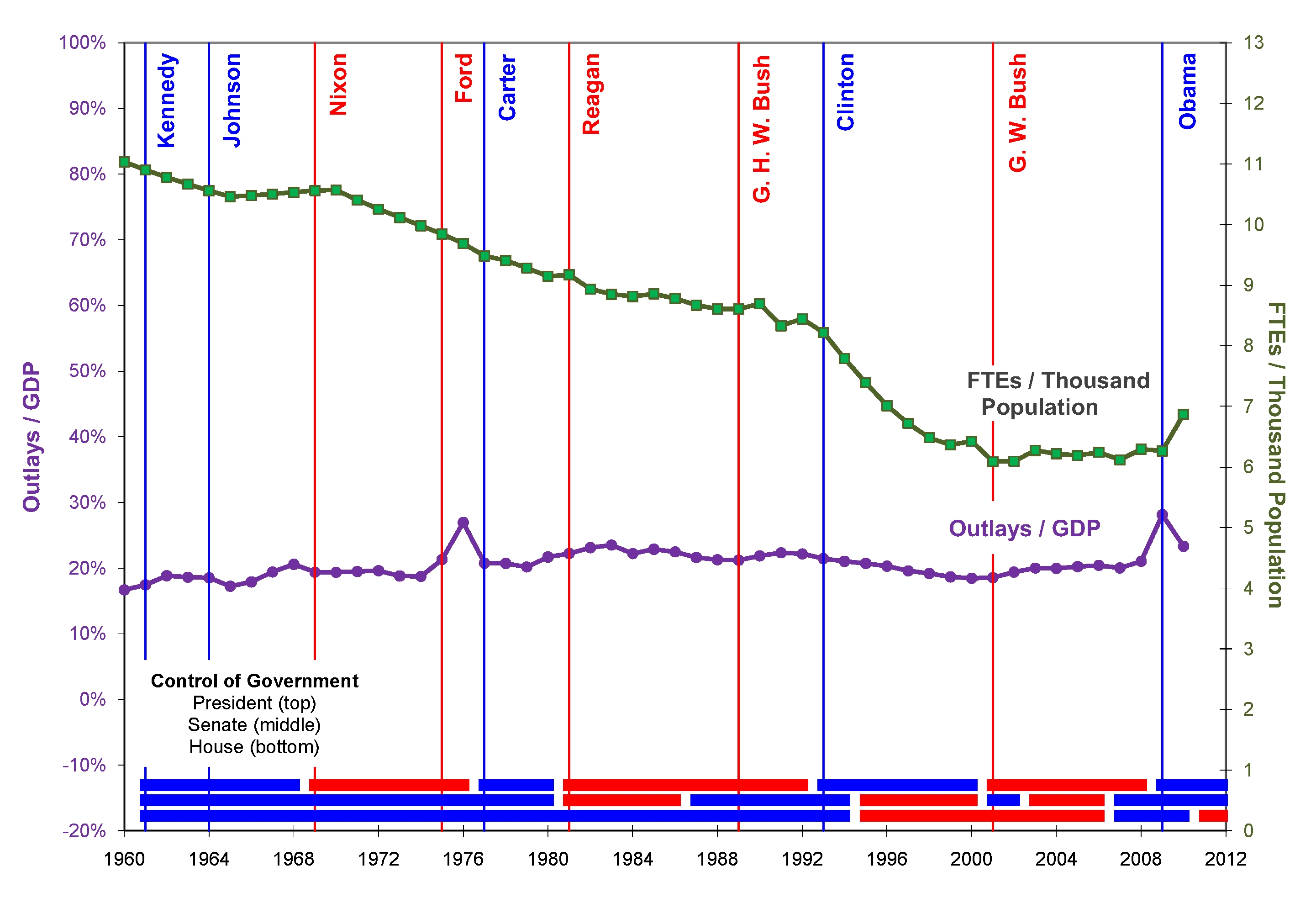
Consider this example. How many times have you heard political pundits rant about the unbridled growth of the U.S. federal government? Is that really true? Sure, the government spends more dollars and has more employees than fifty years ago. But that’s to be expected because the country’s economy and population are both growing. It’s like a family that pays more for groceries to feed their hungry teenagers than they did when they were young children. So the government is indeed growing along with the rest of the country, but like children fueling an increase in grocery expenditures, the growth of the government is fueled by the growth of the economy and the population. If you want to examine the growth of the federal government, you have to compensate for the growth of the economy and the population. That’s what this chart does using data from a variety of federal websites.

Between 1960 and today, annual federal expenditures have been a fairly constant 20% of the country’s gross domestic product (GDP). The percentage was a bit less in the 1960s and 1970s, and a bit more in the 1980s. There have been two blips in the otherwise flat data trend—one in 1976 when the government changed its fiscal year, and one in 2009 attributable to the Troubled Asset Relief Program of 2008 (TARP, the Bailout) and the American Recovery and Reinvestment Act of 2009 (ARRA, the Stimulus). Overall, though, the amount the government spends is growing at about the same rate as the economy.

What about the federal workforce? The U.S. government is the largest employer in the world and it’s growing, but again, the growth is in response to the country’s growth in population. In fact, the chart shows that the number of full-time equivalent positions (FTEs) per thousand of population has decreased from 11 in 1960 to about 6 in 2009. The jump of half a percentage point in 2010 is attributable to the people the government hired for the 2010 Census, and more importantly, the people hired to administer TARP and ARRA. This data is for the Executive Branch of the government only and does not include Post Office Employees. The Office of Management and Budget has estimated that with Post Office FTEs, the ratio was 13.3 in 1962 and about 8.4 in 2010, but the trend is still downward.

Another popular rant of the political pundits is that Democrats grow the government and Republicans shrink the government. In the chart, the red lines represent Republican control of the government and the blue lines represent Democratic control of the government. Democrats have controlled the Presidency and both Houses of Congress five times in the past fifty years. The number of federal employees per the country’s population decreased substantially under Clinton, decreased slightly under Kennedy and Carter, remained about the same under Johnson, and increased under Obama. Republicans have controlled the Presidency and both Houses of Congress only once since 1960. The number of federal employees per the population remained about the same under G. W. Bush. So, it doesn’t matter who is in office, the government grows in line with the growth of the economy and the population. Don’t let those political pundits tell you differently.

Around the World in FTE Haze

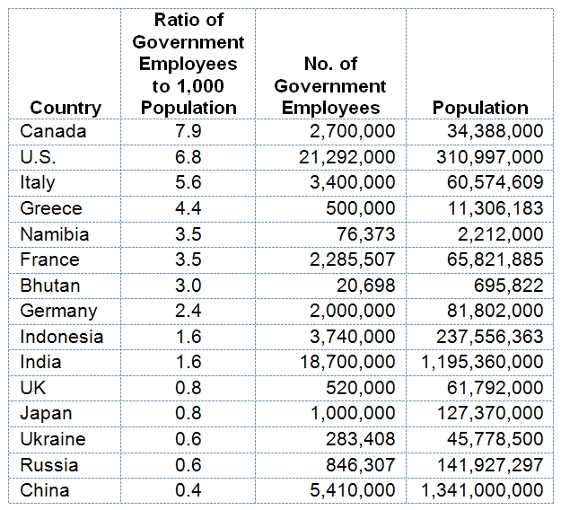
Here’s another example along the same lines using data from http://www.numberof.net/number-of-government-employees-in-the-world/ and http://en.wikipedia.org/wiki/List_of_countries_by_population.

This table shows that the U.S. has a relatively large number of federal employees for its population and would top the list if the USPS employees were included. About a third of the countries have one government employee or less per 1,000 population. China with its huge population has the lowest ratio. The U.S. government may be getting smaller but it’s still way bigger than any other government in the world. Right? Maybe, but before you go all libertarian, consider this.

The data used in the table are frankendata—data collected by different people at different times and locations, analyzed with different procedures and equipment, and reported in different ways (https://statswithcats.wordpress.com/2010/10/31/resurrecting-the-unplanned/). The Employment data were collected between 2002 and 2010, each by a different source. Some are rounded to thousands and some are rounded to millions. Some represent FTEs and some are all employees. And perhaps most importantly, each country has a different government structure and defines civil service in different ways. Maybe there’s a grain of truth in it and maybe it’s just an illusion produced by a messy data set.

Putting Data in Perspective

If you are generating your own data, you can develop a sampling plan that will help ensure that your data are comparable and representative of the population you are investigating. Sometimes, though, you have no alternative except to use whatever data you can get. In that case, you can try three approaches:

  • Filter the data you will analyze by selecting from a much larger dataset only those data that are comparable to each other. For example, you might use only the environmental data that were collected at about the same time.
  • Index the data by some relevant factor, such as in the first example in which FTE counts over time were divided by population counts over time. The Consumer Price Index, used to adjust dollars to a constant point in time, is another example of indexing.
  • Transform the data so that they all have an entirely new common basis. The example of the chemical concentrations in groundwater that appears in the Stats with Cats blog Resurrecting the Unplanned is an example.

You may never have to resort to these measures to create a set of comparable data to analyze. Nevertheless, you should be aware of the problem and recognize it when you see relative data misused in an analysis. This is important … relatively.

Read more about using statistics at the Stats with Cats blog. Join other fans at the Stats with Cats Facebook group and the Stats with Cats Facebook page. Order Stats with Cats: The Domesticated Guide to Statistics, Models, Graphs, and Other Breeds of Data Analysis at Wheatmark, amazon.combarnesandnoble.com, or other online booksellers.

Posted in Uncategorized | Tagged , , , , , , , , , , | 10 Comments

Becoming Part of the Group

Imagine looking for patterns in a scatter plot of two variables. You see no linear trends, no curvilinear trends, and no cyclic or sinusoidal trends. Does that mean there are no associations between the variables? Maybe not.

No sooner than he had gotten out of bed, two clusters of black fur formed on the blanket.

Most people think of statistics as hypothesis tests and regression lines, but of course, there’s much more https://statswithcats.wordpress.com/2010/08/22/the-five-pursuits-you-meet-in-statistics/. Classification is often an important goal of data analysis. You can classify data visually by sorting or filtering metadata, and by plotting histograms and setting thresholds. But that approach is inefficient, especially compared to cluster analysis.

Cluster Luck

Cluster analysis refers to a number of procedures for arranging ungrouped items into statistically similar collections. Either samples or variables can be clustered. Sample clusters can be used to better describe the data using descriptive statistics or coded as grouping variables for other types of statistical analysis. Variable clusters can be used to help evaluate what a set of variables actually measures. Cluster analysis can also be used to identify atypical groups, even individual outliers.

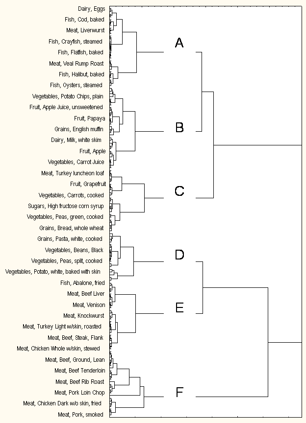
There are several types of cluster analysis, each with many options for directing the clustering process. The most commonly used type of cluster analysis is hierarchical cluster analysis. Results from a hierarchical clustering are usually expressed as a tree diagram, which looks a bit like a company’s organization chart. The challenge in hierarchical cluster analysis is to interpret a tree diagram and select the appropriate clusters.

Cluster analysis has been used to classify animal and plant species, soil and rock types, astronomical bodies, and weather systems. It is used in education research to classify students, schools and districts. It is used to analyze customer preferences, market segments, target markets, and social networks. It is used to identify crime hot spots and anatomical features in forensic analysis.

Food for Thought

Consider this example. People follow special diets for a variety of reasons, such as controlling weight or blood glucose. But food is complex. Ignoring taste, food is characterized by the energy it provides (i.e., calories), the rate it is metabolized (i.e., Glycemic index for carbohydrates), its components (i.e., carbohydrates, proteins, and fats), and many other attributes. So, it is useful for nutritionists to classify foods to help consumers make healthy choices. Cluster analysis is one approach for such a characterization.

Data for this analysis consisted of values of five variables (i.e., calories, carbohydrates, proteins, fats, and Glycemic index) for 213 sample foods. The figure shows the tree diagram produced by the cluster analysis (although only 38 of the 213 foods are listed to aid readability). From the tree diagram, an appropriate number of clusters are selected. Cluster selection requires a combination of information on the statistical differences between potential clusters, an understanding of the data to interpret why each member might belong to a certain cluster, and a sense of how many clusters might be reasonable for characterizing the data. The letters in the tree diagram of the figure show one of the many possible sets of clusters.

Tree diagram for the Cluster Analysis of Food Types.

Once clusters ore chosen, they are characterized based on the characteristics of their members. The table summarizes how the six food clusters could be interpreted. These interpretations might have been different if the original variables or the number of clusters were different.

Characteristics of Six Food Categories Identified with Cluster Analysis.

Food Category and Description

Calories

Metabolism

Protein

Carbo-

hydrates

Fats

Foods

A

Muscle- maintenance foods

Low

Very Slow

High

Low

Moderate

Eggs, most fish, ham, salami, bacon, liverwurst, frankfurters

B

Quick-energy foods

Low

Fast

Low

Moderate to High

Low to Moderate

Milk, fruit juices, apples, bananas, cherries, grapes, pears, mangos, papayas, potatoes, crackers, pretzels

C

Low-calorie foods

Very Low

Moderate to Fast

Low

Moderate to High

Low to Moderate

Bread, peas, carrots, citrus fruits, peaches, plums, kiwis, watermelon, anchovies, caviar, gefiltefish, pepperoni

D

Sustained-energy foods

High

Fast to Very Fast

Moderate

High

Moderate

Yogurt, dates, prunes, pasta, rice, beans, French fries

E

Muscle-building foods

High

Very Slow

High

Low

Very High

Catfish, abalone, flounder, herring, mackerel, corned beef, liver, skinned chicken, turkey, venison, veal

F

Weight-gain foods

Very High

Slow to Moderate

High

Low

Very High

Raisins, soybeans, bass, kingfish, most beef, chicken and pork

One thing you should do after every analysis is to ask yourself if the results make sense. This isn’t the same as trying to bias the results, or at least it shouldn’t be. If you really understand your data, you should be able to tell if a result fits with the conventional wisdom. In the table, for example, does it make sense that raisins and soybeans are weight-gain foods and pepperoni is a low-calorie food? Could there be errors in the data? Might the serving sizes be non-representative of what might be eaten at one time? Perhaps. In other cases, it might also be possible that a different clustering algorithm, a different measure of data distance, or a different number of clusters would allow a better interpretation of the data.

Cluster analysis is a powerful technique for exploring patterns of similarity and difference in samples or variables. It is considered to be an exploratory statistical technique. It requires considerable knowledge of the phenomenon the data represent to interpret the results. For applied statisticians, though, this is where data analysis really gets fun.

[The data for this analysis came from http://www.ast-ss.com/research/food/food_listing_all.asp. Values for calories, carbohydrates, proteins, and fats are contingent on serving size. Not all of the foods were included in the analysis because of missing data.]

Read more about using statistics at the Stats with Cats blog. Join other fans at the Stats with Cats Facebook group and the Stats with Cats Facebook page. Order Stats with Cats: The Domesticated Guide to Statistics, Models, Graphs, and Other Breeds of Data Analysis at Wheatmark, amazon.combarnesandnoble.com, or other online booksellers.

Posted in Uncategorized | Tagged , , , , , , | 8 Comments

The Data Dozen

Data can take a variety of forms. Some are readily amenable to statistical analysis and some are better suited to other methods of analysis. When you’re trying to solve some problem or research question, though, you need to use whatever is available that fits. Here are twelve types of data to think about using in your next analysis.

Data Type

Description

Generation

Examples

Automatic Measurements

Information generated by devices, usually electronic or mechanical, that operate without human involvement (other than calibration and sample introduction). Experimenter-Device Thermocouples, strain-gage scales, electronic meters

Manual Measurements

Information generated by devices that require human involvement to carry out the measurement. Experimenter-Device Rulers, calipers, thermometers, balance-beam scales

Archived Records

Information generated by an identifiable person or organization Known individual or organization Government records, financial data, personal diaries, logs, notes

Directed Responses

Information receives as the result of a specific direct inquiry. Experimenter-Subject Surveys, focus groups, interrogations

Electronic Recordings

Information stored on audiovisual devices Experimenter-Device Videos, audio recordings, photos, false-color images

Metadata

Data about data— their origins, qualities, scales, and so on. Data Generator Time, location, and method of data generation

Transformations

Information created from other information. Data Analyst Percentages, sums, z-scores, ratios, and so on.

Analog Data

Information from a source that resembles in some respect a phenomenon under investigation Experimenter Experimental lab animals, models

First Person Reports

Descriptive, qualitative information derived from a first-person encounter Individual Eyewitness accounts

Secondhand Reports

Information summarized or retold by a second party based on first-person accounts. Known individual or organization News stories

Unverified Reports

Information, written or retold, which cannot be disproven or verified. Unknown individual or organization Anecdotes, stories, legends

Conjectures

Information created from thought experiments rather than physical experiments. Known individual or organization Expert opinions

Automatic and manual measurements are used commonly in statistical analysis when they can be generated in large numbers at reasonable costs. Furthermore, they are often measured on continuous, or at least, quantitative scales. These measurements are usually easy to reproduce but may be time or location dependent.

Data? I thought you said tuna.

Archive records are also used commonly in statistical analyses, usually as government records and financial data, when they are measured on quantitative scales. These data are often considered “official” because they have been verified even though they are not reproducible. Archive records may also provide qualitative information, usually in small amounts, such as personal diaries, logs, notes, and so on. These can be used to support statistical analyses and are a mainstay of scientific investigations.

Directed responses, information received as the result of specific questions, includes results of surveys and focus groups, which are commonly analyzes with statistics. Direct response data is also generated by direct and cross examinations in court and by military and law enforcement interrogations. Direct response data comes from individuals, so their responses may not always be true and consistent.

Two types of data that are used in almost all data analyses are metadata and transformations. Metadata are data about data, such as descriptions of their origins, qualities, scales, and so on. Transformations are data created from other data, which includes percentages, z-scores, sums, ratios, mathematical functions and so on (https://statswithcats.wordpress.com/2010/11/21/fifty-ways-to-fix-your-data/).

Analogs are data sources that substitute for the actual phenomenon of interest. Models are a type of analog as are animals used in medical experiments (much to their and my displeasure). Statistics is all about models (https://statswithcats.wordpress.com/2010/08/08/the-zen-of-modeling/), from basing test probabilities on the Normal distribution to creating regression models from data.

Electronic recordings, like videos and audio recordings, would seem to be a good type of data to analyze. Recordings have a great data density, though it can be laborious to extract individual data elements from the qualitative recording source. They can be faked, but so too can all the other types of data.

Reports come from witnesses. First person reports come from eyewitnesses. The information is typically descriptive, qualitative, and may be verifiable but typically isn’t reproducible and may not even be true. Secondhand reports are eyewitness reports that are summarized or retold by a second party, such as news agencies. Unverified reports, anecdotes, stories, and legends that may be written or retold, come from sources that are unknown. These reports usually cannot be disproven or verified. Reports don’t often provide data elements for statistical analyses but may provide supporting evidence or metadata.

Finally, conjectures are data produced by experts through thought experiments rather than physical experiments. The Delphi process (http://en.wikipedia.org/wiki/Delphi_method) is a good example of the use of conjecture. Usually conjecture is used in situations in which data cannot be collected, such as forecasting the future.

Did you see that?

Data analysts use all these data types. Statisticians want to use data types that provide many observations so they can assess variability. Scientists and engineers may be satisfied with the results of a single, albeit well controlled, experiment. They are truly deterministic breeds. Courts want every piece of evidence to be attested to by an individual, whether an eyewitness or an expert witness. They want to be able to cross-examine witnesses. Historians don’t usually have eyewitnesses so they rely on reports, especially secondhand and even unverified reports. They’ll use whatever they can find.

Certainly, this classification is not the only way to look at data. For example, the U.S. legal system defines courtroom evidence as either:

  • Real—physical objects, like a weapon.
  • Demonstrative—illustrations of evidence, like a map of the crime scene.
  • Documentary—items that contains human language, like contracts and newspaper articles.
  • Testimonial—oral or written evidence from witnesses.

(http://people.howstuffworks.com/inadmissible-evidence1.htm). To be admissible in court, these types of evidence have to be relevant (i.e., proves or disproves a fact), material (i.e., essential to the case), and competent (i.e., proven to be reliable). Trial lawyers use witnesses to tell compelling stories that will keep judges and juries attentive, which non-testimony evidence may not. In contrast, noted scientist and lecturer Neil deGrasse Tyson counters that “In courts, eyewitness testimony is considered great evidence. In science it’s considered worthless.” But that’s not quite true if the observation can be witnessed by others, such as in the cases of astronomical observations and replicated experiments. UFO eyewitnesses don’t fare so well with scientists. Statisticians want more, though. Our analyses aren’t based on cause-and-effect; association works just fine. But whatever you perspective on data, be sure you understand the pluses and minuses of what you’re working with.

Read more about using statistics at the Stats with Cats blog. Join other fans at the Stats with Cats Facebook group and the Stats with Cats Facebook page. Order Stats with Cats: The Domesticated Guide to Statistics, Models, Graphs, and Other Breeds of Data Analysis at Wheatmark, amazon.combarnesandnoble.com, or other online booksellers.

Posted in Uncategorized | Tagged , , , , , , , , , | 6 Comments

Statistics: a Remedy for Football Withdrawal

TOUCHDOWN!

One thing that makes sports so much fun to follow is the plethora of statistics associated with every player, every game, every team, and every season. Other than government agencies, you won’t find better sources of data to practice on. It’s a simple matter to go to the website of a professional sport and find some raw data that needs analyzing.

In football (the American kind) it is often said that good offense provides excitement but good defense wins games. Fans of the 2006 Indianapolis Colts probably wouldn’t agree. Ranked 3rd in offense but 21st of 32 teams in defense, the Colts had a regular season record of 12 wins and 4 losses and won the Super Bowl. Maybe they were an anomaly. So the question is: are teams that make the post-season playoffs better defensively than the rest of the league as the conventional wisdom claims?

Data for this analysis consisted of 26 variables (i.e., team performance statistics, such as number of plays, penalties, fumbles, 3rd and 4th down conversions, and time of possession) for the 32 NFL teams (thank you nfl.com). Having that many performance variables with comparably few teams is a flag that factor analysis might be a useful way to proceed (https://statswithcats.wordpress.com/2010/08/27/the-right-tool-for-the-job/). Factor analysis (FA) is based on the concept that the variation in a set of variables can be rearranged and attributed to new variables, called factors. The use of factors instead of raw variables is sometimes preferable because factors are more efficient (i.e., fewer factors are needed to evaluate almost the same proportion of variability as the original variables).

FA requires some intuition to interpret. FA produces equations that define each factor in terms of the original variables:

F1 = a11x1 + a12x2 + a13x3a1nxn

F2 = a21x1 + a22x2 + a23x3a2nxn

.
.
.

Fm = am1x1 + am2x2 + am3x3amnxn

where:

F1 through Fm are the m factors that replace the original n variables

x1 through xn are the original variables

a1 through an are factor analysis weights.

m is always less than or equal to n, but is a lot less if you’re lucky.

What you have to do is look at the correlations between the original variables and the factors and guess what each factor might mean. It’s like being given a big box of parts—gears, transistors, tires, fabric, motors, pipes, wires, and lumber—and trying to figure out what they’re supposed to make. Some parts will be integral and others will be left over.

FA derived two factors from the 26 NFL statistics—an Offense Factor and a Defense Factor. No big surprise there, in fact, that’s what we were hoping for. Each factor accounts for about 20% of the total variation in the original variables. So, we’ve lost 60% of the information contained in the original 26 variables in exchange for the simplicity of having just two variables. That’s a good example of why FA is often referred to as a data reduction technique.

Two Factors that Summarize 26 Team Performance Statistics.

FA and the associated data reduction techniques of correspondence analysis and multidimensional scaling are like photographs. A photograph conveys only two of three spatial dimensions and usually includes no information about time, odors, sounds, temperature, or other circumstances, yet it still presents enough information so that observers can discern what is happening. So data reduction shouldn’t be taken as a pejorative descriptor. Sometimes simplifying a problem is the best way to solve it; at least that’s what William of Ockham thought. And after all, isn’t that what modeling is about?

Once the number of variables has been reduced to a manageable few factors, you can analyze patterns of relationships much more efficiently. Consider the scatter plot of how the 32 teams scored on the two factors and how far they got in the postseason. The two gray lines represent the averages of the Offense and Defense Factors. The Seattle Seahawks could be considered the average team of the 2006 season because they are located closest to the intersection of these two lines. Draw an imaginary line through the plot origin and the intersection of the lines (i.e., a 45° angle), and you’ll identify the most balanced teams, the teams with about the same scores for their Offense and Defense Factors. The most balanced teams from best to worst would be the Pittsburgh Steelers, the New York Giants, the Seattle Seahawks, the Tennessee Titans, the Cleveland Browns, and the Houston Texans. Of these, only the Giants and the Seahawks made the playoffs. So much for the importance of balance.

Factor Analysis of National Football League Teams.

[Note: There’s a reason why there are no values on the axes. Some readers who saw this graph were totally baffled by the numbers, so I took them out (https://statswithcats.wordpress.com/2011/01/16/ockham%E2%80%99s-spatula/). The units of the analysis were normalized and are meaningful only in relative terms. Both axes do have the same scale increments, however. A difference of 1 on the offense scale is analogous to a difference of 1 on the defense scale.]

The 2006 Super Bowl champion Colts had the highest score on the Offense Factor but the lowest score on the Defense Factor of any of the playoff teams. In fact, 63% of teams with an above average Offense Factor score made the playoffs compared to 44% of teams with an above average Defense Factor score. So, is the notion that good defense beats good offense wrong? Not necessarily; but it sure didn’t apply in 2006.

So remember, if there’s no NFL football in 2011 because of contractual problems, you can always fall back on statistics to fill the gap. Then again, there’s always sabermetrics …

Read more about using statistics at the Stats with Cats blog. Join other fans at the Stats with Cats Facebook group and the Stats with Cats Facebook page. Order Stats with Cats: The Domesticated Guide to Statistics, Models, Graphs, and Other Breeds of Data Analysis at Wheatmark, amazon.combarnesandnoble.com, or other online booksellers.
Posted in Uncategorized | Tagged , , , , | 5 Comments

Six Misconceptions about Statistics You May Get From Stats 101

When you learn new things, you can develop misconceptions. Maybe it’s the result of something you didn’t understand correctly. Maybe it’s the way the instructor explains something. Or maybe, it’s something unspoken, something you assume or infer from what was said. Here are six misconceptions about statistics you might have gotten from Stats 101.

Misconception 1: “Statistics is Math

Yeah, we love stats, or math, or whatever it is.

How could you not come to believe this? Even before you took Stats 101, you learned you had to take the course to fulfill a math requirement. It was taught by the Math Department. Then when you took the course, it was all numbers. Homework and exams were almost all about calculations. Stat 101 was all math. Statistics must be all math too.

Reality

Statistics uses numbers but numbers are not the primary focus of statistics, at least to most practitioners. Applied statistics is a form of inductive reasoning that uses math as one of its tools. It also uses sorting for ranks, filtering for classification, and all kinds of graphics. The point of using statistics is to discover new knowledge and solve problems through the use of inductive reasoning involving numbers. It’s not just about doing calculations. That’s why it’s required for college majors in business, social sciences, and many other disciplines. That’s why it’s taught by professors in all those disciplines, too. Yes, it’s required for math degrees and is taught by math professors at many schools. That’s so there will be mathematical statisticians who will invent statistical tools for the applied statisticians to use. You can love statistics and be good at statistical thinking even if you think you hate math.

Misconception 2: “Statistics Requires a Lot of Data

Stats 101 doesn’t teach you how to work with individual pieces of information, like a solitary measurement, or a picture, or eyewitness testimony. Statistics uses data, lots of data, the more data the better. The number of samples is a term in almost every equation. And anyway, that’s what the law of large numbers says, the more data the better the results.

Reality

The number of samples you really need for a statistical analysis is contingent on how much resolution you want. Think of the resolving power of a telescope or a microscope, or the number of pixels in a computer image. The greater the resolution, the more detail you’ll see. It’s the same way with statistics (https://statswithcats.wordpress.com/2010/07/17/purrfect-resolution/).

Hey, Here’s a bunch of data over here.

What’s more important than the number of data points is the quality of the data points. In statistics, the quality of a set of data point is how well the data points represent the population from which they are drawn. But representative data can be incredibly difficult to generate. How do you decide which registered voters are actually likely to vote in the next election? How do you decide who might use a product you might want to sell?

The number of samples is easy to determine. The quality of the samples is virtually impossible to determine. Nevertheless, what you should remember is that more data may be better but better data are always best.

Misconception 3: “Data are Dependable

In Stats 101, you do a lot of number crunching. You use small datasets and big datasets, real data and fake data, but never were you told to delete data. You figured that data are like facts. You don’t delete them for any reason or you will bias your results.

Reality

Yes I double checked the data. Why do you ask?

Data are messy. Most newly generated datasets have errors, missing observations, and unrepresentative samples. Some population properties may be under-represented or over-represented. There may be samples that should not be included in the analysis, like replicates, QA samples, and metadata. All these problems with data require a lot of processing before an analysis can begin (https://statswithcats.wordpress.com/2010/10/17/the-data-scrub-3/). In fact, data scrubbing often consumes the majority of a project budget and schedule, but you have to do it anyway.

Misconception 4: “Statistics Provides Unique Solutions

In all the problems your Stats 101 instructor solved in class, and all the homework assignments you did, and all the exams you took, there was only one “right answer” to a question. So, any statistical analysis should provide the same results no matter who does it.

Reality

Even if two statisticians start with identical data sets, they may not come to identical results, and sometimes, even identical conclusions. This is because they may make different assumptions and scrub the data differently. Furthermore, there may be more than one way, even many ways, to approach a problem (https://statswithcats.wordpress.com/2010/08/22/the-five-pursuits-you-meet-in-statistics/). There may also be different statistical analysis techniques that can be used, or even different options within the same technique (https://statswithcats.wordpress.com/2010/08/27/the-right-tool-for-the-job/). It would probably be more surprising for two statisticians to calculate the same results from a dataset than for them to have some differences. Just like most problems in the real world, there may have more than one right answer from a statistical analysis.

Misconception 5: “Statistics Provides Unambiguous Results

Results are either significant or they’re not. That’s pretty unambiguous.

Reality

That’s another way to look at it.

Statistical results are based on data and assumptions about the data. Change the number of samples and you change the resolution of the statistical procedure. Change the data or the assumptions and you change the estimates of variability. Change the resolution or the estimates of variability and you have different results. There is indeed uncertainty in uncertainty. Sometimes uncertainty brings with it ambiguity.
Is there really a difference between Type I error rates of 0.049 and 0.051? Many decision makers who never got past Stats 101 think so. But interpretations of these results are based on the assumptions and biases a statistician brings with him. One statistician might take a firm stance and say “significant” and another might say, “maybe not.” Results have uncertainty; interpretations have ambiguity, and decisions have risks. That’s statistics.

Misconception 6: “It’s Easy to Lie with Statistics

With her identity protected, the witness told how she faked the survey results.

Darrell Huff wrote “How to Lie with Statistics” in 1954 (http://www.amazon.com/How-Lie-Statistics-Darrell-Huff/dp/0393310728/ref=pd_sim_b_2). Michael Wheeler wrote “Lies, Damn Lies, and Statistics: The Manipulation of Public Opinion in America” in 1976 (http://www.amazon.com/Lies-Damn-Statistics-Manipulation-Opinion/dp/0393331490/ref=sr_1_17?ie=UTF8&qid=1298231730&sr=8-17). John Allen Paulos wrote “Innumeracy: Mathematical Illiteracy and Its Consequences” in 1988 (http://www.amazon.com/Innumeracy-Mathematical-Illiteracy-Its-Consequences/dp/0809058405/ref=ntt_at_ep_dpi_1). Joel Best wrote “Damned Lies and Statistics: Untangling Numbers from the Media, Politicians, and Activists” in 2001 (http://www.amazon.com/Damned-Lies-Statistics-Untangling-Politicians/dp/0520219783/ref=sr_1_3?ie=UTF8&qid=1298231253&sr=8-3).
So it must be pretty easy to lie with statistics since everybody is doing it.

Reality

It’s hard to do statistics right but it’s also a lot of work to do them wrong, too. You have to collect data, crunch the numbers, and cook up your story, or perhaps more correctly, cook up your story, make up the data, and call the press conference. But if you’re going to mislead an audience, it’s much easier to use made up facts, phony anecdotes, and illogical conjectures. So why do so many people, particularly politicians, even bother lying with statistics? It’s because numbers provide credibility. If you have little credibility yourself, using numbers can confer the illusion of expertise. And that is why people use statistics in the first place.

Read more about using statistics at the Stats with Cats blog. Join other fans at the Stats with Cats Facebook group and the Stats with Cats Facebook page. Order Stats with Cats: The Domesticated Guide to Statistics, Models, Graphs, and Other Breeds of Data Analysis at Wheatmark, amazon.combarnesandnoble.com, or other online booksellers.
Posted in Uncategorized | Tagged , , , , , , , , , , , , , , , , | 10 Comments

Consumer Guide to Statistics 101

But I don’t wanna take Stats 101.

Whether you took or are taking an introductory course on statistics, you probably didn’t get to choose from a dozen candidate offerings. You had to take the specific course required for your major. You can, though, evaluate what you got. Did you get your money’s worth from that introduction to statistics class? Here are a few things to think about.

Your Expectations

Why did you take Statistics 101? Was it a requirement for a degree? Many majors, especially for advanced degrees, require some statistics (https://statswithcats.wordpress.com/2010/06/08/why-do-i-have-to-take-statistics/). Was it a less frightening alternative to other courses? Statistics can be used as a substitute for calculus in some undergraduate programs and for a foreign language in some Ph.D. programs. Or, maybe you didn’t have any expectations other than to learn something new.

I took statistics thirty-five years ago when I was majoring in geology, which doesn’t have a lot of quantitative deterministic theories for describing natural processes. Even today, predicting earthquakes, landslides, volcanic eruptions and other earth phenomena remain elusive goals. I wanted to learn how to develop mathematical equations, models, to explain and predict phenomenon. Regression analysis turned on the light bulb over my head. That’s how I got here.

Well, that’s not what I expected.

When you buy an expensive product at a store, you usually have some expectations of what you should get for your money. When you buy a new car, for instance, you may want it to look and handle a certain way. You may not voice your expectations, or even be able to describe what you want, but you do have expectations. Your Stats 101 course is similar. You paid a lot of tuition to take the course; you must have had some expectation, even subconscious, of what you would take from it. This is important because it sets a reference point for what you experience in the course. So ask yourself, did your course give you what you expected, and just as important, were your expectations reasonable?

Your Instructor

Think of the person who taught you in Statistics 101. How would you rate him or her on these four criteria?

  • Knowledge—Knowledge may be the first thing you think about when you think of a college professor, and for that reason, it’s probably the least important discriminator of instructor quality. They all have adequate knowledge, at least from your level of understanding. It’s what the instructors do with their knowledge that makes the differences.
  • Communication Skills—Being able to convey knowledge is a necessity for an instructor. Some instructors communicate information better than others, and unfortunately, some instructors do not communicate well at all. They may be inarticulate, have an accent or a speech defect, be speaking in a second language, or just not be able to explain difficult concepts or answer questions well.
  • Engagement—Instructors usually teach the same courses over and over again. Some instructors add content and try new descriptions with each class. Others use the repetition to become automatons, teaching the same content in the same way year after year, even to the point of reading their past lectures.
  • Empathy—Instructors have an obligation to teach certain content but they also should be sensitive to what their students want to learn and need to learn to further their careers. Empathetic instructors might try to tailor their teaching to the interests of their students, like citing examples from the disciplines of their majors. Oblivious instructors will teach about their latest interests, regardless of the applicability to the students.

The minimum requirements for an instructor are to know the subject and be able to communicate that knowledge. What separates the best instructors from the rest are their level of engagement and their empathy to the needs of the student. So ask yourself, did your instructor convey his excitement over what he was teaching? Did you leave the class curious about what else there might be to learn about statistics and about how you could use statistics yourself?

Number Crunching

This is more the kind of crunching I want to do.

Artists draw, chefs cook, and statisticians calculate, but they do so in many ways. When I was learning statistics, my choices for doing calculations were a very unfriendly mainframe computer, a hand calculator, or pencil and paper. This choice may be why there are so few old statisticians around today.

How your instructor had you calculate statistics says something not only about the times but also about his level of empathy. Here’s why:

  • Pencil and paper—No professional statistician calculates any serious statistics nowadays by hand, except perhaps on drink-stained cocktail napkins. Still, many instructors want their students to get the hands on feel of number manipulation. That’s valid. If it goes beyond probabilities, descriptive statistics, and simple tests of hypotheses, your instructor is a sadist.
  • Calculator— No professional statistician calculates any serious statistics nowadays with a calculator, unless cocktail napkins are not available. If you plan on being an artist or a chef, manual calculations are fine. If you have any intentions of using statistics in your major, you need to learn software.
  • Spreadsheet Software—Spreadsheet software is probably the best choice for most students. It can be used to set up and edit datasets, calculate statistics, and prepare graphs. Plus, it’s relative easy to use, and likely to be available to the student at school, work, and home.
  • Statistical Software—Statistical software can be another good choice, depending on the learning curve. Simple statistical software can allow students to concentrate on interpreting statistics instead of calculating them. Advanced statistical packages like SAS and SPSS, while necessary for advanced courses, are beyond what introductory students need to learn unless they plan a career in statistics. Because of the cost of these packages, they are not likely to be available to the student at work and at home.

    You do the R programming, I’ll do the puRRRRR part.

  • Programming—If you plan on a career in statistics, you will probably learn the R language or some other coding tool. If you learn it in Stat 101 and you are not a statistics major, you have to wonder what your instructor is thinking, if he is.

So, was your instructor thinking about your needs when he decided how the class would do calculations? If you can’t use his method of choice in the future, it’s kind of a wasted effort.

Concepts vs. Skills vs. Thinking

In designing your Stats 101 course, the instructor had to decide how to proportion class time between teaching concepts, skills, and statistical, thinking.

Concepts are the whys of statistics. They are the reasons why statistics work. Examples include populations, probability, the law of large numbers, and the central limit theorem. Instructors tend to devise games and demonstrations to help students remember fundamental concepts. Learning statistical concepts is beneficial to statistics majors and non-majors, both in school and in later life.

Skills are the whats and hows of statistics. They involve calculations, like probabilities, descriptive statistics, and simple tests of hypotheses. Skills are learned by repetition. You learn them by doing the calculations in the homework assignments, at least the even-numbered problems. After Stats 101, skills like designing data matrices for a particular analysis are much more important than the calculations themselves, which are usually carried out by software.

Yeah, I got skillz.

Concepts and skills account for the majority of Stat 101 classes. This is perhaps unfortunate, for the greatest need in society is for people to understand statistical thinking. Statistical thinking involves understanding how to define a problem in light of some objective, what uncertainty and risk are and how they can be controlled, and the difference between significance and meaningfulness.

You want me to learn about this? Why?

So, did the things you learned in Statistics 101 mostly involve concepts, skills, or statistical thinking? What things were you able to take from the class and use in later life?

What Do You Think?

Now all of this ignores course content. That’s a BIG topic for another time. For now, think about what your introduction to statistics course was like. Was what you expected? What would have made a better Stat 101 for you?

Read more about using statistics at the Stats with Cats blog. Join other fans at the Stats with Cats Facebook group and the Stats with Cats Facebook page. Order Stats with Cats: The Domesticated Guide to Statistics, Models, Graphs, and Other Breeds of Data Analysis at Wheatmark, amazon.combarnesandnoble.com, or other online booksellers.

Posted in Uncategorized | Tagged , , , , , , , , , , , | 7 Comments